Physical Address
304 North Cardinal St.
Dorchester Center, MA 02124
Physical Address
304 North Cardinal St.
Dorchester Center, MA 02124
Discover 19 practical kitchen inspiration ideas that blend style with function. From layout optimization to budget-friendly updates, transform your space today.
As an expert in designing spaces, I’ve spent my career creating environments that serve a very specific human need: to read, to learn, to think. My work in library design has taught me that a room isn’t just four walls and a ceiling; it’s a machine for living, a stage for our daily rituals. And honestly, no room in the house is more of a ritualistic stage than the kitchen. It’s where the story of our day begins and ends.
So many of us, however, are trying to write that story in a space that works against us. We’re battling layouts that feel like obstacle courses, fighting shadows cast by poor lighting, and wrestling with cabinets that seem to swallow our most-needed tools whole. The flood of kitchen inspiration online can feel overwhelming. The real task isn’t finding ideas; it’s finding the right story for your kitchen. It’s about creating a space that honors the rhythm of your life, not just slavishly following a trend. These ideas aren’t just about aesthetics; they are born from the same principles I use to design a great library: logic, comfort, and a deep respect for the user.
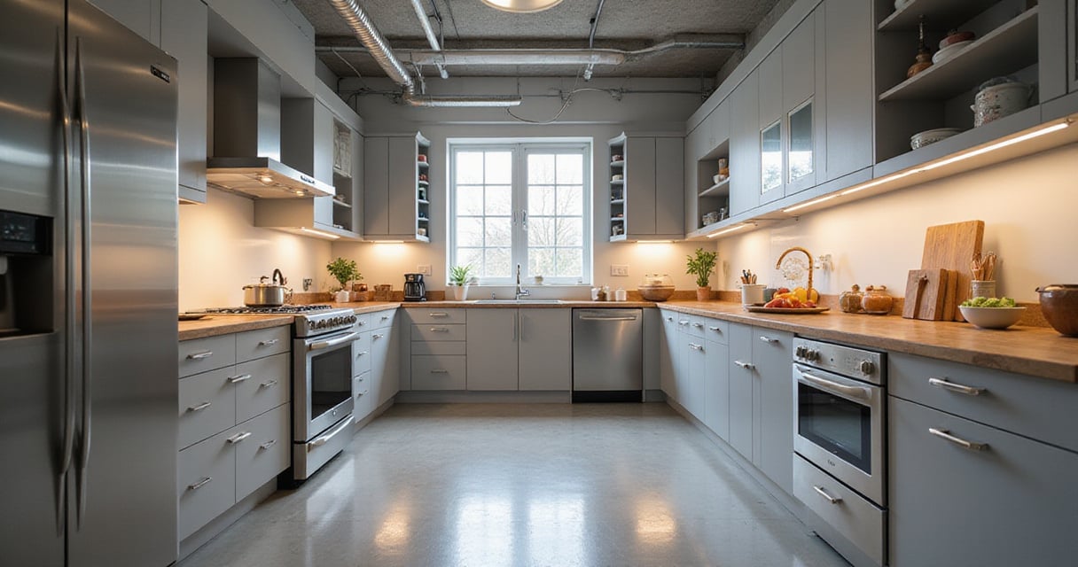
My life’s work is about flow—how a person moves through a space to find a book, a quiet corner, or a piece of information. The kitchen is no different. Forget the rigid “work triangle” for a moment. That was a fine concept for a different era. Today’s kitchens are more complex. Instead, think in terms of zones, like sections in a library. You need a Prep Zone, a Cooking Zone, and a Cleanup Zone. When you organize the space this way, you create a narrative for cooking a meal. Everything you need for a task is right where you need it, cutting down on those frantic, wasted steps between the refrigerator and the stovetop.
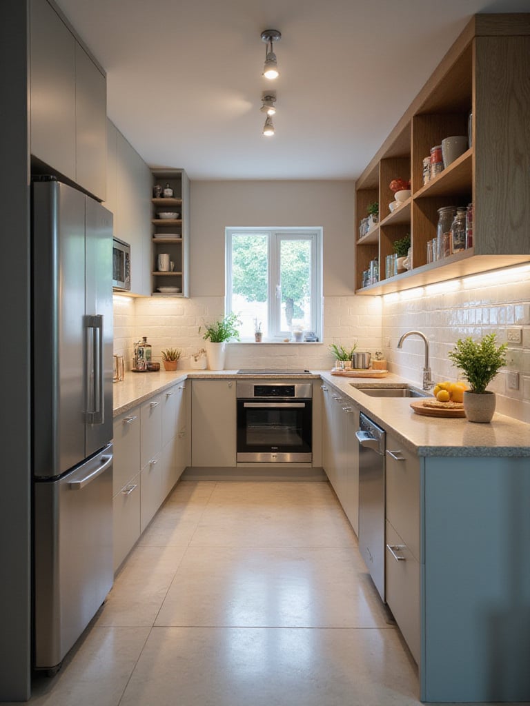
This isn’t just about saving time, though that’s a welcome side effect. A logical layout is fundamentally safer. It prevents traffic jams when someone is carrying a hot pan and a child is running through. Start by being a quiet observer in your own kitchen. Where are the bottlenecks? Where do you pile things up? The National Kitchen and Bath Association (NKBA) has guidelines—like having at least 42 inches for walkways—but you are the ultimate expert on your own movement. Your observations are the data that will inform the entire design.
This foundation of workflow, of pure function, is what allows the beauty to emerge. And that beauty often begins with color.
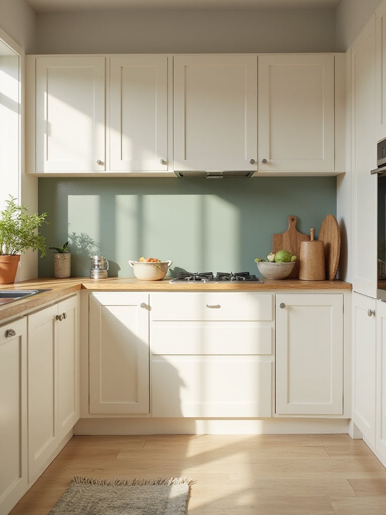
Color is the mood of the room. It’s the first thing you perceive, and it sets the emotional backdrop for everything that happens within it. In libraries, we use color to define quiet reading areas versus active collaborative zones. In your kitchen, it can be the difference between a frantic, sterile laboratory and an energizing, warm creative studio. What really gets me is when people choose a color based on a tiny paint chip under fluorescent store lighting. It’s a recipe for disappointment.
A useful guidepost is the 60-30-10 principle. I find it’s a brilliant way to build a layered, intentional palette.
The trend for all-white kitchens can be beautiful, but you have to be careful. A sterile, cool white can feel cold and impersonal. I always nudge my clients toward whites with a bit of cream or greige in them; they feel more like a page from a beloved old book than a blank sheet of printer paper. Get large sample pots and paint big swatches on the wall. Watch them throughout the day. The way morning sun hits a color is completely different from how it looks under evening task lighting.
The colors you choose will play off every surface, but none more so than the one that takes the most abuse day in and day out.
Your countertop is the primary work surface of the entire home. It’s where you roll out dough, chop vegetables, and rest heavy grocery bags. It’s an enormous part of your budget and your daily experience. It has to perform. While I have a deep, aesthetic love for the dramatic veining of marble, I’m also a pragmatist. For most busy households, it’s just not the right choice unless you enjoy the look of a well-earned patina—which includes the occasional etch from a stray lemon slice.
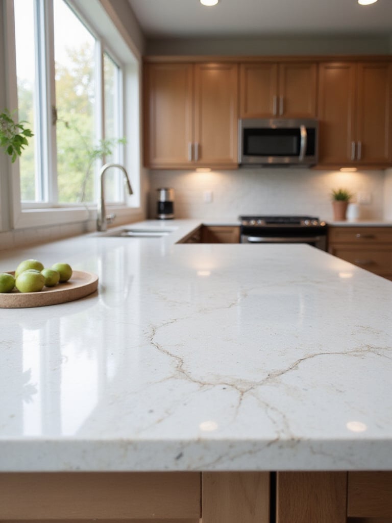
This is why quartz has become so dominant. It marries the look of natural stone with almost zero maintenance. No sealing, no staining. But the real secret isn’t just picking the material; it’s picking the slab. I once had a client who fell in love with a small sample of granite. When the slabs for their kitchen arrived, they contained a massive, dark mineral deposit they hadn’t anticipated. It changed the entire feel of the stone. Always, always insist on viewing and approving the exact slabs that will be cut for your kitchen. It’s like choosing the specific leather hide for a bookbinding—the variations are part of the character, but you want to be sure it’s the character you want.
And as you stand at that beautiful new counter, you’ll quickly realize the importance of the surface beneath your feet.
No floor in the house takes a beating like the kitchen floor. It’s a battlefield of dropped pans, spilled sauces, and constant foot traffic. But it’s also the surface you stand on for hours while stirring a risotto or baking for the holidays. So, your choice has to be about more than just looks; it has to be about endurance and ergonomics. I’ve seen beautiful, expensive hardwood floors ruined by a slow leak from an ice maker. It’s heartbreaking.
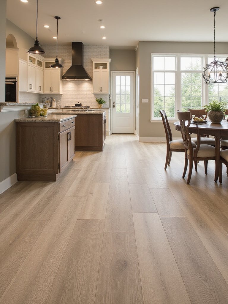
This is where materials like Luxury Vinyl Plank (LVP) have become so compelling. They offer incredible water resistance and have a slight give underfoot that materials like porcelain tile lack. That slight cushion can genuinely reduce leg and back fatigue. Porcelain is, to be fair, nearly indestructible, which is its own form of comfort. But whatever you choose, the preparation of the subfloor is everything. The most expensive flooring in the world will fail on an uneven or damp subfloor. It’s the foundational grammar of the room; get it wrong, and the whole sentence falls apart.
Once the main surfaces are in place, the real magic of organization can begin.
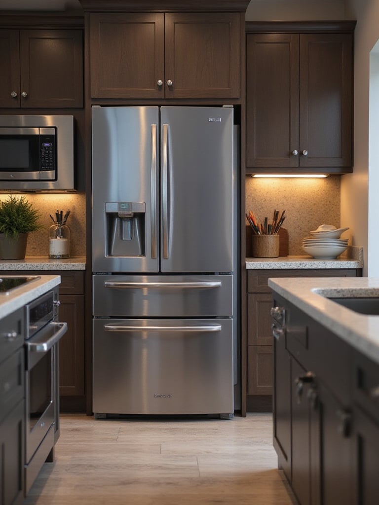
A standard kitchen cabinet is a horribly inefficient box. It’s a dark cave where things go to be forgotten. My work in library science is fundamentally about creating systems for easy retrieval. Your kitchen deserves the same logic. You shouldn’t have to excavate three layers of pots to get to the one you need. Smart storage retrofits aren’t a luxury; they are a sanity-saver.
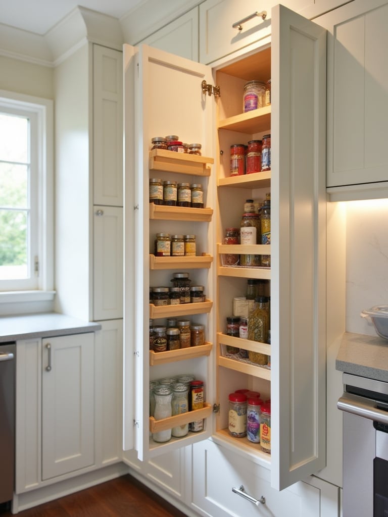
Start thinking vertically. Use dividers to store baking sheets and cutting boards on their sides, like books on a shelf. Install two-tiered pull-out shelves in your base cabinets to bring the contents of the back forward into the light. These small interventions can functionally double your accessible storage. Before you buy a single organizer, empty a cabinet completely. Assess what you’re trying to store and how you use it. Your spice collection needs a different solution than your collection of small appliances.
“A well-organized kitchen isn’t about hiding your possessions; it’s about honoring them with a proper home.”
This kind of internal organization creates an external sense of calm that flows into the kitchen’s most important feature.
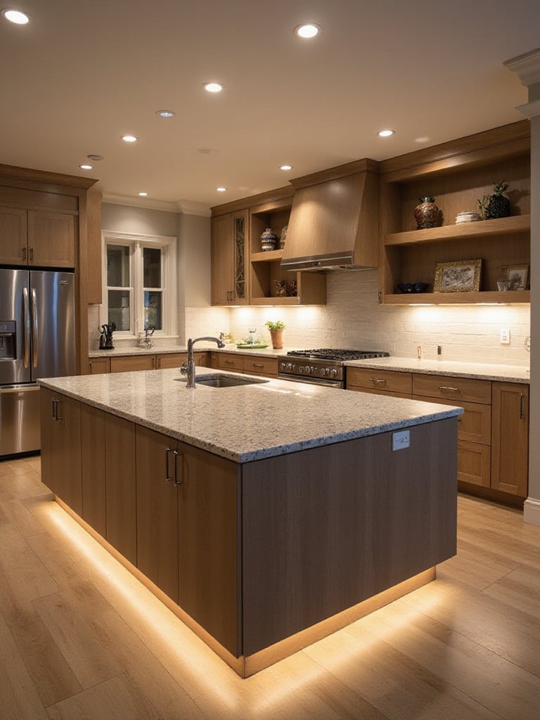
The kitchen island has evolved into the modern hearth. It’s the reference desk, the community table, and the prep station all in one. But to make it work, you have to be ruthless about its proportions and purpose. I’ve seen too many islands that are so massive they choke the kitchen, or so small they’re functionally useless. You need breathing room. A minimum of 42 inches of clearance around the island is non-negotiable in a kitchen with more than one cook.
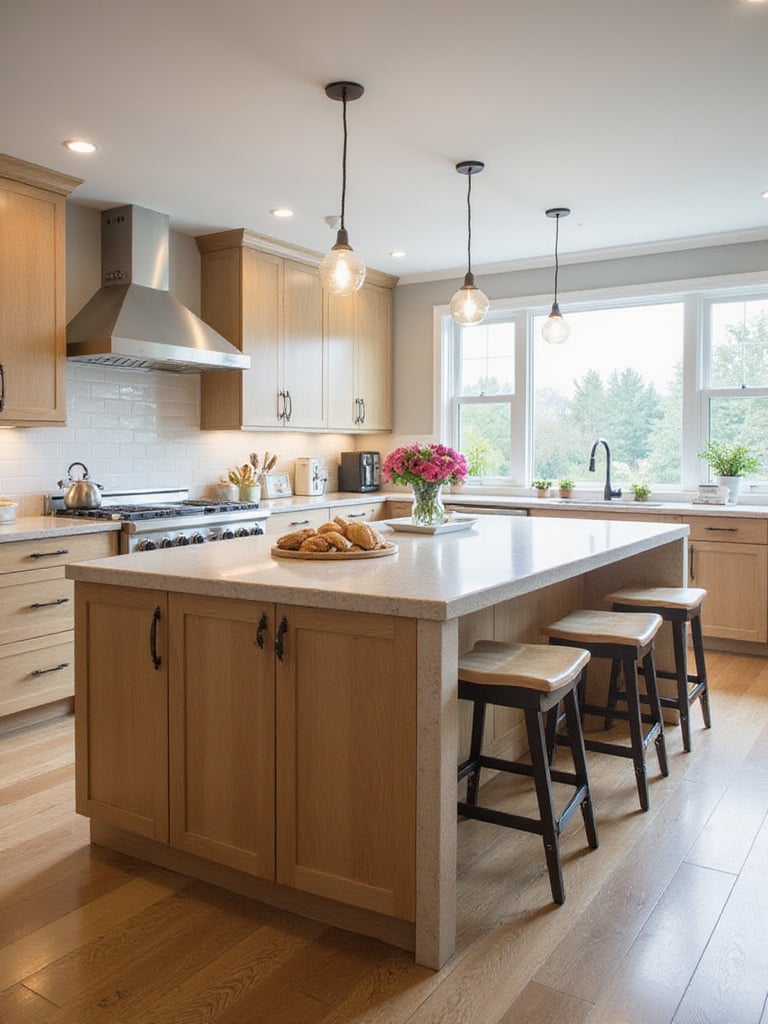
Think about what you primarily need from it. Is it seating? Then you need a proper overhang of at least 15 inches for knee space. Is it a prep station? Then you’ll want to integrate power outlets for mixers and consider a small prep sink. An island is also your best opportunity to introduce a secondary color or material. A soapstone top on an island with quartz on the perimeter cabinets, for example, can create a stunning, layered look. It establishes the island as the kitchen’s anchor.
That anchor then provides the perfect backdrop for one of the most expressive elements in the room.
The backsplash is your canvas. It’s the section of the wall you look at most directly when you’re working, occupying that prime real estate between the counter and the upper cabinets. This is the place to be bold. Because it’s a relatively small area, you can afford to splurge on a material that might be too costly for an entire floor—like handcrafted zellige tiles, where every piece has a subtle, watery variation. Or you could run a single, dramatic slab of veined stone up the wall.
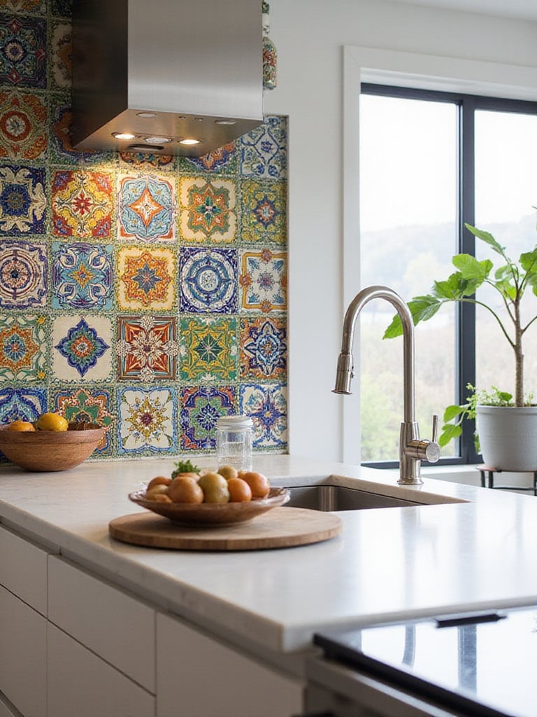
What really elevates a backsplash is taking it beyond the standard 18 inches. Running the tile all the way up to the ceiling, especially on a wall with open shelving or a window, creates a sense of height and intention. It turns a functional element into a true architectural feature. Then, hit it with light. Under-cabinet lighting raking across a textured tile will create beautiful shadows and highlights, bringing the surface to life. It adds a chapter of pure artistry to your kitchen’s story.
That artistry, of course, relies entirely on a well-conceived lighting plan.
If there’s one mistake I see more than any other, in any room, it’s poor lighting. A single, sad ceiling fixture in the middle of the kitchen is a design crime. It casts shadows on your work surfaces exactly where you need to see what you’re doing. Good lighting, like in a library, is about layers.
You need three kinds of light working in harmony:
Pay attention to color temperature. For task areas, you want a clean, bright light around 3000K-4000K. For ambient and accent lighting, a warmer 2700K creates a cozy, inviting glow. And put everything on dimmers. Full stop. The ability to adjust the light for different tasks and times of day is the ultimate mark of a well-designed space.
With the major lighting in place, you can turn your attention to the smaller details that hold the design together.
Cabinet hardware is the punctuation of your kitchen’s design statement. It’s the jewelry. And changing it is the single most effective, low-cost update you can make. You can take a kitchen from dated traditional to sleekly modern in an afternoon, just by swapping out the knobs and pulls.
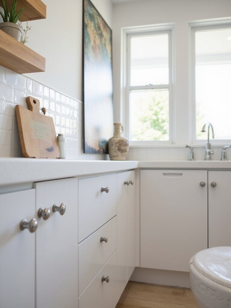
Don’t be afraid to mix and match, but do it with intention. A common strategy I like is to use knobs on doors and pulls on drawers. Or, you can use one finish, like brushed brass, on your perimeter cabinets and another, like matte black, on the island. The key is to establish a dominant metal and then add one, maybe two, accents. And please, invest in quality. You touch this hardware dozens of times a day. Flimsy, lightweight pulls feel cheap. A piece of hardware with some heft to it feels better in your hand and signals quality throughout the space.
The feel of that hardware should connect to the other high-touch point you interact with constantly.
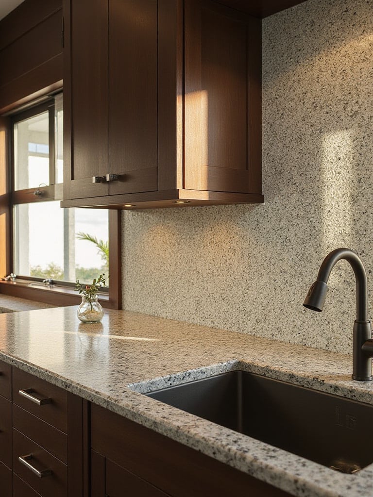
The sink is arguably the single hardest-working fixture in your entire home. The debate between a single, large basin and a divided double bowl is a surprisingly personal one. I find that people who cook with large pots, pans, and sheet trays—the roasters and bakers—almost always prefer a big, deep single bowl. It gives you the space to maneuver. Those who prefer to have a system of soaking on one side while rinsing on the other will always gravitate toward a double bowl. There’s no right answer, only what’s right for your workflow.
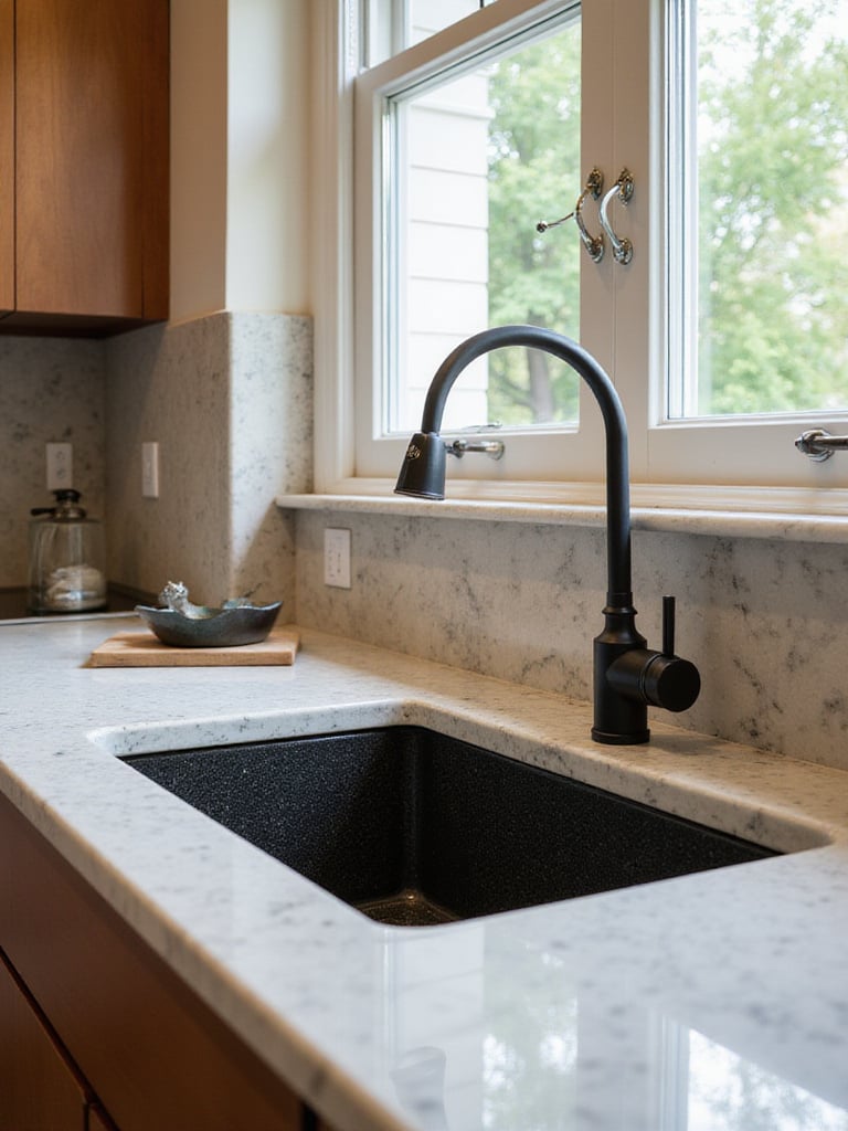
Beyond the configuration, the material and installation method are key. An undermount sink creates that seamless, clean line with the countertop that makes wiping down a breeze. A classic apron-front or “farmhouse” sink makes a bold statement but requires a special cabinet to support it. And materials like composite granite offer incredible durability against scratches and stains, giving stainless steel some serious competition. Think of it as your primary workstation and choose accordingly.
And that workstation is utterly incomplete without its most crucial tool.
The kitchen faucet is a design opportunity. It’s a graceful, sculptural element that can elevate the entire sink area. But it must be a workhorse first and an art piece second. Today, a pull-down sprayer is practically a requirement. The flexibility it gives you for rinsing vegetables, cleaning the sink, and filling tall pots is indispensable.
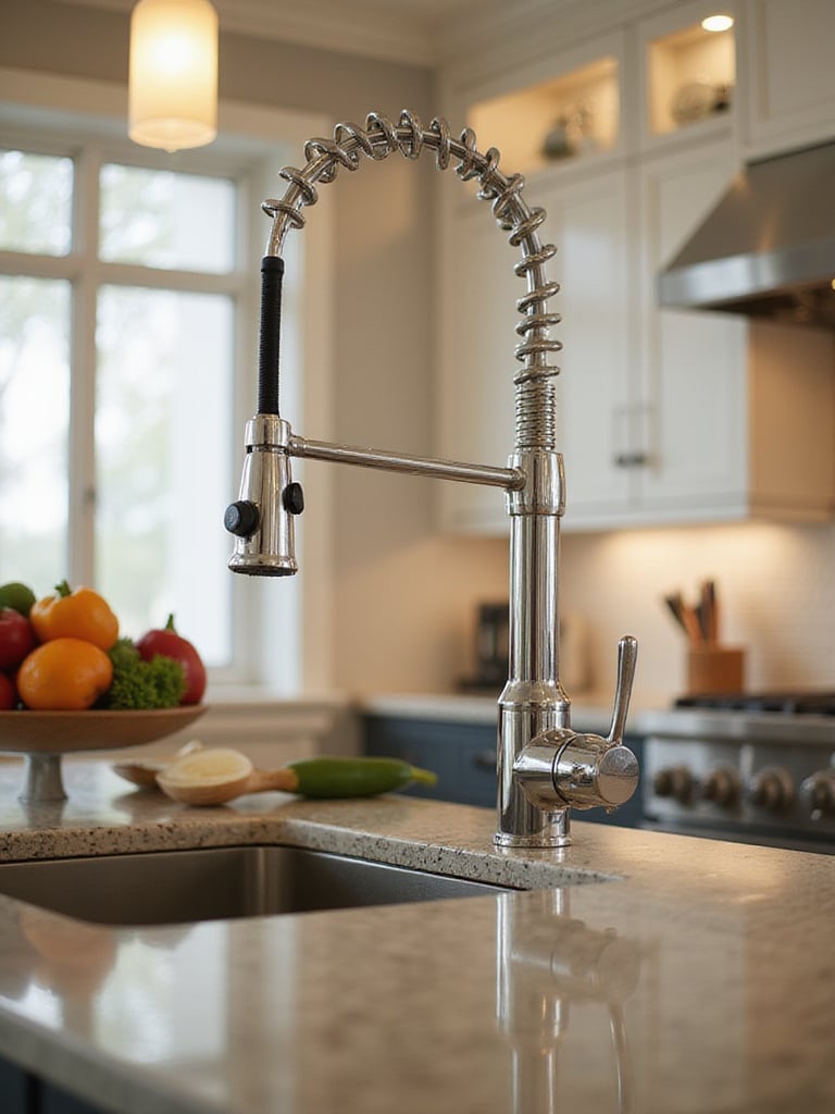
Look for signs of quality construction. A solid brass body, a ceramic disc valve that prevents drips, and a magnetic docking system for the spray head are all indicators of a faucet that’s built to last. The finish should complement your hardware, but it doesn’t have to match exactly. A brushed brass faucet can look stunning with matte black pulls. Just consider maintenance—polished finishes show water spots more readily than brushed or matte ones. It’s a small detail that affects your daily experience.
This blend of technology and design brings us naturally into the modern age of cooking.
I approach smart technology in the kitchen with a healthy dose of skepticism. The goal isn’t to have a kitchen that talks to you; it’s to have a kitchen that helps you. Ask yourself: does this feature solve a real problem I have? A refrigerator that creates a shopping list for you can genuinely reduce food waste. An oven that you can preheat on your way home from work can be the difference between a home-cooked meal and takeout. That’s useful technology.
Focus on the appliances you interact with most. A smart oven with precision cooking modes can take the guesswork out of a delicate bake. A connected dishwasher that tells you when it’s finished can be surprisingly helpful in a busy house. But don’t feel pressured to get every smart gadget. A “dumb” but reliable appliance is always better than a “smart” one that’s finicky or requires a frustrating app to operate. The best technology is the kind that fades into the background and simply makes your life easier.
This sleek modernity can be beautifully balanced by bringing a touch of the organic world inside.
Open shelving is a beautiful, contentious idea. In a library, we use display shelves to feature new arrivals or beautiful book covers. In the kitchen, open shelves do the same thing: they turn everyday storage into a curated display. They can make a small kitchen feel much larger and more open by removing the visual bulk of upper cabinets.
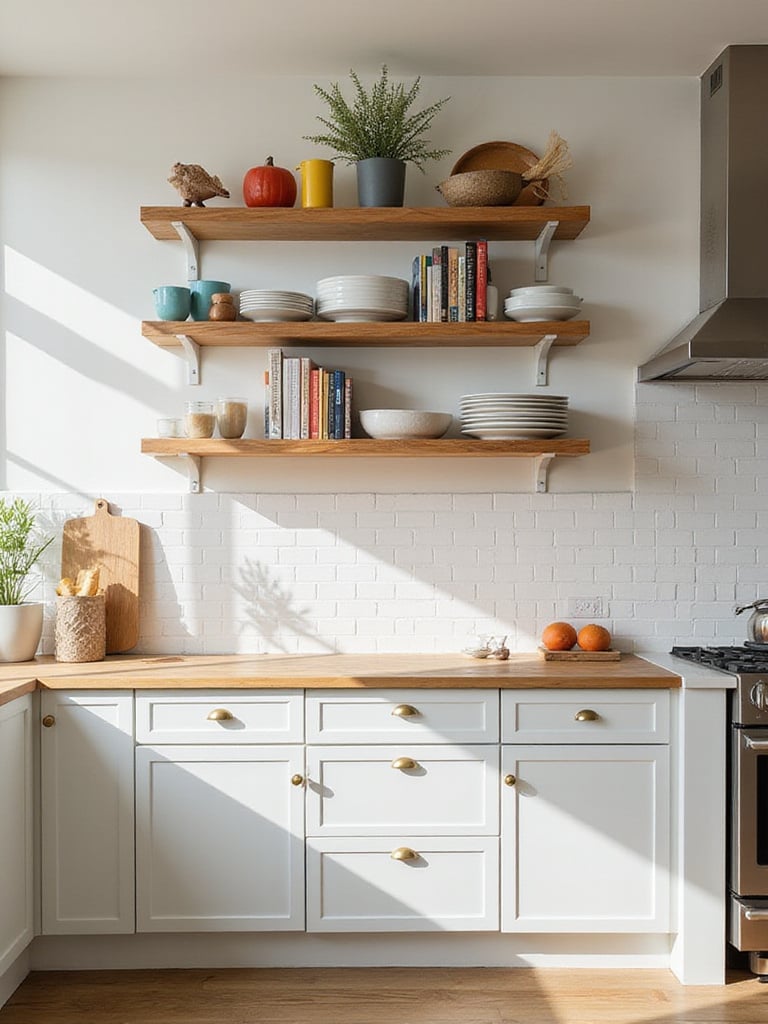
But here’s the honest truth: open shelving requires discipline. It’s not for everyone. If you’re not the kind of person who gets a quiet satisfaction from stacking dishes neatly, it might just become a source of visual clutter and stress. The key is to be selective. Use it to display your most beautiful and most-used items: a collection of white ceramic dishes, colorful cookbooks, shapely glassware. Mix in a plant or a piece of art. I often recommend it for a specific zone, like a coffee station, rather than for the entire kitchen.
This idea of creating zones is one of paint’s most powerful, and affordable, applications.
Paint is the most transformative and budget-friendly tool in your entire design kit. You can completely change the character of a kitchen over a weekend. One of my favorite techniques is to use it to create zones without building a single wall. Painting your island a deep, dramatic color—a moody green or a rich navy—instantly establishes it as the kitchen’s focal point.

Don’t overlook the power of painting just the lower cabinets. A darker color on the bottom can ground the space and is incredibly forgiving of scuffs and wear, while keeping the uppers light and white maintains a sense of airiness. It’s a sophisticated look that feels custom. And think about sheen. A durable semi-gloss is perfect for cabinets, but using a velvety matte finish on the walls can add incredible depth and absorb light in a beautiful, soft way.
This strategic use of color works hand-in-hand with another layered, sophisticated technique.
The era of the “matchy-matchy” kitchen is over. Having your faucet, hardware, and light fixtures all in the exact same finish can feel a bit dated and, frankly, a little boring. A thoughtfully mixed-metal scheme gives the impression that the kitchen was curated over time, with each piece chosen for its own merit.
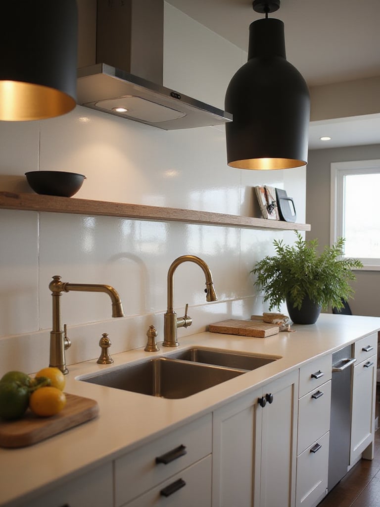
The key to getting it right is to not go overboard. Pick one dominant metal that will be your anchor—often this is the finish on your faucet and appliances. Then, choose one or two accent metals. Perhaps you have a stainless steel faucet and appliances (your dominant metal), matte black pendant lights over the island (accent #1), and warm brass pulls on the cabinets (accent #2). The combination of cool, dark, and warm creates a dynamic and visually rich environment. It’s a confident design move.
This layering of finishes extends beyond just metal to all the surfaces in the room.
A kitchen filled only with smooth, flat, glossy surfaces can feel sterile and one-dimensional. Texture is what brings a space to life. It engages our sense of touch, or at least our memory of it. It’s the roughness of a reclaimed wood shelf against a smooth tile backsplash. It’s the subtle hammered finish on a copper sink or the gentle waves in a handmade tile.
Look for opportunities to introduce this tactile quality. Fluted or reeded glass in an upper cabinet door adds texture while obscuring the contents just enough. A leathered or honed finish on a countertop offers a soft, matte alternative to a high-polish gloss. Natural materials are a fantastic source of texture—the grain of wood, the crystalline structure of stone, the weave of a wicker basket. These details prevent a kitchen from feeling like a showroom and make it feel like a home.
And nothing adds life and natural texture quite like a bit of green.
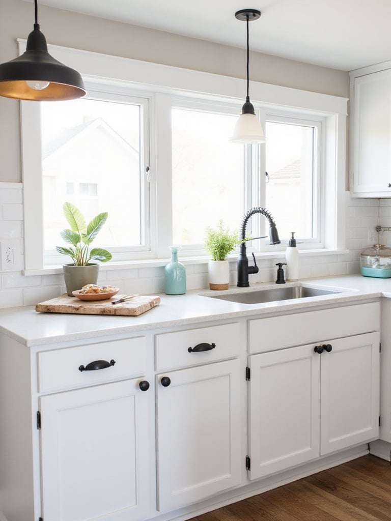
Every space I design, whether it’s a vast public library or a tiny reading nook, feels more human with the addition of a living plant. In the kitchen, they are especially welcome. They add a vibrant splash of color, can help purify the air, and, in the case of herbs, can be part of the meal itself. A small pot of basil on a windowsill is both beautiful and practical.
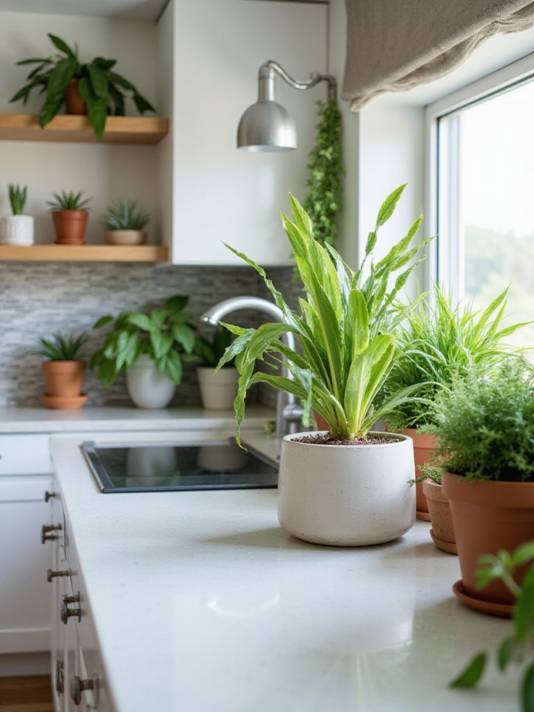
Choose the right plant for the right spot. A sunny window is perfect for a small herb garden, but a lower-light corner can still be home to a resilient snake plant or a cascading pothos. Consider hanging planters to draw the eye upward and keep your counters clear. Grouping a few plants together not only looks better but also creates a tiny, humid microclimate that helps them thrive. They are a living, breathing element that reminds us that the kitchen is a place of nourishment.
This feeling of nourishment extends to creating spaces where people want to linger.
My passion is creating reading nooks—comfortable, welcoming spaces that invite you to stay a while. Your kitchen deserves its own version of a reading nook. By incorporating dedicated, comfortable seating, you transform the kitchen from a pure utility space into the social heart of the home. This is where the kids do their homework, where a friend sips wine and chats while you cook, where you have a quiet cup of coffee in the morning.

A built-in banquette tucked into a corner is a brilliant use of space, often providing hidden storage in the bench. A few comfortable stools at the island create an immediate gathering spot. Even a tiny bistro table and two chairs near a window can create an intimate setting. Just be mindful of traffic flow. You need to ensure there’s enough room to walk around the seating comfortably, even when people are sitting there. The goal is to encourage gathering, not to create an obstacle course.
Many of these impactful ideas, from paint to seating, don’t have to break the bank.
A full-scale renovation isn’t always possible or necessary. You can achieve a profound transformation by focusing on the elements with the highest visual impact. Painting your existing cabinets, for example, is far and away the most effective way to change the look of your kitchen for a relatively small investment of time and money. Do the prep work properly—the cleaning, sanding, and priming—and you’ll be rewarded with a finish that looks professional.
Focus on the things you see and touch the most. A new faucet and updated cabinet hardware can make an old kitchen feel fresh and new. A new light fixture over the island or sink can change the entire mood of the room. A weekend spent installing a new tile backsplash can inject a huge dose of personality. Be a savvy curator of your space. Know where to invest (a great faucet) and where to save (a clever paint job). These strategic, high-impact moves are what separate a good renovation from a great one.
In the end, designing a kitchen is much like designing a personal library. It’s not about cramming in as much as possible or chasing every new trend. It’s about a thoughtful curation of elements that serve a purpose and bring you a sense of ease and inspiration. It begins with understanding your own story—how you move, what you value, what frustrates you, and what brings you comfort. The best kitchen is a reflection of its user, a space where the tools are at hand, the light is good, and the environment encourages you to create, to gather, and to linger.
Whether you’re starting from scratch or refreshing a tired space, let function be your guide and personality be your goal. Start with the one thing that drives you most crazy—the dim lighting, the chaotic pot cabinet—and fix it. That single, satisfying improvement will often provide the momentum and clarity you need for the next step. Create a space that doesn’t just work, but one that feels like a true extension of yourself. A kitchen that feels, in every sense of the word, like coming home.


