Physical Address
304 North Cardinal St.
Dorchester Center, MA 02124
Physical Address
304 North Cardinal St.
Dorchester Center, MA 02124
Master small kitchen design using Nordic principles. Discover high-end finishes, integrated appliances, and vertical storage to create a sophisticated jewel box. Read our guide!
There is a prevailing cultural belief, cemented by late 20th-century trends, that a kitchen’s worth is measured strictly by its square footage. Yet, for the discerning homeowner, mastering the art of small kitchen design is not about compromise. It is about concentrated sophistication.
Since the 1950s, the kitchen has evolved from a distinct utilitarian workspace into a sprawling status symbol. We have been conditioned to believe that without a massive central island or an open-concept layout, a space is inherently “lesser.” We often conflate “compact” with “cramped,” assuming that a modest footprint denies us the opportunity for luxury. This mindset forces us to sacrifice style for the sake of mere survival.
However, Scandinavian design principles teach us that restriction is often the catalyst for the most thoughtful creativity. A smaller canvas invites the “Jewel Box” philosophy—a concentrated approach where the budget shifts from quantity to quality. This allows for the use of sustainable stones, warm woods, and high-end finishes that might be cost-prohibitive in a larger room.
By shifting the focus from expansion to curation, a compact kitchen transforms into a space of warm minimalism. Here, floor-to-ceiling cabinetry and vertical lines create a sense of airy height rather than confinement.
This guide explores the methods for turning limited dimensions into a design advantage, proving that high-impact style does not require high acreage. For more sophisticated guidance on director-approved designs for small kitchens, we will examine how to abandon the outdated “work triangle” in favor of intuitive linear zones. We will also look at how to employ the art of editing to reduce visual noise and how to select materials that bring a sense of grandeur to an intimate space. It is time to rethink the small kitchen not as a compromise, but as an opportunity for concentrated, cozy sophistication.
In Nordic design, we do not view limited square footage as a constraint, but rather as an invitation to intimacy. While many cultures equate luxury with vastness, the concept of *Hygge* thrives in the opposite environment.
Historically, our long, dark winters created a deep psychological need for enclosure—a protective shell against the elements. A sprawling kitchen with high ceilings can often feel cold and exposed. A compact space, however, naturally forms a sanctuary where soft light and the scent of baking bread can fill the room instantly.
This preference for modest dimensions is also practical. It is rooted in the Swedish principle of *Lagom*, meaning “just right.” A kitchen scaled to human needs rather than status creates a rhythm of effortless efficiency. When your primary work zones are condensed, cooking becomes less about frantic movement and more about the simple pleasure of preparation. By eliminating the unnecessary steps required in a large room, we allow ourselves to slow down and savor the process.
A smaller footprint also acts as a natural filter against clutter. The physical boundaries force a kind of intentional curation. Without space for excess, we keep only what is functional or deeply loved. This rejection of material abundance in favor of “significant trinkets” ensures the kitchen remains a place of personal connection rather than a showroom. A compact kitchen is easier to clean and maintain, freeing up time for what truly matters: the comfort of togetherness.
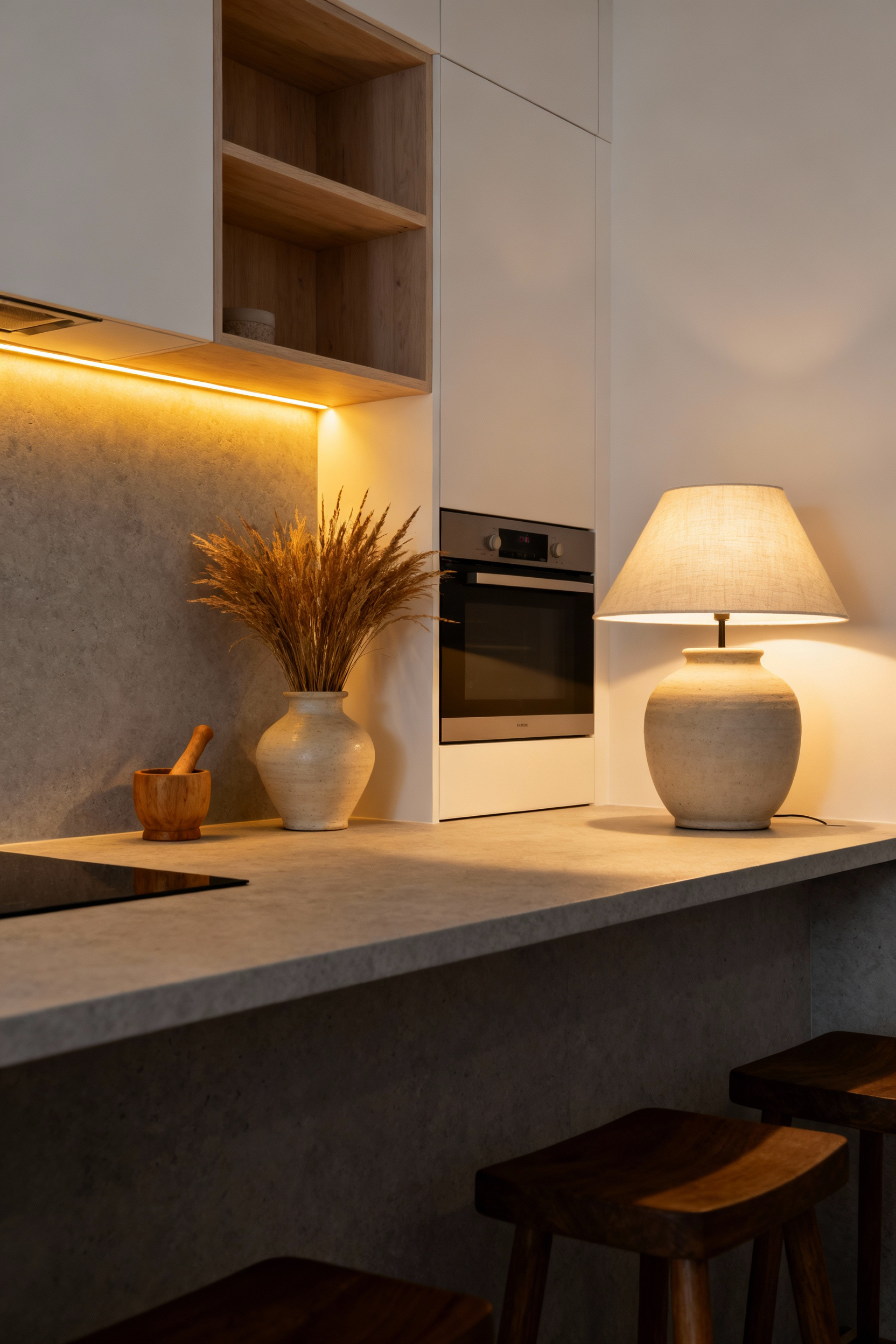
Applying the Nordic white palette in a compact kitchen isn’t merely a stylistic preference; it is a practical exercise in physics known as the Albedo Effect. High-albedo surfaces possess high diffuse reflectivity, meaning they bounce the maximum amount of incident light back into the room rather than absorbing it.
In the Nordics, where the *mørketid* (polar night) severely limits daylight, interiors must function as light collectors. By utilizing these reflective surfaces, we essentially engineer the kitchen to amplify whatever natural or artificial illumination exists. This forces light into the deepest corners to create a sense of airiness where space is physically limited.
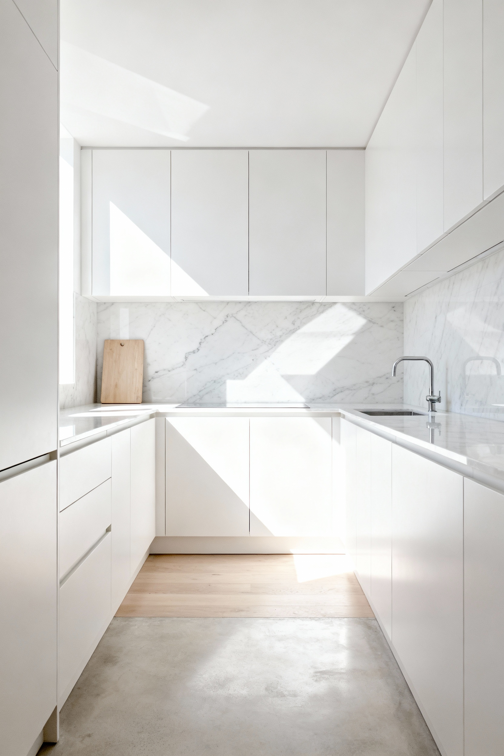
Maximizing reflectivity requires a nuanced hand to avoid creating a sterile, clinical environment. The goal is to balance brilliance with *hygge*, that essential feeling of cozy contentment. Rather than selecting a stark, brilliant white which can cast cold blue shadows, look toward soft whites, creams, and pale greiges. These tones maintain a high albedo rating but carry warm, yellow, or red undertones. This softens the reflected light, ensuring the kitchen feels inhabited and welcoming rather than institutional.
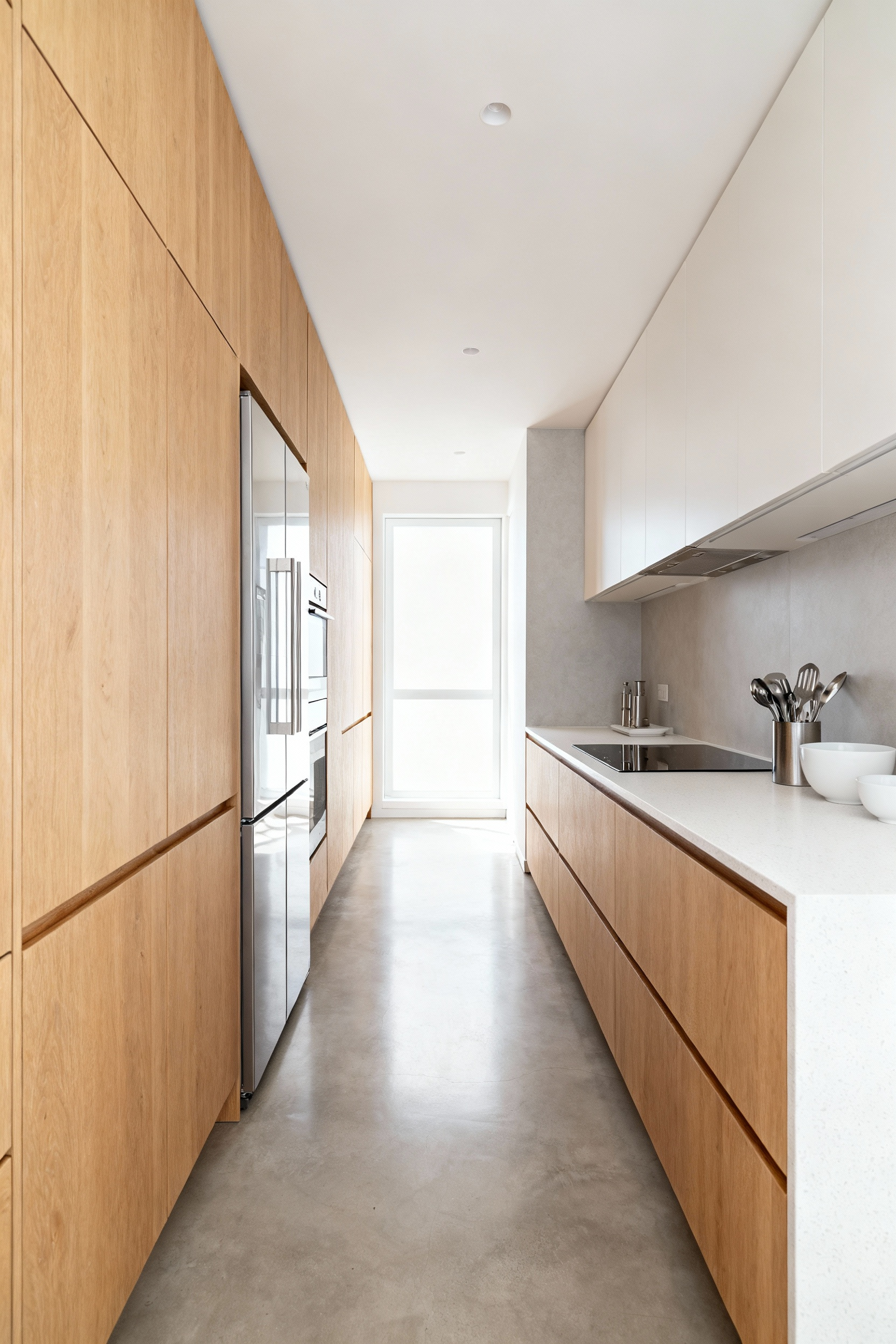
This monochromatic approach serves a dual purpose by dissolving the room’s perceived boundaries. When you apply these unified, light-reflective tones across vertical planes like cabinets and walls, as well as horizontal countertops, you blur the distinct lines that typically define the volume of a small room. The eye travels seamlessly across surfaces without finding a hard edge to land on, creating a psychological impression of expanded space. To ground this ethereal lightness, incorporate elements of natural wood, such as oak or birch. The timber introduces texture and absorbs just enough light to prevent the brightness from becoming visually overwhelming.
To truly expand a compact footprint, we must look beyond mere color and consider the physics of our surfaces. High-gloss finishes operate through specular reflection, acting much like a mirror. Unlike matte surfaces that scatter and absorb luminosity, a polished lacquer can reflect up to 80% of incoming natural light. It preserves the integrity of the light beam, bouncing the image of a window deep into the room. This optical trickery deceives the brain, pushing the walls outward and making the light source feel significantly larger than it truly is.
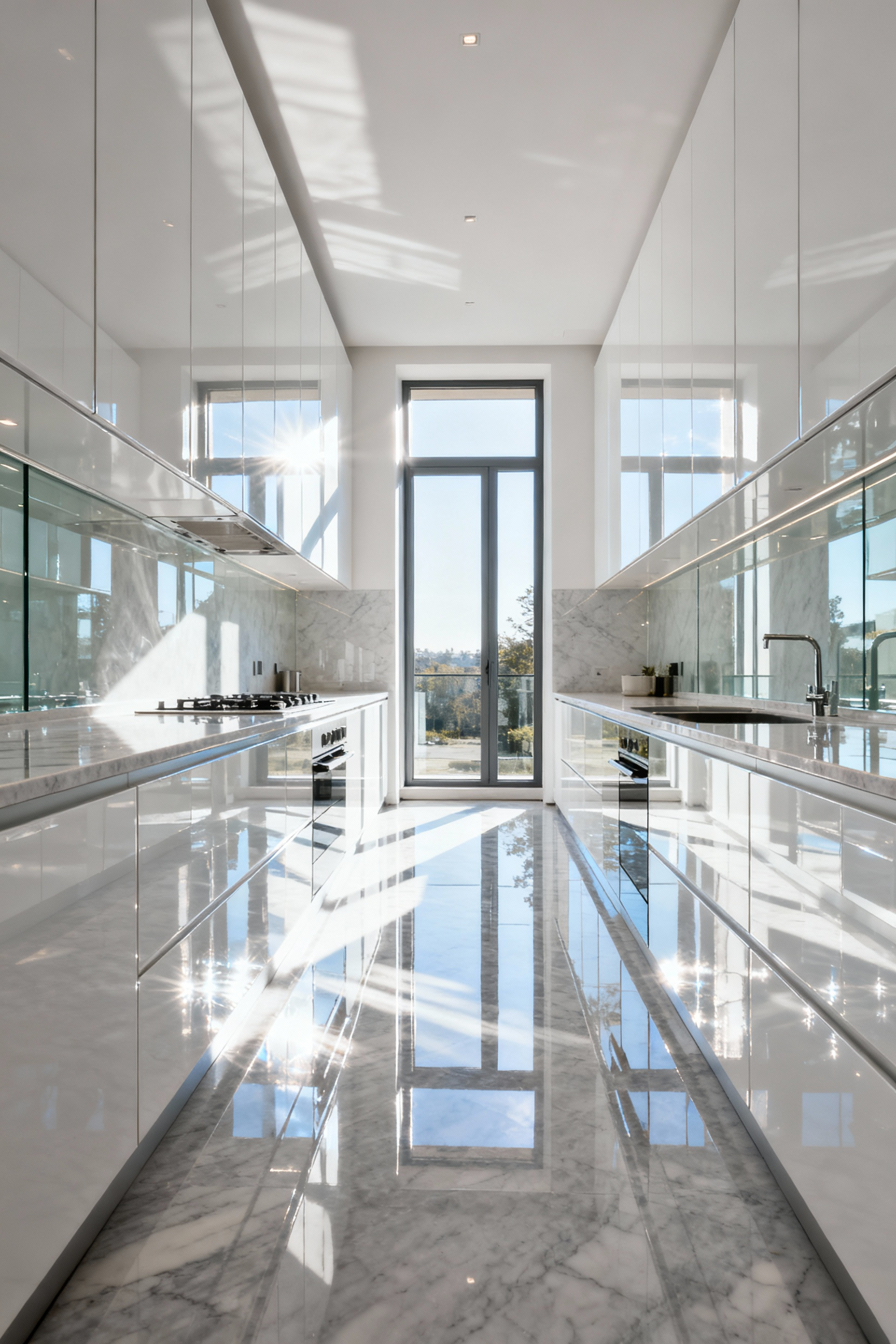
This effect allows us to embrace darker, moodier hues even in tight quarters. Through the phenomenon of “contrast gloss,” a deep charcoal or navy finish often appears glossier than white because of the sharp distinction between the dark surface and the bright reflection. It channels the glamour of Art Deco architecture, where high-shine surfaces were utilized not just for brightness, but to inject perceived depth and cinematic luxury into modest city apartments.
A kitchen wrapped entirely in high-gloss materials, however, can feel sterile and quickly reveals every fingerprint. The solution lies in strategic layering. Consider utilizing glass-front upper cabinets or gloss finishes at eye level to maximize light refraction and break visual barriers. You can then balance this by grounding the space with matte base cabinets in natural oak or walnut. This combination captures the airy, expansive benefits of glass and gloss without sacrificing the tactile warmth and durability essential for a welcoming, functional home.
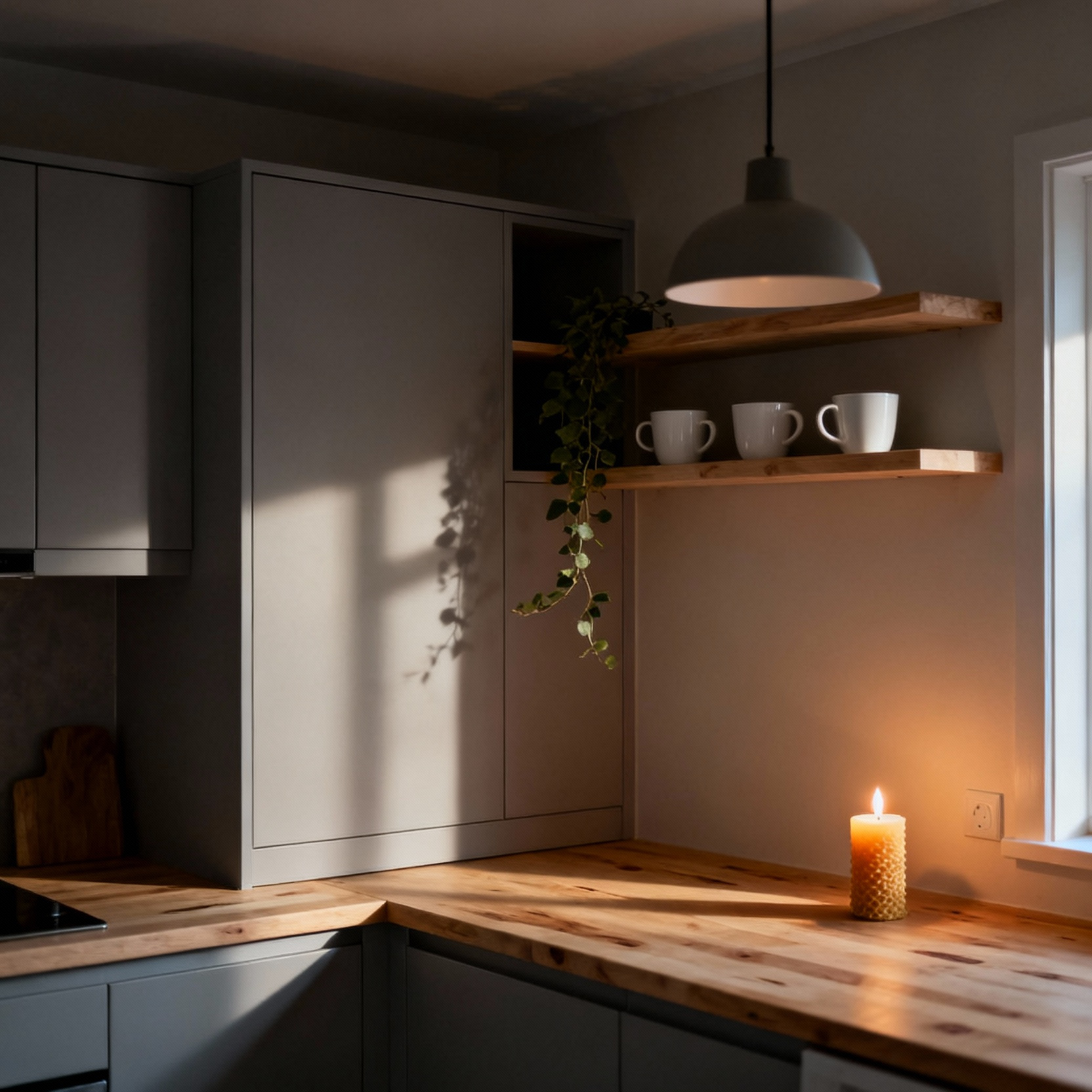
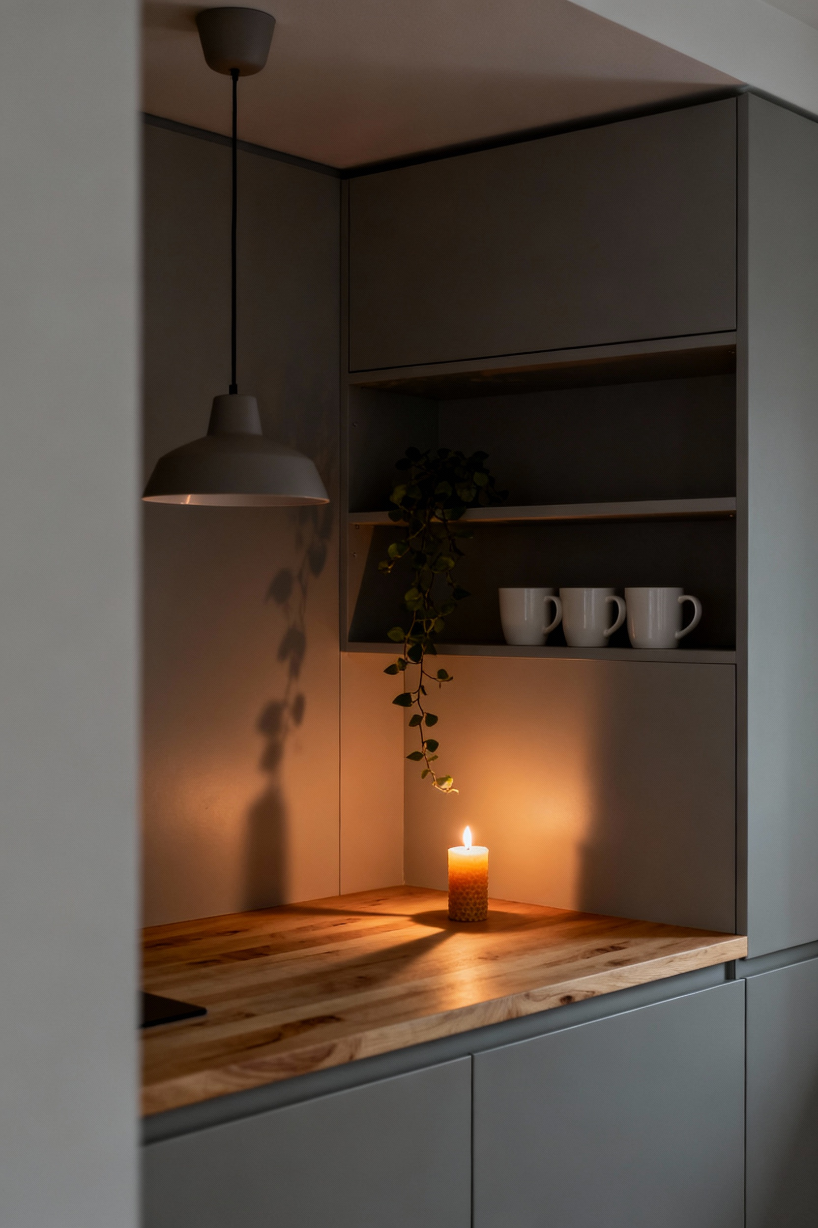
Relying on a single central fixture is a common misstep that leaves compact kitchens feeling harsh and institutional. This “big light” effect creates a high-contrast glare that our nervous systems often interpret as being under scrutiny rather than at home. Practically, it fails the cook; standing at the counter places the light source behind you, casting a deep shadow over the workspace. This forces you to lean awkwardly to read a recipe or safely chop vegetables, adding subtle stress to daily rituals.
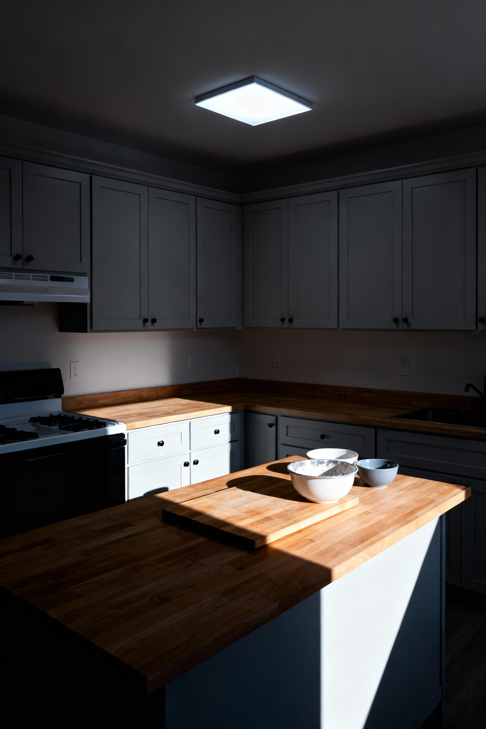
The antidote lies in bringing light down to the human scale. Before the LED revolution, adding supplemental lighting was a challenge due to the excess heat and bulk of incandescent bulbs, which posed risks in tight spaces. Today, ultra-slim LED strips integrate invisibly into even the shallowest cabinet profiles. For the prep zone, a neutral white light (around 3500K) ensures true color visibility, eliminating shadows and making the act of cooking feel grounded and contained.
To truly expand the visual boundaries of a small room, we must look beyond utility. Installing strip lighting at the toe-kick—the base of the floor cabinets—casts a soft glow across the floor. This architectural trick breaks up the solid mass of cabinetry, making the units appear to float and tricking the eye into perceiving continuous floor space beneath them. By layering these elements on separate dimmers, a kitchen transforms from a bright functional lab into a warm, sophisticated space for the evening, offering depth without demolition.
True Scandinavian efficiency begins when we stop looking at the floor plan and start seeing the vertical volume. In compact kitchens, the conventional gap above upper cabinets—usually a dusty 12 to 18 inches—represents a significant missed opportunity. By extending joinery all the way to the ceiling line, we reclaim that lost volume. This often increases storage capacity by nearly 30 percent without sacrificing a single square inch of floor space.
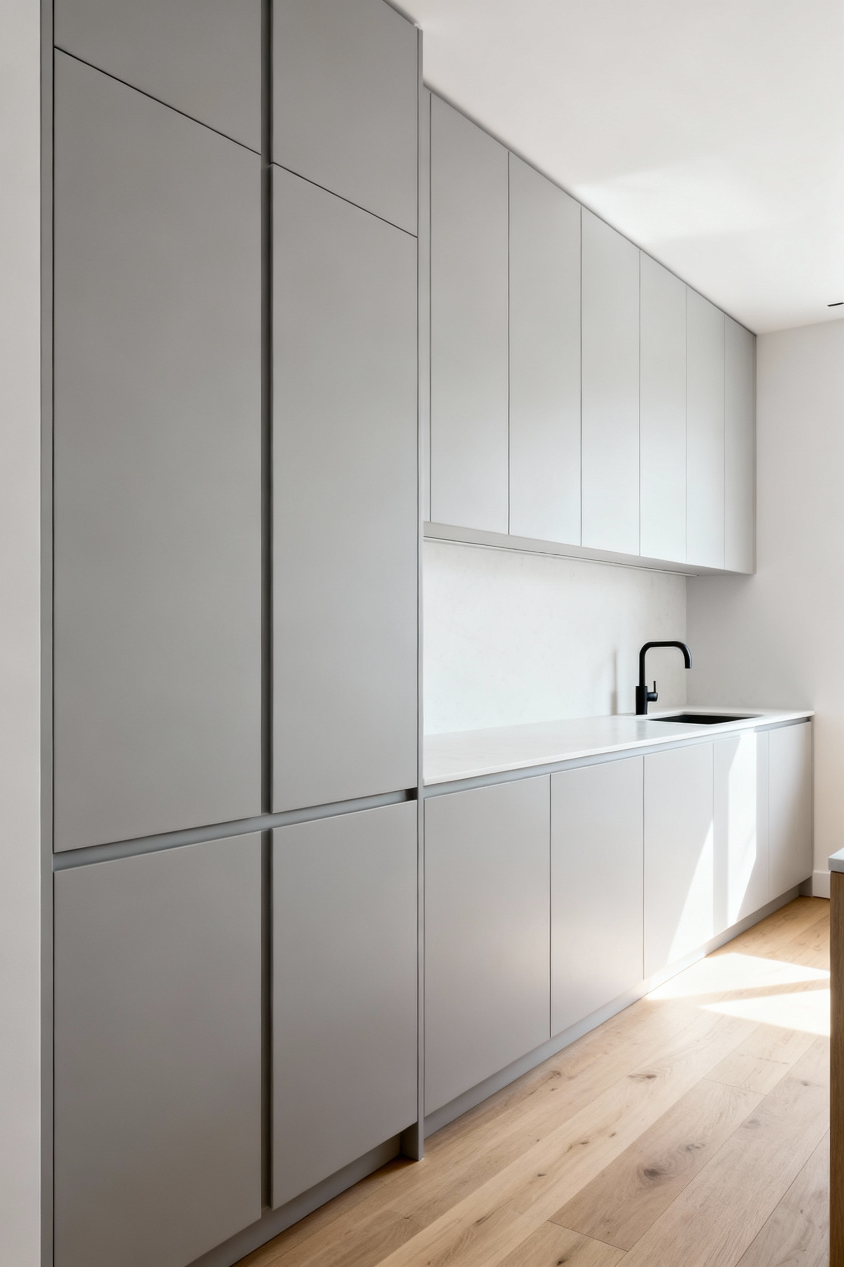
This strategy creates the sense of calm essential to the minimalist aesthetic. When we consolidate pantry goods, small appliances, and cookware into one continuous vertical mass, we effectively scrub the visual noise from the rest of the room. The cabinetry ceases to look like a collection of stacked boxes and transforms into a seamless architectural feature. This uninterrupted line draws the eye upward, tricking our senses into perceiving a higher ceiling and a more expansive atmosphere, rather than a cramped utility space.
To maintain this serene, monolithic look, integrated appliances are vital. Hiding a refrigerator or dishwasher behind matching panels creates a “wall of function” that feels intentional rather than utilitarian. Naturally, the highest tiers are impractical for daily use; logic dictates reserving these shelves for seasonal platters or holiday linens. I often recommend dedicating just one wall to this full-height treatment. Leaving the adjacent walls open prevents the room from feeling tunnel-like, ensuring the kitchen remains a breathable, welcoming heart of the home.
The industrial designer Dieter Rams famously championed the ethos of *Weniger, aber besser*—less, but better. In the context of a compact Scandinavian kitchen, this isn’t a plea for barrenness, but a call for purity. We must concentrate on the essential aspects of the room, ensuring that the countertop is not burdened with non-essentials. When we edit strictly, the objects that remain—perhaps a handcrafted wooden cutting board or a single ceramic vessel—elevate the daily ritual rather than competing for attention.
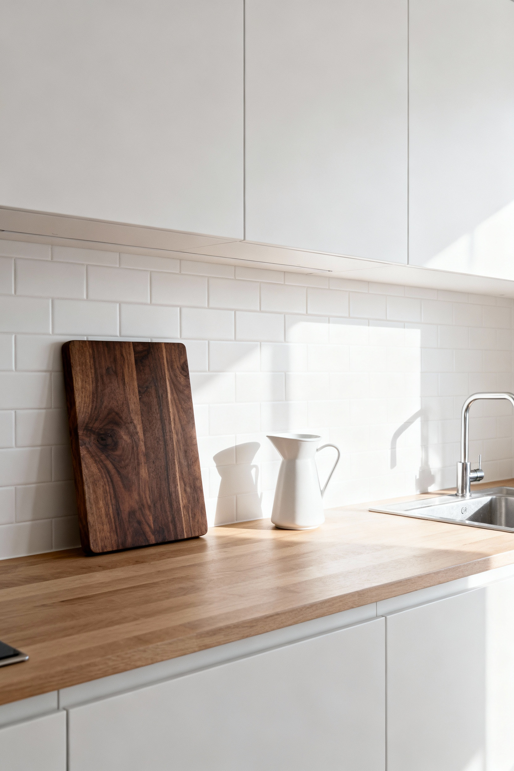
This curation creates a tangible shift in how the room feels. A crowded counter creates “visual noise,” contributing to cognitive load where the brain is exhausted by processing unnecessary clutter. By clearing the surface, we reduce this subconscious stress, replacing irritability with a sense of mental clarity and peace.
Beyond the psychological benefits, the edit is a functional survival rule. We must treat the countertop as prime real estate divided into protected micro-zones rather than a general catch-all. The most critical of these is the “landing zone,” a dedicated 15-to-18-inch clear space next to major appliances. This area acts as a shock absorber for sizzling pans or heavy grocery bags, ensuring safety and flow. By migrating anything used less than weekly into cupboards or vertical storage, we preserve these zones. This turns spatial constraints into a design strength that feels intentional and surprisingly luxurious.
In a compact footprint, your brain is constantly processing environmental stimuli, often without you realizing it. The jarring contrast of a stainless steel refrigerator against warm oak cabinetry isn’t merely an aesthetic clash; it acts as visual noise, forcing the eye to stop and start rather than gliding smoothly across the room.
By concealing these utilitarian boxes behind custom panels, we eliminate those visual interruptions. The result is a monolithic surface that creates a sense of “mental quiet,” significantly reducing the cognitive load required to navigate the space.
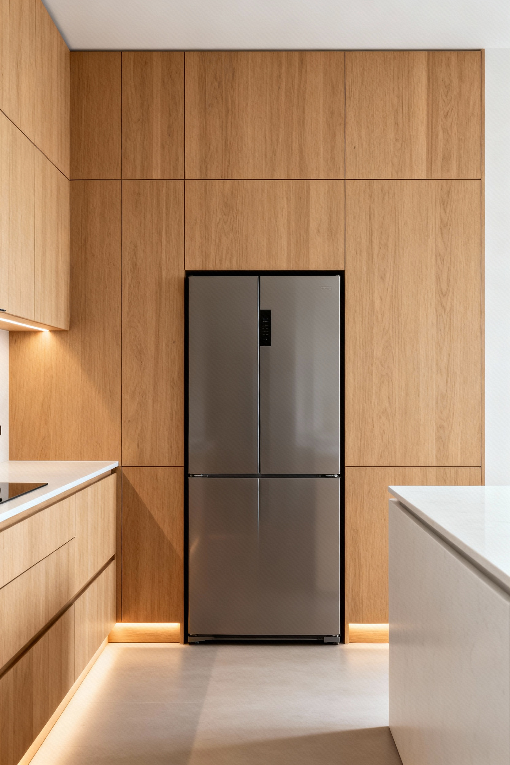
This approach creates a seamless architectural flow, which is the cornerstone of making a small kitchen feel expansive. When a dishwasher or freezer blends perfectly with the surrounding joinery, the kitchen ceases to look like a workspace filled with machinery. Instead, it begins to feel like a curated piece of furniture. This continuity allows the eye to travel the full length of the wall, tricking the mind into perceiving more square footage than actually exists.
The benefits of integration extend beyond the visual into the acoustic realm, a crucial factor in open-plan Scandinavian living. Heavy custom cabinetry acts as a dense sound barrier, muffling the hum of a compressor or the cycle of a dishwasher. By dampening this acoustic clutter, the kitchen creates a genuine sense of sanctuary. It lowers the subtle, stress-inducing background noise that raises cortisol levels, ensuring the heart of the home remains a place of calm rather than distraction.
In a compact home, the kitchen often serves as a permanent backdrop to the living area. This makes visual silence just as important as culinary utility. We are seeing a modern revival of the Victorian scullery, but rather than a separate room, we are compressing that functionality into the cabinetry itself.
This approach addresses the “ugly necessities” of daily life—trash, sponges, and cords—to reduce the cognitive load that comes from constantly seeing clutter. When the eye isn’t snagged by visual noise, the space feels significantly larger and the mind remains at rest.
The “appliance garage” is a vital component of this calm aesthetic, acting as a streamlined descendant of the traditional Hoosier cabinet. It provides a dedicated, concealable station for daily workhorses like coffee makers and toasters, allowing you to close a door on the mess instantly. This preserves the clean, horizontal lines essential for Scandinavian minimalism while keeping tools accessible.
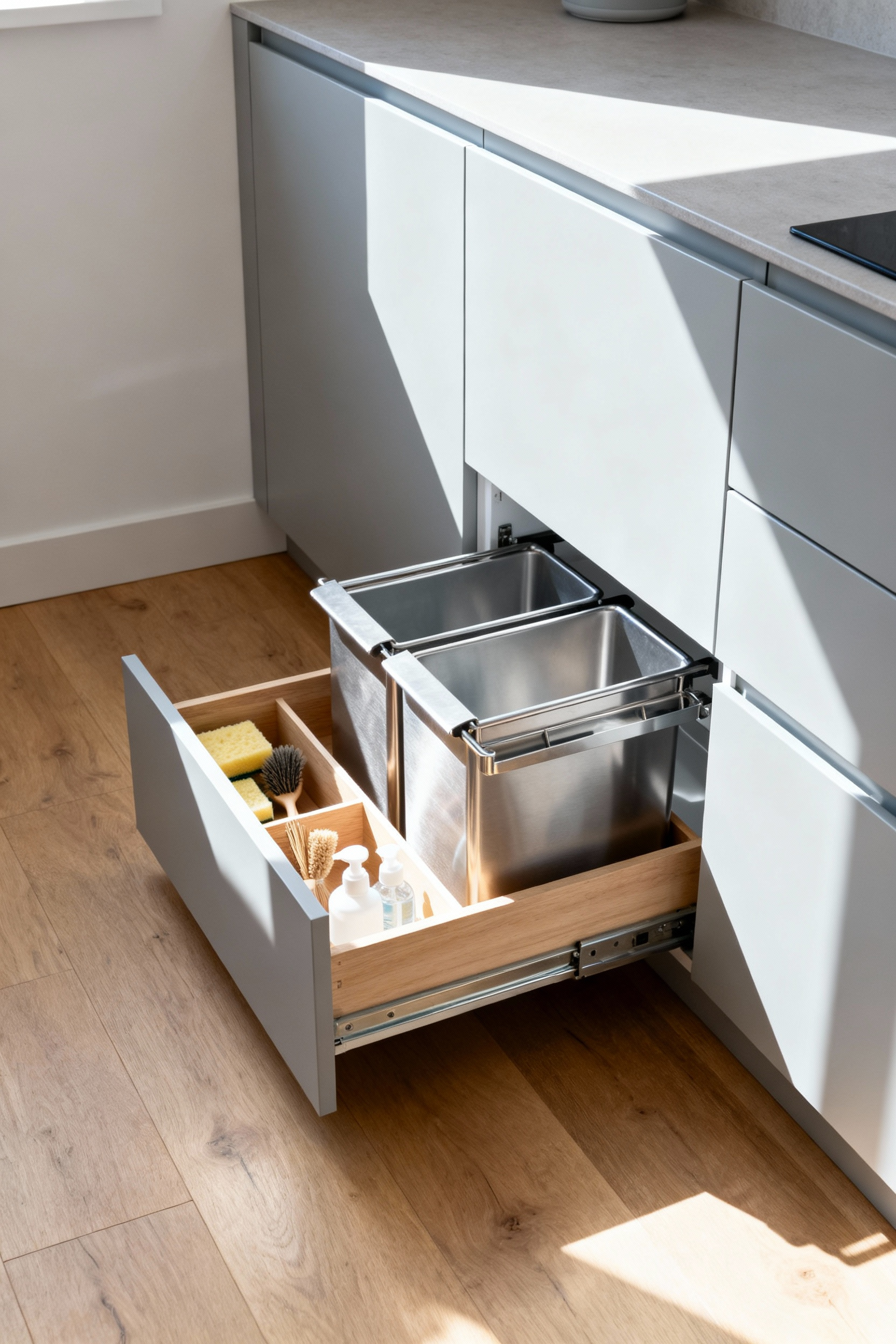
Below the countertop, engineering takes over to reclaim floor space usually lost to bulky, freestanding items. A freestanding trash can disrupts traffic flow and aesthetics; replacing it with a dual-bin pull-out system on heavy-duty, soft-close glides creates a “zero-footprint” waste solution. We can even activate the “dead” spaces found in standard construction. The false front beneath a sink should transform into a tip-out tray for damp sponges, and the structural void near the floor can become a toe-kick drawer for flat items like serving platters. For additional clever small kitchen storage ideas, we replace visual clutter with invisible mechanics, prioritizing human comfort to create a sophisticated, breathable atmosphere.
True Scandinavian design understands that a home should never feel clinical, yet stark minimalism often risks leaving a small kitchen feeling cold and sterile. The antidote lies in “Warm Minimalism,” a philosophy that introduces the organic character of blonde woods to soften hard edges without cluttering the visual field.
In compact spaces, pale species like birch, ash, and light maple work a distinct optical magic. Because they maintain a creamy, light-reflective quality, they actively bounce light around the room, preserving an airy atmosphere without the visual bulk or heaviness associated with darker timbers like walnut.
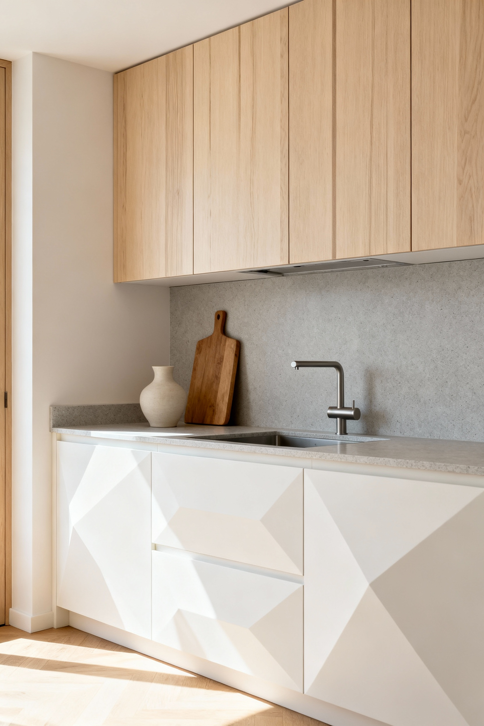
The beauty of this approach is found in its restraint. When we strip away ornamentation—think handleless, slab-front cabinetry—the wood grain itself becomes the primary decorative element. I often recommend rift-sawn White Oak for this specific application. Its tight, vertical grain offers a consistent linear pattern that respects the sleek geometry of modern architectural lines while adding necessary tactile depth.
Whether applied to a feature wall of vertical battens or a simple floating shelf, these natural textures do more than just look good; they satisfy a deep biophilic need to connect with nature. This turns a functional utility space into a grounded, restorative sanctuary, proving that a kitchen can be both geometrically precise and inherently cozy.
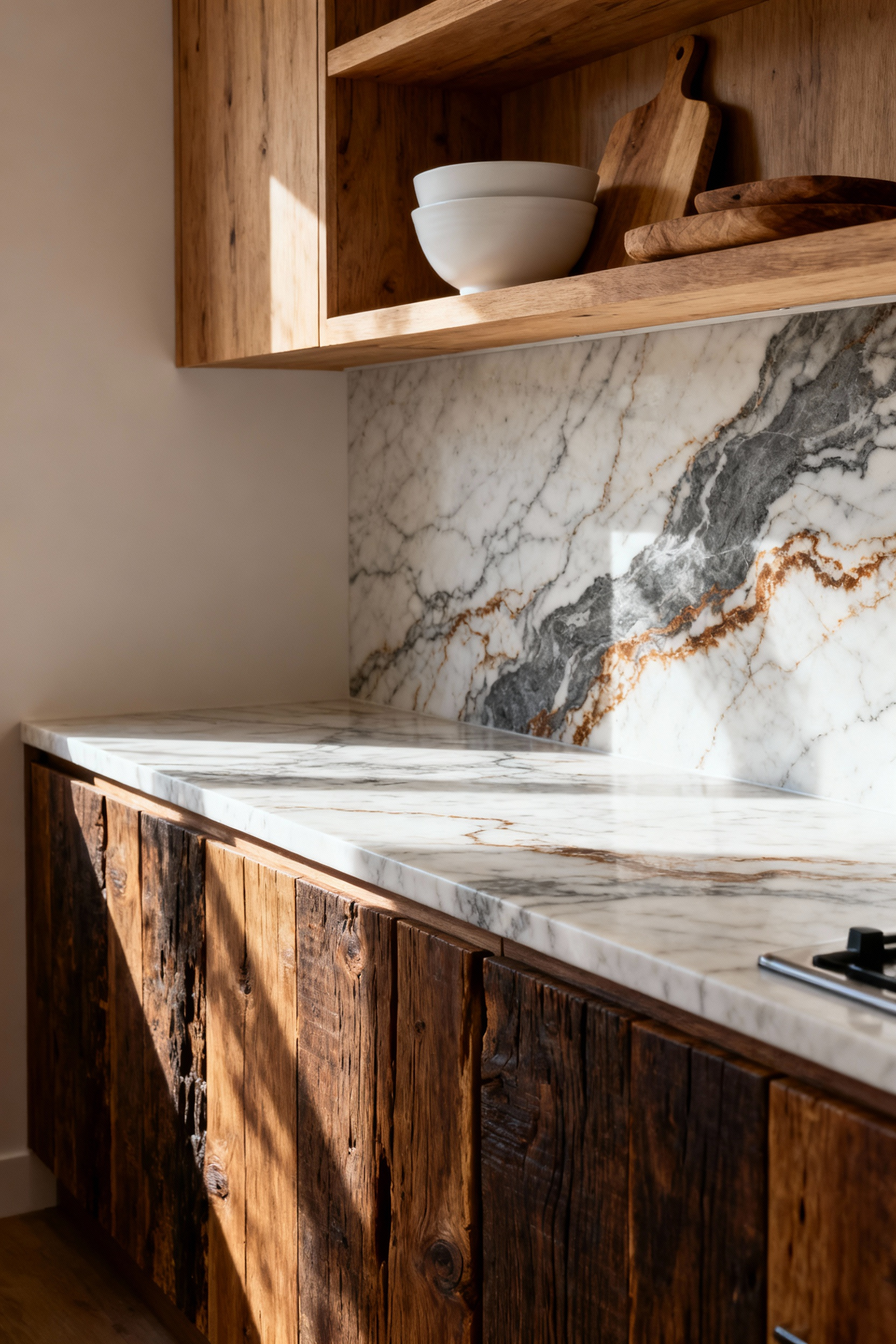
True sustainability isn’t just about how a material is extracted, but how long it remains a beloved part of your home. While engineered quartz is popular, natural stone often boasts a significantly lower Global Warming Potential because it is a finished product of the earth rather than a factory blend of resins and aggregates. When you source stone locally to minimize transportation emissions, a granite or quartzite slab becomes an inter-generational asset. These can easily last 50 to 75 years—far outliving the typical cycle of manufactured alternatives.
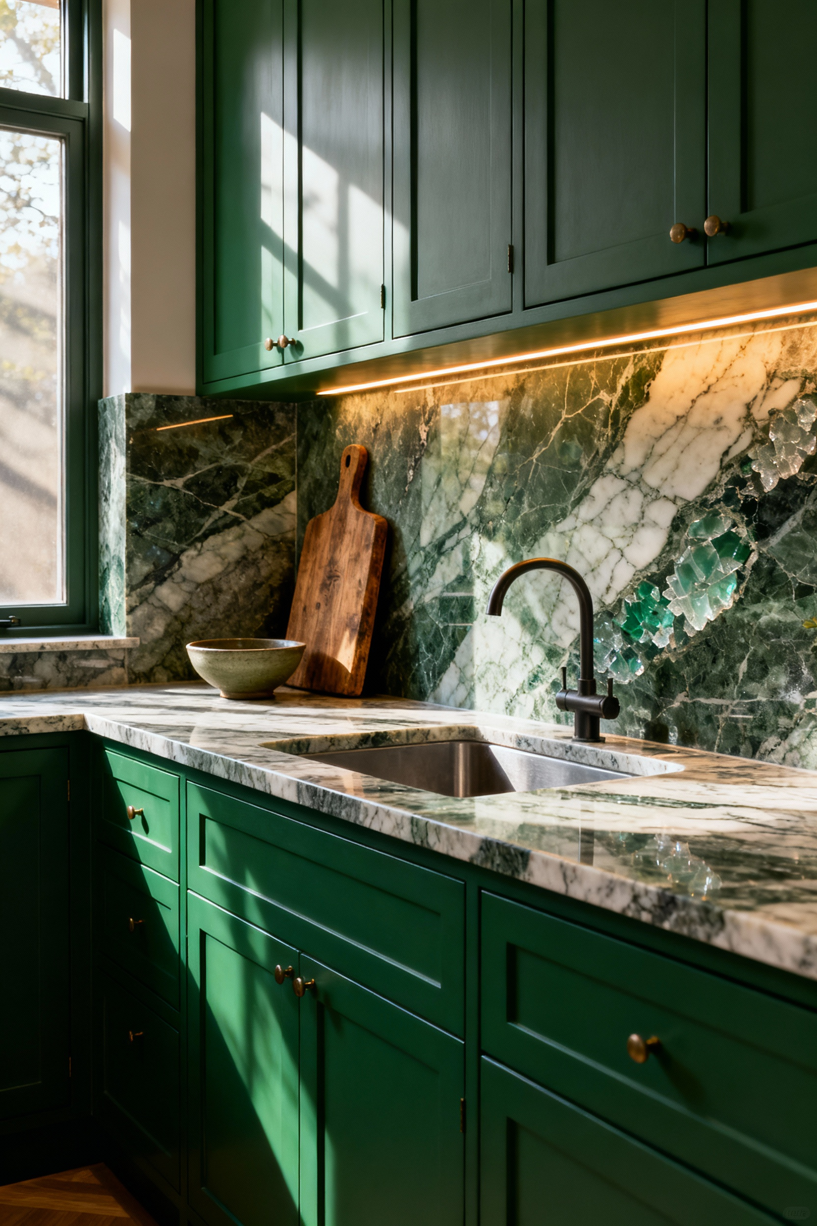
In a small kitchen, where every inch of surface area is touched and used daily, we should embrace materials that map the history of the home rather than chasing sterile perfection. Soapstone is a prime example of this philosophy. Though soft, it is incredibly dense and non-porous, meaning it requires no chemical sealants. Over time, contact with cooking oils transforms its color from ash-gray to a deep, rich charcoal. It develops a “soapy,” tactile warmth that feels grounding in a compact space.
The beauty of these “living” stones lies in their resilience. A scratch on a soapstone counter isn’t a disaster; it’s easily buffed out with a bit of sandpaper and mineral oil, returning the surface to a velvety finish. Similarly, opting for a honed finish on marble hides the inevitable etching from acids like lemon juice, creating a soft, satin patina reminiscent of old European bakeries. By selecting materials that age gracefully and allow for simple DIY maintenance, you transform a significant upfront cost into lasting value, ensuring your kitchen grows more beautiful with use.
In compact living, we often rely on visual sleight of hand—glossy finishes and stark white walls—to manufacture a sense of volume. However, without tactile variation, these spaces risk feeling sterile rather than spacious. When we cannot expand outward, we must create depth through texture. By introducing elements like wire-brushed timber or fluted cabinetry, we catch the light in complex ways. This creates pockets of shadow that add a perception of “thickness” and warmth without occupying physical square footage.
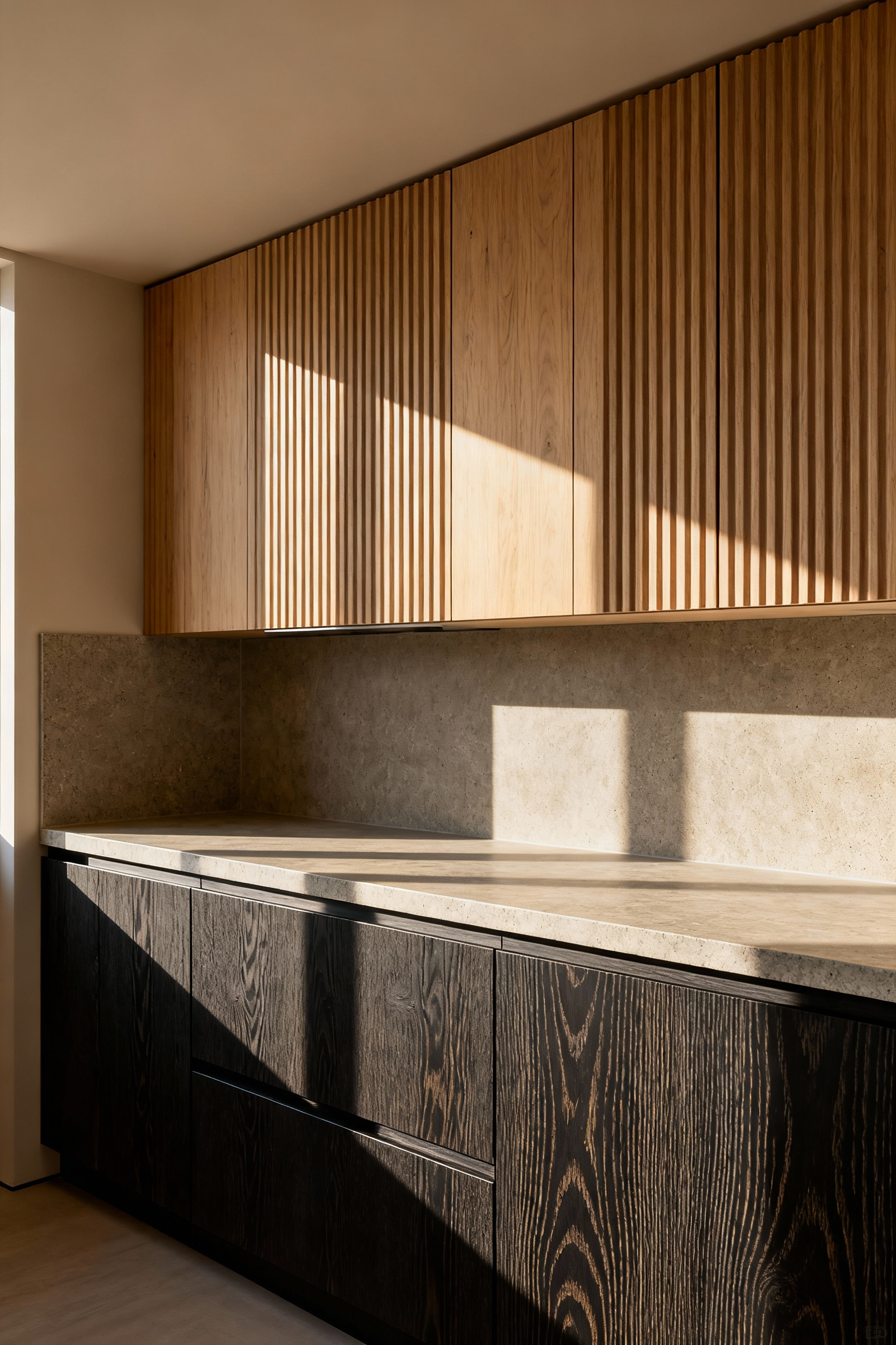
Beyond aesthetics, texture provides a necessary psychological anchor. Tight quarters can inadvertently trigger a sense of confinement, but natural materials counteract this by offering a subconscious connection to the outside world. Running your hand along the organic grain of a solid wood butcher block or the cool irregularity of honed stone offers a grounding stability that creates a calming refuge. This approach aligns with the principles of Japandi and Scandinavian design, where the goal is to soften the edges of minimalism with organic character.
It is also vital to recognize that in a small kitchen, you are never far from your surroundings. This high “haptic density” means you are constantly interacting with every surface. Every pull of a drawer and wipe of a counter is an intimate engagement with the material. Consequently, the quality of these touchpoints matters immensely. Investing in substantial metal hardware or a matte, velvety cabinet finish transforms mundane utility into a moment of quiet luxury. By prioritizing how a space feels under your fingertips, you ensure the kitchen is not just efficient, but deeply satisfying to inhabit.
The traditional “Golden Triangle” was a triumph of industrial efficiency, yet it envisioned a solitary cook isolated in a closed room. If you are preparing for a complete overhaul, check out our guide on brilliant small kitchen remodel ideas. Modern Scandinavian living demands something different: a social, multi-user space that breathes.
In the constraints of a galley layout—historically the most efficient use of a narrow footprint—we must shift from simple geometry to a human-centric zonal approach. Instead of a rigid triangle, imagine a linear sequence of self-contained stations for storage, prep, cooking, and cleanup that allows traffic to flow without bottlenecks.
To make this “passing lane” comfortable, we prioritize a clearance of 42 to 48 inches between parallel counters. This specific width is the difference between a cramped corridor and a fluid workspace where one person can sauté at the range while another moves past to the refrigerator without collision. It transforms the galley from a hallway into a dual-sided engine of productivity.
True optimization in these compact spaces often relies on collapsing distinct zones into one multi-functional hub. The modern workstation sink is a revelation here, featuring sliding tiers for cutting boards and drying racks directly over the basin. By fusing the prep and cleanup zones, you minimize the chaotic spread of ingredients, keeping the workflow tight and the mess contained to a single area.
We must also combat the “tunnel effect” through visual decompression. High-gloss cabinetry reflects natural light to create an illusion of depth, while floor-to-ceiling storage draws the eye upward, celebrating verticality rather than limitation. By extending a peninsula at the galley’s end, you invite social interaction, allowing guests to linger near the warmth of the kitchen without disrupting the chef’s rhythm.
In compact homes, we view the kitchen island not merely as furniture, but as a bridge between utility and human connection. It solves a fundamental problem of small spaces: the isolation of the cook. By turning the prep zone outward, we embrace a social neuroarchitecture where chopping vegetables happens alongside conversation. This creates a comfortable boundary—a natural “proxemic zone”—that defines the work triangle without building walls, effectively transforming the kitchen into the home’s command center for homework, remote work, and socializing.
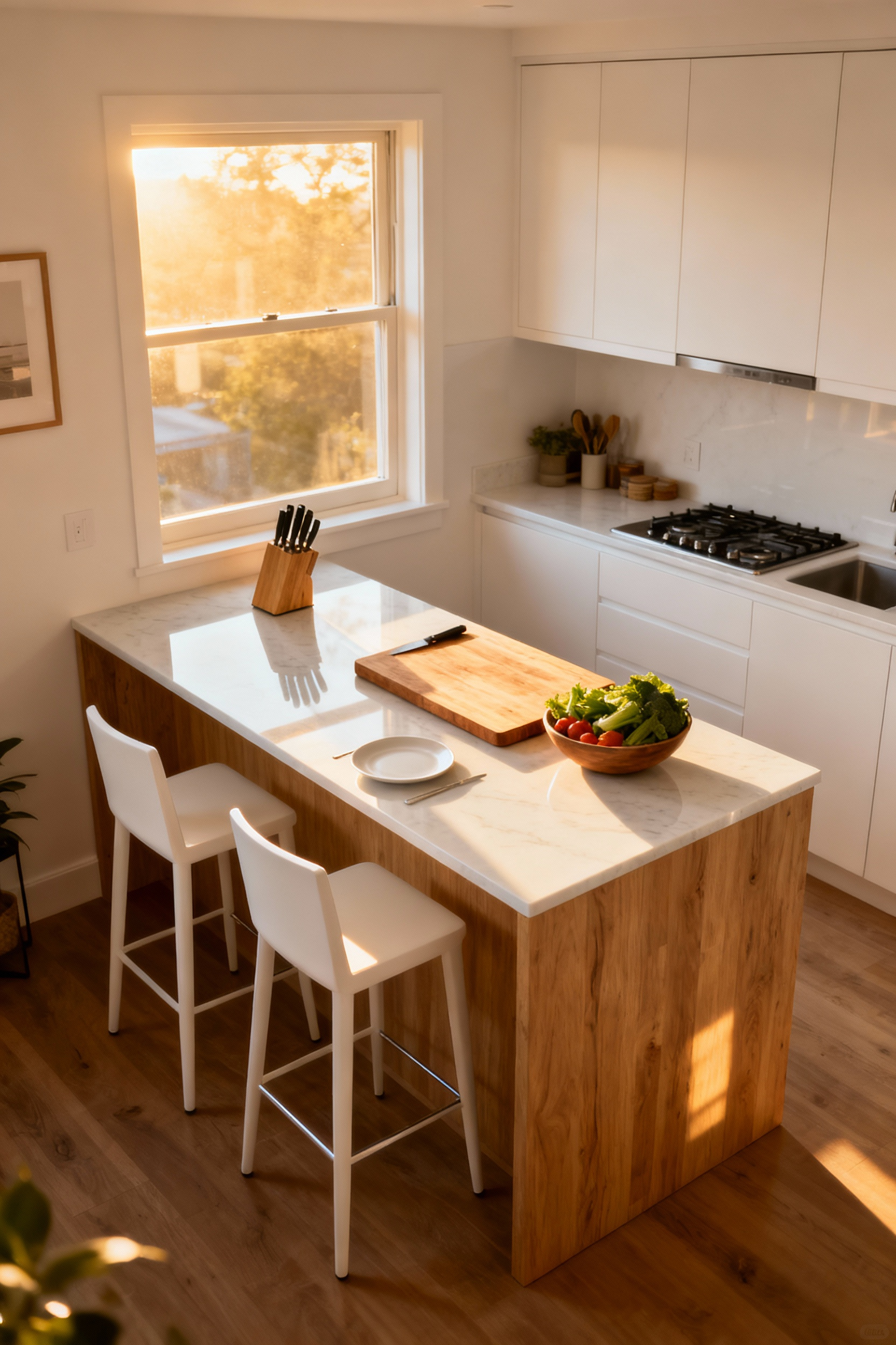
Success here relies on precise geometry. To maintain a sense of calm flow rather than congestion, preserving a clearance of 90 to 120 centimeters around the perimeter is vital. In tighter quarters, rigidity is the enemy; a mobile island on lockable wheels or a narrow design with drop-leaf extensions allows the room to breathe, expanding its footprint only when it is time to serve a meal.
Material choices play a crucial role in softening the transition from active workspace to relaxed dining table. A butcher block surface offers a tactile, warm contrast to cold stone counters, inviting guests to lean in and touch. Visually, opting for an island with open shelving rather than solid cabinetry prevents the piece from feeling heavy, keeping the small footprint airy. The transformation is completed by light: a dimmer switch on overhead pendants allows you to shift the atmosphere instantly, turning a bright, functional workstation into an intimate setting for an evening meal.
In compact interiors, the most effective way to amplify space is to erase the visual borders that define it. When the flooring material shifts abruptly from the kitchen to the living area, it creates a mental stop, boxing in the culinary zone and highlighting its limited footprint. To counter this, we rely on continuity. By carrying a single, durable material—such as high-quality wood-look porcelain or waterproof Luxury Vinyl Plank (LVP)—throughout the entire open plan, you trick the brain into perceiving one expansive volume rather than two small compartments.
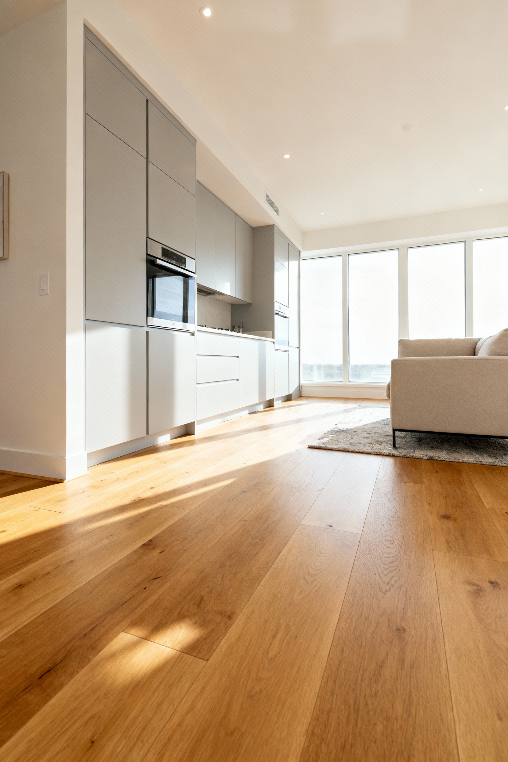
These unified flooring solutions act as a bridge, offering the resilience required for kitchen spills while maintaining the tactile warmth and organic aesthetic essential for a cozy living space. Ideally, the material should mimic natural elements, bringing a sense of calm to the home. The goal is a seamless “edge-to-edge” look where the floor runs continuously beneath cabinetry, avoiding the visual clutter of shoe moldings or transition strips.
To maximize this effect, consider the direction of the installation. Laying wide planks or large-format tiles parallel to the room’s longest wall guides the eye forward, elongating the perspective. This directional flow, combined with lighter, natural tones, reflects light and blurs the boundary where functionality ends and relaxation begins, creating a serene, unified foundation for the home.
Bringing nature into a compact kitchen is about more than decoration; it is a psychological necessity. Rooted in the biophilia hypothesis, the goal is to create a restorative environment that lowers stress without compromising the room’s functionality. In a tight culinary space, we often start with “indirect” experiences of nature. This involves selecting materials that mimic the outdoors—the complex, non-repeating veins of a natural stone countertop or the warm, tactile grain of reclaimed wood shelving. These elements ground the room in an earthy palette, offering a connection to the natural world that requires zero footprint.
For direct greenery, the most effective strategy for the space-conscious cook is vertical integration. Rather than cluttering your precious prep surface with pots, utilize the vertical plane to create a “living wall.” Modular planters or sleek, wall-mounted hydroponic systems can transform an empty backsplash or window frame into a thriving ecosystem. This approach echoes the colonial tradition of keeping medicinal herbs on windowsills and the urban resilience of mid-century victory gardens, yet adapts it for modern living.
Today, advanced solutions allow these vertical gardens to serve dual purposes. Soft LED grow lights can function as ambient under-cabinet lighting, highlighting fresh basil or rosemary while sustaining them. This setup invites the sensory pleasure of plucking fresh herbs—transforming a routine cooking task into a restorative ritual. If wall space is scarce, simple hanging planters with trailing Ivy or Pothos draw the eye toward the ceiling, creating an illusion of height and airiness while quietly purifying the air.
A small kitchen often prioritizes efficiency, but Scandinavian design teaches us that function shouldn’t come at the cost of feeling grounded. The *Hyggekrog*, or cozy corner, isn’t necessarily a physical nook in a tight culinary space; often, it is created entirely through the intentional manipulation of light. The absolute enemy here is the single, sterile overhead fixture—what I call “visual caffeine”—which keeps the nervous system on high alert.
Instead, swap high-Kelvin bulbs for warm 2700K options and introduce a secondary light source. A small lamp with a fabric shade placed on the counter casts a gentle pool of illumination, instantly transforming a utilitarian prep zone into a tranquil cocoon.
Within this softened glow, you can carve out a dedicated ritual zone. Since counter space is premium real estate, corral your daily essentials—a favorite ceramic mug, coffee beans, and the kettle—onto a simple wooden or woven tray. This creates a “coffee altar” that reframes the morning routine from a hurried chore into a moment of creation and contemplation. To deepen the experience, layer in tactile elements that soften the hard edges of cabinetry. A linen tea towel, a handmade ceramic bowl, or even a sheepskin draped over a stool introduces a “visual silence” and invites touch.
Engage the senses beyond sight as well. A simmer pot on the stove with cinnamon and cloves adds humidity and fragrance, signaling safety to the mind. Hygge thrives on authenticity, so allow for “intentional clutter”—a stack of well-worn chopping boards or a family cookbook—to anchor the space in your personal history, proving that even the smallest kitchen can offer a profound pause.
Viewing a compact kitchen through the lens of limitation misses the profound opportunity for tranquility and precision. By embracing the constraints of the footprint, we are forced to trade the sprawling chaos of excess for the calm of curation. This transforms the room from a mere utility zone into a jewel box of efficiency. When we prioritize verticality and streamlined ergonomics, we do not lose functionality; rather, we gain an intimate atmosphere where high-quality natural materials and thoughtful lighting can shine without the dilution of vast, empty spaces. This approach proves that true luxury in small kitchen design is not found in the abundance of space, but in the intentionality of the design.
This shift in perspective allows the kitchen to return to its historical roots as the warm, beating heart of the home—a space defined by human connection rather than square footage. As you plan your future kitchen, remember that the most sustainable and inviting spaces are those that serve you effortlessly. Begin your journey not with renovation, but with a rigorous audit of your current collection. Strip away the superfluous to reveal only those items that offer true utility or spark genuine joy, creating a room that feels as good as it functions.
Making a small kitchen look luxurious involves diverting the budget from quantity (square footage) to quality (materials). Focus on high-end finishes like integrated, paneled appliances, custom floor-to-ceiling cabinetry, and monolithic natural stone countertops (quartzite or honed marble). Minimize visual clutter by concealing necessities, allowing the curated materials to become the focus.
The most effective strategy is employing the Albedo Effect, using high-albedo surfaces like soft whites, pale creams, or light greiges, particularly on cabinetry and walls. These tones maximize light reflection. Supplement this with high-gloss finishes (lacquer or glass) on upper cabinets to create specular reflection, bouncing the image of light sources deeper into the room and creating an optical illusion of greater depth.
Yes, the galley layout is inherently efficient for small spaces because it optimizes linear flow, eliminating the wide turns required by the traditional work triangle. Modern galley designs focus on human-centric zones (prep, cooking, cleanup) placed sequentially along parallel walls, maximizing workflow while requiring minimal floor space (ideally 42–48 inches between counters for comfortable multi-user passage).


