Physical Address
304 North Cardinal St.
Dorchester Center, MA 02124
Physical Address
304 North Cardinal St.
Dorchester Center, MA 02124
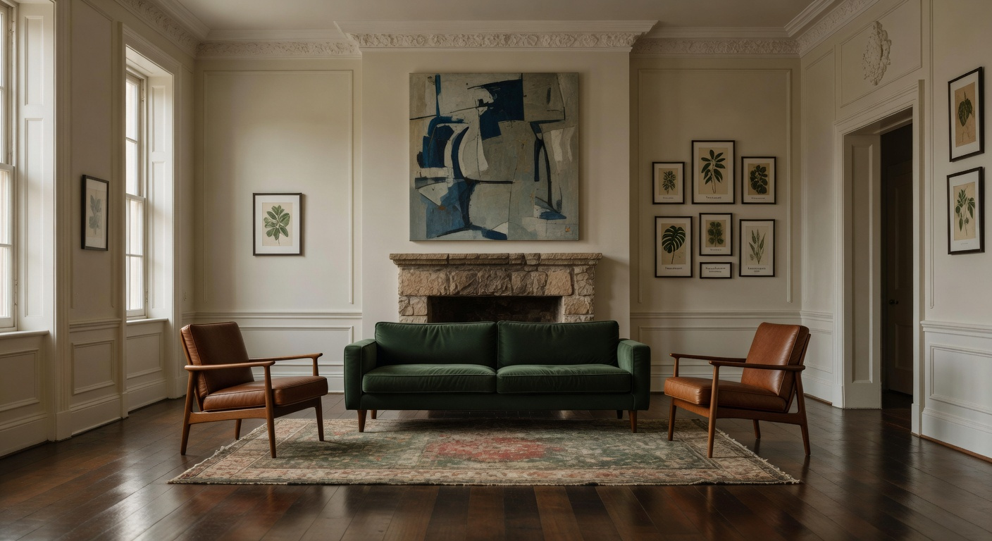
Master the art of the eclectic living room with our 15 expert design principles. Learn to blend heritage pieces with modern luxury for a cohesive, soulful space. Start curating your home today.
Many discerning homeowners feel torn between historical authenticity and modern comfort. They fear that adding contemporary furniture might ruin a period home’s integrity. However, expert designers champion a different philosophy. They believe distinct eras should coexist to create a richer narrative. This fusion creates the essence of a truly beautiful eclectic living room.
The secret lies in “Curated Contrast” rather than seamless matching. Specifically, designers intentionally juxtapose history’s rough patina against sleek, modern forms. For example, a polished steel lamp might sit beside weathered plasterwork. Consequently, the room documents the passage of time rather than freezing it. This tactile balance allows the space to hum with quiet confidence. We will explore how to master this relationship between the past and present. Furthermore, this guide reveals why a neutral foundation acts as the ultimate secret weapon. By focusing on texture over color, you unify diverse elements. Ultimately, you will craft a living room that is historically anchored yet boldly eclectic, following the timeless principles for creating an authentic luxurious living room.
We analyzed over 200 renovations to find the pattern. The difference between “cluttered” and “curated” rests entirely on discipline. Specifically, the strongest designs utilize the “heritage shell” as a unifying anchor. Rather than fighting the architecture, skilled curators treat original walls as a neutral canvas. Consequently, this backdrop allows collected items to shine without competing for attention.
Furthermore, we must exercise restraint regarding color. Instead of an “anything goes” approach, successful spaces adhere to a strict core palette. Usually, this involves one overarching neutral and two specific accent colors. This weaves an invisible thread of harmony through the room.
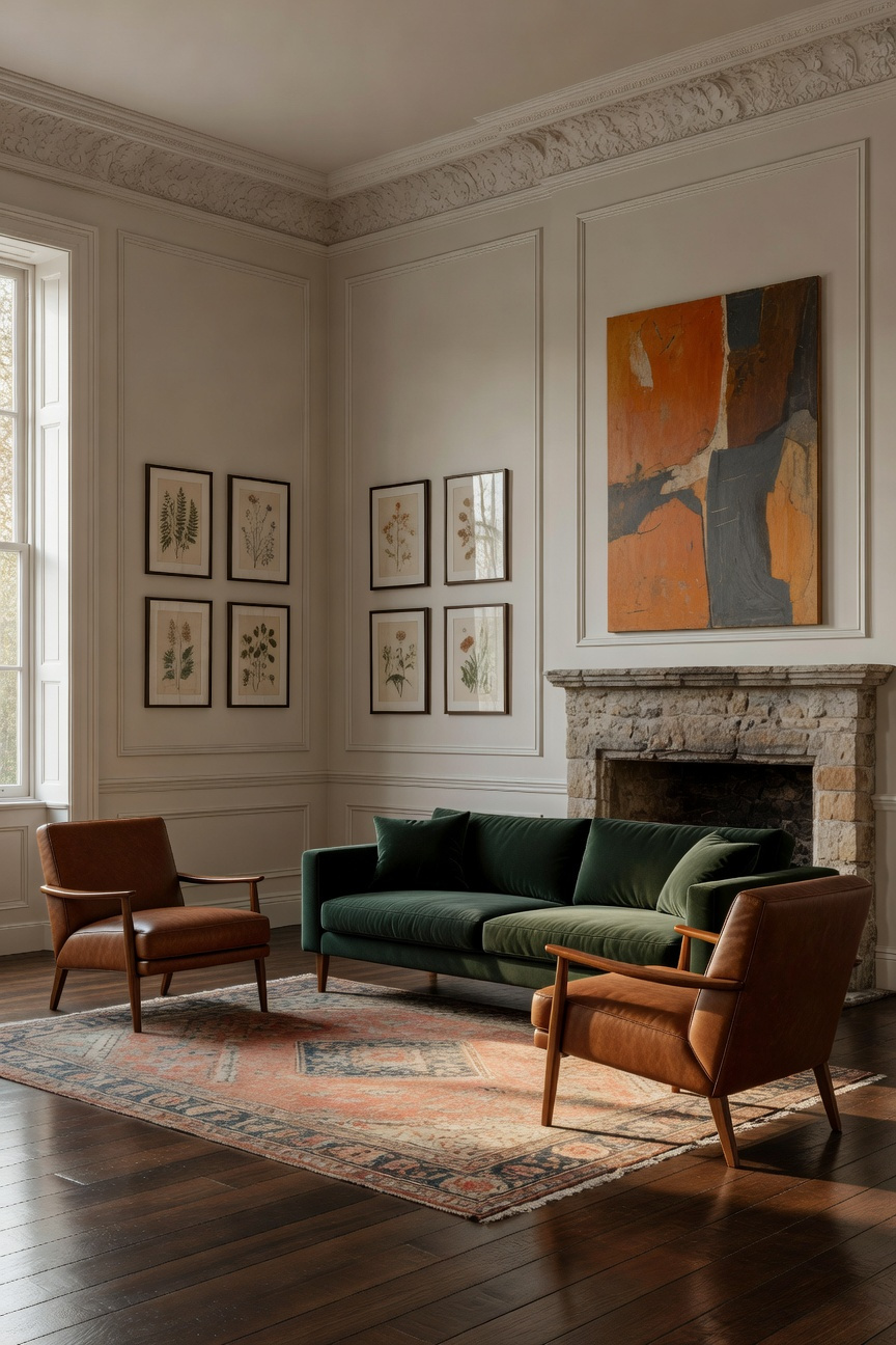
However, color is not the only decisive factor. The true distinction lies in rigorous editorial discipline. Surprisingly, visual clutter often stems from a lack of negative space, not merely an excess of objects. Therefore, we prioritize “breathing room” around substantial vintage pieces. Earlier eras often produced larger furniture. Thus, preserving space prevents these items from overwhelming the composition. Additionally, establishing a hierarchy is vital. The most impactful rooms feature one bold statement piece that commands the spotlight.
Finally, the “how” of layering determines the room’s energy. Specifically, look for geometric similarities across different eras. For example, a mid-century sofa might share a silhouette with an antique armchair. Moreover, texture plays a tactile role. Repeating specific finishes—like rough metal or soft velvet—bridges the gap between history and modernity. Ultimately, these decisions transform a random collection into a sensory narrative.
Eclectic design risks becoming a chaotic jumble without a framework. To prevent this, successful interiors rely on the “80/20 Provenance Ratio.” Essentially, this repurposes the classic Pareto principle for styling. You must devote 80% of the room to a single, dominant era. Ideally, this foundational style derives directly from your home’s architectural shell.
For instance, a 1910 Tudor naturally demands a Traditional base for walls, trim, and flooring. Similarly, primary furniture like sofas should align with this narrative. This consistency acts as a neutral canvas. It provides necessary visual rest. Consequently, the room feels inherently stable rather than forced.
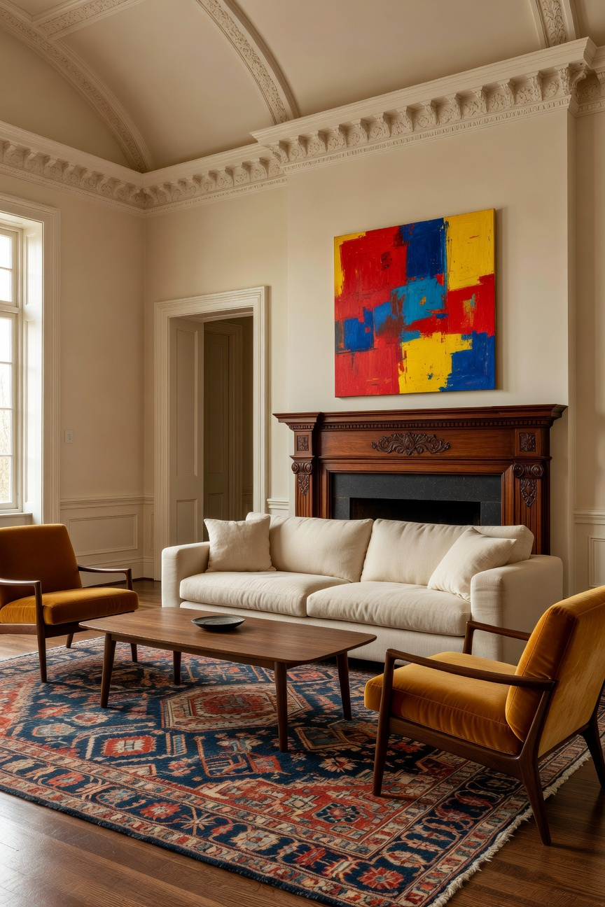
Conversely, the remaining 20% serves as a catalyst for drama. This minority percentage allows for sharp, intentional deviation. Specifically, it creates a dialogue through juxtaposition. Imagine placing an ornate Louis XVI chair next to a sleek console. Furthermore, these outlier pieces should be highly curated. In fact, items like inherited antiques or iconic chairs work best here. Ultimately, this ratio prevents individual elements from competing. It ensures your space remains a harmonious fusion.
Restoring a period home is a delicate balance. Traditionally, norms dictate that millwork requires high-gloss finishes to catch the light. However, that reflective sheen often creates visual noise in modern settings. Instead, apply a modern matte finish to original crown moldings. This creates sophisticated stylistic tension. Specifically, this technique is known as architectural deference.
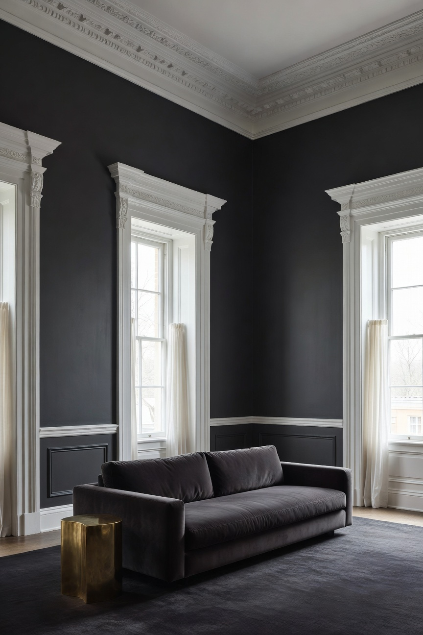
By rejecting the convention of gloss, you alter how the eye perceives detail. Matte paint absorbs light rather than reflecting it. Consequently, intricate curves become flatter and more graphic. The molding creates a dense, velvety outline. It anchors the room without feeling imposing. Furthermore, this shifts the focus from surface sheen to architectural form.
In addition, a matte finish offers a practical solution. Original millwork often suffers from accumulated paint layers. Unfortunately, glossy paint highlights every dent. Conversely, a low-sheen matte finish discreetly masks flaws. Therefore, the trim appears smoother despite its age. Finally, matte finishes provide superior color retention. Deep tones appear exceptionally rich without reflection. Ultimately, this respects the home’s bones while adapting them for modern life.
How do you bridge the gap between an 18th-century antique and contemporary art? You need more than matching wood tones. Instead, rely on the psychological authority of high saturation. Specifically, a bold, high-chroma hue acts as a visual anchor. For instance, imagine a minimalist abstract painting above a Louis XVI commode. Introducing a shared, deep teal forces the eye to connect these disparate objects. This shared intensity creates a language of visual weight.
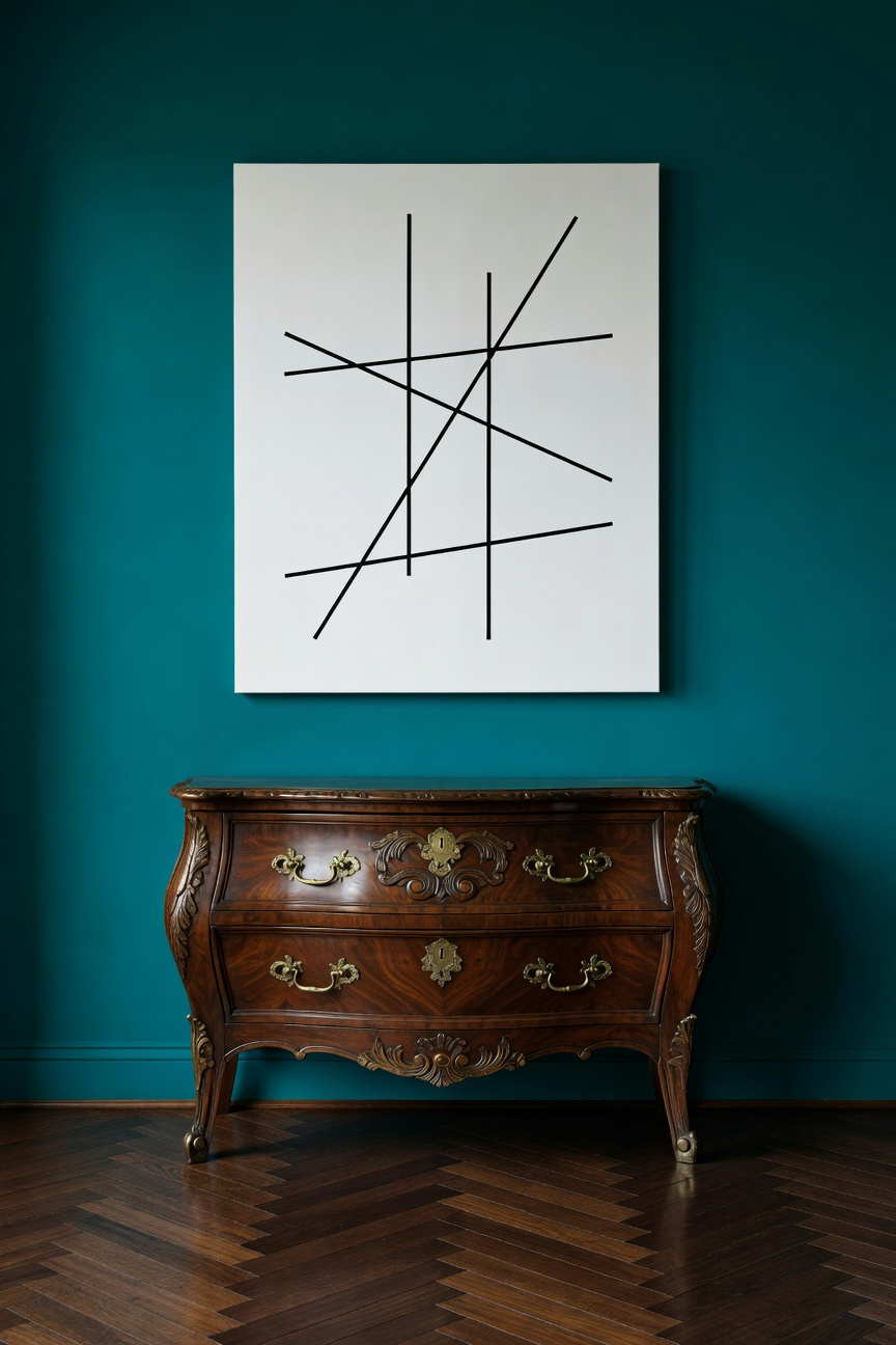
Interestingly, this honors the original “luxury intent” of historical design. Modern eyes see faded antiques, but period interiors featured vibrant pigments. In fact, wealthy homeowners used rich reds or copper-based greens to display status. Therefore, applying a saturated color echoes these expensive historical pigments. It links the organic chemistry of the past with the synthetic stability of modern art.
To execute this effectively, apply the hue as a “thin-lined repetition.” Ideally, repeat the accent color three times. Identify the shade in the canvas art, the silk piping of a chair, and a sleek glass lamp. While textures contrast, identical saturation ensures the room feels curated.
Visual echoing is a powerful architectural tool. It unites disparate eras within a single space. Specifically, the curve serves as a perfect bridge between Art Deco and 1970s Italian design. In the 1930s, the “streamline” curve symbolized machine-age progress. Consequently, architects rendered these forms in hard materials like chrome. Conversely, the 1970s reimagined this geometry through comfort. Designers embraced organic shapes, creating “plush” furniture for lounging.
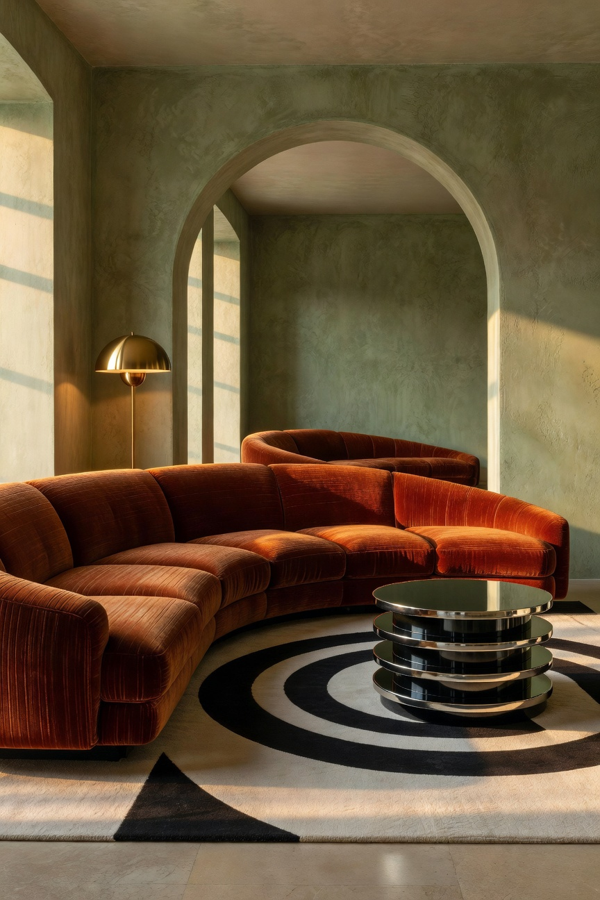
Despite sensory differences, the underlying form remains identical. Therefore, repeating this shape creates a rhythm that overrides clashing time periods. For instance, the radiating arcs of an Art Deco mirror “answer” a 1970s semi-circular sofa. Here, the sleek historical motif prepares the eye for the larger modern form. Furthermore, this technique turns the shape into a “bridge.” Ultimately, repetition transforms contrast into an intentional dialogue about fluidity.
The interplay between history and modernity creates compelling narratives. Specifically, pairing a distressed Oushak rug with industrial furniture establishes vital aesthetic tension. Furniture often celebrates raw structure using cold materials like iron. Conversely, the rug offers a “soulful patina,” communicating craftsmanship through imperfection. Consequently, this contrast prevents a polished space from feeling sterile. For more ideas on how placement affects design, read our guide on ways living room rugs can transform your space.
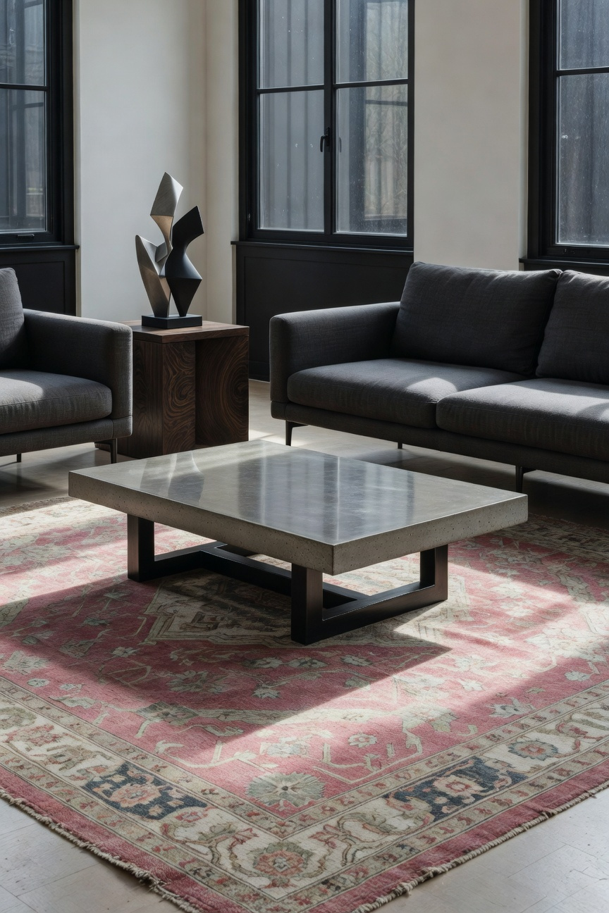
Furthermore, the Oushak acts as a sensory mediator. Industrial style is defined by hard edges. Therefore, the rug’s wool pile introduces essential softness. Additionally, the typical Oushak palette features sun-washed apricots. In fact, these faded tones warm the room without overpowering the monochromatic furniture.
Finally, the unique scale of an Oushak resolves spatial issues. Industrial pieces are often streamlined and lack visual weight. However, these rugs were woven for palaces, featuring large-scale motifs. Thus, the expansive pattern anchors the arrangement. Ultimately, the rug serves as a cohesive foundation for modern living.
The Victorian settee offers an ideal anchor. Historically, these pieces featured dark woods and heavy fabrics. However, reimagining them with bold performance velvet creates a stunning visual counterpoint. This modern intervention effectively “un-muddies” the aesthetic. Suddenly, the curvaceous silhouette pops against the luminous sheen. Therefore, a formal museum piece becomes a vibrant feature.
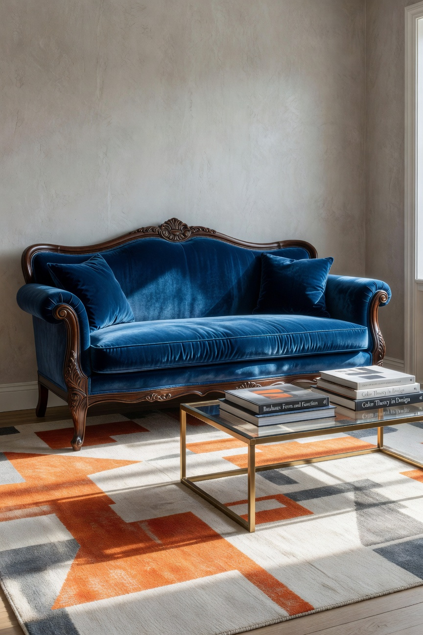
Beyond aesthetics, using performance-grade material is a technical triumph. Traditional silk velvets were notorious for bruising. In contrast, modern polyesters are engineered for longevity. Specifically, look for abrasion scores exceeding 50,000 rubs. This ensures the settee withstands daily use. Furthermore, stain resistance transforms a fragile heirloom into practical seating.
Finally, the plush pile enhances deep button tufting. Light catches the velvet, emphasizing dimensionality through shadow. Ultimately, this preserves craftsmanship while infusing the space with fresh luxury. This technique is just one way to elevate your living room styling.
Strict symmetry often makes a room feel static. Conversely, the “Odd Chair” philosophy introduces necessary visual tension. This principle relies on asymmetrical balance to create dynamic equilibrium. Therefore, the goal is intentional contrast. Specifically, you serve the eclectic narrative by juxtaposing distinct forms. For instance, try pairing a sleek modern sofa with an antique armchair.
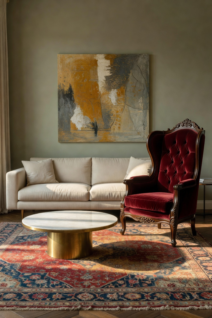
Unlike a matching set, this combination forces engagement. Consequently, the space feels “collected” rather than copied. Furthermore, this approach fosters human connection. In fact, a distinctive chair acts as a natural focal point. Guests are often prompted to ask about its history. Moreover, these pieces are frequently movable. This allows you to create flexible conversation zones. Ultimately, breaking symmetry invites dialogue.
Treat lighting as suspended sculpture to elevate a room. Specifically, rely on a deliberate conflict between opposing archetypes. On one hand, the crystal chandelier represents historical grandeur. Its prisms refract light, creating a soft, romantic ambience. Conversely, severe mid-century lamps embody functionalism. These fixtures feature clean lines and reductive forms. Consequently, they provide directional focus and intentional shadows.
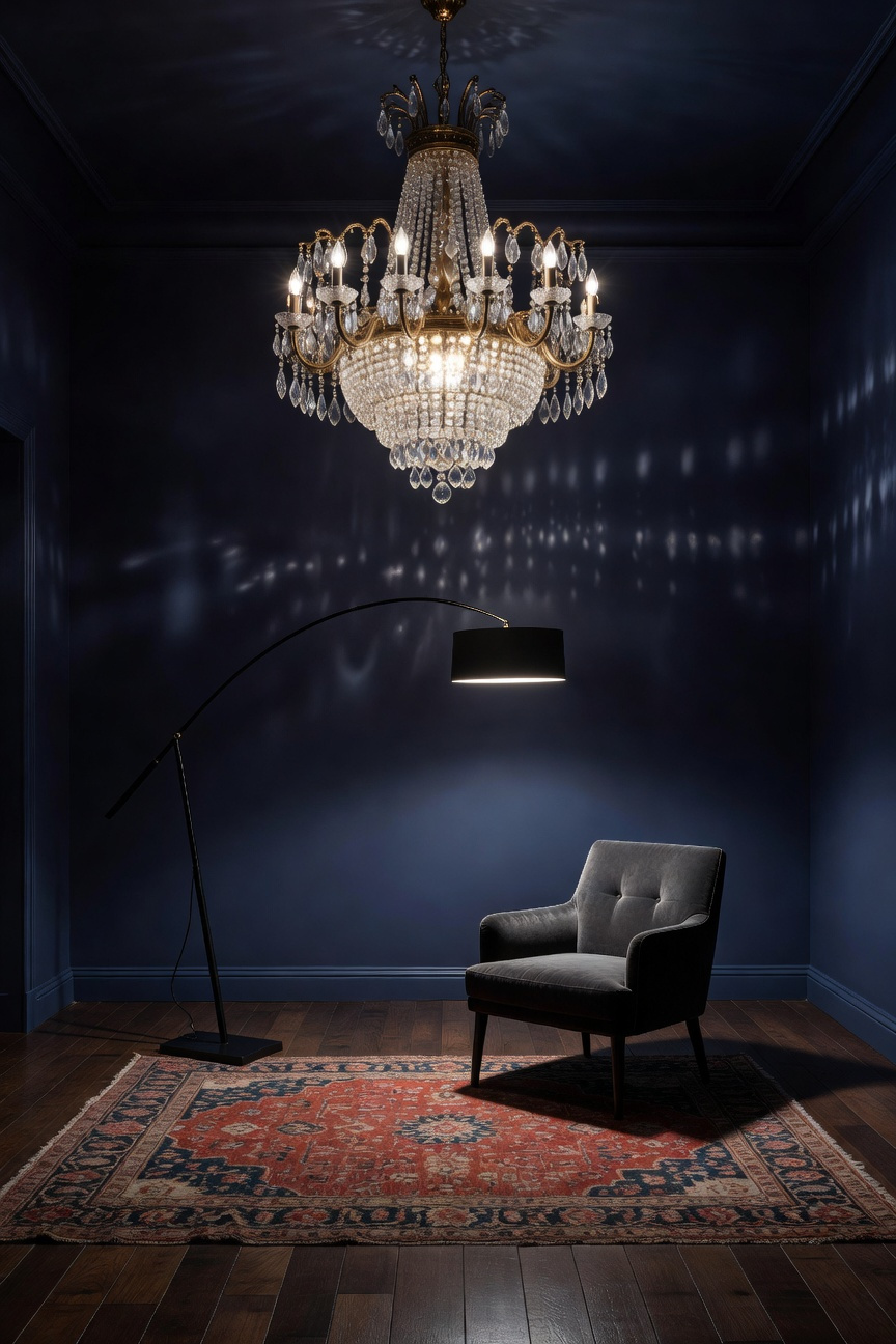
Bringing these styles together generates narrative tension. Ideally, the chandelier offers poetic ornamentation. Simultaneously, the lamp provides engineering precision. However, preventing a chaotic mismatch requires an anchor. Therefore, designers often utilize a shared material finish. For instance, selecting brushed brass for both fixtures creates harmony. As a result, the connection feels intentional. Ultimately, this allows the contrast to stand out as art.
Creating a sophisticated eclectic gallery wall requires more than hanging random pieces. Specifically, mixing oil portraits, photography, and salvage establishes a dialogue. First, consider the oil portrait. It offers heavy, tactile depth. Conversely, abstract photography provides a sleek counterpoint. This medium introduces intellectual flatness, effectively balancing the historic painting.
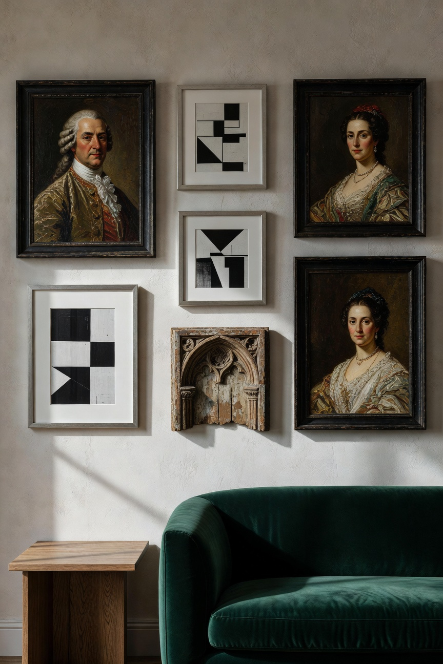
However, flat frames can feel static. Therefore, architectural salvage is essential for dimension. Elements like antique window frames add raw history. Furthermore, these objects ground the art with distressed textures. In fact, this combination bridges the gap between “patina” and minimalism.
Ultimately, the key to cohesion is color. For example, match the oxidized green of a copper piece to a hue in the abstract print. Thus, the wall becomes a curated timeline. By blending these eras, you preserve the home’s narrative.
Texture mapping serves as a guide for your room’s sensory journey. Specifically, it pits polished surfaces against natural elements. This approach creates the tension essential for an emotionally balanced home.
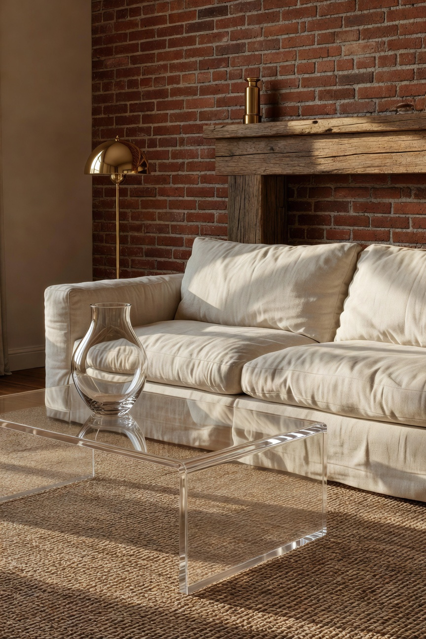
For instance, slick materials like Lucite are light reflectors. Consequently, they evoke modernity and clean lines. By minimizing visual weight, a glass table creates a “clean break.” Therefore, the room feels expansive rather than cluttered.
Conversely, raw materials act as light absorbers. Unfinished wood and brick provide the room’s “soul.” Because they are tactile, they offer essential warmth. Thus, they ground the design in comfort.
Ideally, exploit the tension between these forces. For example, placing a Lucite console against a brick wall creates an optical illusion. The slick object provides functionality without masking the texture. Ultimately, this contrast allows the raw wall to remain the focal point. Furthermore, consider the relationship between linen and glass. The matte softness intensifies the sleekness of adjacent surfaces. This interplay invites the eye to linger.
True eclecticism is rooted in the Greek word *eklektikos*, meaning “to choose.” Consequently, integrating travel artifacts requires a shift in intent. You must move beyond gathering kitschy souvenirs. Instead, view your space as a gallery for culturally significant narratives. Therefore, successful display relies on negative space. Specifically, isolate a striking artifact against a simple backdrop. This “one-piece focus” mirrors museum techniques. It gives the object breathing room.
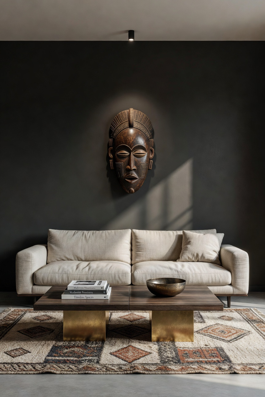
Furthermore, preservation is key. For instance, encase delicate textiles behind UV-protected glass. This prioritization lends authority to the display. Moreover, lighting acts as a narrator. Strategic spotlights draw the eye to textures or carvings. In fact, warm lighting can dramatically enhance the age of artifacts.
To prevent chaos, anchor narratives with a neutral foundation. A tranquil wall color allows symbolism to take center stage. Finally, ensure cohesion by linking eras through materials. For example, echo the wood tone of an antique stool in a modern sofa’s trim. Ultimately, this transforms a room into a personal museum.
Eclectic design involves a deliberate collision of eras. Consequently, this complexity creates a high concentration of stimuli. In fact, the brain works overtime to process these elements. Therefore, without rest, sensory overload leads to “visual fatigue.” Specifically, eclectic interiors require roughly 30% more negative space than traditional styles.
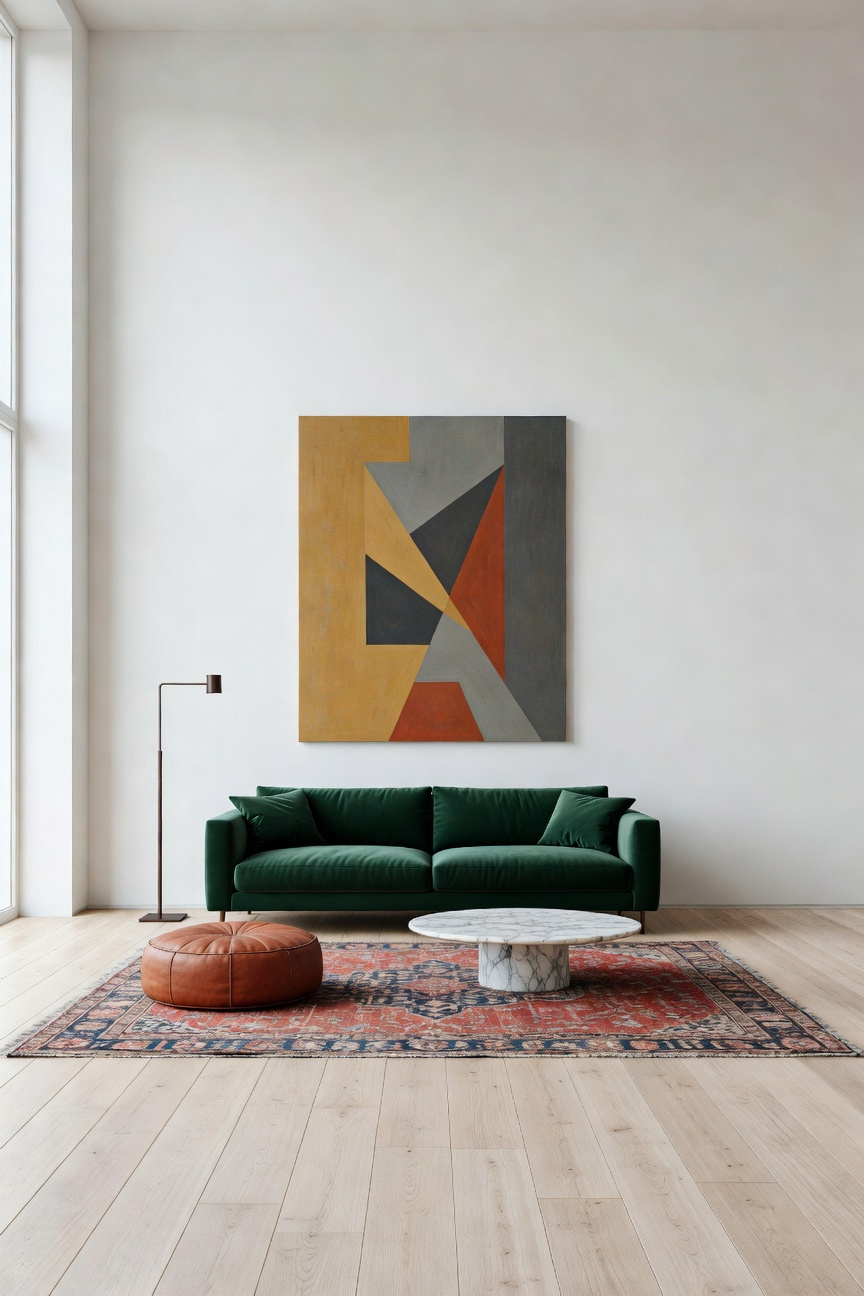
Essentially, empty space functions as a “visual low.” Thus, it allows the eye to recover from bold juxtapositions. Furthermore, this “breathing room” transforms objects into focal points. Unlike traditional styles relying on symmetry, eclectic rooms depend on asymmetrical balance. Consequently, you must utilize expansive neutral walls or clear flooring. Ultimately, negative space acts as a buffer. It ensures the design feels energized rather than chaotic.
Unlacquered brass is a “living finish.” Specifically, it is an alloy left uncoated to react with its environment. Consequently, exposure to air and handling naturally oxidizes the surface. Initially, the metal appears bright. However, it gradually softens into warm copper tones. Eventually, it settles into a deep verdigris. In fact, these discolorations are not flaws. Instead, they serve as characteristics that inject history.
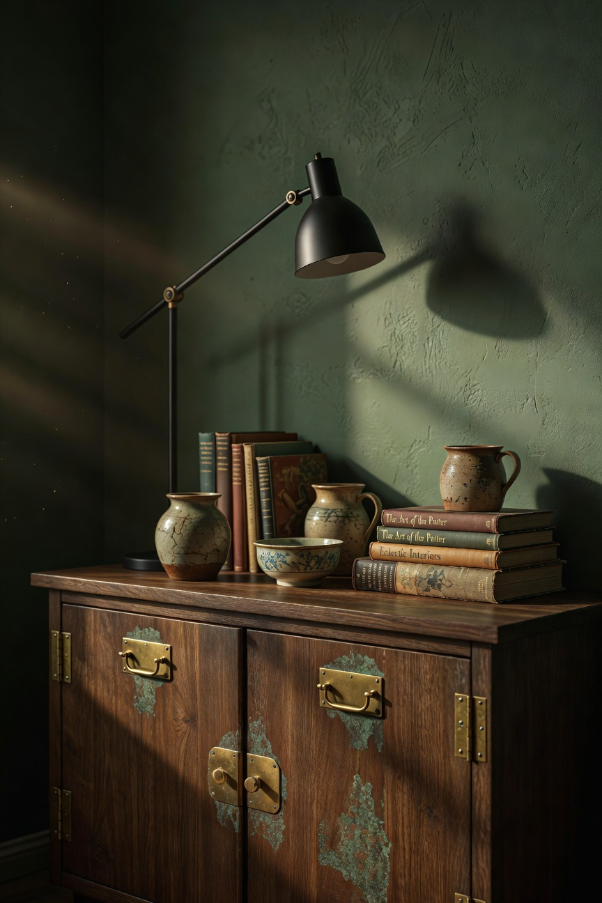
To modernize this, pair it with matte black fixtures. Ideally, this combination creates depth through contrast. Unlacquered brass provides a warm, reflective tone. Conversely, matte black offers static saturation. Therefore, the black finish anchors the design with a contemporary edge. Simultaneously, it highlights the organic nature of the brass.
This pairing bridges old-world architecture and minimalism. To maintain balance, use one finish as the foundation. For example, select matte black for large elements like lighting. Then, introduce unlacquered brass for high-touch accents. Specifically, apply brass to door handles or knobs. As a result, high-use areas patina faster. Ultimately, this approach ensures the space feels curated.
Functional bookscaping reimagines your library. It transforms books from storage into active architectural texture. Specifically, view each spine as a modular unit. Consequently, the varied topography of leather and paper creates visual complexity. Unlike flat paint, these materials refract light unevenly. Thus, this heterogeneity adds immediate warmth.
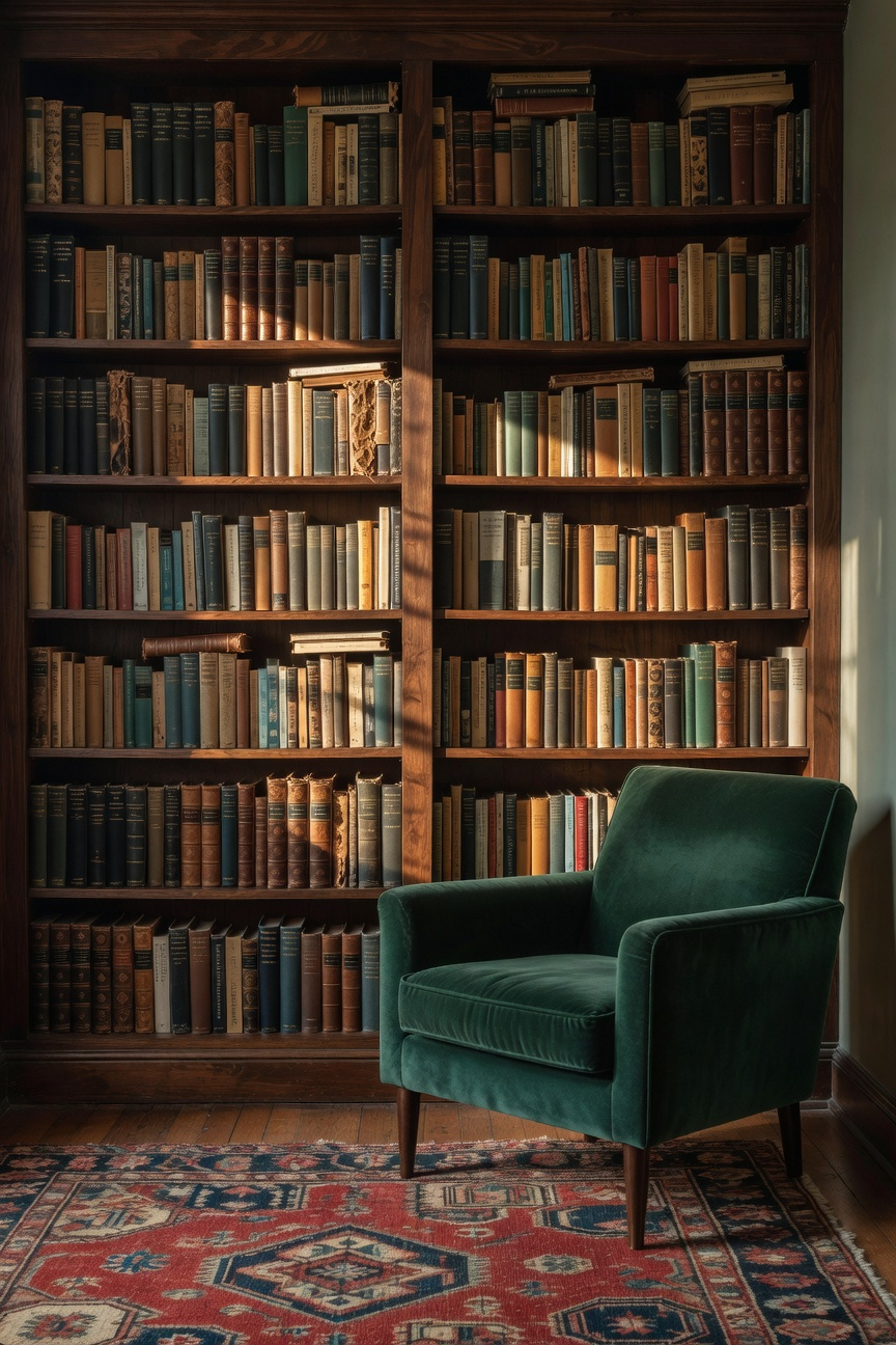
Furthermore, a floor-to-ceiling collection acts as an anchor. The mass of spines forms a chromatic mosaic behind bold furniture. In fact, this neutralizes the risk of fragmentation. Beyond aesthetics, this celebrates the book as an artifact. Therefore, patina becomes a layer of character.
Structurally, dense shelving offers functional benefits. For instance, books act as acoustic dampeners. They absorb echo, creating an intimate atmosphere. Ultimately, treating shelves as permanent architecture elevates the room.
True eclecticism defies the speed of consumption. Instead, it relies on emotional durability. Consequently, a room furnished in a weekend often lacks soul. It captures a fleeting trend rather than a narrative. In contrast, “Slow Design” prioritizes a curated timeline.
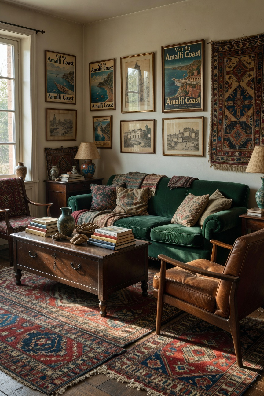
This deliberate pace allows for meaningful relationships with objects. Specifically, acting as a curator requires patience. You must wait for the perfect piece. Furthermore, time introduces patina. Visible wear on a table suggests history. Similarly, a vintage rug offers textures that mass production cannot replicate.
Ultimately, this accumulation allows for editing. You can balance a modern lamp against a distressed cabinet. Therefore, authentic interiors are not designed instantly. They evolve alongside the inhabitants.
True eclecticism involves far more than accidental clutter; in reality, it is a deliberate, intellectual exercise. As we have explored, the practice relies on the Greek concept of *eklektikos*, meaning “to choose.” Therefore, successfully layering eras requires a deep understanding of style. You must intentionally orchestrate a dialogue between a sleek modern console and an antique mirror. Consequently, this high-tension contrast transforms friction into a fluent narrative. Furthermore, technical discipline provides the necessary glue. By strictly managing color and repeating textures, you ensure the space remains cohesive.
Ultimately, this rigorous approach allows your home to reflect a personal journey. It honors history while embracing contemporary needs. Thus, your living space remains functional yet soulful. However, maintaining harmony demands constant editing. To begin, audit your current collection critically. Remove items that lack distinct purpose. Then, slowly reintroduce pieces that bridge the gap between yesterday and today. In doing so, you curate a timeless, harmonious sanctuary—the ultimate eclectic living room.
While all three styles embrace layered elements, they differ in discipline. Bohemian (Boho) prioritizes comfort, travel, and handmade textures with a relaxed vibe. Maximalism focuses on filling space with color and pattern, valuing “more is more.” Eclecticism, however, is a rigorous style defined by intentional contrast. It uses restraint to allow disparate items of historical significance to engage in a sophisticated dialogue.
The most crucial rule is maintaining a strict foundational color palette, typically 80% neutral. By keeping walls and large pieces low-saturation (e.g., matte white, charcoal, linen), you create rest. This neutral backdrop acts as a gallery. It allows your chosen 20% of bold pieces to stand out as curated statements rather than clutter.
For the foundation (walls, architectural features), prioritize a neutral, texture-rich palette. Bold color should be introduced strategically as a “common thread.” Use a single saturated hue (like teal or mustard) and repeat it deliberately in three non-adjacent items. This repetition ensures the color bridges disparate elements, guaranteeing cohesion.