Physical Address
304 North Cardinal St.
Dorchester Center, MA 02124
Physical Address
304 North Cardinal St.
Dorchester Center, MA 02124
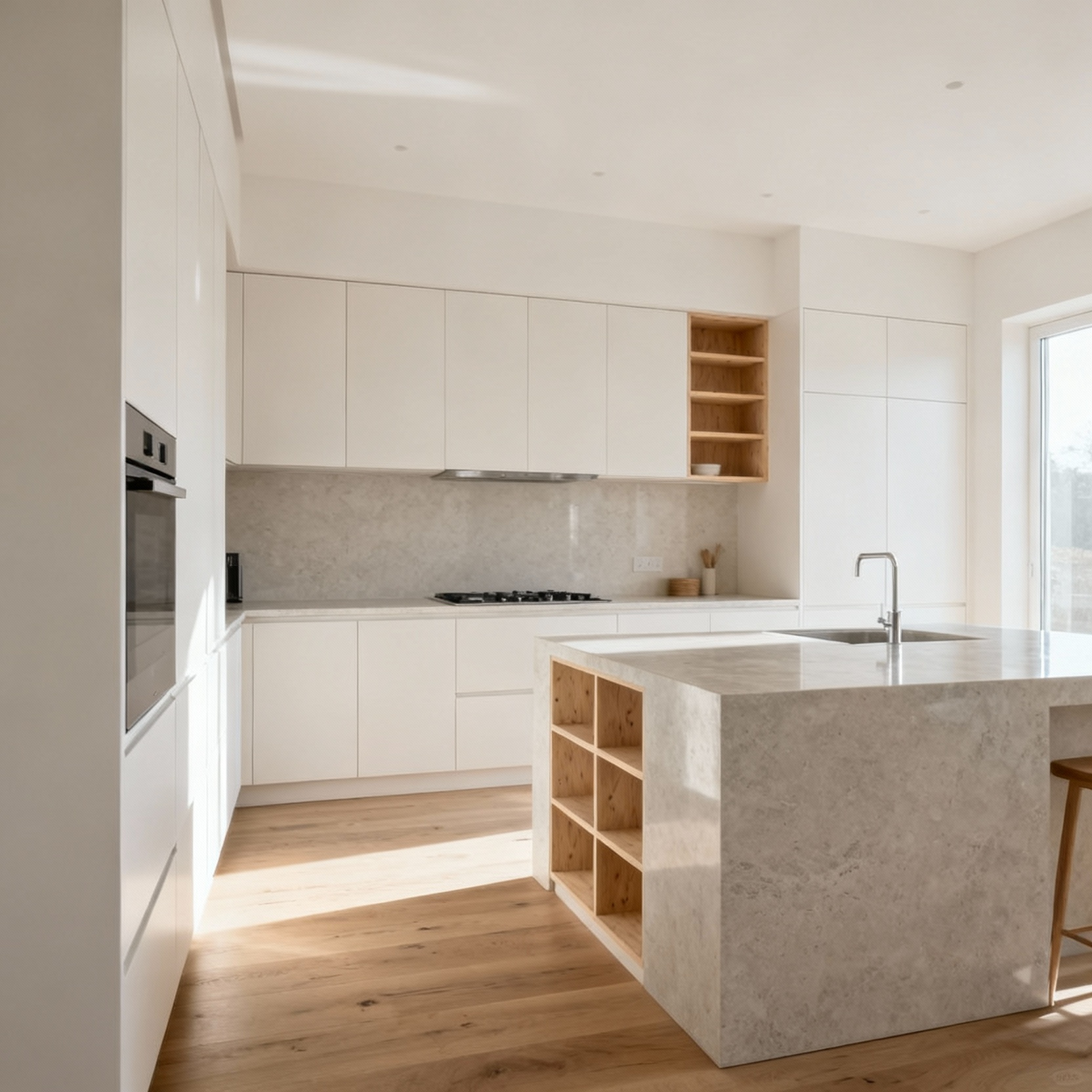
Discover 20 enduring kitchen cabinet color ideas guided by Scandinavian design. Expert advice on timeless palettes, materials, and light for lasting functional beauty.
Most people believe selecting kitchen cabinet colors is about finding what’s in style this year. You see it everywhere—on social media feeds and home renovation shows, all pushing the ‘color of the year.’ Here’s what they’re not telling you: In my eleven years working in Nordic interior design, I’ve seen firsthand how these trends fade, leaving homeowners with a space that feels dated in just a few seasons. True Scandinavian design isn’t about trends; it’s about longevity. These twenty principles aren’t just ideas. They are a framework for choosing colors that create a sense of functional beauty and quiet contentment—a kitchen that will feel right for decades, not just for a moment.
Before we speak of pigments, we must speak of purpose. In Scandinavian design, a cabinet’s color is never just a decorative choice. It is a fundamental decision that defines the light, the mood, and the very soul of the kitchen. Here, we lay the groundwork with principles that value thoughtful integration over fleeting fashion, creating spaces of lasting calm.
In Scandinavia, our relationship with light is everything. The principle we call ‘Lyse’—lightness—is the soul of our design philosophy, and it’s far more nuanced than simply choosing white. It’s a thoughtful calibration of color to maximize intrinsic luminescence, especially during those long, dark winters. We choose cabinet hues that don’t just reflect light, but seem to hold and amplify it from within. Think of colors that feel lit from the inside out: desaturated whites, creams with a whisper of grey, or the palest of natural wood tones.
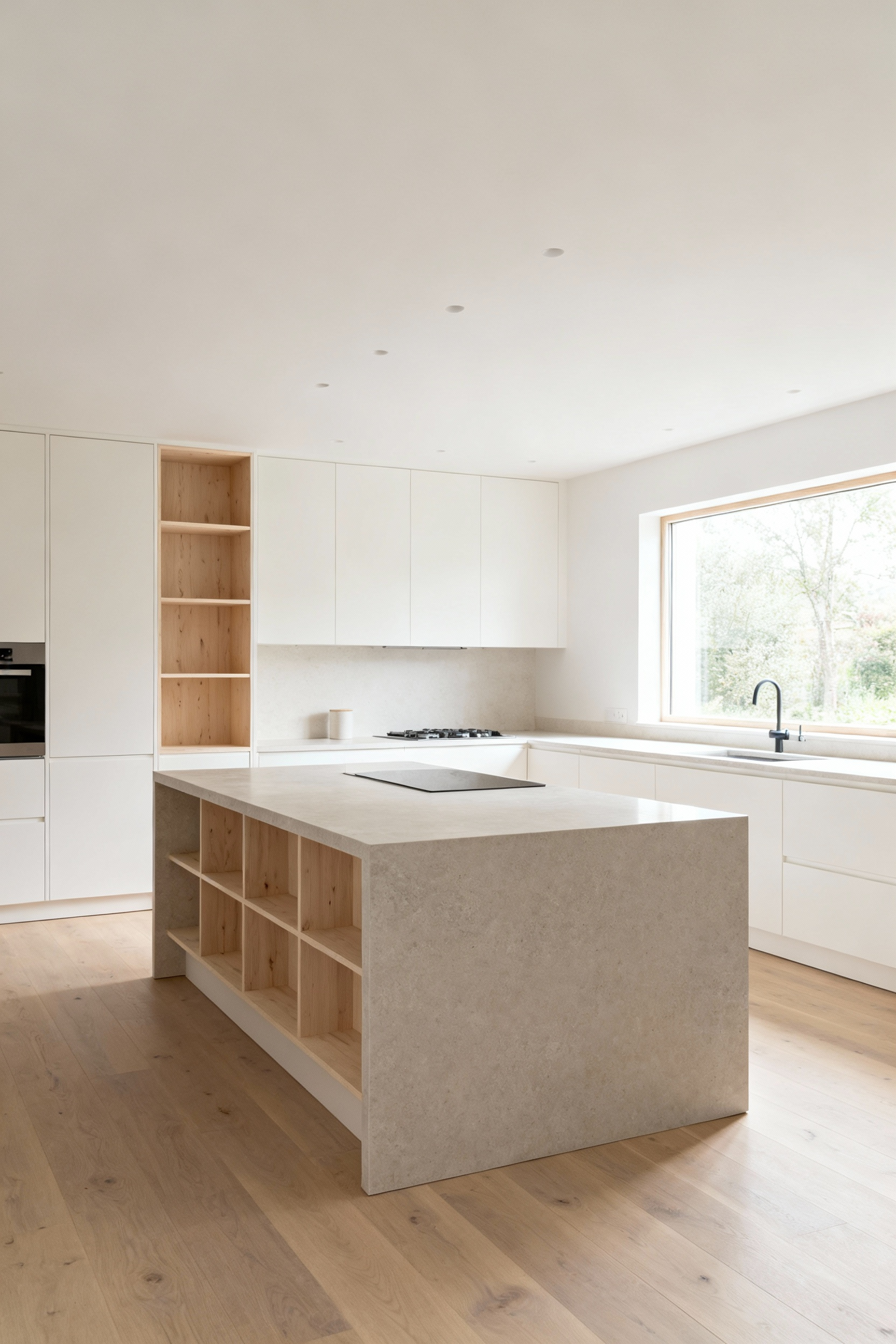
What I tell my clients seeking warm, minimalist spaces is to focus on the finish. A subtle matte or eggshell surface diffuses light gently, creating the soft, uniform glow that defines Lyse. High gloss can create a jarring glare, undermining that essential calm. The goal is to create a visual breathability, making a smaller kitchen feel open and a larger one feel connected. This is how color contributes to hygge—that profound sense of cozy contentment—making the kitchen a true refuge.
Building on the need for light, we embrace colors that offer quiet sophistication. The art of Scandinavian color is found in the whisper, not the shout. This is where you find the profound beauty of greige—that perfect blend of grey and beige—and a palette of muted earth tones. These are colors drawn directly from the Nordic landscape: the soft grey of a coastal stone, the muted green of moss in a forest, the warm taupe of damp earth. They provide a gentle visual anchor that allows natural light and simple textures to take center stage.
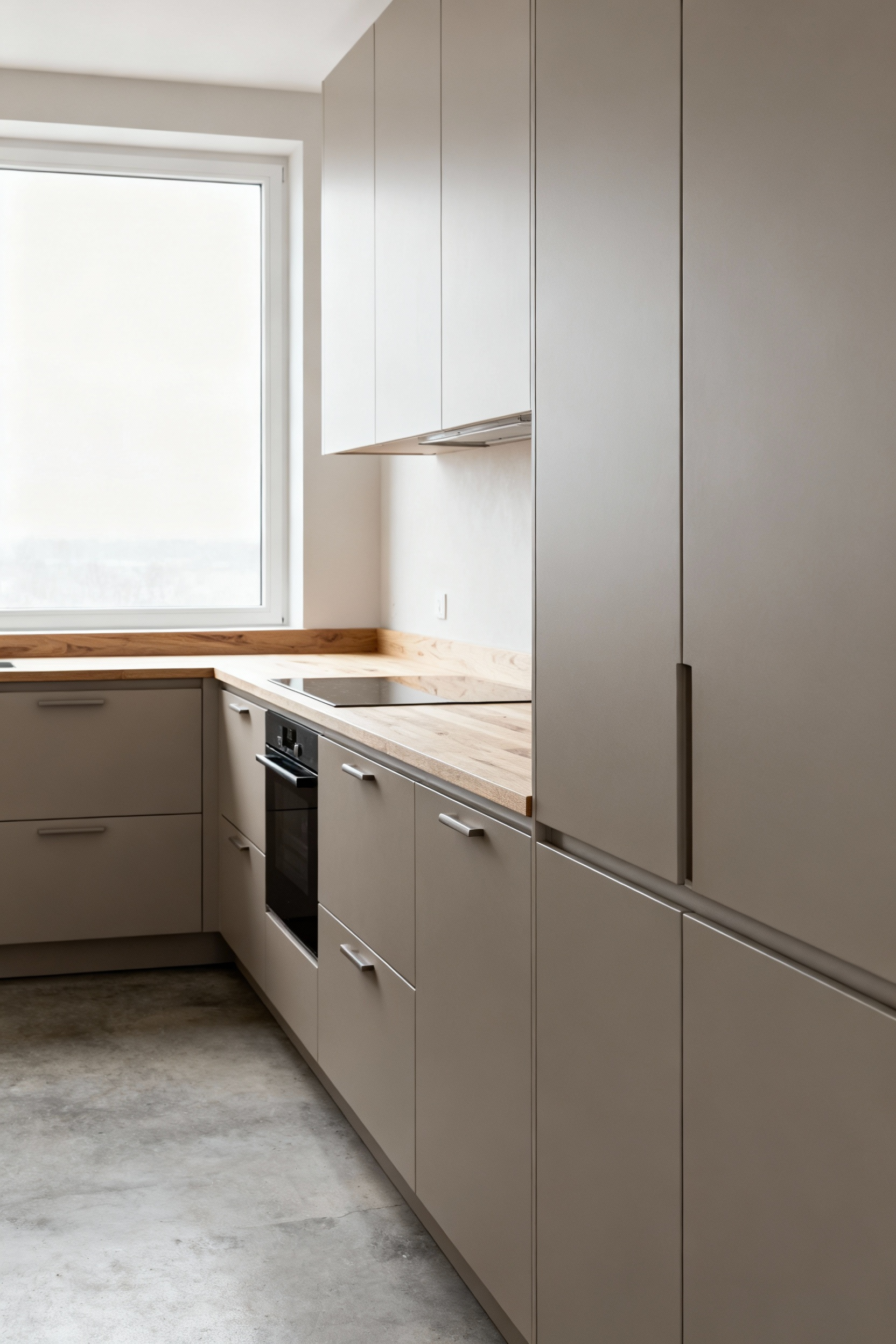
In my experience with Scandinavian design principles, these colors come alive when they echo natural materials. A muted clay pink cabinet door, for example, feels deeply connected to unglazed pottery. The texture of the cabinet, whether it’s the grain of the wood or the smoothness of the lacquer, becomes part of the color story. Spatially, these hues create a seamless, calming backdrop that makes a room feel larger and less cluttered, supporting a life of lagom—just the right amount.
A truly harmonious kitchen isn’t a collection of beautiful objects; it’s a single, cohesive composition. This requires us to look beyond individual colors and consider their tonal depth—how different shades and undertones interact across every surface. The goal is to create a ‘color story’ where cabinets, countertops, floors, and walls all speak the same quiet language. It’s about managing the subtle ebb and flow of light and shadow, not creating sharp, competing contrasts.
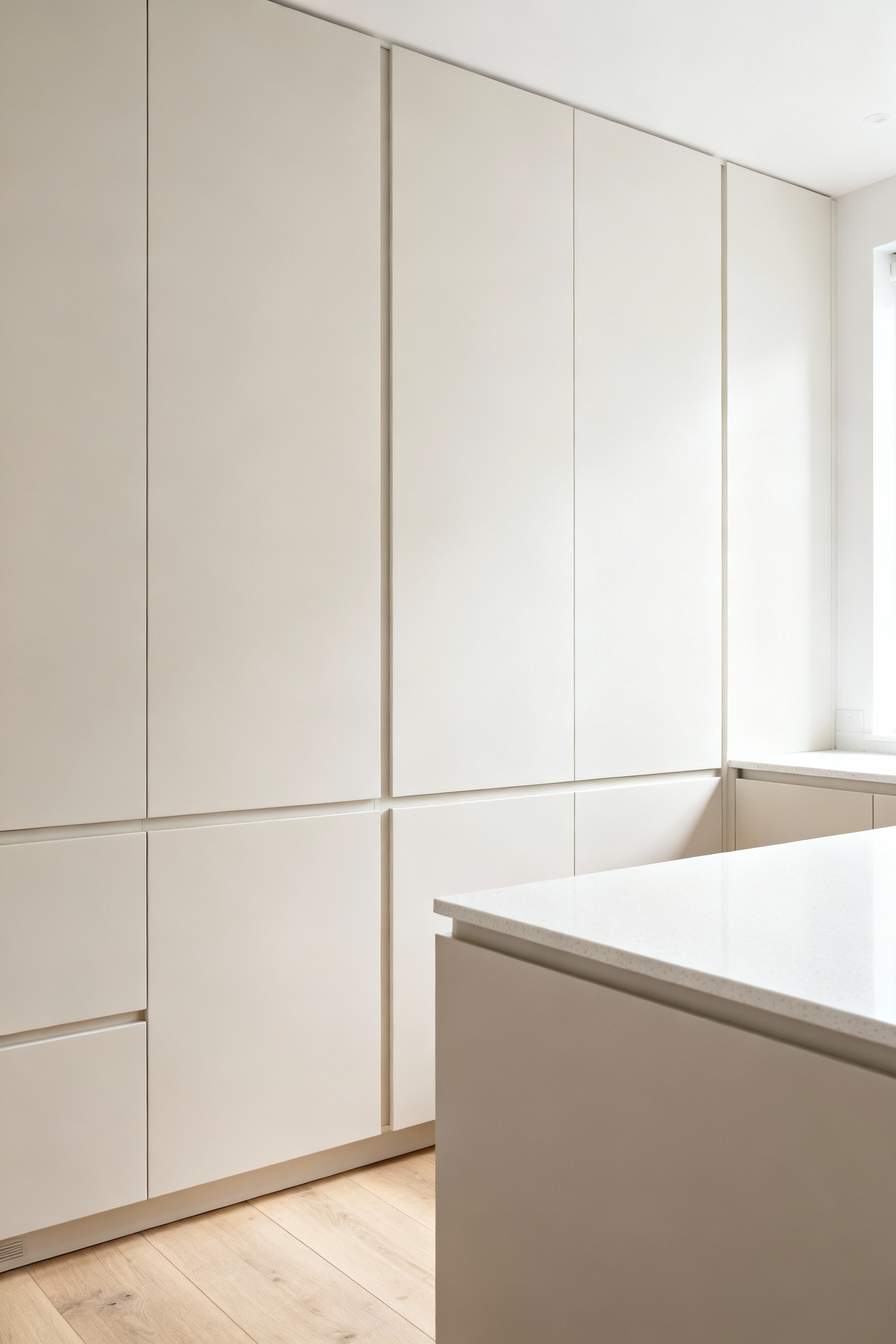
I’ve noticed that this is where many people get lost. They choose a cabinet color they love, then a countertop they love, without considering their relationship. A better way to put it is to think of it as a gradient. Imagine cabinets in a mid-tone grey-green, paired with a paler grey wall, a very light concrete counter, and natural light oak flooring. Each element is distinct, yet their tonal relationship is so carefully calibrated that the eye moves smoothly across the space. This is how you reduce visual noise and create an environment that feels inherently restful.
Here is the most important principle of all. We must prioritize the enduring over the ephemeral. Chasing fleeting trends is the antithesis of Scandinavian design. It’s a philosophy rooted in sustainability and mindful consumption—choosing with intent, so you don’t have to choose again soon. An enduring cabinet color is an investment in your home’s tranquility and value, freeing you from the exhausting cycle of constant updates.
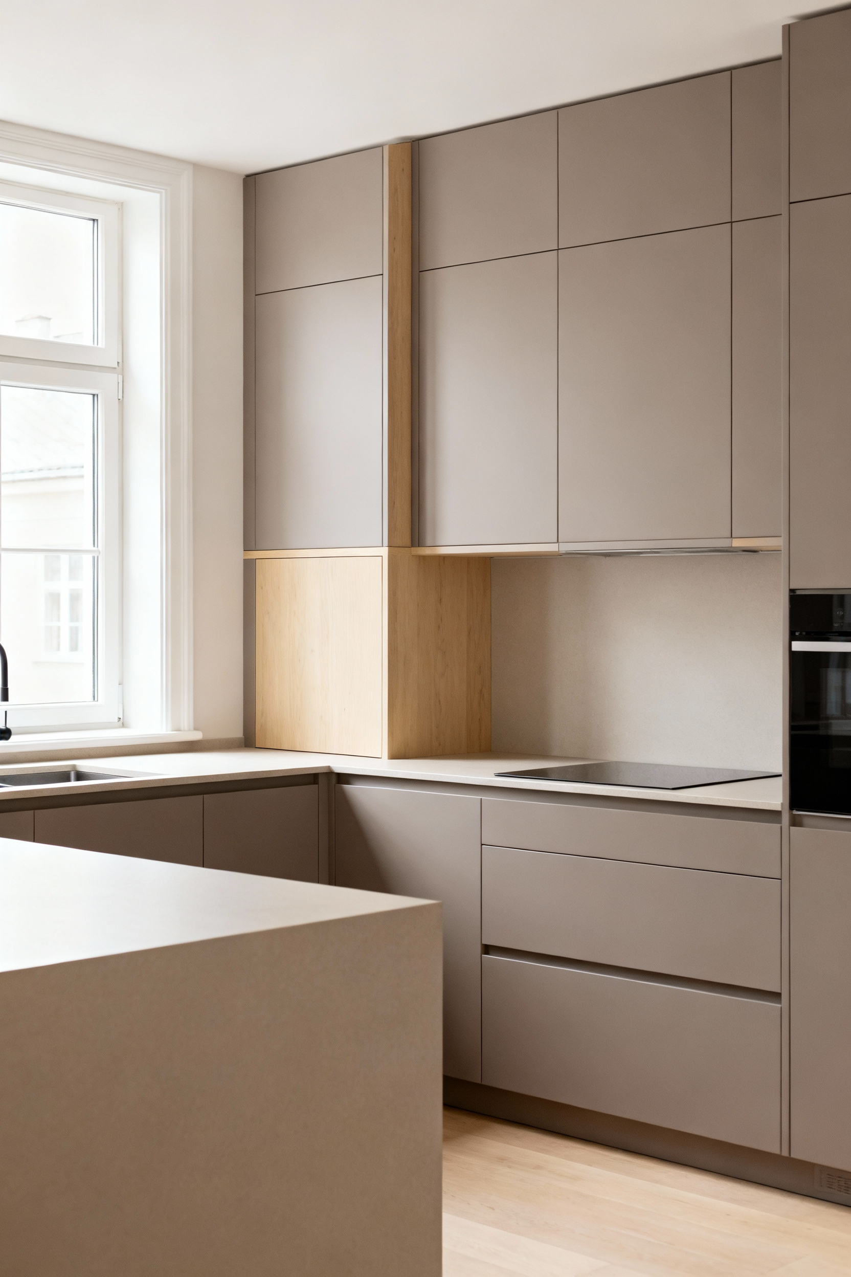
Years of working with hygge principles and natural materials taught me that longevity is about versatility. Classic whites, understated greys, and natural wood tones are timeless for a reason: they are quiet canvases. They allow you to change the feeling of your kitchen with textiles, art, or a simple vase of branches—things that are easy and sustainable to update. This mindset shift is liberating. It fosters a deep appreciation for your home as a constant, stable sanctuary, not a project that’s never finished.
Here we move deeper, exploring how color becomes a silent architect of atmosphere. A cabinet’s hue is not just seen; it is felt. It can shape our emotions, fostering calm and supporting the daily rituals of cooking and connection.
The color of your kitchen cabinets has a direct, if subtle, impact on your emotional state. In Scandinavian design, we use color to create a backdrop for a calmer life. This is why you so often see cooler, desaturated tones like soft greys, muted blues, and natural wood finishes. These hues are psychologically associated with order, calm, and spaciousness. While a vibrant color might provide a temporary jolt of energy, we are more interested in sustained well-being. The kitchen should be a retreat, not another source of overstimulation.
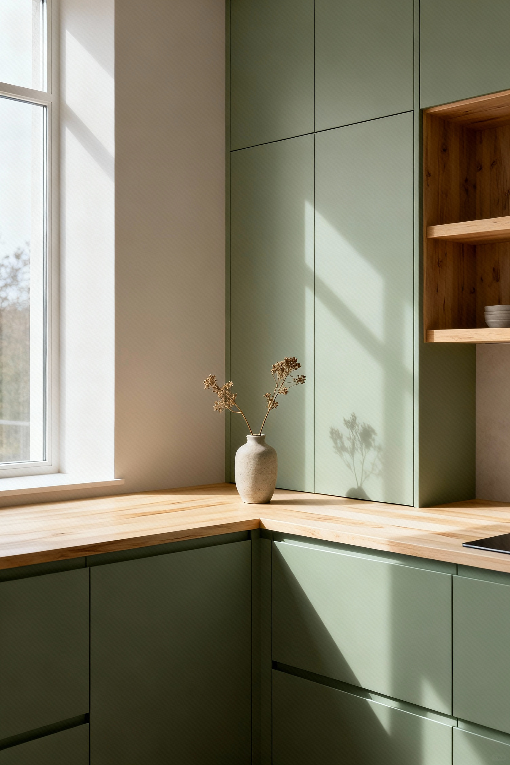
I learned this when working on a compact city apartment. The client was feeling overwhelmed by the constant noise of urban life. We chose a deep, muted fjord blue for the cabinets. The result was transformative. It wasn’t dark or oppressive; it was enveloping and serene. Paired with a matte finish that absorbed light softly, the kitchen became her quiet sanctuary. It proves that color, when chosen with emotional resonance in mind, is one of the most powerful tools for creating a truly supportive home.
The hue is only half the story. The way light touches a surface—whether it bounces off or is gently absorbed—completely changes our perception of color. Here we explore the critical relationship between finish and material, and how it shapes the atmosphere of your kitchen.
There is a profound quietude to a matte finish that aligns perfectly with our Nordic preference for understated elegance. Unlike gloss, a matte surface absorbs light, diffusing it gently across the surface. This simple act has a powerful effect: it enhances the purity of the pigment. The color appears deeper, richer, and more authentic, without the distraction of bright spots or reflections. A matte black feels like a profound shadow; a matte white radiates a soft, chalky glow.
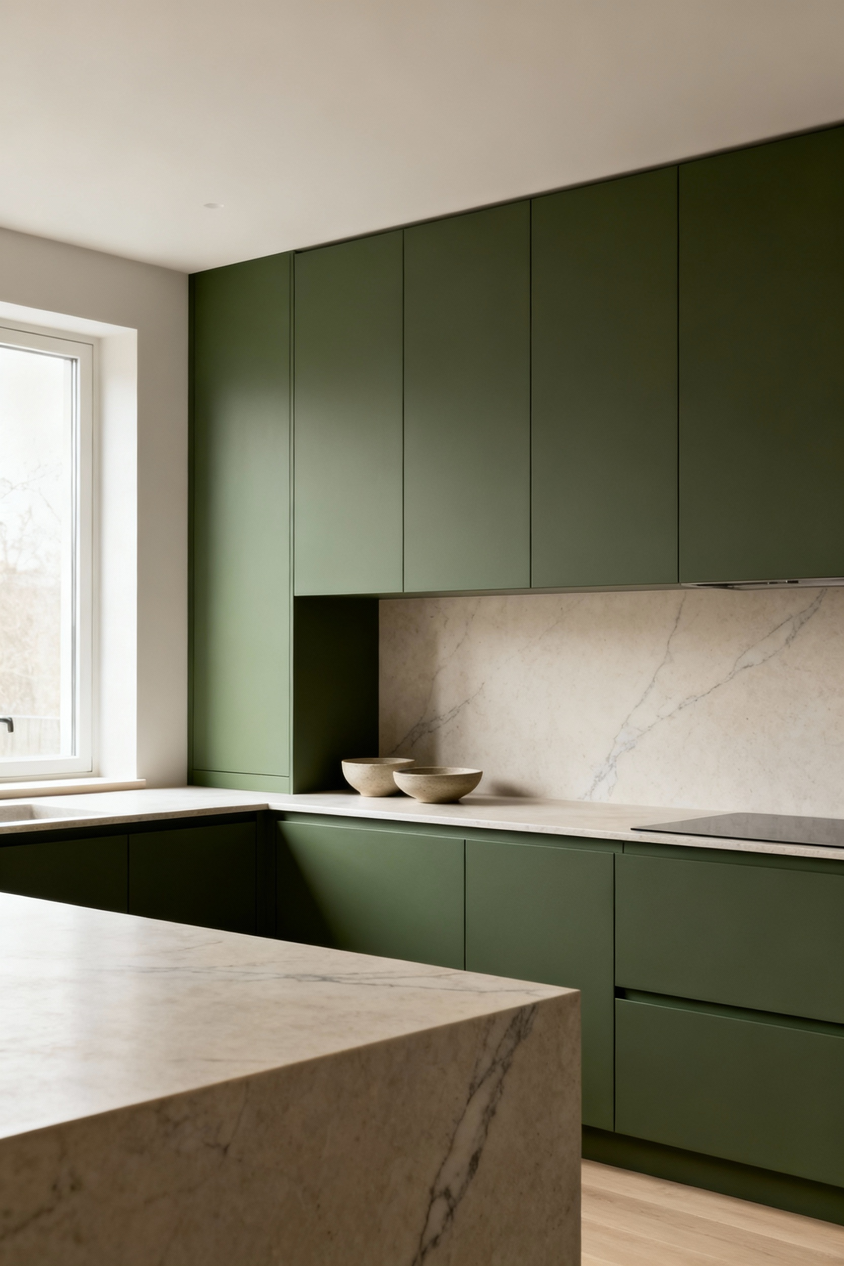
In my experience with Scandinavian design principles, a matte finish lends a tactile, almost velvety quality to a cabinet. It invites touch and grounds the color in a way that feels incredibly solid and real. It’s an excellent choice for creating serene, intimate kitchens, making a large space feel more welcoming and a smaller one feel seamless and calm. This is a finish for those who appreciate the subtle, felt sense of a room over its overt visual impact.
While my personal preference often leans toward matte, there is undeniable wisdom in the functional application of gloss. In climates where natural light is a precious commodity, a gloss finish can be a powerful ally. Its ability to bounce light around a room creates an immediate sense of spaciousness and energy. This is not about ostentation, but about practical light maximization—a core tenet of functional design.
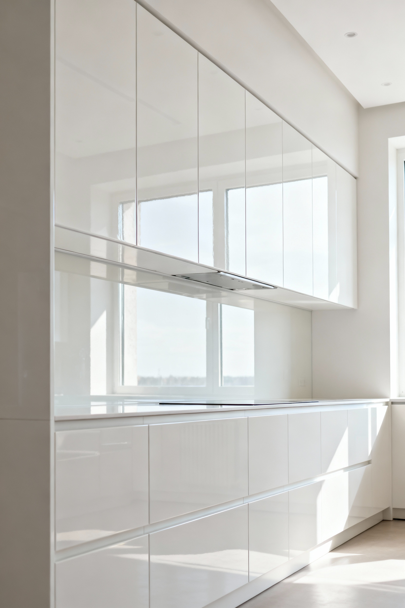
Here’s what’s interesting: a gloss finish makes color appear more luminous and vibrant. A brilliant white in high gloss can feel almost electric, dramatically brightening a dim space. Even a deep charcoal in gloss takes on a liquid, sophisticated depth, reflecting the life of the room back at you. What I tell my clients is that balance is key. To avoid a clinical feeling, you must pair gloss cabinets with grounding, textural elements—a matte countertop, a natural wood floor, or handmade ceramic tiles. This creates a dynamic yet harmonious dialogue between surfaces.
Our deep respect for natural materials means we often prefer to honor a material’s intrinsic character rather than conceal it. A transparent or semi-transparent stain on a wood cabinet is a perfect example of this. It isn’t about hiding the wood; it’s about engaging in a chromatic dialogue with it. The stain acts as a subtle veil, tinting the wood while allowing its unique grain, knots, and history to remain the hero of the story.
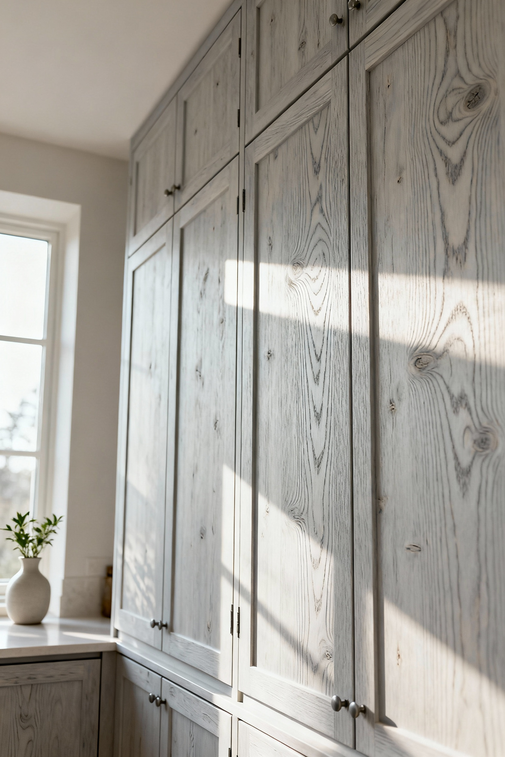
The final color is a co-creation between the stain and the wood species itself—the warm undertones of oak, the quiet grain of ash, the light spirit of birch. A light grey wash on oak, for instance, cools the wood’s warmth and highlights its prominent grain in a very contemporary way. What really gets me is the authenticity of this approach. It creates a warmth and depth that no opaque paint can ever replicate, bringing a tangible piece of nature into the heart of the home.
Sophistication in Scandinavian design is often found in what you don’t see—the seamless transitions. One powerful technique is to use integrated finishes, carrying a cabinet color or material onto adjacent surfaces like kick plates, wall panels, or appliance fronts. This blurs the traditional boundaries of the kitchen, creating a monolithic, almost architectural effect that is incredibly calming to the eye.
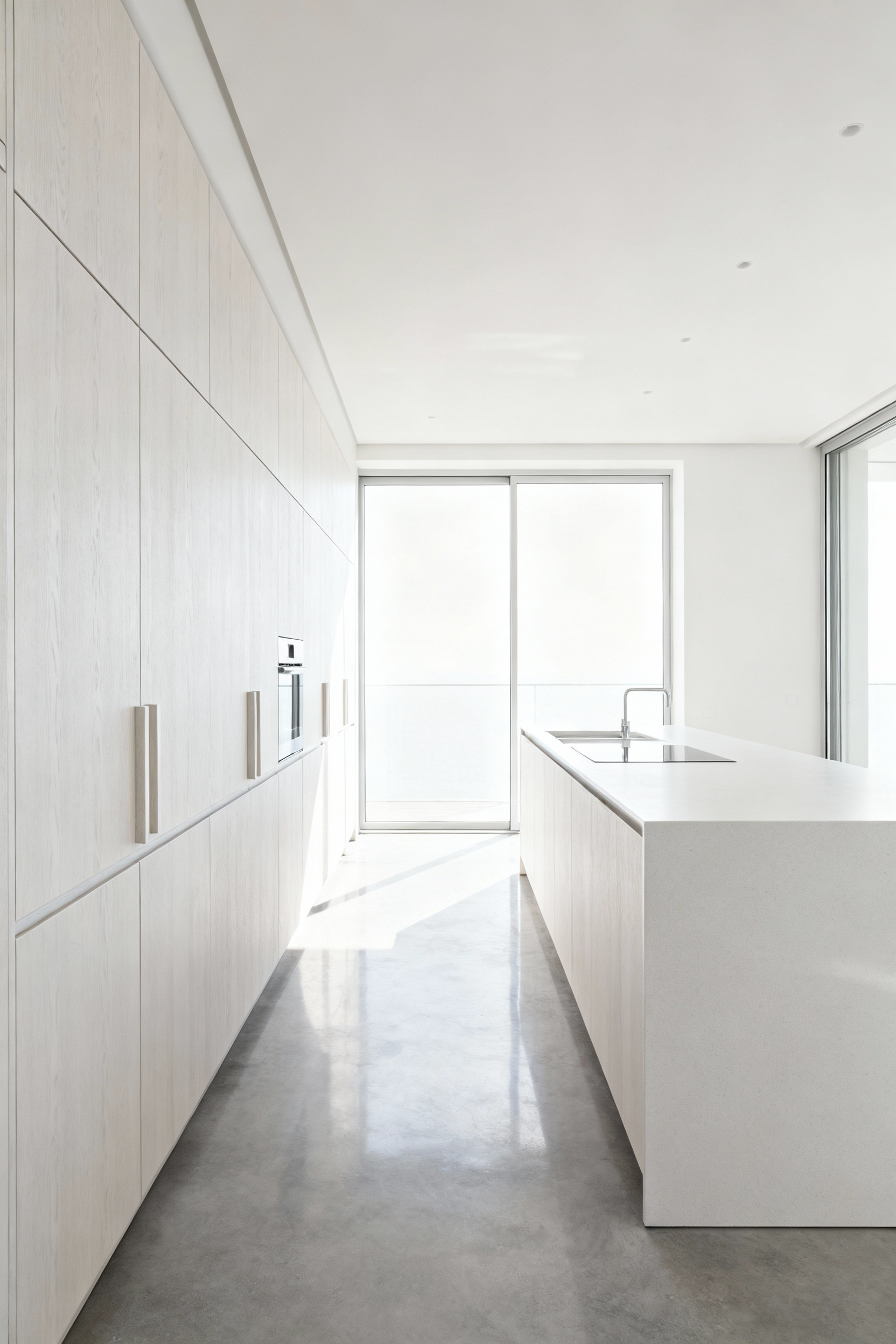
Years of Nordic interior design taught me that this method reduces visual clutter more effectively than almost anything else. Imagine a bank of tall cabinets in a muted sage green, where the same finish seamlessly covers an integrated refrigerator door and the pantry entrance beside it. The space no longer feels like a collection of separate objects, but a single, thoughtfully designed piece of furniture. It creates an uncluttered visual plane, allowing the kitchen to feel more spacious and serene.
We continue our exploration of materiality by looking at the small details that make a big impact. Even the smallest element, like a cabinet pull, can modulate our perception of the kitchen’s entire color story, proving that every choice matters.
The choice of hardware is never just a final detail; it is a critical chromatic modulator. The type of metal you choose can fundamentally alter the perceived warmth or coolness of your cabinet color. Think of it as seasoning for your color palette—a small addition that changes the entire flavor.
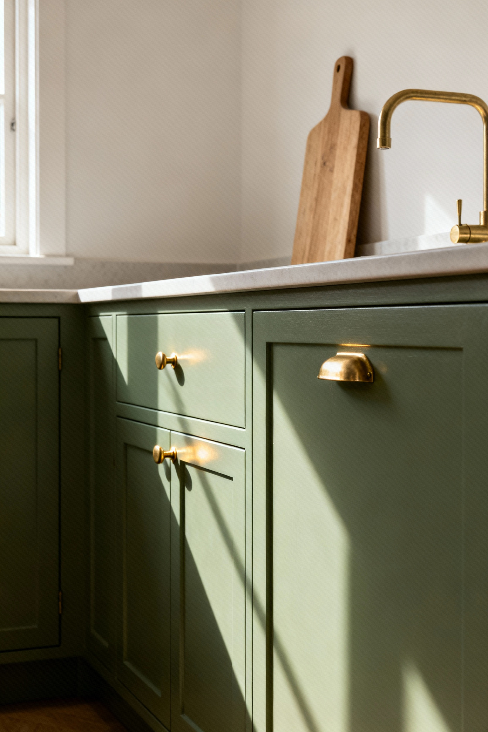
Polished brass, with its warm golden glow, will cast a subtle warmth onto surrounding surfaces. In my work with natural materials, I’ve seen it pull the creamy undertones out of an off-white cabinet or enrich the earthy quality of a muted green. In contrast, brushed stainless steel or matte black hardware has a cooling, sharpening effect. It lends a graphic precision that makes colors appear crisper and more modern. A simple hardware change can shift the entire mood of the kitchen without a single drop of paint.
Now we elevate our thinking. Color is not just a surface treatment; it is an architectural tool. With thoughtful application, we can use cabinet colors to reshape our perception of a room, making it feel larger, more grounded, or better illuminated.
In a smaller kitchen, the right cabinet color can be a form of architectural magic. By deploying lighter tones—crisp whites, soft creams, pale greys—we can orchestrate a sense of visual expansion. These hues have a high light reflectance value (LRV), meaning they bounce more light back into the room. This makes the surfaces appear to recede, optically pushing the walls back and making the space feel more open and breathable.
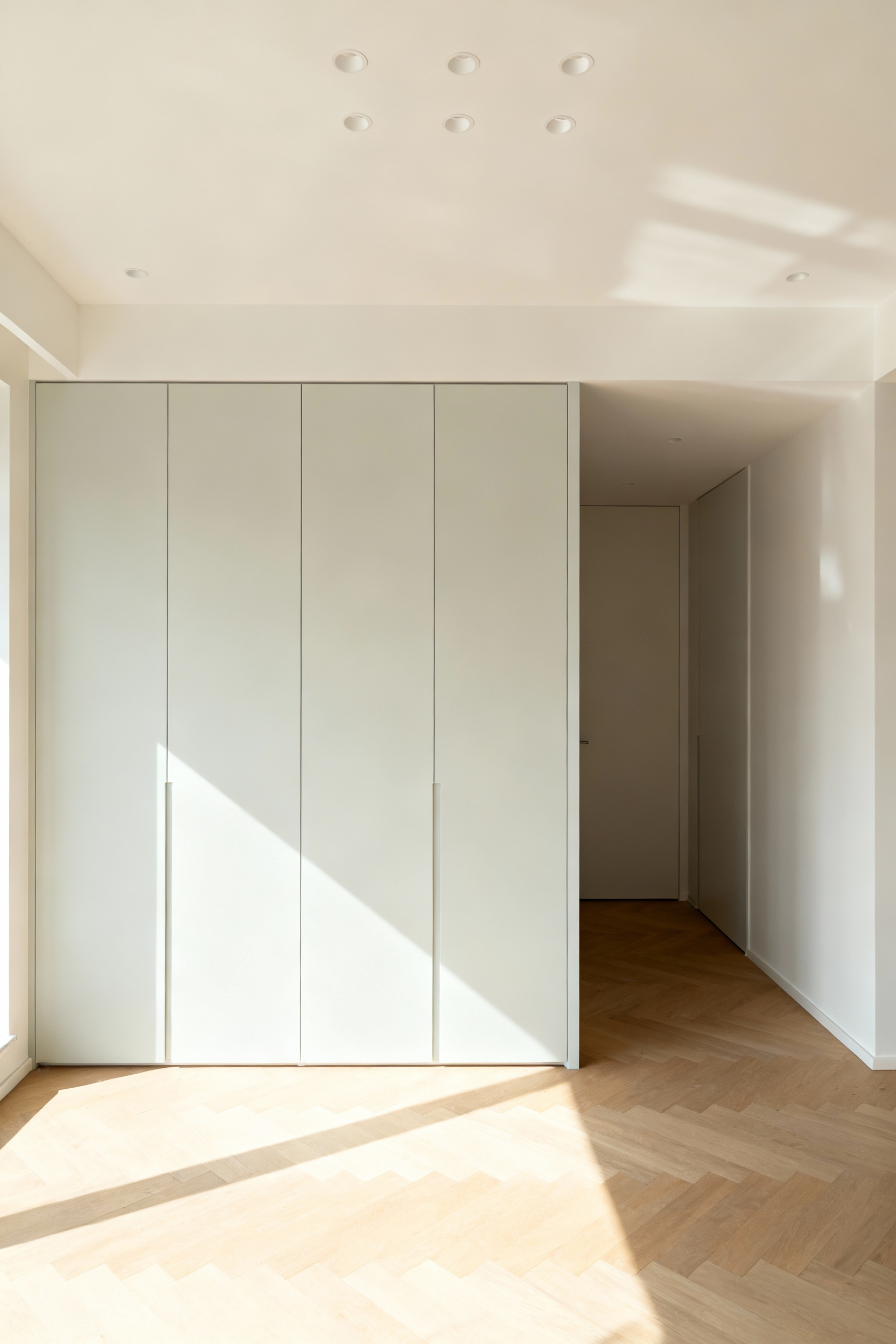
What I tell my clients seeking functional minimalism in small spaces is that this isn’t just about white. A very pale, desaturated sage or blue can achieve the same effect while adding a touch of personality. The goal is to dissolve the hard edges of the cabinetry into the background. This creates an unhindered visual path, allowing the eye to move freely and fooling the brain into perceiving a larger, more accommodating space.
In an expansive open-concept space, the challenge is often the opposite: how do you define the kitchen and keep it from feeling adrift? Here, deeper, more saturated cabinet shades—charcoal, deep navy, forest green—act as a vital architectural anchor. While light colors recede, dark colors advance, giving them a visual weight that provides stability and creates a clear sense of place.
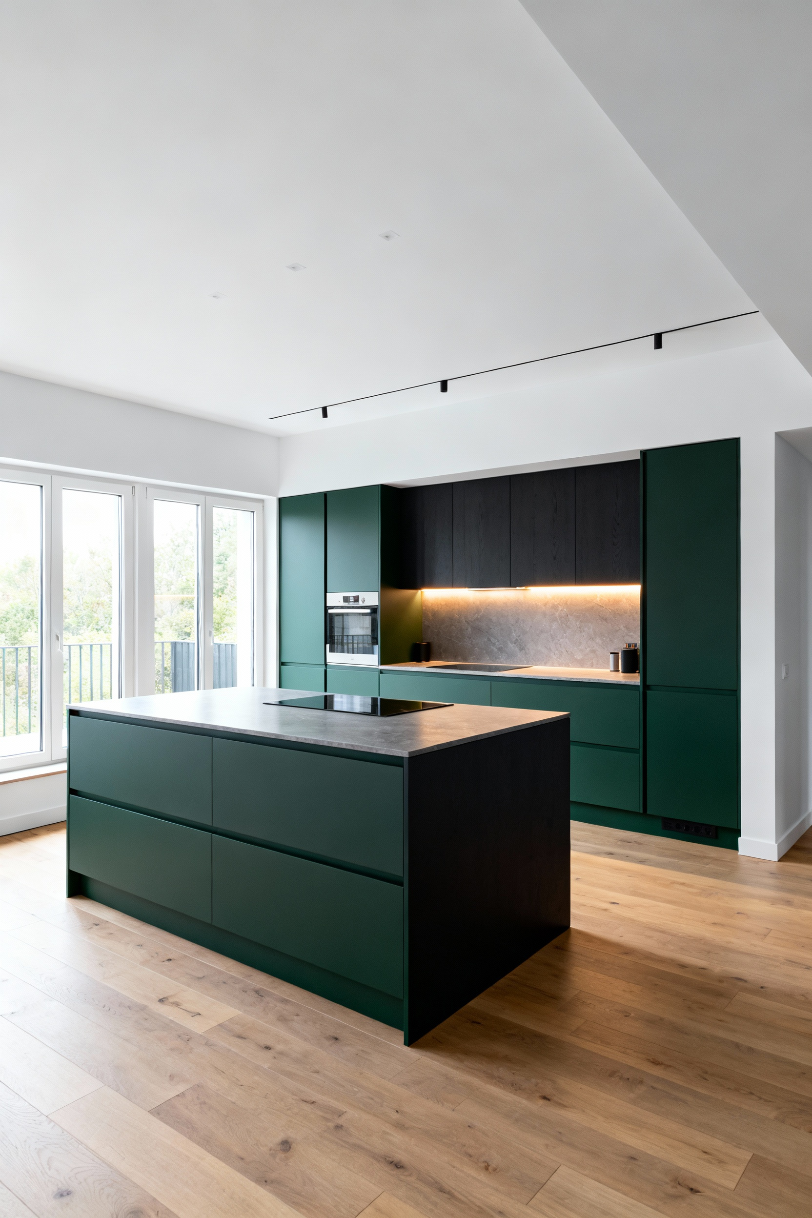
I learned this when designing a large loft. We used a deep charcoal for the base cabinets and the island. Instantly, the kitchen became the gravitational center of the entire living area. It felt grounded, substantial, and inviting. You can use this principle to establish a strong horizontal line with base cabinets or make an island feel like the true hearth of the home. It’s a powerful way to bring intimacy and focus to a large, open room.
Using two different cabinet colors is more than a stylistic choice; it’s a strategic tool for spatial manipulation. The most common application—a lighter color for upper cabinets and a darker one below—is brilliant because it works on multiple levels. The darker base cabinets ground the space, while the lighter uppers seem to recede, making the ceiling feel higher and the room feel more airy.
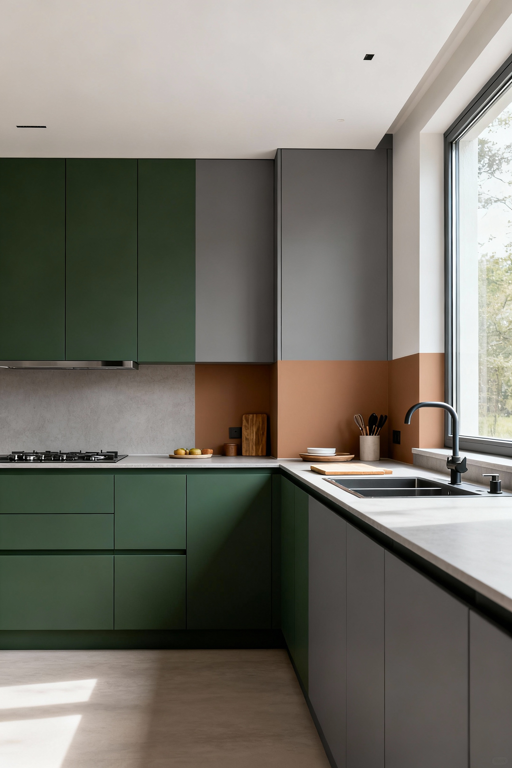
But this isn’t the only way. I’ve noticed a growing interest in using color to zone functionality. For instance, an entire wall of floor-to-ceiling pantry cabinets might be done in a distinct, deep hue to signal its function as a storage hub, while the primary cooking area remains in a lighter, calmer tone. This creates an intuitive, organized kitchen where the design itself guides your workflow, a perfect expression of functional beauty.
For kitchens that suffer from a lack of natural light—perhaps they are north-facing or have small windows—the cabinetry must become an active part of the solution. This is where color and finish work together as an instrument for light modulation. The goal is to turn the cabinets from light-absorbing objects into light-enhancing surfaces.
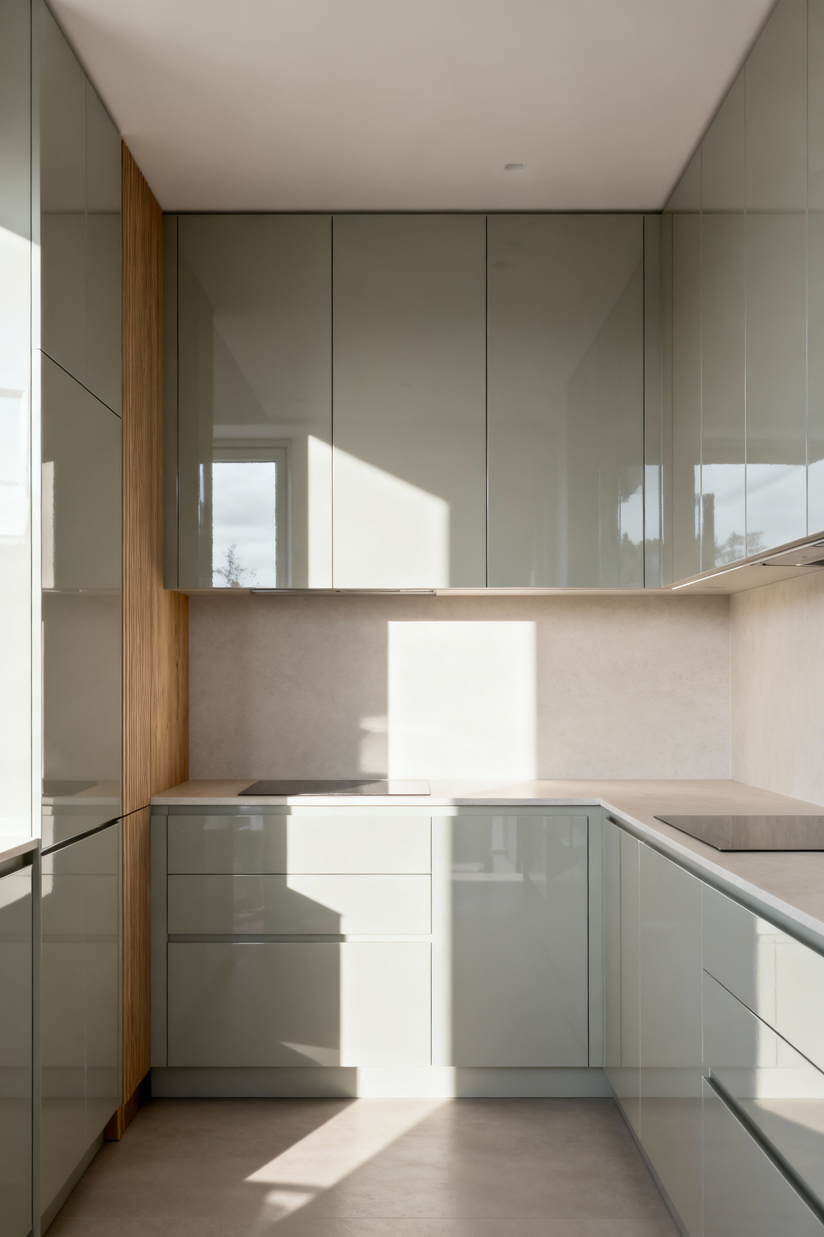
The most effective strategy combines a light color with a reflective finish. Pristine whites, cool pale greys, or even very light woods in a semi-gloss or high-gloss lacquer will catch and propagate any available light, dispersing it throughout the room. What really gets me is the impact on daily life. A brighter kitchen is simply a more pleasant place to be. By engineering the cabinetry to amplify illumination, we can transform a somber space into a welcoming one, proving that thoughtful design can solve very real, practical problems.
We now expand our architectural view to the entire room. A cabinet color never exists in a vacuum. It must engage in a deliberate, harmonious dialogue with the other fixed elements of the space—the floor, the backsplash, the countertops—to create a truly cohesive and enduring design narrative.
The ultimate sophistication in kitchen design comes from chromatic symbiosis—when the cabinet color exists in perfect harmony with the flooring and backsplash. These foundational elements have their own colors, textures, and undertones that must be respected. Ignoring them is like inviting three musicians to play in different keys. The result is visual noise.
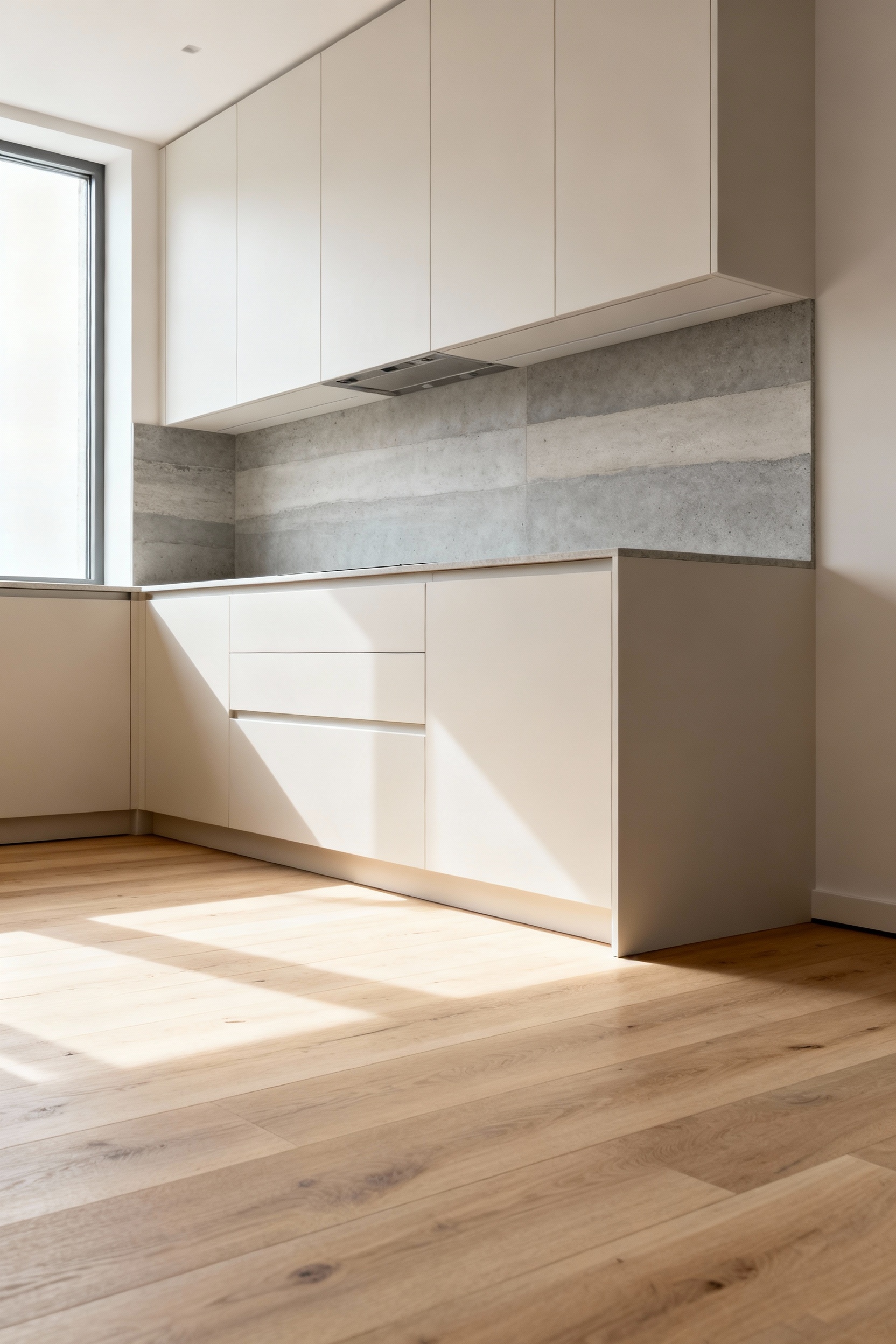
Years of Nordic interior design taught me to start by observing the “givens.” Does your wood floor have warm, golden undertones? If so, a cabinet color with a cooler undertone might create a beautiful balance. Does your stone countertop have subtle grey veining? Perhaps that exact grey can be picked up in a slightly lighter or darker shade for the cabinets. It is this thoughtful conversation between surfaces that creates a serene, integrated space where every element feels intentional and part of a larger, calmer whole.
Finally, we arrive at the most personal intersection of design: where aesthetic choices meet the practical realities of everyday life. A truly well-designed kitchen looks beautiful not just on day one, but after years of daily use. This requires us to select colors that are not only pleasing to the eye, but are also durable, forgiving, and aligned with how we want to live.
Functional beauty means a kitchen must withstand the rigors of life. The ideal cabinet color should not only be beautiful but also forgiving. It must be able to gracefully handle the smudges, splashes, and minor bumps of a well-loved and well-used kitchen. This practical consideration is a cornerstone of sustainable, long-term design.
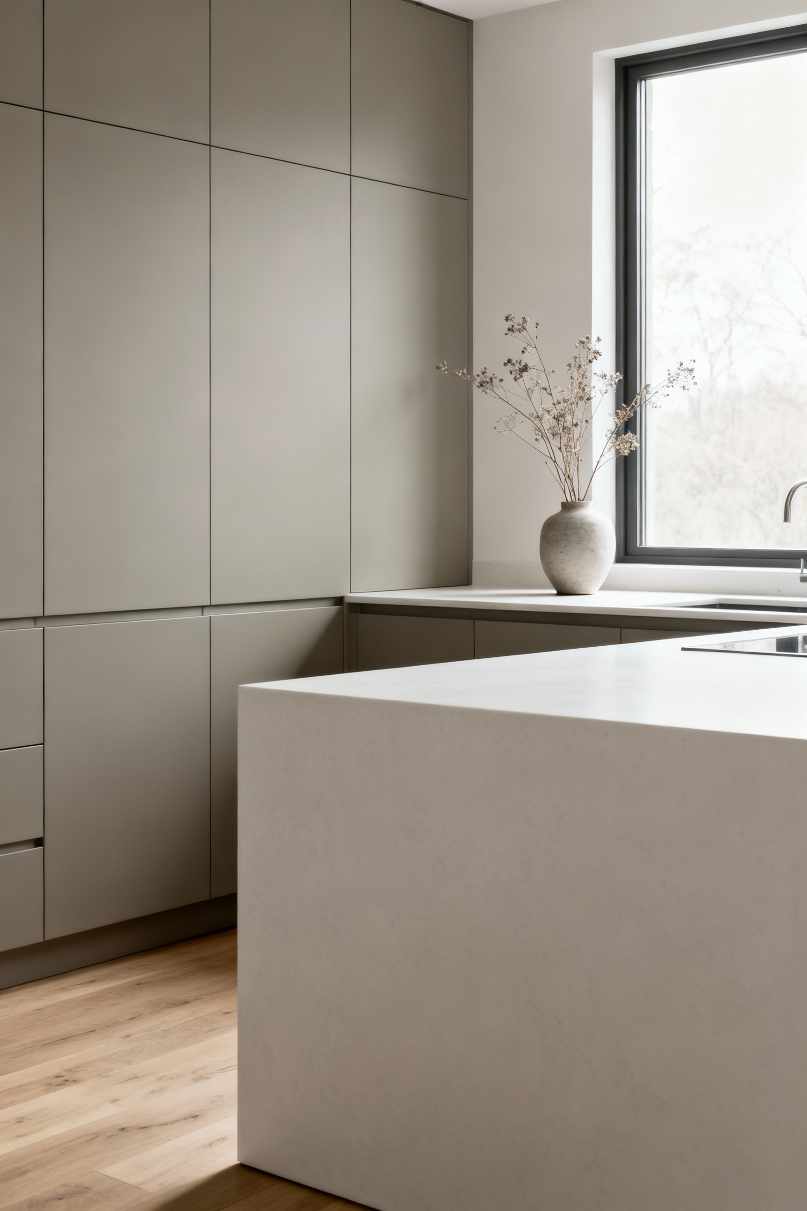
In my experience, mid-tones are the unsung heroes of the family kitchen. While a very dark color shows every speck of dust and a stark white highlights every splatter, a mid-tone grey, a muted sage green, or a warm greige has a remarkable ability to camouflage minor imperfections. The finish is equally critical. A subtle satin or eggshell finish offers a good balance, being easier to clean than a pure matte but less likely to show every fingerprint like a high gloss. Choosing a forgiving color is an act of kindness to your future self.
A kitchen is a significant investment. Future-proofing its aesthetic is not only wise, but it is also a sustainable practice. This means choosing cabinet colors that possess an inherent adaptability—a timeless quality that provides a serene backdrop for evolving tastes and styles. This is about creating a foundation so strong it doesn’t need to be changed.
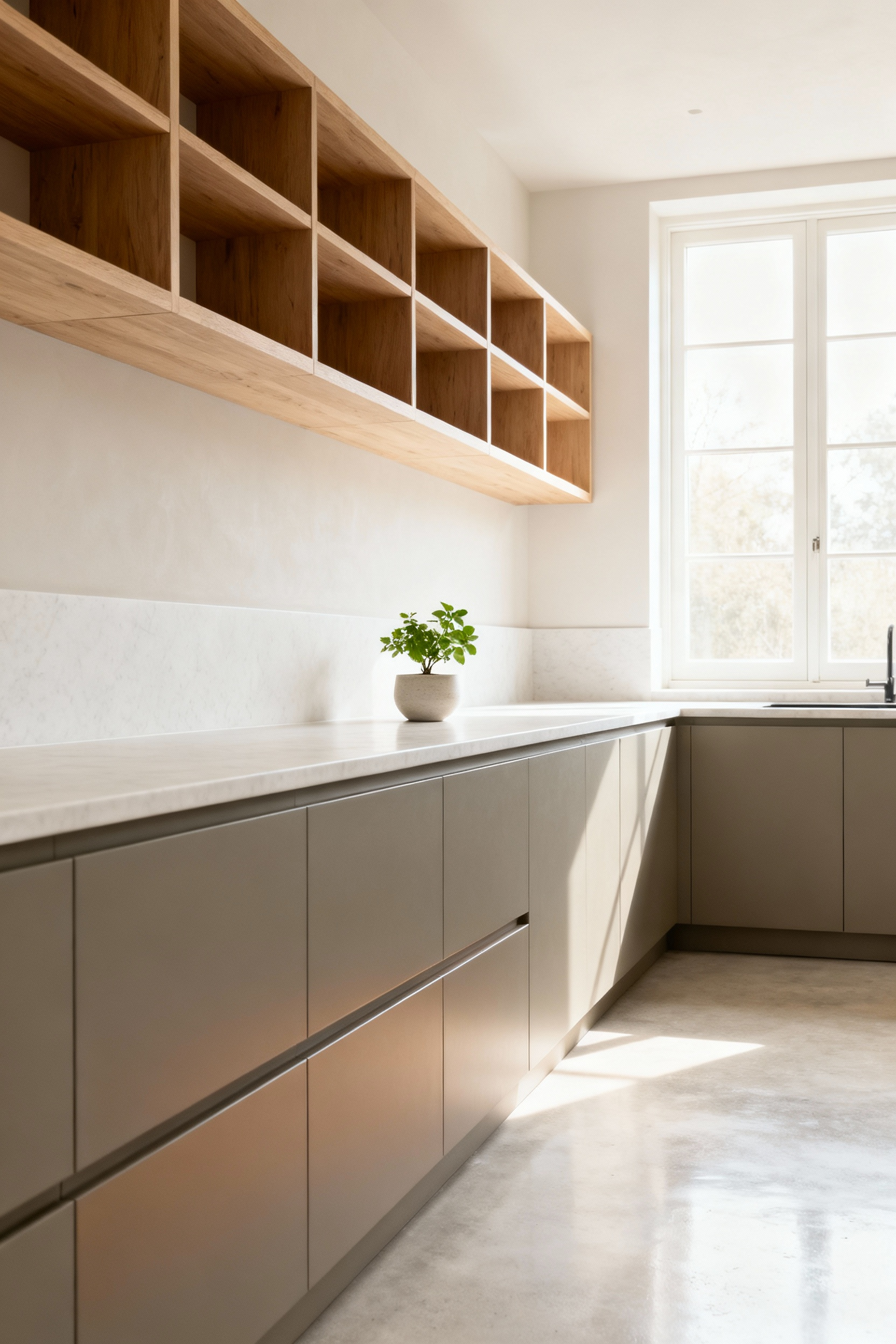
What I tell my clients seeking warm, minimalist spaces is to focus on nuanced neutrals. Not just grey, but a grey with a subtle green or blue undertone. Not just white, but a warm off-white that feels soft and inviting. These sophisticated neutrals are chameleons; they can harmonize with a wide array of future wall colors, backsplash updates, or hardware changes. They provide a quiet, elegant canvas that allows the kitchen to be refreshed over the years without a costly and wasteful full renovation.
Biophilia—our innate human need to connect with nature—can be a powerful guide in color selection. Integrating an organic palette transforms the kitchen from a purely functional space into a restorative one. This is about harnessing the calming psychological power of colors drawn from the natural world to create a sanctuary in the heart of your home.
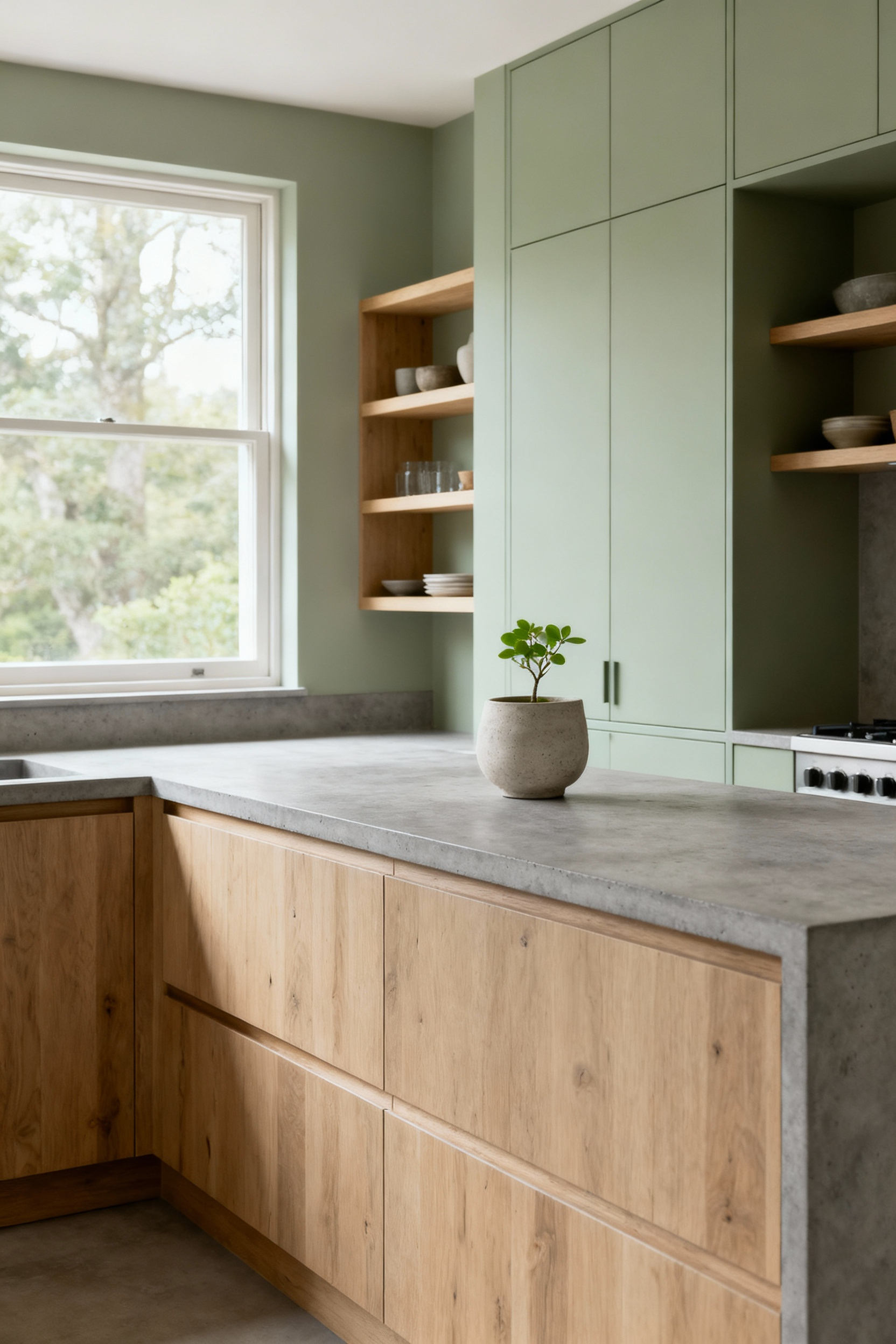
This goes far beyond just green. Think of the entire natural spectrum: the deep blues of a Nordic sea, the warm terracotta of clay, the sandy beige of a windswept coastline, and the myriad tones found in natural wood. The goal is to create a subtle immersion. I learned this when I helped a client choose a very soft, dusty blue for their cabinets, paired with light ash countertops. The room instantly felt calmer, like looking at a quiet morning sky. It’s a reminder that a connection to nature fosters a deeper sense of well-being.
We must talk about cleanability. It is a deeply practical, yet often overlooked, aspect of choosing a cabinet color and finish. A kitchen that is easy to maintain is a kitchen that brings more joy and less stress. This aligns perfectly with the Scandinavian ethos of functional, simple living. The design should support your life, not add to your list of chores.
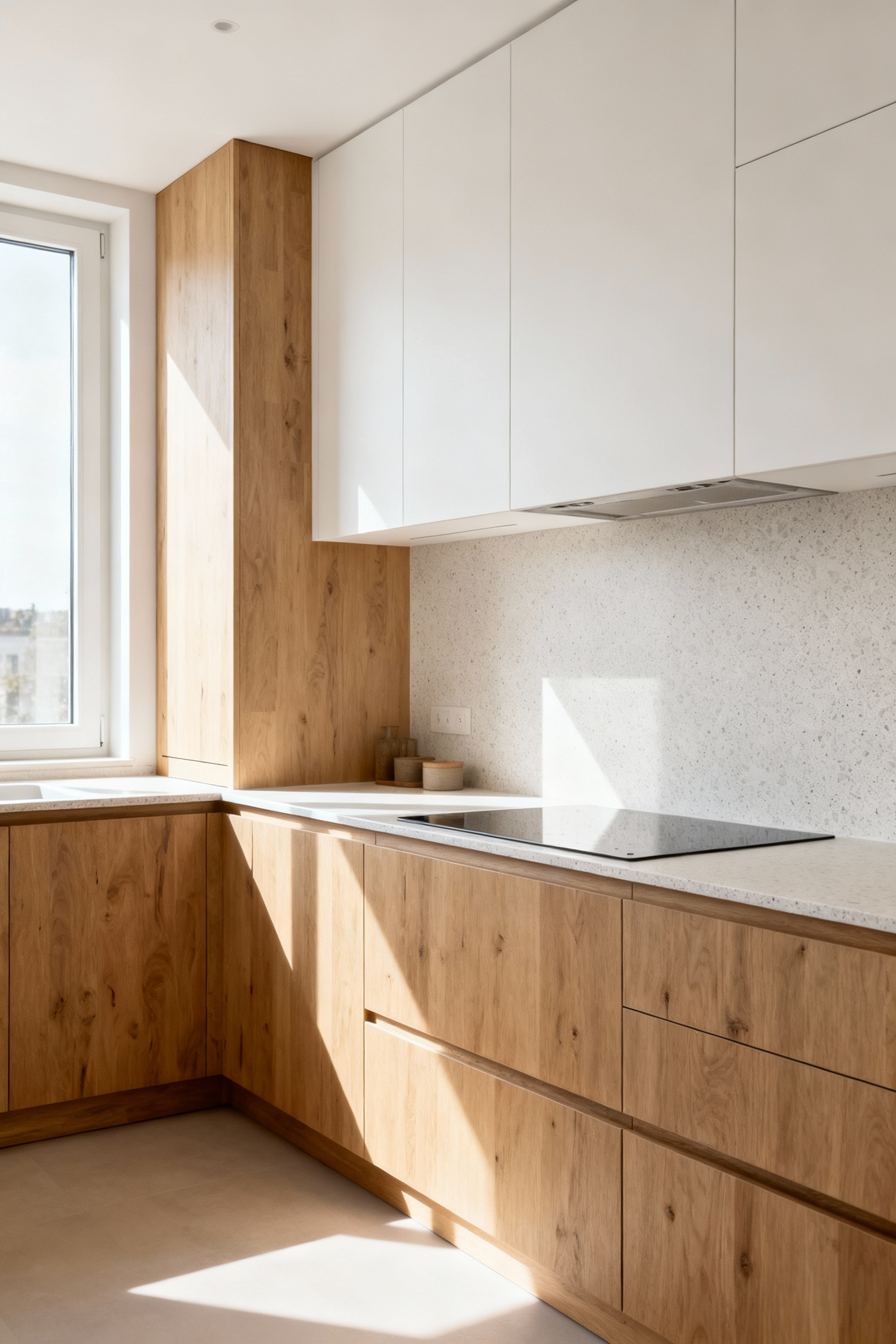
Here’s the truth: different surfaces demand different levels of care. A super-matte finish, while beautiful, can sometimes be more susceptible to showing oily fingerprints than a surface with a slight sheen. High-gloss is notoriously high-maintenance. Dark tones often show streaks more than lighter ones. My advice is always to balance your aesthetic desire with an honest assessment of your lifestyle. For a busy family, a mid-tone cabinet in a durable satin finish is often the wisest, most beautiful choice in the long run.
In our final reflection, we consider the kitchen’s color narrative as a whole. It must be consistent and intentional, a unified composition that reflects a deep understanding of design principles and, most importantly, feels authentically you. This is the ultimate goal of a curated life: to create a space that is a true expression of enduring calm and personal values.
To create a kitchen with enduring soul, you must have an intentional color narrative. This means every color choice, from the largest cabinet run to the smallest detail, is part of a deliberate and cohesive story. Without this clear intention, a kitchen can quickly become a collection of nice things that don’t speak to each other, resulting in a subtle but persistent visual unrest.
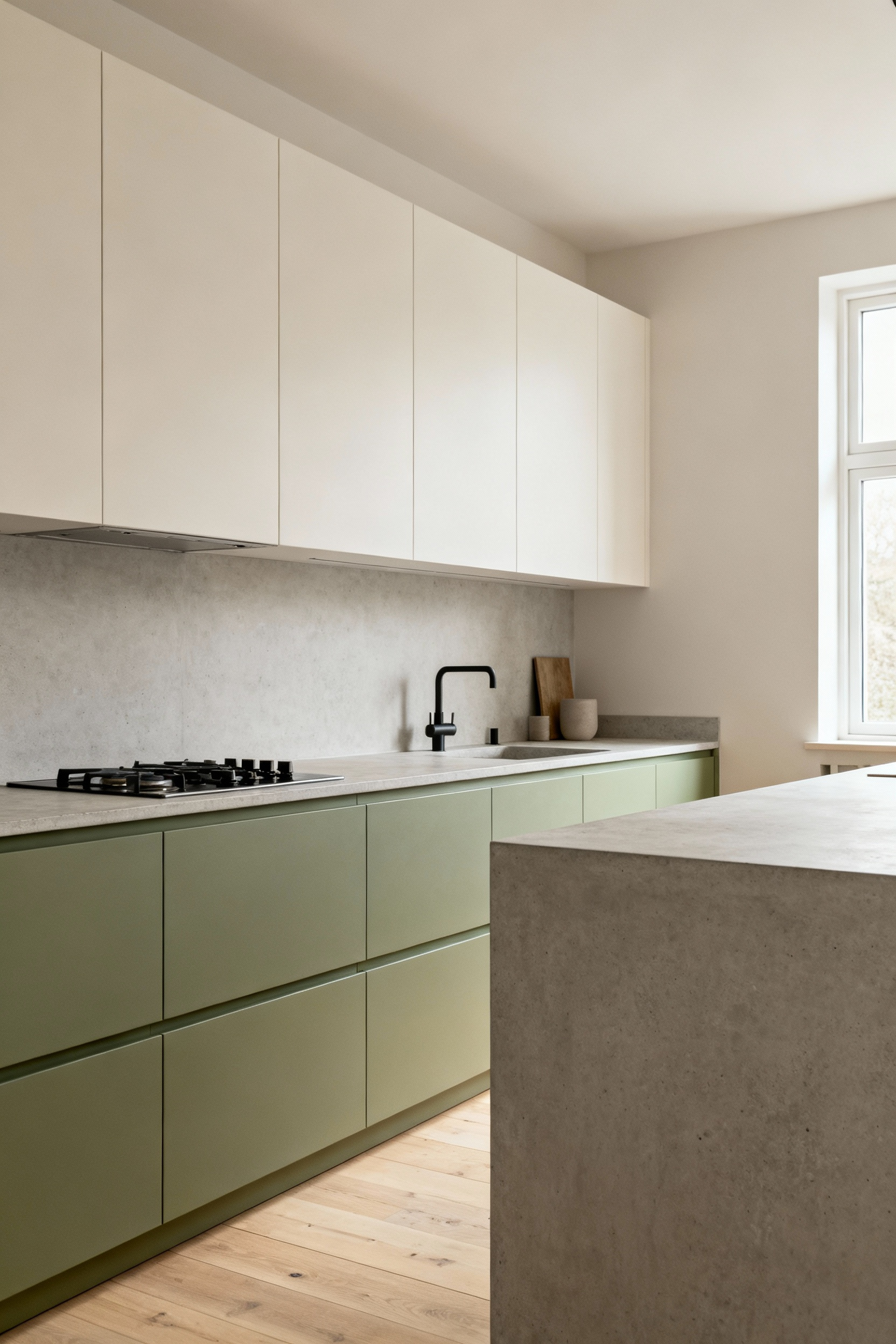
Years of working with hygge principles taught me that this is less about rules and more about discipline. Limit your palette. If your cabinets are a deep, muted green, your walls should probably be a warm off-white, and your flooring a neutral grey or wood. Let contrast come from texture, not from competing colors. This consistent, considered approach is what fosters that sense of profound calm and order. It is the final, crucial step in creating a kitchen that is not only beautiful to look at, but deeply and lastingly beautiful to live in.
We began by questioning the fast-fashion approach to kitchen design. The twenty principles we’ve walked through offer a different path—one guided by longevity, function, and a quiet respect for material and light. They prove that the most impactful kitchen cabinet color ideas are born not from chasing trends, but from a deeper understanding of how to create a supportive and serene environment. This is the core of the Scandinavian way: functional beauty that endures.
You now have a framework that moves beyond the surface. Use these tenets not as rigid rules, but as a lens through which to see your own space. Trust in the power of subtlety, the wisdom of restraint, and the enduring value of quality over quantity. Let your choices be an intelligent investment in your daily contentment. By doing so, you will create a kitchen that feels right for decades—a true and timeless heart for your home.