Physical Address
304 North Cardinal St.
Dorchester Center, MA 02124
Physical Address
304 North Cardinal St.
Dorchester Center, MA 02124
Stop fighting your small kitchen! Discover 23 director-approved designs and smart solutions to maximize space, light, and style for a blockbuster cooking experience.
Picture this: You’re standing on set. The scene is a cramped kitchen, lit by a single, harsh overhead bulb casting dramatic, unflattering shadows. Every time our hero—that’s you—opens the refrigerator, the door hits a cabinet and completely blocks the only path through the room. Getting a glass of water becomes a poorly choreographed stunt sequence. It’s a scene from a claustrophobic thriller, not the heartwarming family comedy it’s supposed to be.
You know what people always ask me? How do you take a set that small and make it feel epic? Forget corporate speak and rulebooks. This is about production design for your life. It’s not about making the room bigger; it’s about directing the space, managing the light, and choreographing the action. So, let’s scrap the bad script and rewrite your kitchen scene. Here’s the real story on how to make a small kitchen feel like a blockbuster.
Before a single light is switched on or a camera rolls, a director blocks the scene. We decide where the actors move and how the space tells the story. Your kitchen is no different. This first act is all about the script and the floorplan—getting the fundamental movements right so the final performance is seamless, not a clumsy outtake.
That term, the “Work Triangle,” sounds like some technical nonsense from a textbook. Forget that. Think of it as choreography. It’s the three key marks on your set: the fridge (where the action starts), the sink (your main prep station), and the stove (the fiery climax). In filmmaking, we call this blocking. You need clean, efficient paths for your actors to move between these marks without tripping over set pieces or each other.
The design gurus will tell you each leg of the triangle needs to be between 4 and 9 feet long. That’s for a sprawling suburban soundstage. On a tight, indie film set—your kitchen—the only rule that matters is flow. Can you pivot from one station to the next with grace? Can you grab onions from the fridge, rinse them at the sink, and chop them next to the stove without running a marathon? The real enemy is a layout that forces you to take ten steps for a three-step task. That’s just bad direction.
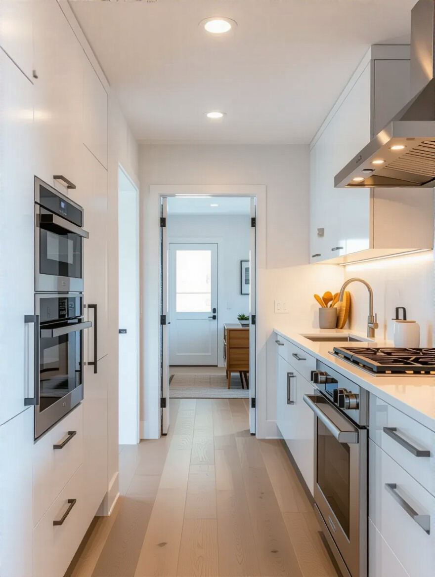
Every great scene needs the right set. For a small kitchen, your best bets are the Galley or the L-Shape. Think of the Galley—two parallel counters—as the ultimate efficiency set, like the cockpit of a starfighter. Everything is within arm’s reach. It’s lean, mean, and incredibly functional, designed for a focused performance. There’s no wasted movement, just a clear corridor for action.
An L-shaped layout, which uses two adjoining walls, is more like a wider shot. It opens up the floor, making it feel less like a corridor and more like a corner of a larger scene, which is perfect if your kitchen bleeds into a living or dining area. This setup is brilliant because it keeps the primary action contained to the “L,” preventing foot traffic from crashing your scene while you’re trying to work. Both layouts are classic for a reason: they respect the tight space and prioritize clean, simple blocking.
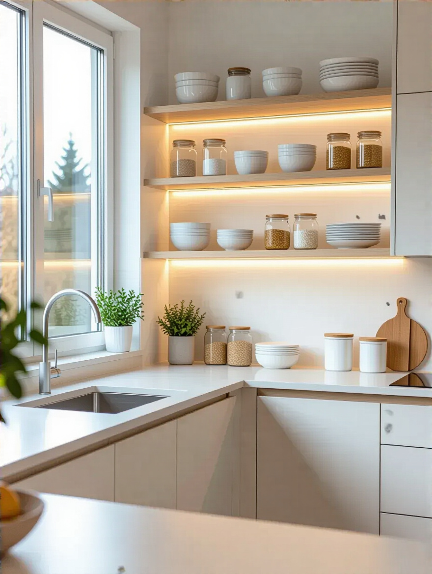
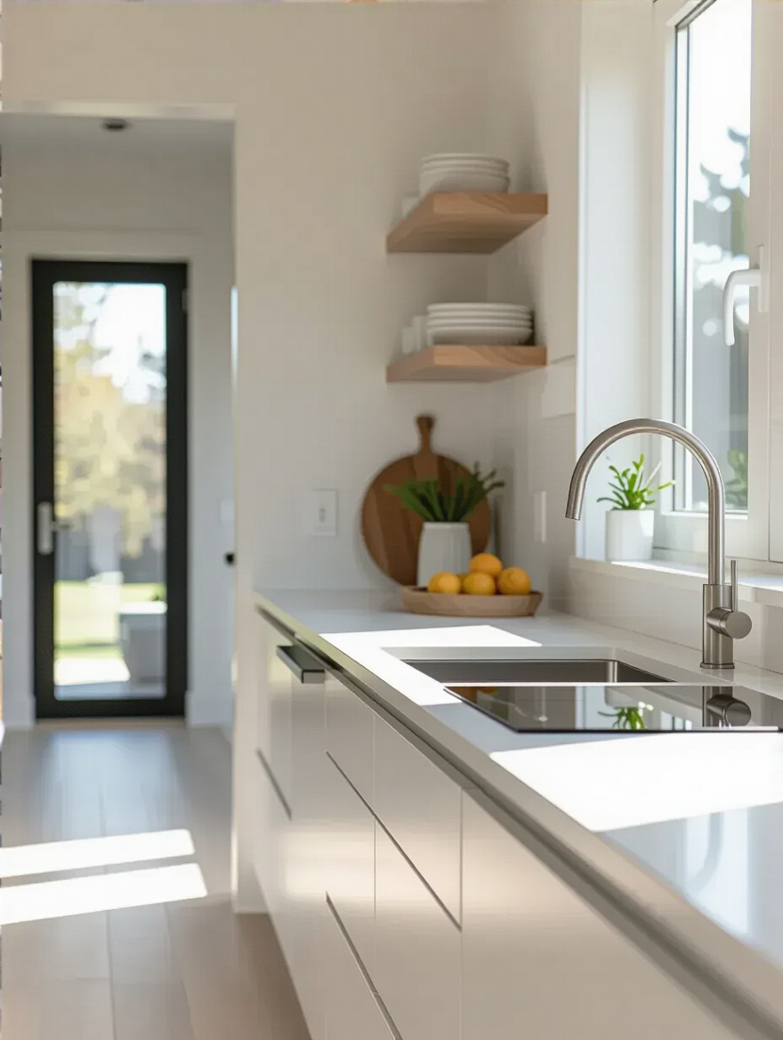
In cinema, we use lines to control where the audience looks. You can do the same thing in your kitchen. Standard cabinets that stop a foot short of the ceiling create a clunky horizontal line that visually chops your room in half, making it feel short and squat. It’s a classic rookie mistake. Taking your cabinets all the way to the ceiling creates powerful vertical lines that draw the eye up, making the whole room feel taller and more grand.
This isn’t just a visual trick; it’s a massive storage win. You gain an incredible amount of real estate for those once-a-year items—the turkey platter, the giant punch bowl. It also eliminates that dusty, greasy dead space on top of cabinets that nobody ever wants to clean. It creates a seamless, built-in look that feels intentional and high-end. It tells the viewer, “This set was designed with precision.”
Freestanding appliances are like rogue actors who refuse to hit their marks. They jut out, they create awkward gaps, and they break the visual flow of the scene. Built-in appliances, on the other hand, are your disciplined ensemble cast. They integrate perfectly into the cabinetry, creating one clean, continuous surface. The difference is night and day. Your eye glides across the space without interruption, which is a master-level trick for making any room feel bigger.
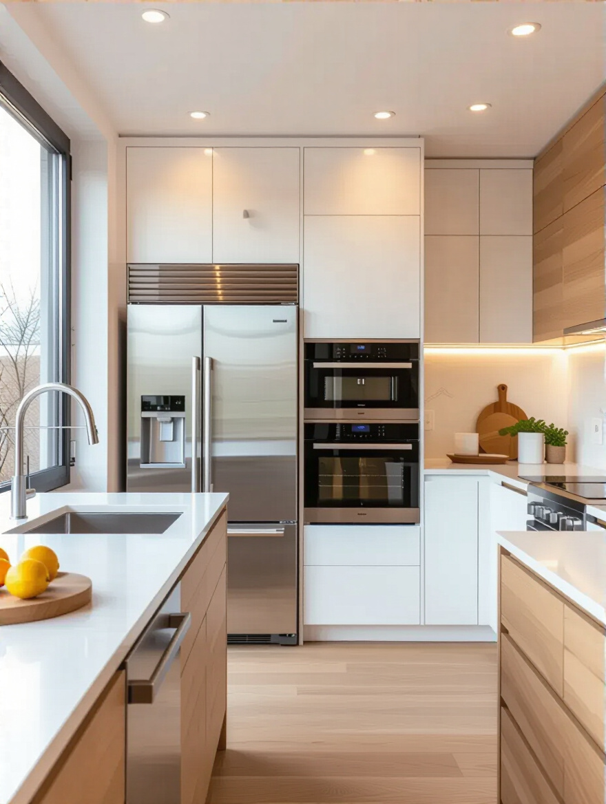
The ultimate move here is the panel-ready appliance. The refrigerator, the dishwasher—they disappear completely behind cabinet fronts. It’s the special effect that makes your tiny kitchen feel like a sleek, custom-designed set piece. And it’s not just about looks. By integrating a microwave into the cabinetry, for instance, you can free up several square feet of precious counter space. It’s a win for both the cinematographer and the lead actor.
We’ve set the stage with a smart layout and integrated cast. But a great scene needs more than just blocking. Now it’s about making the space work smarter by designing for flexibility and nuance, ensuring every element can play multiple roles.
Small sets require every prop and set piece to work overtime. A static, single-purpose kitchen is a waste of potential. Your goal is to create multifunctional zones—areas that can transform based on the scene you’re shooting. That small island isn’t just a prep station; with a pair of stools, it’s a breakfast bar for your morning coffee scene. Add some locking casters, and it’s a mobile serving cart for your cocktail party scene.
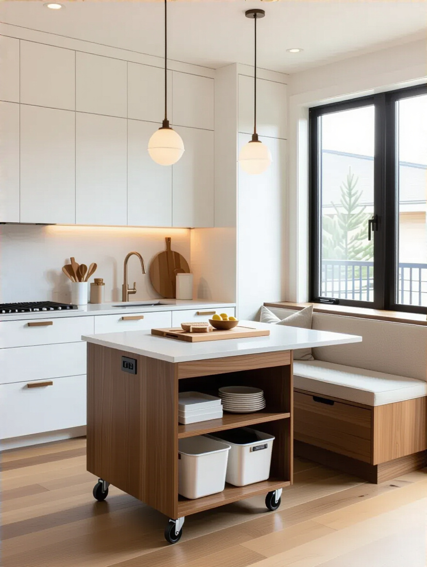
I once worked with a client whose kitchen felt like a dead end. We added a wall-mounted drop-leaf table. Most of the time, it’s folded down, creating a wide-open path. But when they need it, it flips up to become a dining spot for two or an extra 6 square feet of prep space for their big holiday cooking marathon. This isn’t about cramming more stuff in; it’s about making what’s there smarter and more adaptable. Every element needs to be ready for its close-up, and ready to play a different part at a moment’s notice.
This is the kind of detail that separates a smooth production from a chaotic one. In a small kitchen, a poorly planned door swing is a disaster waiting to happen. The refrigerator door swinging open to block the main walkway. A cabinet door that can’t open all the way because it hits the microwave. These are the on-set collisions that halt the action and create massive frustration. You have to choreograph everything—right down to the doors.
Before you finalize anything, map out the swing radius of every single door: cabinets, appliances, pantry, and the entryway itself. Use painter’s tape on the floor if you have to. If two doors are going to duel for the same space, you’ve got a problem. The fix? Alternatives. Pocket doors, sliding doors, or lift-up cabinet doors don’t swing out; they move up or sideways, saving precious inches and preventing those frustrating bottlenecks. This isn’t glamourous, but getting it right is the mark of a pro.
Alright, our set design and blocking are solid. Now let’s talk props. Your kitchen gear, your food, your materials—they all need a home. A disorganized prop department can sink a production. Smart storage and material choices are what turn a good layout into a brilliant, functional reality.
Deep, dark cabinets are where good intentions go to die. You shove things in the back, and they’re never seen again until they’ve expired or you’ve moved out. It’s a black hole. Pull-out systems are the solution. They are the cinematic equivalent of a reveal shot. Instead of you reaching into the abyss, the entire contents of the cabinet glide out to meet you. Nothing gets lost. Everything is a hero.
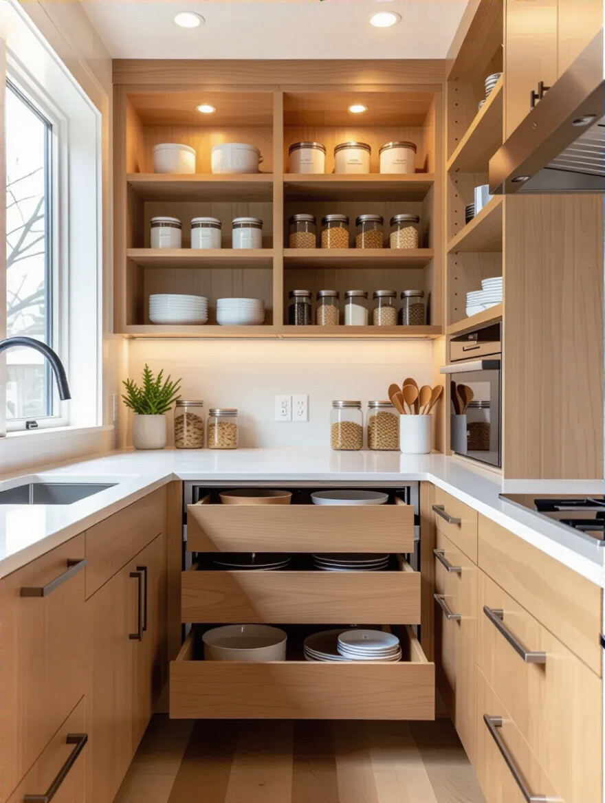
I had a client who insisted they had no storage. I spent an afternoon installing full-extension drawers in their lower cabinets. Suddenly, every pot and pan was visible and accessible. It was like they’d found an extra 10 square feet of space they never knew they had. Forget fixed shelves in deep cabinets. That’s just lazy set design. Every deep space should have a drawer or a pull-out mechanism. It’s non-negotiable for a kitchen that actually performs.
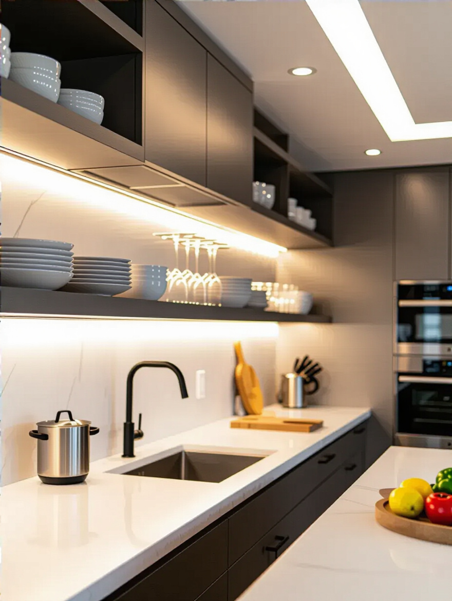
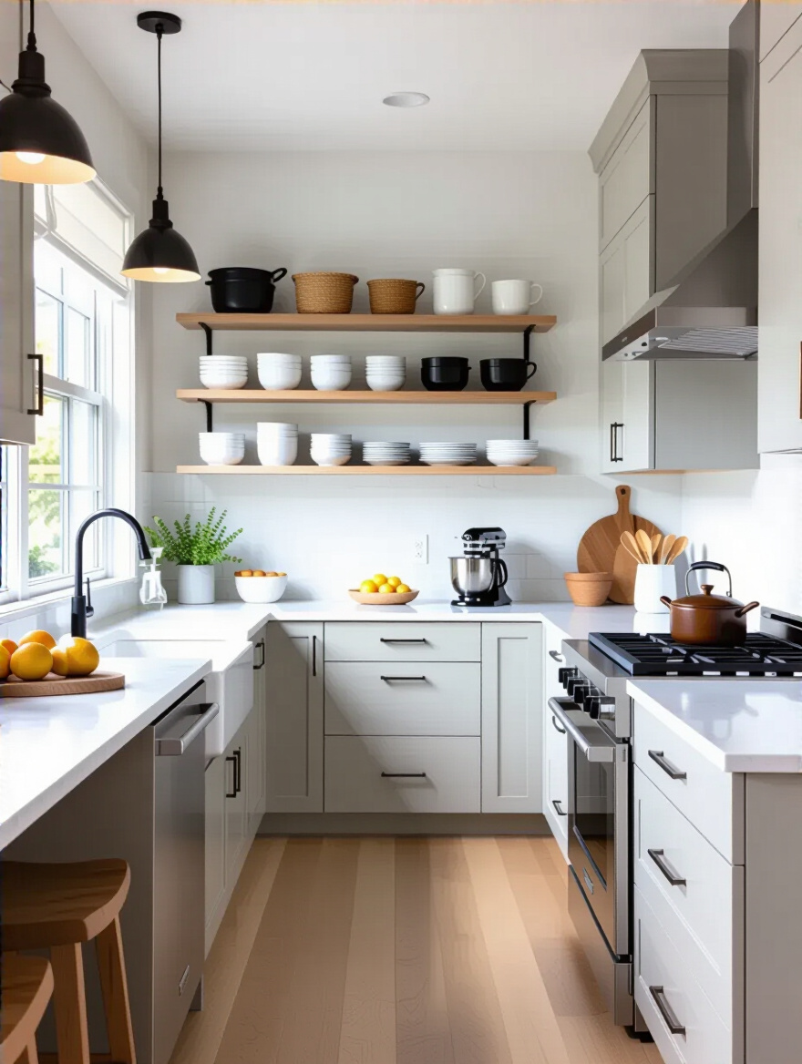
Let’s get one thing straight: open shelving isn’t for everyone. If you’re not disciplined, it can look like the messy aftermath of a disaster movie. But used strategically, it’s a brilliant directorial choice. Bulky upper cabinets are visual heavyweights that can make a small kitchen feel top-heavy and claustrophobic. Swapping a few of them for open shelves is like letting the scene breathe. It creates negative space, making the whole room feel lighter and more expansive.
The trick is to treat it like a curated shot. This is where you display your most beautiful and frequently used props—your matching white dishes, your elegant glassware, your favorite cookbooks. It’s not for the half-empty box of cereal or the mismatched Tupperware. Pick one wall or a small section, and make it a feature. It adds personality and depth, transforming simple storage into a piece of the set design.
Visual weight is everything in a small space. Think about camera lenses. A bulky 3-inch-thick countertop is like shooting with a zoom lens—it compresses the space and makes everything feel closer and heavier. A slim-profile countertop, less than an inch thick, is like shooting with a wide-angle lens. It creates clean, crisp lines and a feeling of lightness and elegance. The effect is subtle, but powerful.
I confess, I used to think this was just a trendy aesthetic choice. Then I saw it in action. A client switched from a thick, heavy granite to a thin, 12mm composite slab. The entire kitchen instantly felt taller and more modern. It’s a trick of the eye that works. Modern materials like quartz, sintered stone, or even high-pressure laminates can give you this sleek look with incredible durability. It’s a sophisticated move that pays huge dividends in perceived space.
This is Production Design 101. Dark, heavy colors absorb light and make a room feel like it’s closing in on you. It’s great for a moody film noir, but terrible for a small kitchen. To create a sense of expansive, bright space, you need to use light and color like a master cinematographer. A palette of whites, pale grays, and soft pastels on your walls and cabinets is your best friend. These colors reflect light, bouncing it around the room and blurring the hard edges of a small space.
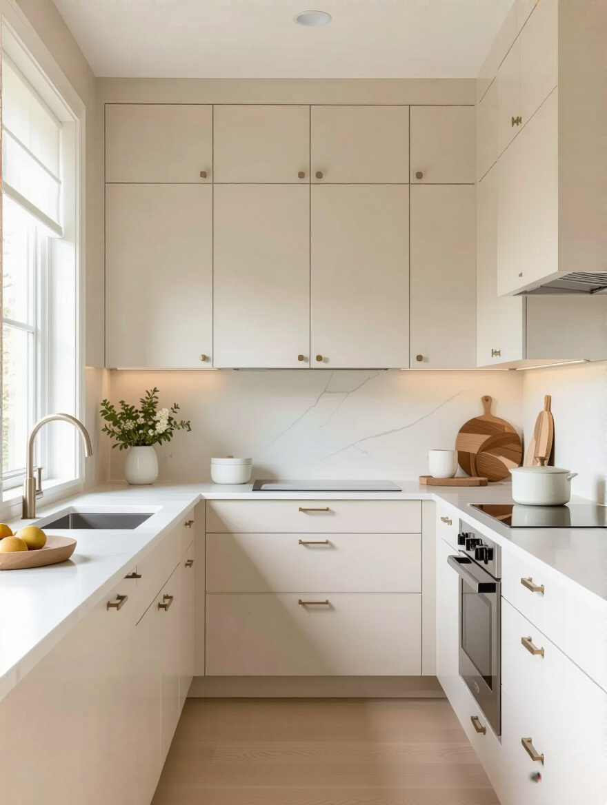
But here’s the pro tip everyone misses: “all-white” can feel sterile and boring, like a hospital scene. The secret is texture and tone. Don’t use the same flat white everywhere. Mix it up. A matte white on the walls, a satin finish on the shaker cabinets, a glossy white tile for the backsplash, and a light gray quartz with subtle veining. This creates visual interest and depth without sacrificing that bright, airy feel. It makes the space feel layered and intentional, not just painted white out of desperation.
Now that our main set pieces are in place, it’s time to fine-tune the details. This is where the artistry comes in—using reflection and smart technology to enhance the scene and trick the viewer’s eye into seeing more than is actually there.
Want to know a classic filmmaking trick for making a small room look bigger? A well-placed mirror. A mirrored or reflective backsplash is that same trick, deployed as a stunning special effect in your kitchen. It captures all the light in the room, bounces it around, and reflects the space back on itself, creating a powerful illusion of depth. It can literally make your kitchen feel twice as wide.
You don’t have to use a perfectly clear mirror—that can be a nightmare to keep clean. I love using antiqued mirror glass, which has a bit of texture and character that hides smudges. Other options are high-gloss subway tiles, which have a subtle reflective quality, or a sheet of polished stainless steel for a cool, industrial vibe. Whatever you choose, the effect is instant glamour and spaciousness. It’s a bold move that always pays off.
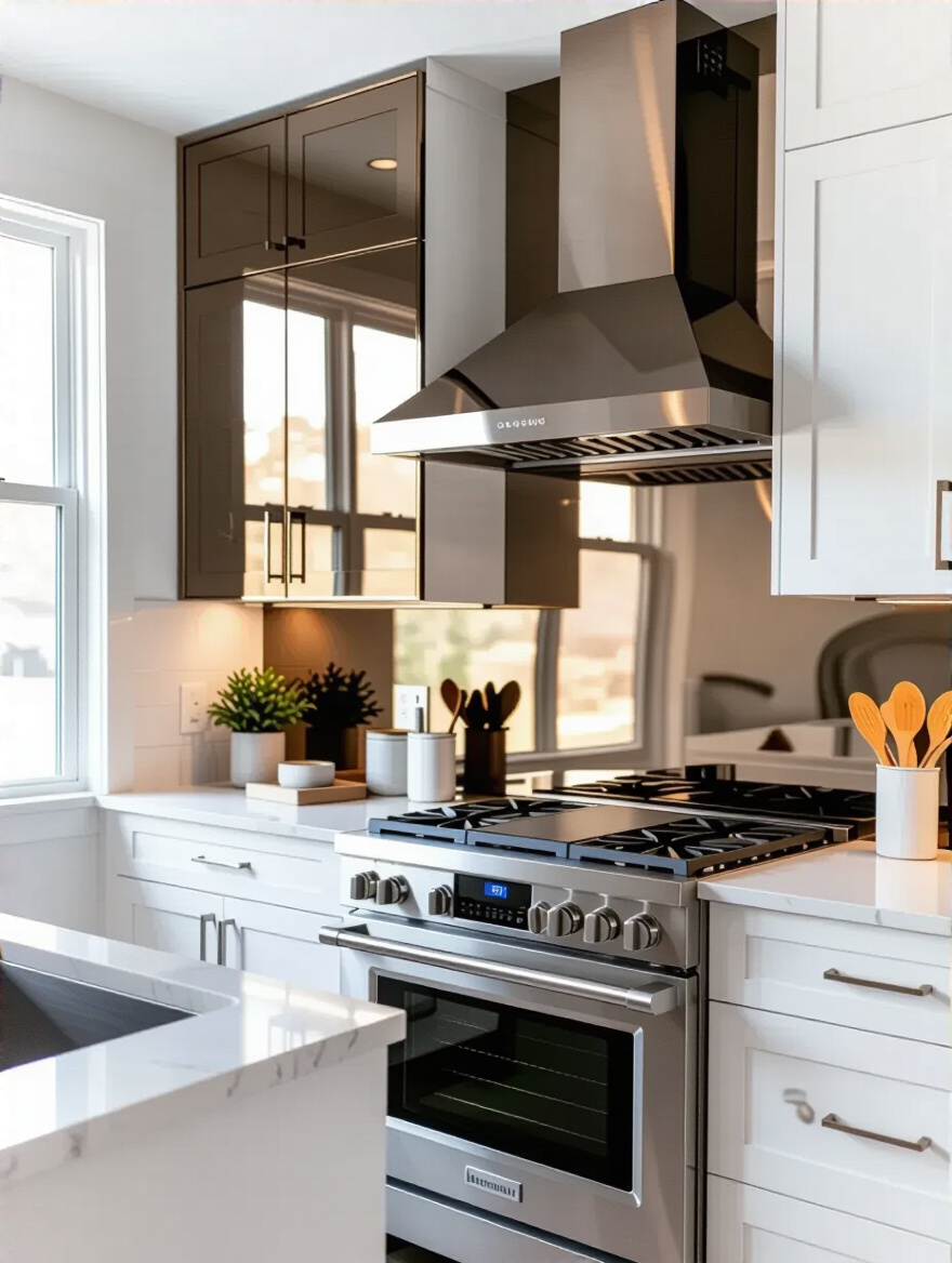
Trying to cram full-sized appliances into a small kitchen is like casting a 6’5″ actor to play a hobbit. It just doesn’t work. The scale is wrong, and it throws off the entire scene. The biggest mistake people make is insisting on that giant, restaurant-style range or that massive French-door refrigerator. It will absolutely devour your space and ruin your workflow. Your mantra must be: right-size your appliances.
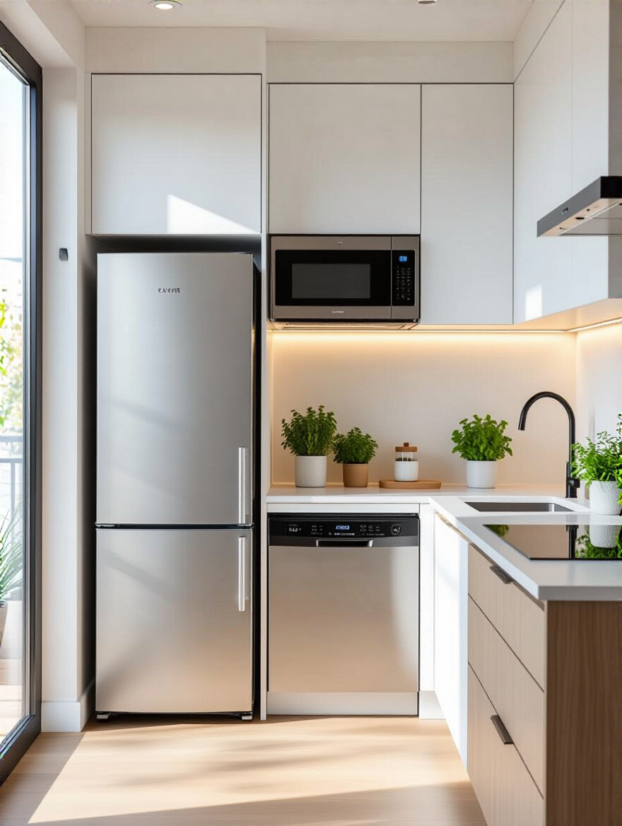
Today, there’s a whole universe of brilliant compact appliances that are designed for small-space living without sacrificing performance. Look at brands like Bosch, Smeg, or Fisher & Paykel. You can find 18-inch dishwashers, 24-inch counter-depth refrigerators, and sleek induction cooktops that provide incredible power in a small footprint. And always, always go for ENERGY STAR certified models. They’re not only better for the planet, but they’ll also save you money—a smarter performance all around.
We have our set, our props, and our cast. The final piece of the puzzle is lighting. In film, lighting is everything. It sets the mood, directs the eye, and can make or break a scene. Without a brilliant lighting scheme, even the best-designed kitchen will fall flat.
You would never light a movie with a single harsh light in the middle of the room. It’s unflattering, creates terrible shadows, and looks cheap. So why would you do that to your kitchen? A great lighting design is layered, just like on a film set. You need three distinct types of light working together: Ambient (the general, overall light), Task (focused light for your work zones), and Accent (dramatic light to highlight features).
For a small kitchen, your ambient light might be a sleek flush-mount fixture or a few recessed cans. Your task lighting is the real workhorse—this is your under-cabinet lighting. And your accent lighting could be a stylish pendant over a small peninsula or subtle lights inside a glass-front cabinet. The key is to have them all on separate dimmer switches. This gives you complete control to dial in the mood, from bright and functional for “prep mode” to soft and dramatic for “late-night snack mode.”
If you make only one lighting upgrade in your kitchen, make it this one. Under-cabinet lighting is your “key light”—the primary light that illuminates your main subject, which in this case is your countertop workspace. Without it, you’re always working in your own shadow cast by the overhead lights. It’s inefficient, it’s unsafe, and it makes your kitchen feel dark and gloomy.
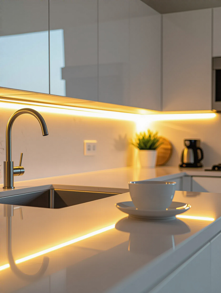
Modern LED strips are a game-changer. They’re incredibly thin, easy to install, and provide beautiful, even light right where you need it most. They illuminate your entire prep area, making chopping and cooking easier and more enjoyable. But they also have a secondary function: they bounce light off the countertop and onto the backsplash, which adds a wonderful ambient glow and creates another layer of depth, visually pushing the wall back.
Your color palette is the visual language of your kitchen. If you have too many competing colors and patterns, it’s like having actors all yelling their lines at once. It’s visual chaos. To create a unified and expansive look, you need a cohesive color palette. This means choosing a primary light, neutral color for the big surfaces—walls and cabinets—and then sticking to one or two accent colors for smaller elements.
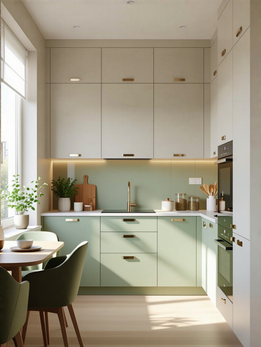
The secret is to ensure all your colors share the same undertone. Are you working with warm tones (creams, beiges, warm grays) or cool tones (crisp whites, cool grays, blues)? Sticking to one family creates harmony. My favorite trick for small spaces is a tone-on-tone approach. Use a single color but in different shades and finishes. For example, light gray walls, medium gray base cabinets, and white upper cabinets. It adds sophisticated depth without making the room feel busy or disjointed.
Solid cabinet doors create an imposing visual wall. It can feel like the set is closing in on you. Introducing a few clear glass cabinet fronts is like punching a window into that wall. It allows your eye to travel through the cabinet to the back wall, which immediately creates an illusion of depth and makes the entire kitchen feel more open and airy.
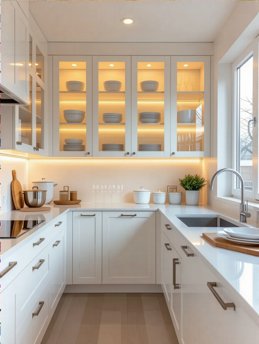
Like open shelving, this requires some discipline. This is your hero cabinet. It’s where you display your beautiful glassware or your coordinated set of white dishes. To really elevate the effect, install a small puck light inside. This turns the cabinet into a glowing jewel box at night and adds another beautiful layer to your lighting scheme. It’s a detail that adds a ton of character and perceived space.
Now that the scene is lit and the major design choices are locked in, we move into post-production and finishing touches. These are the details that elevate the entire project from good to great, ensuring the final cut is sleek, polished, and ready for its premiere.
In a tight shot, every detail matters. Bulky, ornate cabinet handles are visual noise. They catch the eye, they break up the clean lines of your cabinetry, and you will inevitably snag your clothes on them in a tight space. The solution is to go sleek and streamlined. Handleless cabinets are the pinnacle of this approach. Using integrated J-pulls or push-to-open mechanisms creates a completely flat, uninterrupted surface.
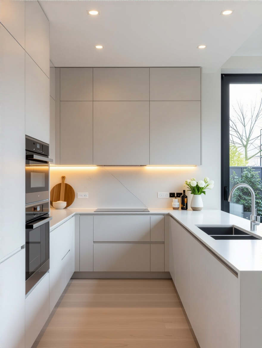
This minimalist aesthetic is powerful in a small kitchen because it makes the space feel modern, clean, and expansive. If a fully handleless design isn’t in the budget, opt for slim, low-profile bar pulls that run the full width of the door or drawer. They almost disappear into the design while still being perfectly functional. The goal is to remove visual clutter. Think of it as cleaning up the edit for a tighter, more impactful final cut.
Sometimes, the best actor is the one who can play any part. In a small kitchen, that’s a movable island or a simple utility cart. A fixed island can often be a space-killer, a big, immovable object that dictates all the traffic flow. A mobile cart on locking casters, however, gives you complete directorial control. Need more prep space? Roll it to the center of the room. Setting up a buffet for a party? Roll it against the wall. Need to clear the floor completely? Roll it out of the room.
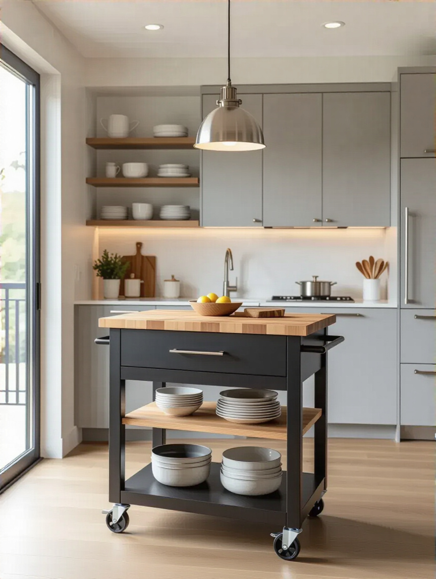
I recommend this to almost every client with a kitchen under 100 square feet. It provides that extra bit of counter space and storage you desperately need, but without the permanent commitment. You can find beautiful ones with butcher block tops for chopping, shelves for storage, and even hooks for towels. It’s the ultimate flexible performer, ready to adapt to whatever the scene requires.
You’ve designed and built a beautiful set. But the job isn’t over. A film requires care in preservation, and your kitchen needs a plan for long-term maintenance. This is about establishing the daily habits and smart systems that keep your production running smoothly, long after the cameras have stopped rolling.
Your countertops are your main stage. If they’re cluttered with props—utensil crocks, spice carousels, knife blocks—there’s no room for the action. The solution is to go vertical. Use that empty wall space to get everything up and off the counter. A magnetic knife strip is a non-negotiable for me. It’s sleek, hygienic, and frees up a huge chunk of real estate.
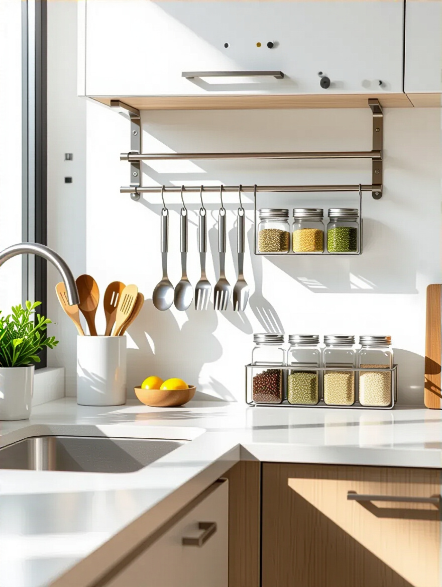
Wall-mounted rail systems with hooks and small baskets are also brilliant. You can hang your most-used utensils, a pot for fresh herbs, or a basket for your cooking oils right where you need them. Spices can go on narrow, wall-mounted shelves. The goal is to keep your main stage clear and ready for the performance of cooking. An empty counter is a kitchen that feels calm, capable, and much larger than it is.
Opening a kitchen drawer shouldn’t feel like a jump scare. A chaotic jumble of utensils, gadgets, and junk is where good workflow goes to die. You need to organize your prop department, and smart dividers are your best tool. They are the difference between a carefully managed inventory and a pile of random props.
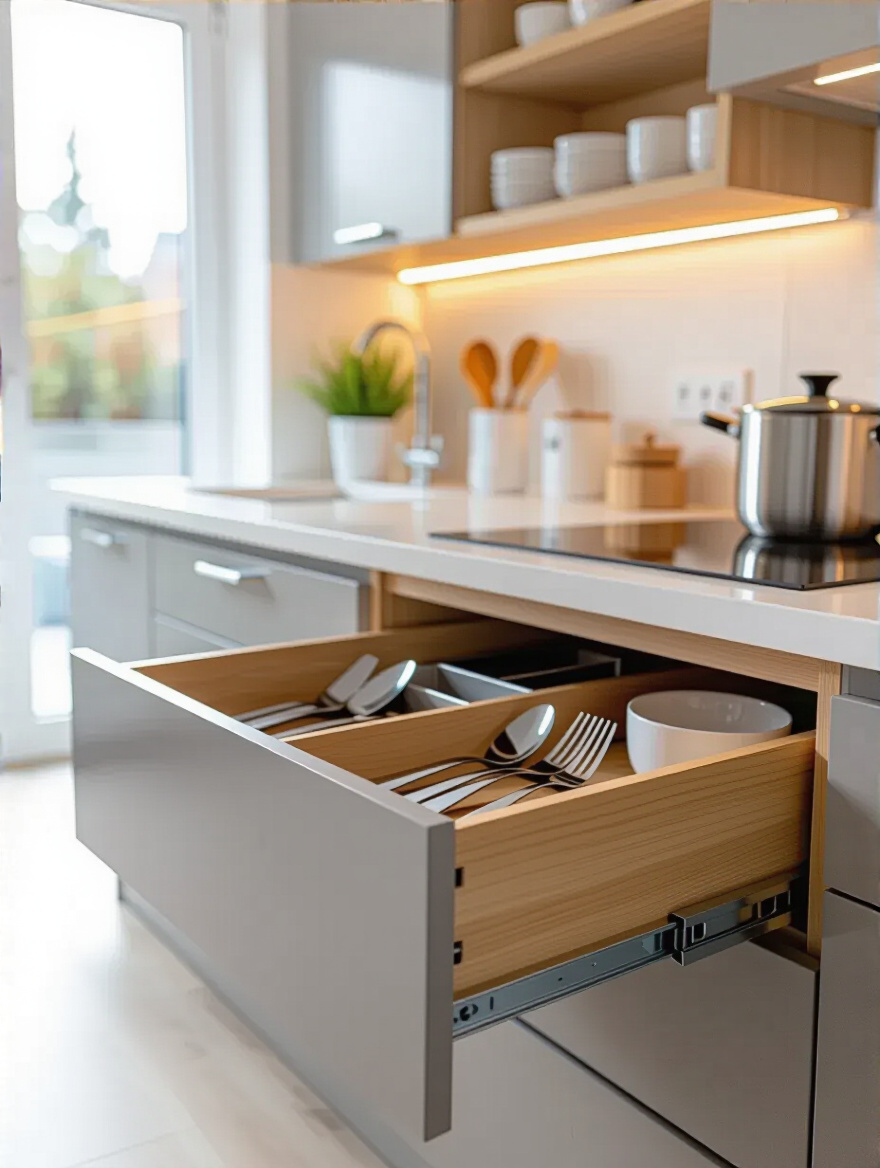
Invest in adjustable bamboo dividers for your utensil drawers, tiered inserts for your spice drawer, and vertical dividers for cupboards so you can store baking sheets and cutting boards on their sides. This isn’t just about being tidy; it’s about efficiency. When every single item has a dedicated home, you can grab what you need without thinking. This meticulous organization within your drawers and cabinets is what allows the visible parts of your kitchen to remain beautifully uncluttered.
Nothing ruins a beautiful shot faster than a tangled mess of charging cables and devices cluttering the counter. It’s the modern-day scourge of clean design. The pro move is to build a hidden charging station. This can be as simple as having an electrician install an outlet inside a deep “junk” drawer. It becomes a dedicated spot to charge phones and tablets, completely out of sight.
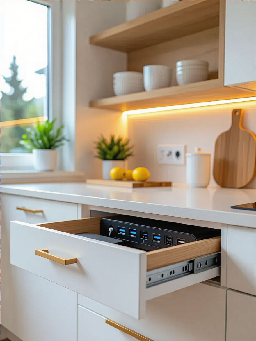
You can also install pop-up outlets that recess flush into the countertop or use specialized in-cabinet charging hubs. The point is to create a centralized, hidden location for all that electronic clutter. It keeps your counters free for their intended purpose—cooking—and preserves that sleek, uncluttered aesthetic you’ve worked so hard to create. It’s a simple detail that makes a massive difference in the daily experience of the space.
A director’s job isn’t done until the final cut. Editing is the process of removing everything that doesn’t serve the story. You need to become the editor of your own kitchen. Clutter is the enemy of a small space. It fills up your cabinets, spills onto your counters, and makes the whole room feel stressful and dysfunctional. You have to be ruthless.
Adopt the “one in, one out” rule. If you buy a new coffee mug, an old one has to go. Once a year, go through your pantry and toss expired spices. Be honest with yourself about that novelty gadget you haven’t used in two years. In a small kitchen, every single item must earn its place. Regular, disciplined editing is the only way to maintain the visual space and functionality you’ve designed. It’s a continuous process, not a one-time fix.
We’re in the home stretch. We’ve covered the big picture and the tiny details. The final piece of advice is about investing in smart, high-performance tools that do the work of many, ensuring your kitchen operates at peak efficiency for years to come.
Why have a whole cast of extras when a few talented stars can play all the parts? A sprawling collection of single-purpose pots, pans, and gadgets is a storage nightmare. Investing in high-quality, multifunctional cookware is one of the smartest things you can do in a small kitchen. You don’t need twelve pans; you need three or four great ones.
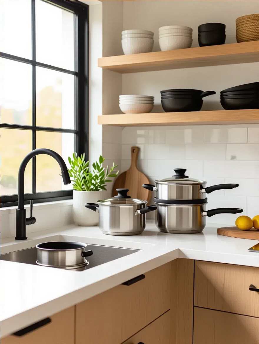
A high-quality Dutch oven can braise, deep-fry, bake bread, and make soup. A good cast-iron skillet can go from stovetop to oven to table. The modern “Always Pan” is designed to replace eight different pieces of cookware. This isn’t about minimalism for its own sake; it’s about reducing the sheer volume of stuff you need to store. By choosing fewer, better, more versatile tools, you free up an incredible amount of cabinet space and simplify your entire cooking and cleaning process. It’s the ultimate smart play.
So, there you have it. The secret to a brilliant small kitchen isn’t magic; it’s good direction. It’s about seeing your space not as a limitation, but as a tightly written script full of creative opportunities. We’ve walked through everything from the initial blocking and set design to lighting, prop management, and the final edit. Each of these 23 strategies is a tool to help you craft a space that is not only beautiful but performs flawlessly under pressure.
Don’t let a small footprint define your story. Take these ideas, pick the ones that excite you, and start planning. Your dream kitchen is not a fantasy; it’s an achievable reality. With a clear vision and a bit of cinematic flair, you have everything you need to transform that cramped, frustrating set into a scene-stealing star of your home—a space that’s expansive, inviting, and perfectly directed by you.
Now, roll camera… and action.


