Physical Address
304 North Cardinal St.
Dorchester Center, MA 02124
Physical Address
304 North Cardinal St.
Dorchester Center, MA 02124
Discover 23 bedroom paint ideas to create your perfect reading retreat, from calming blues to dramatic accent walls. Expert advice on colors that enhance both reading and rest.
Of all the decisions we make in our homes, paint feels both the most momentous and the most reversible. It has the power to completely change the emotional temperature of a room overnight. I’ve walked into countless spaces over the years—from sprawling private libraries to tiny bedroom reading nooks—and the one thing that sets the tone before any piece of furniture is moved in is the color on the walls. It’s the backdrop for our quietest moments, the canvas against which we read, think, and rest.
Choosing that color, however, can be paralyzing. Standing in front of a wall of a thousand subtly different shades of white is enough to make anyone want to give up. The secret isn’t about finding a “nice” color; it’s about finding the right color for how you want to feel in that space. It’s about creating a sanctuary that supports your reading life, not just your sleep schedule.
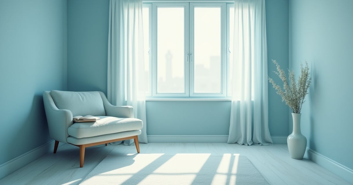
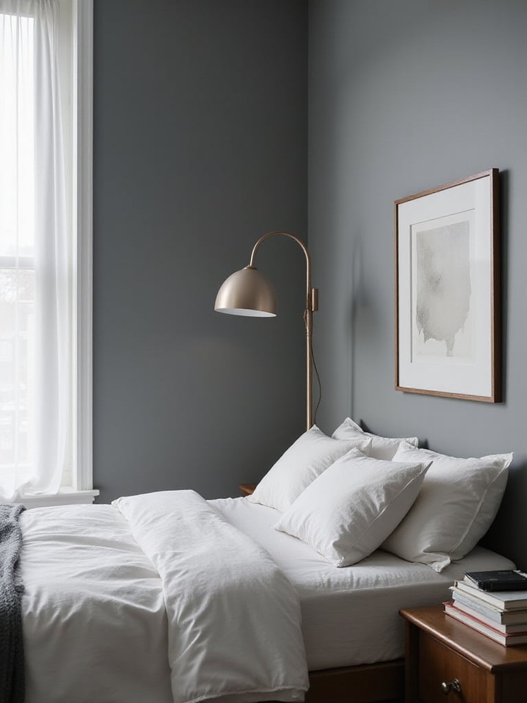
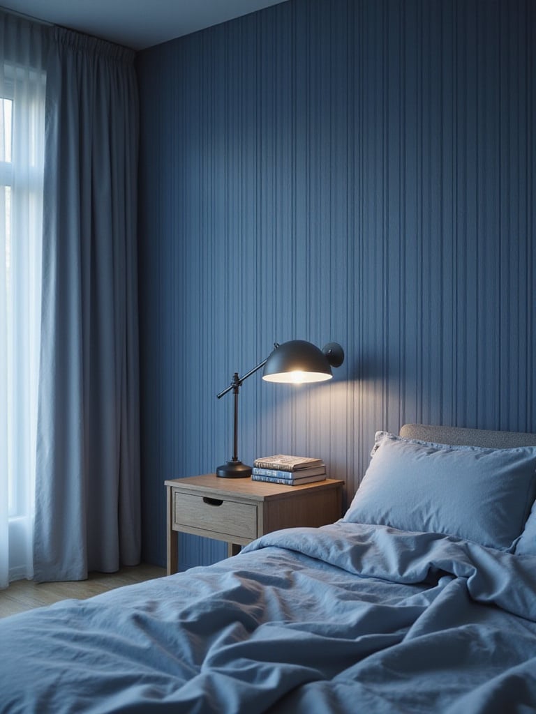
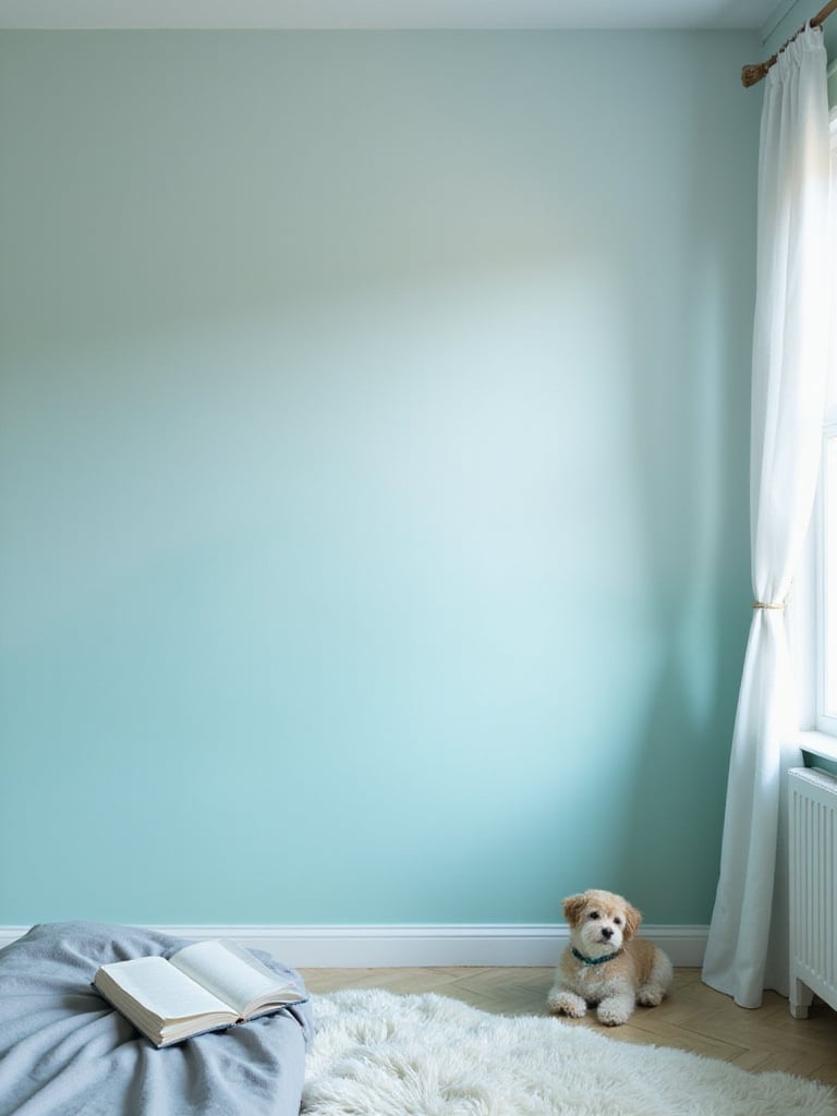
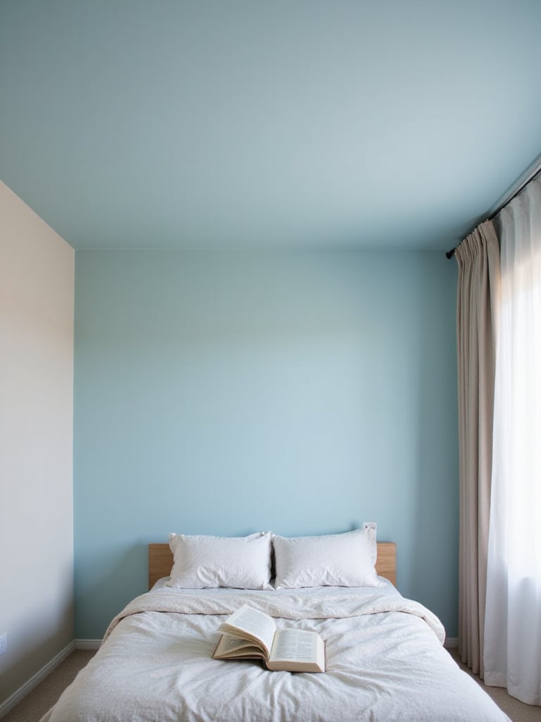
There’s a reason so many institutions of quiet thought—libraries, universities, studies—lean on blue. Its connection to sky and water puts us in a state of calm receptivity. It’s a color that encourages you to exhale. For reading, this is invaluable. It quiets the background noise in your head, making it easier to slip into the world of a book.
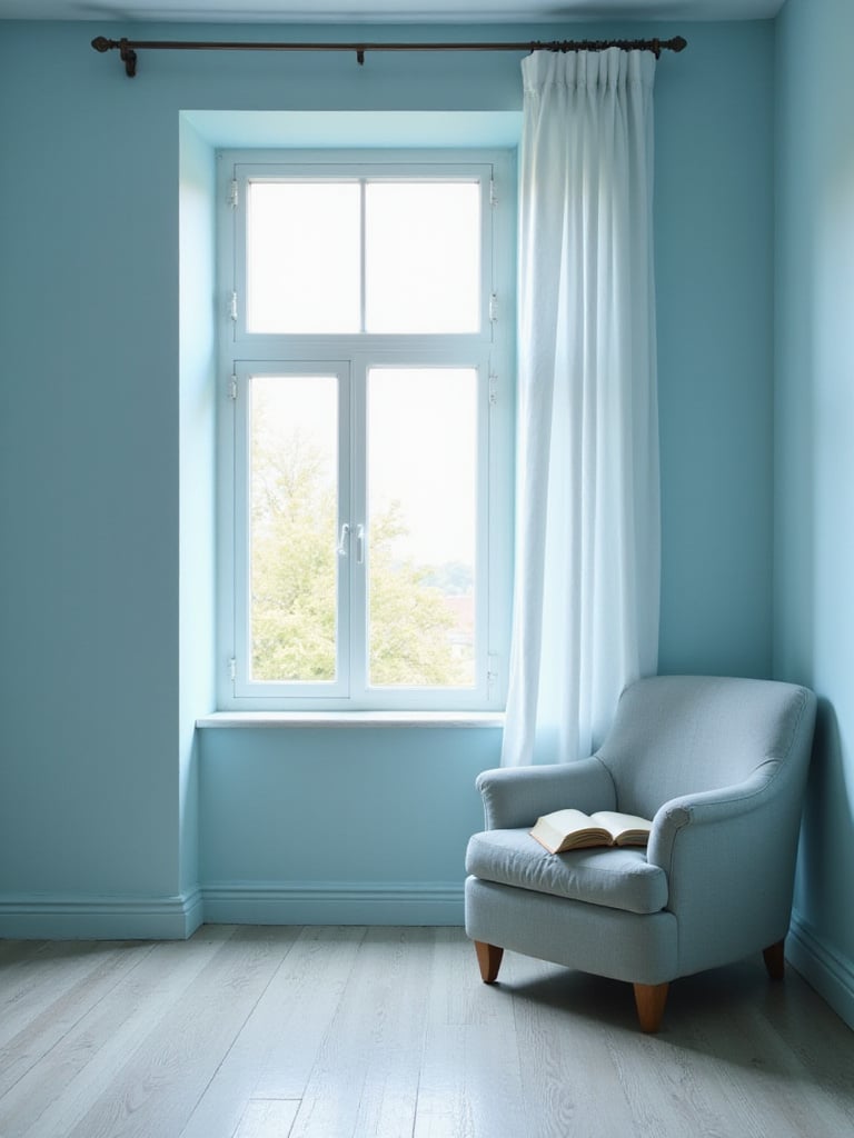
In my experience with library planning, I’ve noticed a clear difference in how blues function. Lighter, airier blues seem to help with expansive thinking, perfect for big-idea non-fiction or sprawling fantasy epics. Deeper, moodier blues, like a good navy or indigo, create a cozy, cocoon-like feeling. They minimize distractions and are brilliant for late-night reading sessions where you want the world to melt away, leaving just you and the illuminated page. A client once described her new navy bedroom as feeling like “a hug from the night sky,” which is exactly the kind of environment that lets a story take over.
This isn’t just about picking a shade you like. Think about when you read. Is it in the sun-drenched afternoon or under the soft glow of a bedside lamp? A pale blue that looks fresh in daylight can feel chilly at night, so it’s a balance.
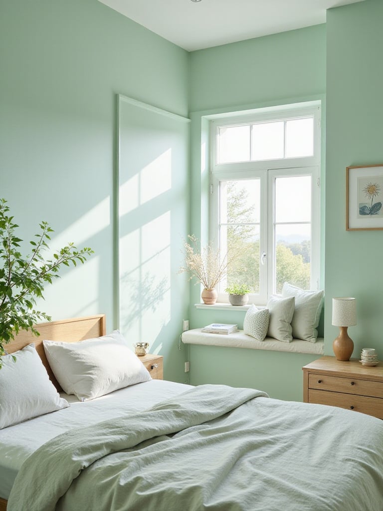
Green is my go-to recommendation for heavy readers. There’s a scientific reason for this—it’s the color the human eye has to work the least to see. When you’re spending hours staring at high-contrast black text on a white page, giving your eyes a place to rest on a soothing green wall is a physical relief. It genuinely reduces eye strain, allowing you to read for longer, more comfortable stretches.
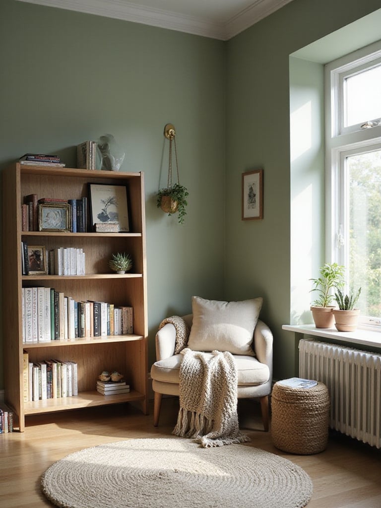
The specific green really shapes the experience. A client who read mostly environmental science and nature writing wanted to bring that feeling indoors, so we chose a deep, mossy green for his study. It felt like being in a forest clearing. On the other hand, a soft sage or pale olive green can feel fresh and energizing, ideal for a reading nook that gets beautiful morning light. What I tell my clients who are a bit nervous about color is that a muted green, like Benjamin Moore’s “October Mist,” acts almost like a neutral. It complements natural wood bookshelves and linen textiles beautifully, creating a calm, cohesive look.
It’s the color of life, of quiet growth. It makes a room feel grounded and thoughtful without ever being demanding.
I know what you’re thinking: beige? boring. But stay with me here. When you’re a true book lover with a sizable collection, the books themselves are the color, the pattern, and the art. In that case, the best thing a wall can do is step back and let the collection shine. Warm neutrals—think taupes, mushroom grays, and beiges with a hint of yellow or red—provide what I call “invisible comfort.” They create a soft, inviting envelope without clamoring for attention.
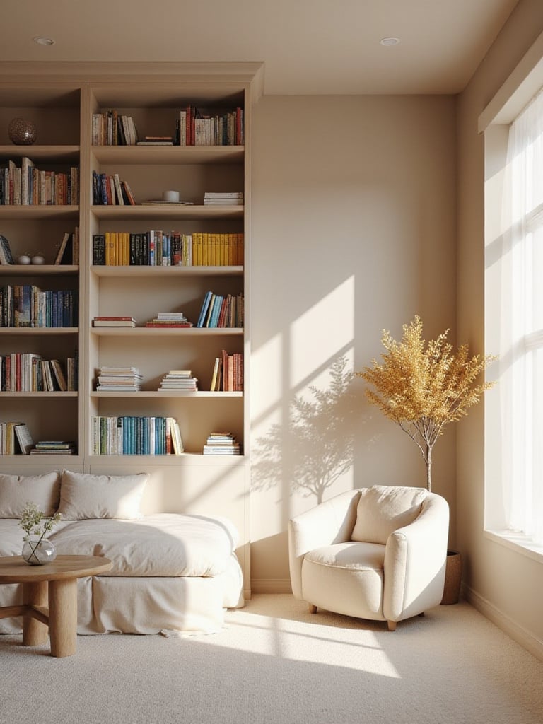
I once worked with a couple whose book collection was a chaotic rainbow of fantasy paperbacks, serious hardcovers, and old university texts. The room felt cluttered and visually noisy. We painted the walls a warm greige, and the transformation was incredible. Suddenly, the book spines popped. The collection went from looking like a mess to looking like a curated library. What I’ve learned from years of book display work is that a quiet background makes your collection the hero.
The trick is to avoid flat, lifeless beige. Look for colors with depth and complex undertones that shift with the light. And layer textures—a chunky wool throw, a linen headboard, a worn leather chair. That’s how a neutral room becomes rich and interesting, not just empty.
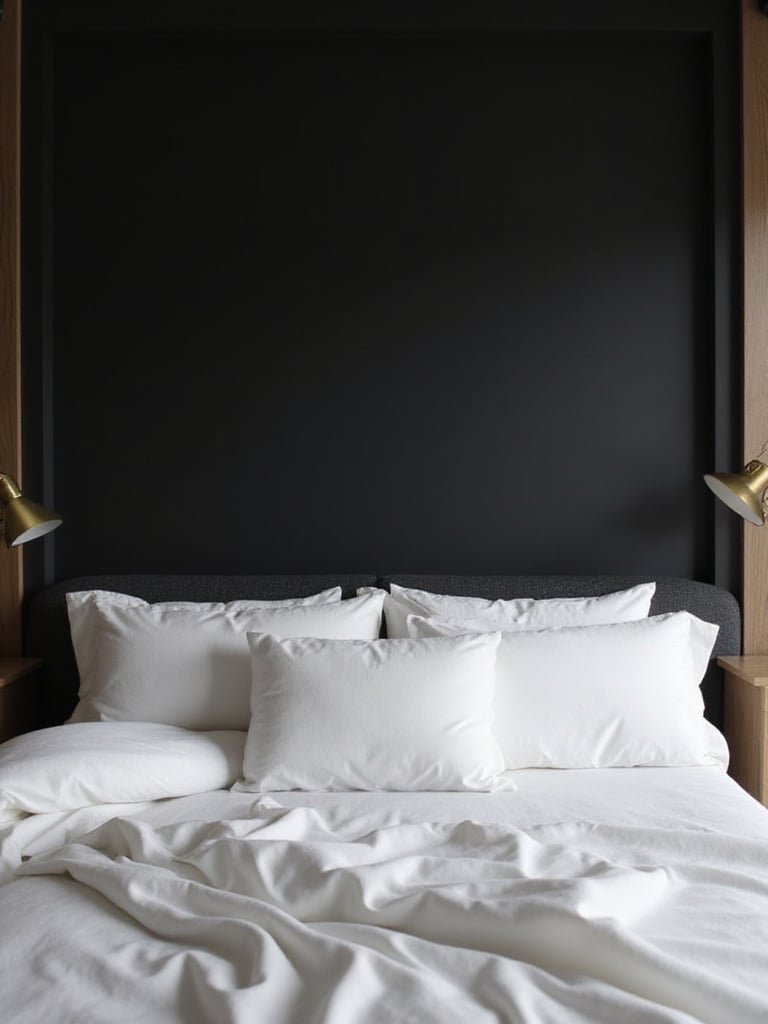
This is the choice for the brave, and the payoff is immense. You’ve probably been told that dark colors make a room feel small. In a bedroom, that’s not a bug; it’s a feature. At night, when most of us do our pleasure reading, a dark wall—charcoal, deep navy, even a soft black—essentially disappears. The corners of the room blur, creating a sense of infinite, velvety space. It’s the ultimate literary cocoon.
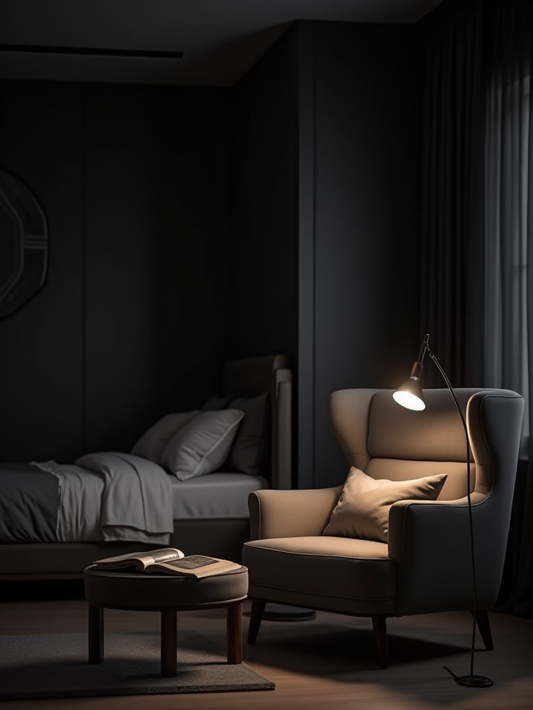
All your attention is funneled directly to the warm pool of light from your reading lamp and the pages in your hands. It’s a deeply immersive experience. A few years ago, a client wanted a “dramatic but restful” bedroom. I suggested a deep charcoal. She was terrified. We painted one wall behind her bed as a test, and she immediately understood. It felt sophisticated, quiet, and incredibly calming.
The key is balance. You need good, layered lighting—a soft ambient lamp in a corner, and a sharp, focused task light for reading. You also need to introduce contrast with lighter elements like crisp white bedding, a pale rug, or a light-colored ceiling to keep the space from feeling heavy. Done right, it doesn’t shrink the room; it gives it soul.
Okay, let’s be frank. Red is a tricky, demanding color for a bedroom. It’s stimulating and energizing—the opposite of what most of us need when we’re trying to wind down. Painting all four walls in a bright crimson is a recipe for restless nights. But that doesn’t mean red is off the table entirely. It just requires precision.
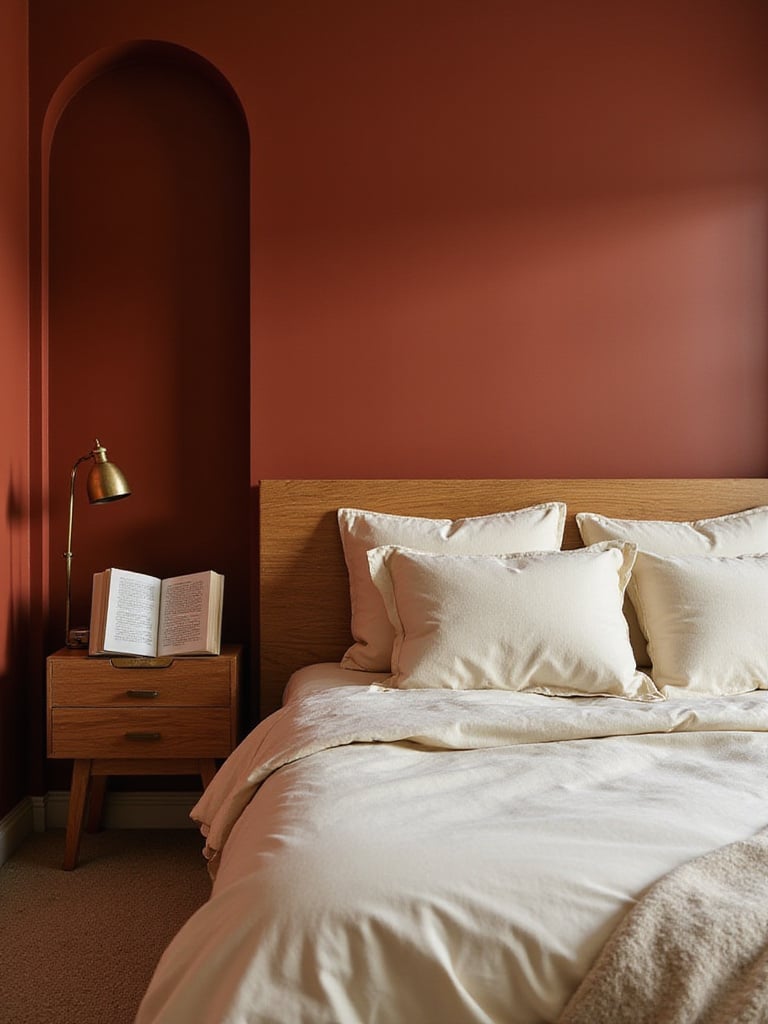
I learned this lesson the hard way early in my career. We used a beautiful barn red in a client’s bedroom, and while it looked stunning in photos, they confessed a month later that they felt agitated in the space. Now, I use red as a strategic accent. A deep, rich burgundy or a warm, earthy terracotta on a single wall behind the headboard can create an atmosphere of warmth and drama. It feels classic and historical, perfect for someone who loves to curl up with a Victorian novel. It can also be fantastic painted on the inside of a bookshelf, giving your books a rich, jewel-box background.
This way, you get the visual warmth and richness without the psychological jolt. It’s about using a powerful spice in your cooking—a little bit adds incredible depth, but too much ruins the dish.
For the morning reader, the person who pairs their first chapter with a cup of coffee, yellow is a wonderful choice. It brings a feeling of optimism and gentle energy into a room, essentially bottling the feeling of a sunny morning. It can make a dark, north-facing room feel infinitely brighter and more cheerful.
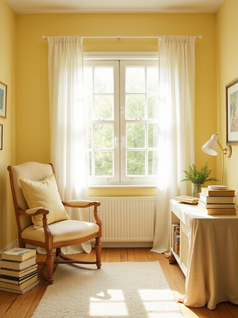
But yellow can go wrong very quickly. The key is to avoid anything too primary or with a greenish undertone, which can look acidic and unsettling. You’re not aiming for a highlighter. Instead, look for soft, muted yellows like buttermilk, pale straw, or a creamy vanilla. I always advise clients to get multiple samples and watch how they change throughout the day. The right yellow will feel bright but not jarring in the morning, and will cast a soft, candle-like glow under lamplight in the evening.
Pair it with crisp white trim for a clean, classic feel or with warm wood tones for a more traditional, almost honey-like library warmth. It’s a happy color, and it sets a wonderfully positive tone for starting your day with a good book.
Pink has finally shaken off its juvenile reputation, and it’s become one of my favorite colors for creating intimate, thoughtful retreats. We’re not talking about bubblegum pink here. Think of the sophisticated, complex pinks: dusty rose, blush with a hint of gray, or earthy, terracotta-adjacent pinks. These colors feel less like a color and more like an atmosphere—a soft, gentle hum.
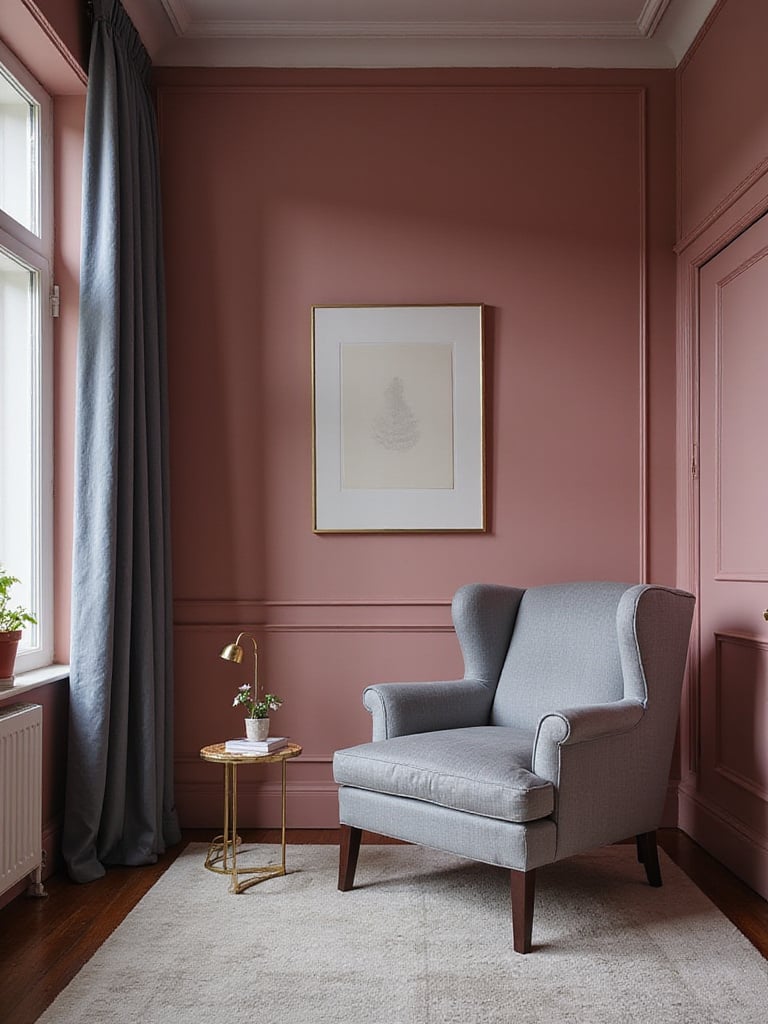
There’s a reason it works so well. From my design background, I know these muted pinks are incredibly flattering to skin tones and create a soft, warm glow that’s deeply comforting. It fosters a feeling of what I’d call “literary intimacy.” It’s a color that makes you want to settle in for a long, indulgent reading session with a memoir or a book of poetry. It’s nurturing.
The styling mistake people make is leaning into the sweetness. The key to making pink feel grown-up is to contrast it with something more grounded. It’s absolutely stunning paired with deep grays, navy blue, or emerald green accents and a bit of brass. The tension between the soft pink and the stronger accent color is what makes the whole room sing.
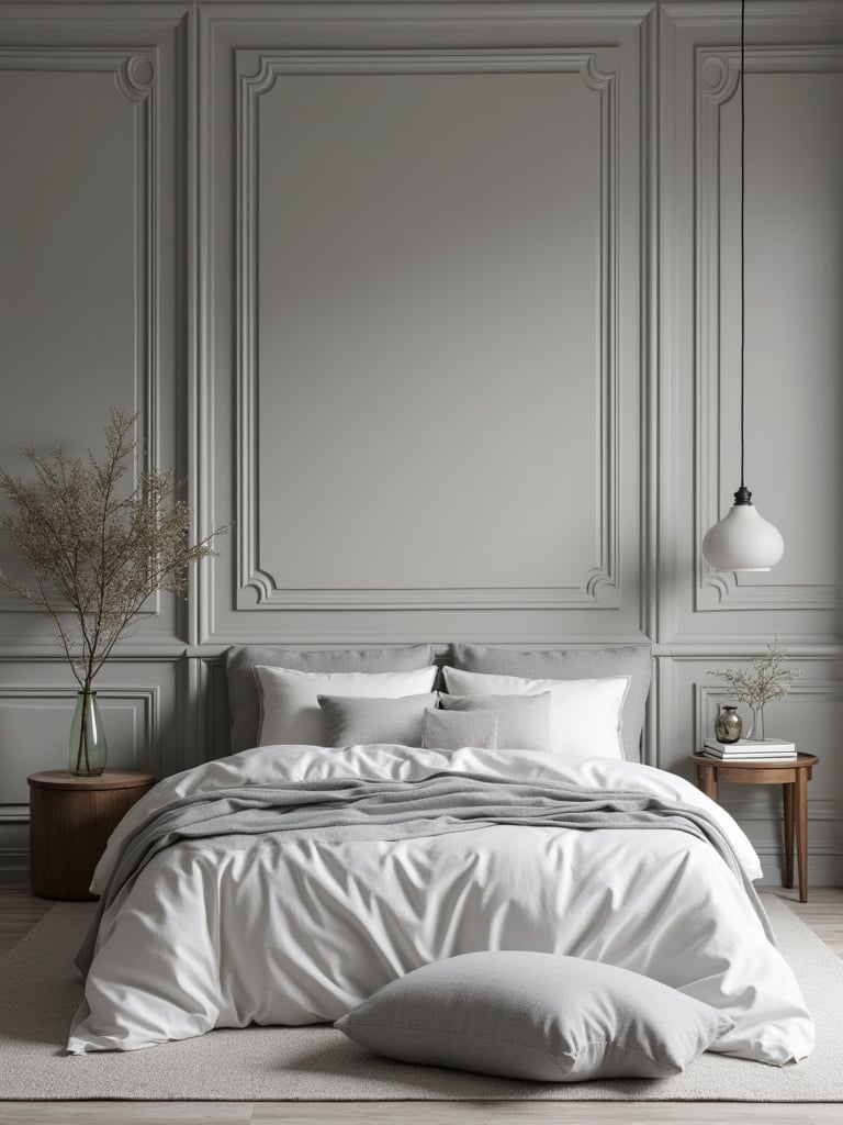
Gray is the ultimate chameleon, which is why it’s been the backbone of modern design for the last decade. For a reader, this versatility is a huge asset. A good gray wall provides a calm, neutral backdrop that doesn’t compete with the wild array of colors on your book covers. It’s a quiet stage for your collection.
However, not all grays are created equal. This is where it gets tricky. You have to understand the undertones. A cool gray with blue or purple undertones will feel crisp, clean, and minimalist. A warm gray—or “greige”—with yellow or brown undertones will feel much cozier and more traditional. I often find a mid-tone warm gray is the sweet spot for reading spaces. It’s dark enough to provide some contrast so a white page stands out, but not so dark that it absorbs all the light.
I’ve always said a great gray wall is like a good book cover—it sets the mood but lets the story do the talking.
Choosing the right gray is about testing. What looks like a simple, warm gray in the store can suddenly flash purple in the afternoon light of your bedroom. Get a sample pot, paint a big swatch, and live with it for a couple of days before you commit.
If painting an entire room black feels like a step too far, the black accent wall is a brilliant compromise. Placing it behind the bed creates an immediate, dramatic focal point that anchors the entire room. From a reader’s perspective, it serves a very specific purpose: it creates “narrative focus.”
Think about it: when you’re reading in bed at night, a black wall behind you and your reading lamp becomes a void. It eliminates visual noise. The contrast makes your reading light more effective and the pages of your book appear brighter. In library design, we sometimes use black or very dark colors to define special collection areas or to make art pop, and the same principle applies here. It frames your reading experience, making it feel more intentional and special.
This is a look that sings with natural materials. The depth of the black makes the warmth of a wooden bed frame, the glint of a brass lamp, or the texture of white linen bedding look incredibly rich and deliberate. It’s a high-impact choice that requires surprisingly little courage, as it’s just one wall.
Two-tone walls are a fantastic way to add architectural character to a room that doesn’t have any. By painting the lower portion of the wall a different color from the top, you can trick the eye and manipulate the feeling of the space. This is a classic technique that feels fresh again.
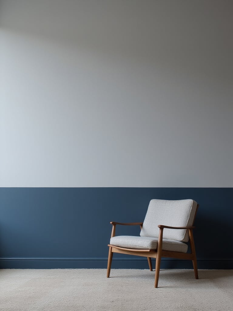
For a reading nook, this is especially effective. A common application is to paint the lower third or half of the wall a darker, grounding color (like a deep green or blue) and the upper portion a lighter, airier shade (like a soft white or pale gray). This grounds the space and makes the ceiling feel higher. It creates a subtle horizon line that is very calming to the eye. What I tell my clients is to think of it as creating a “visual wainscoting” with paint.
The key to making this look sophisticated and not like a nursery is the color choice. A subtle, tone-on-tone combination (two shades of the same gray, for example) is incredibly chic. Or, if you go for contrast, make sure the two colors share a similar undertone—a cool blue with a cool gray—to ensure they feel related.
Stripes are a bold commitment, but they can bring an incredible sense of rhythm and personality to a bedroom. For a book lover, the linear, ordered nature of stripes can subconsciously echo the neat rows of books on a shelf or the lines of text on a page. It’s a pattern that makes sense in a literary space.
The orientation of the stripe makes a huge difference. Vertical stripes draw the eye upward, adding a sense of height and formality to a room. This can feel quite grand and traditional. Horizontal stripes, on the other hand, make a room feel wider and a bit more casual and contemporary. From my work in library design, I find that wide, horizontal stripes can be very effective in creating a relaxed, lounge-like atmosphere.
My main piece of advice here is to be careful with contrast. High-contrast stripes like black and white can be very stimulating and visually busy—maybe not the best for a space dedicated to rest and focus. A tone-on-tone stripe, like a glossy navy over a matte navy, or two closely related shades of beige, can provide that beautiful texture and rhythm without being overwhelming.
An ombre or gradient wall is the painterly equivalent of getting lost in a story. It’s a slow, atmospheric fade from one state to another, which perfectly captures the immersive experience of reading. This technique, where a color gradually shifts from dark to light, is incredibly effective at creating a dreamy, ethereal mood. It’s especially beautiful for readers who love poetry, magical realism, or atmospheric fiction.
This isn’t as difficult as it looks, though it does require more patience than a single-color wall. You essentially work in bands of color, blending the edges while the paint is still wet. A common approach is to go from a deeper color at the bottom to a very pale version at the top, which can make a room feel like it’s opening up to the sky. It’s a fantastic solution for a bedroom with high ceilings or one that’s a bit of a plain white box.
The beauty of it is how it interacts with light. As the sun moves across the room, different parts of the gradient are highlighted, making the wall feel alive and constantly changing. It’s a dynamic backdrop for a static activity like reading.
The ceiling is the most neglected surface in interior design. I call it the “fifth wall,” and for a reader, it’s arguably the most important one. It’s what you gaze at when you look up from a profound sentence to think. It’s the view from your pillow. Leaving it builder-white is a missed opportunity to create a truly immersive space.
Painting the ceiling can transform a room. Continue the wall color up onto the ceiling to create that cozy, cocooning effect—I love this with dark colors. Or, choose a color that’s a few shades lighter than the walls to give a sense of depth without feeling heavy. My personal favorite trick for a reader’s room is to paint the ceiling a very pale, soft blue. It subtly evokes the feeling of an open sky, which is wonderful for those moments of contemplation between chapters.
I once convinced a client to paint the ceiling of their small, cozy bedroom a deep, high-gloss navy. They were hesitant, but the result was magical. It felt like sleeping under a starry, polished dome.
The accent wall is a tried-and-true design tool for a reason: it works. It’s a low-commitment way to bring in a bold color or pattern and gives the room immediate focus. In a bedroom, the most logical place for this is the wall behind your headboard. It frames the bed, anchors your reading lights, and sets the stage for the room’s main event: rest and reading.
But a successful accent wall shouldn’t feel random. It needs to connect to something else in the room. What I advise clients is to pull a secondary color from their favorite piece of art, a pattern in their duvet cover, or even the color of a beloved armchair. This makes the choice feel intentional and cohesive, not like you just slapped a random color on one wall.
For readers, the accent wall color can help define the mood. A deep, studious green behind the bed signals that this is a space for focus. A warm, welcoming terracotta might be better for someone who reads light-hearted fiction. The goal is for the accent wall to create a moment of interest and engagement as you enter, while the rest of the walls remain calm and supportive of sleep.
A monochromatic scheme—using different shades, tones, and tints of a single color—is the secret to creating a room that feels incredibly sophisticated and serene. From a library science perspective, this is all about reducing “visual static.” When the walls, trim, and even some furniture are all in the same color family, there are no jarring contrasts. Nothing is competing for your attention, which allows your mind to focus entirely on the text in front of you.
This is my go-to strategy for clients who have extensive, colorful book collections. The subtle variations in the monochromatic scheme create depth and interest, but the overall effect is one of quiet harmony. This allows the chaotic beauty of the book spines to become the room’s primary artwork without overwhelming the space. You might paint the walls a mid-tone gray, the trim a slightly deeper charcoal gray, and have a pale gray headboard. It’s layered, peaceful, and timeless.
It’s the design equivalent of a perfectly organized bookshelf. Everything is in its right place, creating a sense of calm and order that is deeply conducive to focused reading.
Pastels have grown up. We’re now seeing complex, dusty pastels with gray or brown undertones that feel sophisticated and serene. For a reader, a room painted in a soft pastel—like mint, lavender, or a pale sky blue—can feel like a perpetual gentle morning. These colors are fantastic for creating “daylight reading sanctuaries,” spaces that feel bright and optimistic even on a cloudy day.
The secret is pairing them with natural, textural materials. A pale blush pink wall can feel childish with shiny, white furniture. But pair that same wall with a rustic wooden side table, a nubby linen duvet, and a rattan chair, and it suddenly feels earthy, chic, and incredibly inviting. From my design experience, this textural contrast is what gives modern pastels their character.
This is a great starting point for homeowners who are hesitant to use bold color but want something more personal than plain white.
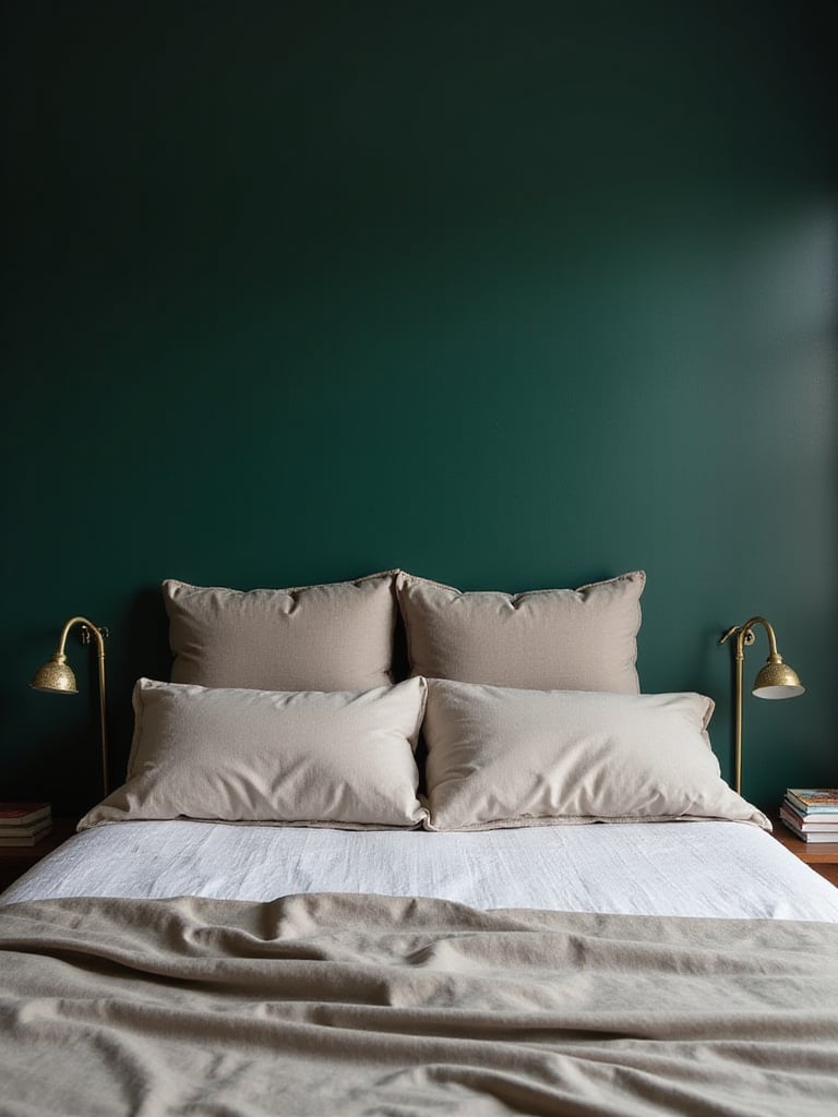
Jewel tones are a direct nod to the history of grand, traditional libraries. Think of old studies filled with leather-bound books, velvet curtains, and brass lamps. Using an emerald green, a sapphire blue, or a deep ruby red on your bedroom walls taps into that history, creating a feeling of “literary opulence.” It makes the act of reading feel important, luxurious, and a little bit dramatic.
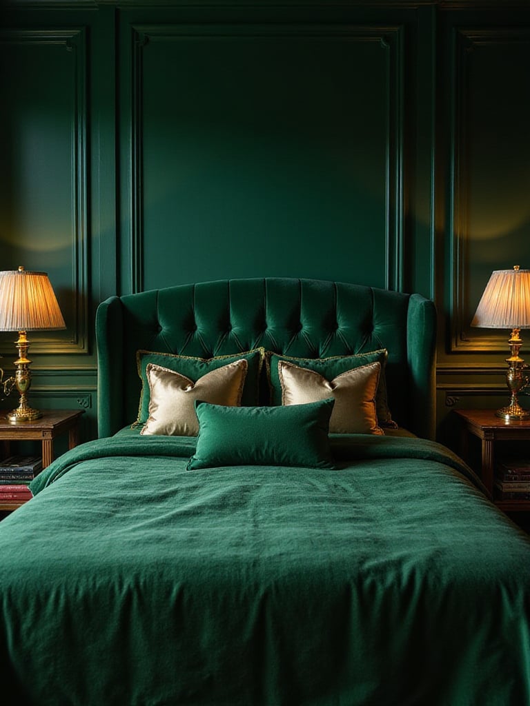
These deep, saturated colors create an incredibly rich and enveloping atmosphere, especially in the evening under warm lamplight. A jewel-toned room feels like a hidden world, a perfect escape for readers of historical fiction, thrillers, or epic fantasies. A client who was a professor of medieval literature chose an emerald green for her bedroom, and she said it made her feel like she was reading in a manuscript illumination.
Because these colors are so strong, they pair beautifully with metallic finishes. A brass reading lamp against a sapphire wall is a classic, stunning combination. You do need good light, either natural or artificial, to keep them from feeling gloomy. But in the right room, a jewel tone can be absolutely magnificent.
There’s something deeply primal and comforting about earth tones. Terracotta, ochre, sienna, and warm umber connect us to the natural world and to history. In a reading space, they feel sturdy, grounded, and timeless. These are the colors of clay tablets and ancient pigments, creating a subconscious link to the very origins of writing. This makes them a wonderful choice for readers who love history, classics, or anthropology.
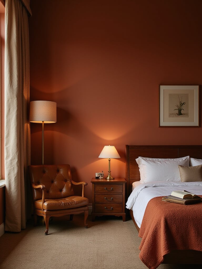
What I love about earth tones is how they behave under artificial light. Unlike some cooler colors that can go flat at night, earthy reds, browns, and golds become richer and warmer under a lamp’s glow. This creates a perfect, cozy ambiance for evening reading. It’s what I call “circadian harmony”—the colors feel right for the time of day, supporting your body’s natural rhythms.
These colors are made for natural materials. They look fantastic with dark wood, leather, wool, and linen. They create a room that feels like it has been assembled and loved over time, full of objects that have their own stories—just like a good library.
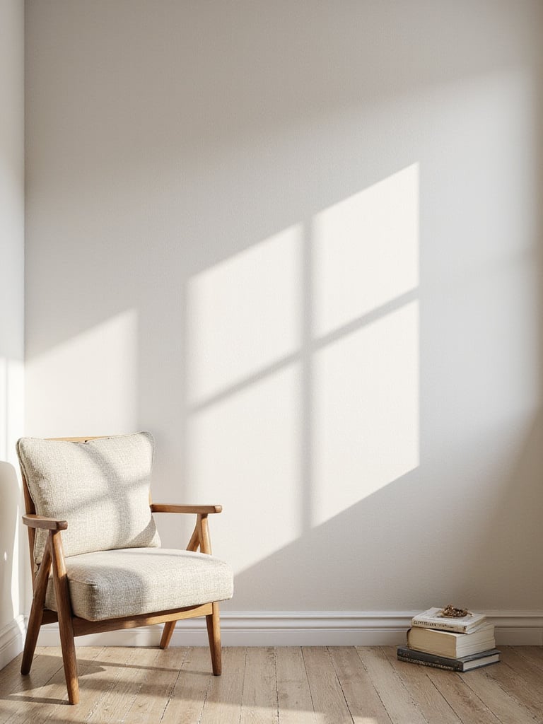
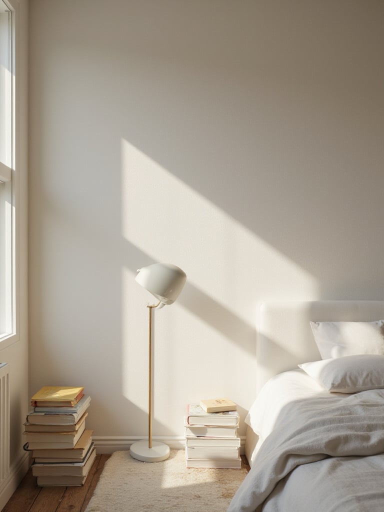
White is not a lack of decision; it is a very deliberate choice. A white room creates “literary breathing room.” It’s a clean slate that allows the world of the book to provide all the color and complexity. For a reader, especially of fiction, a white room can be a canvas for the mind’s eye. There are no visual distractions competing with the scenes you’re building in your imagination.
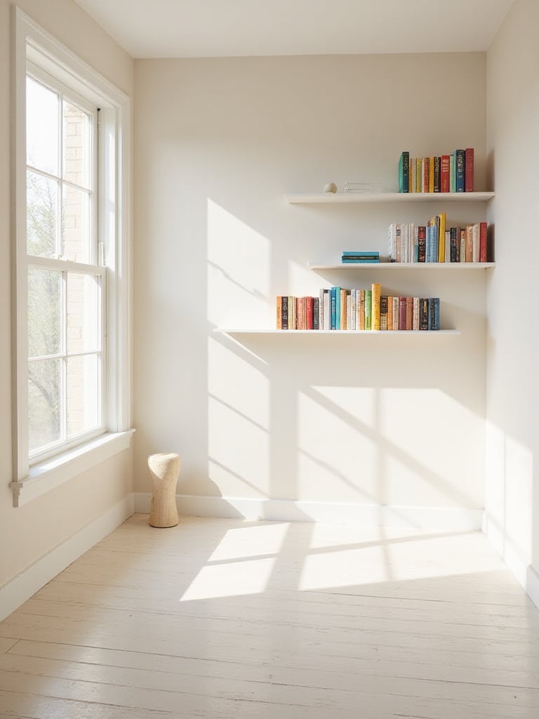
But the key is choosing the right white. A stark, cool white can feel sterile and clinical. For a bedroom, you almost always want a white with a subtle warm undertone—a hint of yellow, pink, or cream. This will keep the room from feeling cold, especially in the morning or evening light. My advice is always to get samples of three or four whites you think are the same and paint them on the wall. You will be shocked at how different they look.
A white room also turns your book collection into a gallery. The colorful spines become the art, neatly arranged against a clean, quiet background.
Reading is a sensory experience. It’s not just visual; it’s the smell of the paper, the weight of the book in your hands, the texture of the cover. A textured wall finish, like limewash or Roman clay, brings that tactile quality to your environment. It creates a space that engages more than just your eyes.
These finishes, which are applied by hand with a brush or trowel, have a soft, matte, and slightly mottled appearance. They create subtle variations in color and texture that shift beautifully as the light changes throughout the day. A wall with a limewash finish doesn’t just sit there; it has a depth and movement that flat paint can’t replicate. It feels ancient and modern at the same time.
In my design practice, I find this is a perfect choice for minimalist spaces where you want character without adding clutter or pattern. The texture itself becomes the decoration. Running your hand along a Roman clay wall is a grounding, pleasant experience—a physical connection to your surroundings that can make your reading retreat feel all the more special.
Painting the trim is like proofreading a document. It’s a finishing detail that tightens everything up and gives the space a sense of polish and intention. While crisp white trim is the classic, default choice, making a different decision here can completely redefine your room.
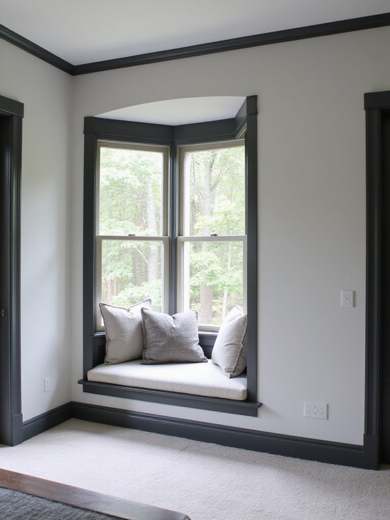
Painting the trim a dark, contrasting color—like a deep charcoal or black against pale gray walls—creates a bold, graphic effect. It frames your windows and doorways like pictures, adding instant architectural drama. A more subtle, but equally sophisticated, approach is to paint the trim the exact same color as the walls, but in a different finish. For example, eggshell walls with a semi-gloss trim. This creates a subtle, light-catching definition that feels very custom and high-end.
In a reader’s bedroom, this can be used to great effect to highlight a specific feature. Imagine a cozy window seat reading nook, where the window trim is painted a deep, inviting color that matches the cushions. It’s a small detail that says, “This spot is special. This is a place for books.”
Think of your bedroom door as the cover of a book. It’s the first hint of the story inside. Painting the interior of your door a unique color is a low-risk, high-reward way to inject personality into your reading retreat. It creates what I call a “narrative threshold”—a visual cue that you are entering a space that is set apart from the rest of the house.
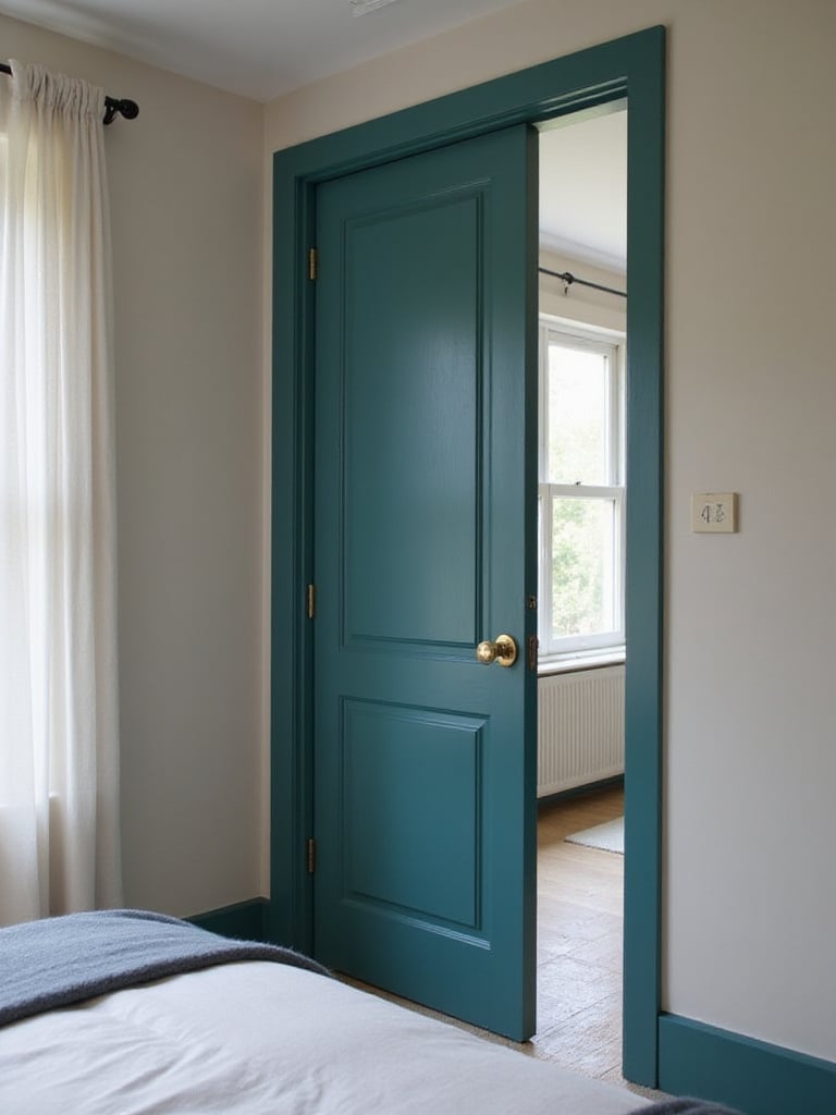
This is the perfect place to use that bold color you love but are afraid to put on all four walls. A bright, sunny yellow door in an otherwise calm, gray bedroom can be a delightful surprise. A deep teal door can add a touch of moody sophistication. The best part is that it’s a contained pop of color. It doesn’t have to dictate all your other decor choices, and when the door is open to the hallway, your bedroom’s color story remains its own.
I’ve found this works exceptionally well in homes where the bedrooms open off a neutral hallway. It gives each room its own identity right from the entrance. It’s a small project that takes an afternoon but makes the space feel infinitely more custom and personal.
This is the technical detail that most people overlook, but it’s crucial for a reader. The paint’s finish—its sheen level—dramatically affects how light behaves in your room. This “reading light relationship” can be the difference between a comfortable reading environment and one that causes glare and eye strain.
Here’s the simple breakdown I give my clients:
Understanding this isn’t just about aesthetics; it’s about the ergonomics of reading. Creating a comfortable space is as much about managing light and reflection as it is about choosing a pretty color.
Ultimately, the perfect color for your bedroom isn’t something I or any designer can pick for you from a catalog. It’s a deeply personal choice that should be guided by how you want to live in your most private space. The right color supports the bridge between the active world of reading and the quiet world of sleep. It creates an environment that can hold the energy of a thrilling story and then gently release you into a restful night.
Before you go to the paint store, ask yourself some questions. Do you read to escape, or to learn? Do you need your room to energize you in the morning, or cocoon you at night? Let the answers guide you.
And please, please test your samples. Paint a large poster board and move it around the room at different times of day. A color that looks perfect in the morning sun might look completely different under the warm glow of your bedside lamp. The right color will feel right in all lights, creating a true sanctuary that’s uniquely yours. A place where you and your books can feel perfectly at home.


