Physical Address
304 North Cardinal St.
Dorchester Center, MA 02124
Physical Address
304 North Cardinal St.
Dorchester Center, MA 02124
Transform your home with these 20 coastal kitchen ideas that blend Nordic minimalism with seaside charm. From light-filled spaces to natural textures and seaglass colors, discover how to create a kitchen that feels like a permanent vacation by the water.
The moment you step into a coastal kitchen, a real one, something shifts. It’s not about the blue stripes or seashell soap dishes. The air just feels different. Your shoulders drop. It’s that elusive feeling of standing at the water’s edge, where the noise in your head finally quiets down.
I learned early in my career, working on a project in a small cabin on the Swedish coast, that true coastal design isn’t about adding things to a room. It’s about stripping away everything that isn’t essential until all that’s left is light, function, and a deep sense of peace. That’s the feeling we’re after. The kitchen, as the true heart of the home, is the perfect place to cultivate it.
Let’s forget the clichés. This is about bringing that clear, Nordic-inspired coastal calm into your kitchen, one honest element at a time.
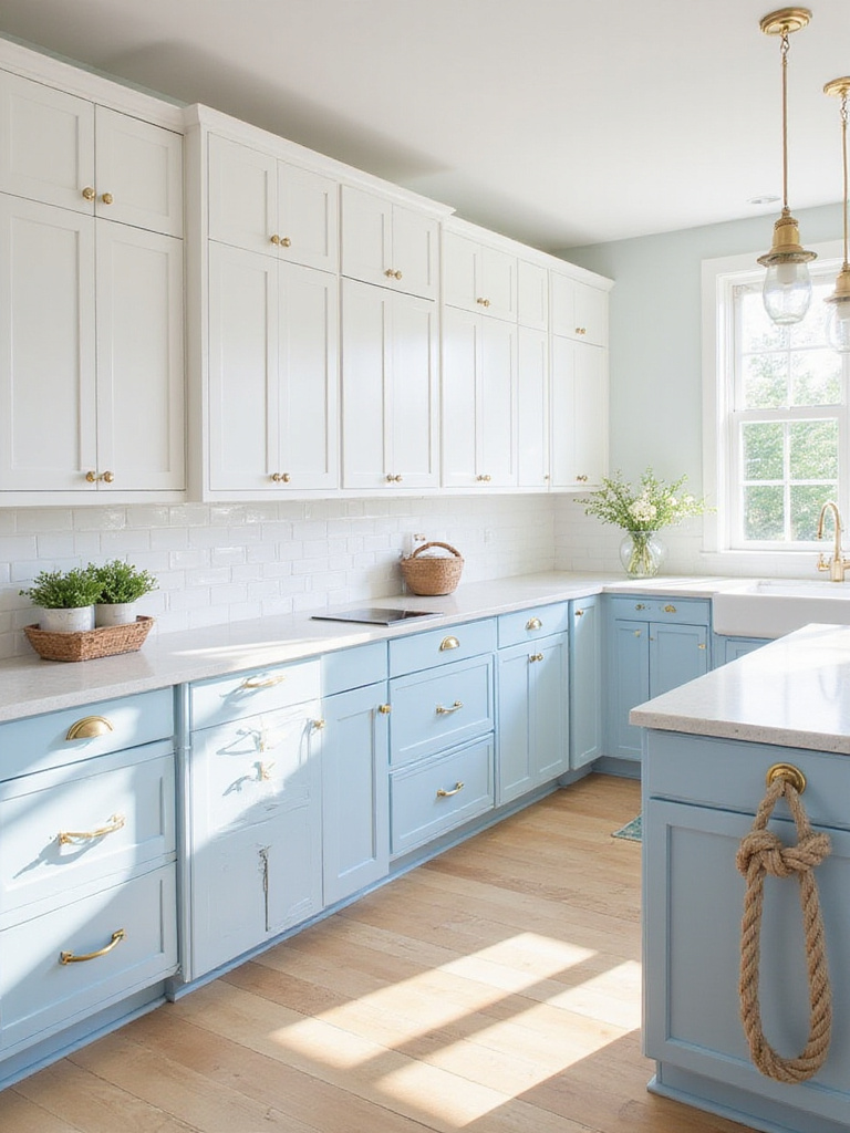
Forget “coastal colors.” Think instead of a specific coast. Is it the chalky white cliffs of Møn, the deep, moody blues of the Lofoten Islands, or the sandy tones of Skåne’s beaches? The palette for a genuine coastal kitchen comes from a real place, not a paint swatch book. The base is almost always a spectrum of whites and light greys that amplify the light. Then, you layer in the colors of the water and sky—not just one blue, but a range from pale, misty morning blue to a deep, stormy navy.
What I tell my clients is to find a single photograph of a coastline they love and pull every color directly from it. One client in Malmö kept trying to make a bright, Mediterranean blue work in her kitchen, and it felt jarring. It fought the soft, silver light of southern Sweden. We switched to a muted, grey-green pulled from a photo of sea-washed stones, and the entire room settled. It finally felt authentic.
The right colors don’t just decorate the space; they tune it to the natural light you have. And getting that light right is everything.
In Scandinavia, we don’t just like natural light; we are obsessed with it. Because for half the year, it’s a precious, fleeting commodity. Coastal design, at its core, is a strategy for capturing and multiplying every single photon. Abundant light makes a space feel open and alive, connecting you to the outside world, which is the entire point.
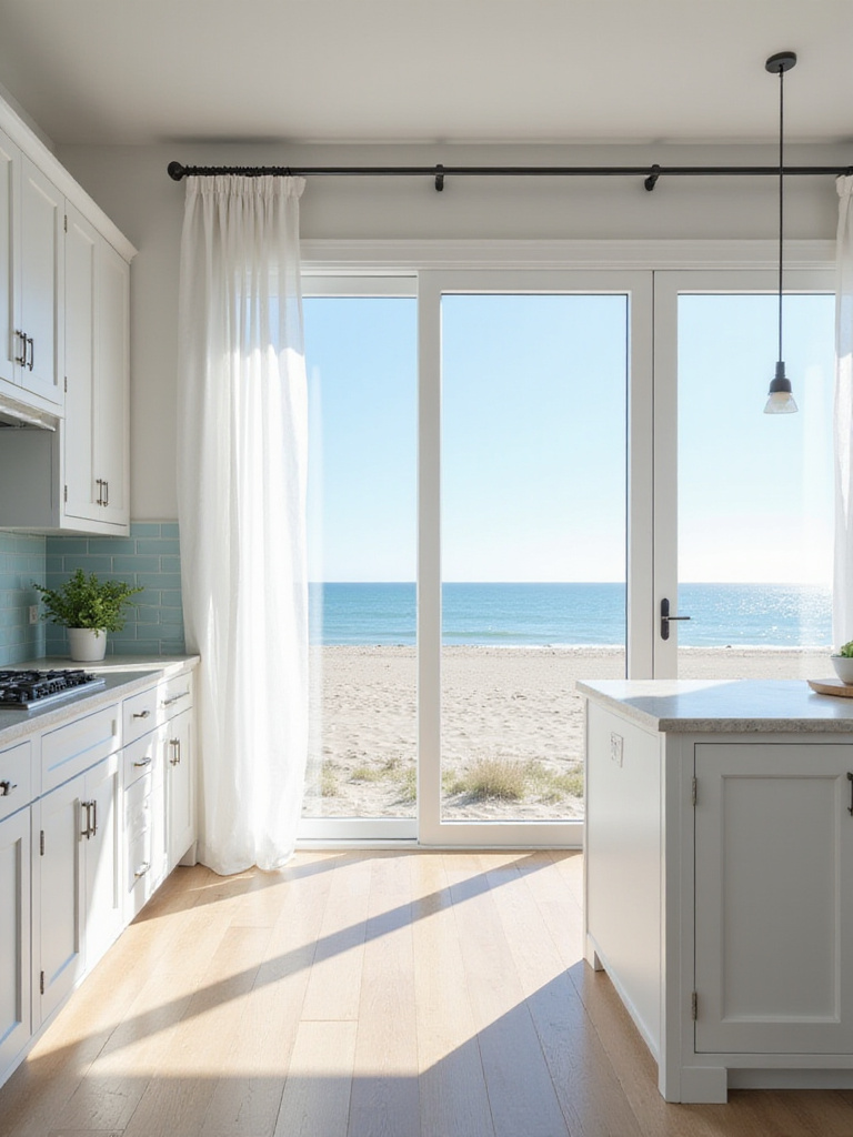
Don’t just think about windows; think about every surface. I once worked on a beautiful but dark ground-floor apartment kitchen in Copenhagen. The first thing we did was remove the heavy, fussy blinds and leave the windows completely bare. It was a small change that made a world of difference. Then we focused on reflection. We used a semi-gloss paint on the ceiling—not the walls, that can be too much—to subtly bounce light downwards. The backsplash was a simple, glazed white tile. The effect was transformative.
In Scandinavian design, we don’t just decorate with light—we design the room for the light. It is the most important element, always.
In my experience with sustainable design, maximizing daylight is also the single most effective way to reduce energy consumption and improve your well-being. It’s a design choice that gives back. Once that light is flooding in, you can start playing with textures that will catch it.
People often associate shiplap and beadboard with American farmhouse style, but its roots are also firmly planted in Nordic maritime life. Think of the simple, hardy interiors of fishing cabins and boat hulls. It’s about adding texture and a sense of structure without ornamentation. Shiplap, with its clean horizontal lines, can make a space feel wider. Beadboard, with its vertical rhythm, can give a room a classic, humble charm.
I’ve seen this play out when clients worry about it looking too rustic. Frankly, it can if you’re not careful. But here’s the secret: when you paint it a clean, gallery white and pair it with modern, minimalist cabinetry, it doesn’t read as “farmhouse.” It reads as pure architectural texture. A client in Gothenburg used beadboard on the ceiling of his long, narrow kitchen. It instantly gave the room a cozy, handsome character, like being inside the hull of a well-made boat.
This kind of textural backdrop is the perfect canvas for something that can scare a lot of people: open shelving.
I know what you’re thinking. Won’t open shelves just get cluttered and messy? Yes, they absolutely will if you treat them like cabinets without doors. But that’s the wrong way to think about them.
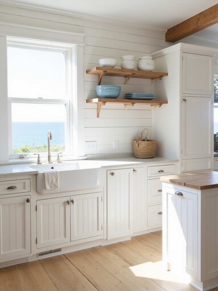
Open shelves are not for your mismatched Tupperware or the half-empty bag of flour. What I tell my clients is this: open shelves are for the things you use every single day, and the few things you own that are beautiful enough to look at. Think of it as a curated display of your life. This is the Nordic principle of lagom in practice—not too much, not too little. Just right.
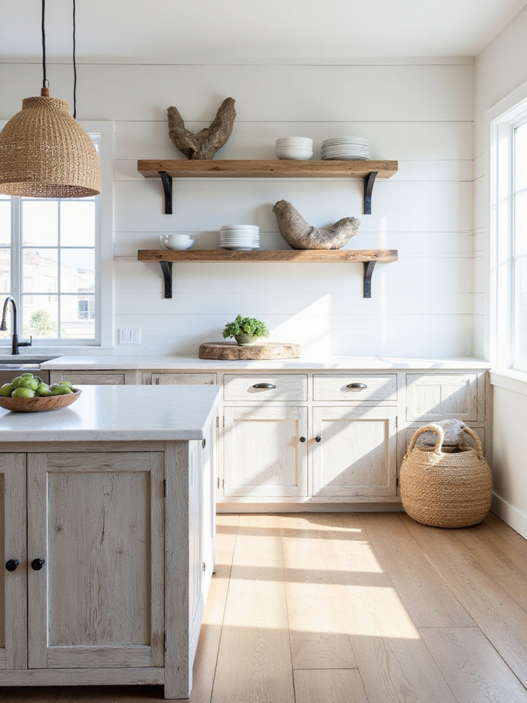
For a recent project, we installed two simple, thick shelves of reclaimed oak. On them, we placed a small stack of everyday white ceramic plates, three hand-thrown coffee mugs, a clear jar of oats, and a single, sculptural piece of driftwood the owner found on a beach in Denmark. That’s it. It’s functional, personal, and breathes life into the kitchen. It forces you to be intentional about what you own.
The wood from those shelves introduces an important element we should talk more about: the beauty of imperfection.
New, perfect materials can feel sterile. It’s the wood that looks like it has a story—the sun-bleached, salt-scrubbed character of driftwood or reclaimed timber—that brings soul to a coastal kitchen. These pieces connect your home directly to the natural world. They offer a texture and an honesty that no factory finish can replicate.
From my work in sustainable design, I always encourage clients to seek out genuinely reclaimed materials. There’s a huge difference between a commercially “distressed” piece and wood salvaged from an old pier or barn. The first is a costume; the second has character. A butcher block countertop made from reclaimed wood will show knife marks and stains over time, and that’s the point. It becomes a map of all the meals and conversations shared around it.
“The most authentic coastal kitchens embrace imperfection. The slightly uneven edge of a weathered shelf tells a story of time and the elements.”
Driftwood is best used as a found object—a single, beautiful piece on a shelf, or fashioned into a unique handle for a pantry door. Its organic, sculptural shape is art created by the sea itself. This leads to the smaller details, the ones you touch every day.
Kitchen hardware is like jewelry. It’s a small detail that can define the entire feel of the room. For a coastal look, you want to avoid anything too literal or kitschy. No anchor-shaped knobs, please. The goal is to suggest a maritime heritage, not scream it.
Look for hardware based on functional maritime objects: boat cleats, simple D-ring pulls, or rugged knobs in materials that age well, like unlacquered brass or tumbled bronze. These metals will develop a patina over time from the oils on your hands, getting better with age. I’ve seen this go wrong quickly. A kitchen plastered with shiny chrome cleats can feel cheap and thematic. But a few heavy, matte brass cleat pulls on pantry drawers? That feels authentic and purposeful.
The authenticity of these pieces sets a tone. Now let’s carry that philosophy into your decorative accessories.
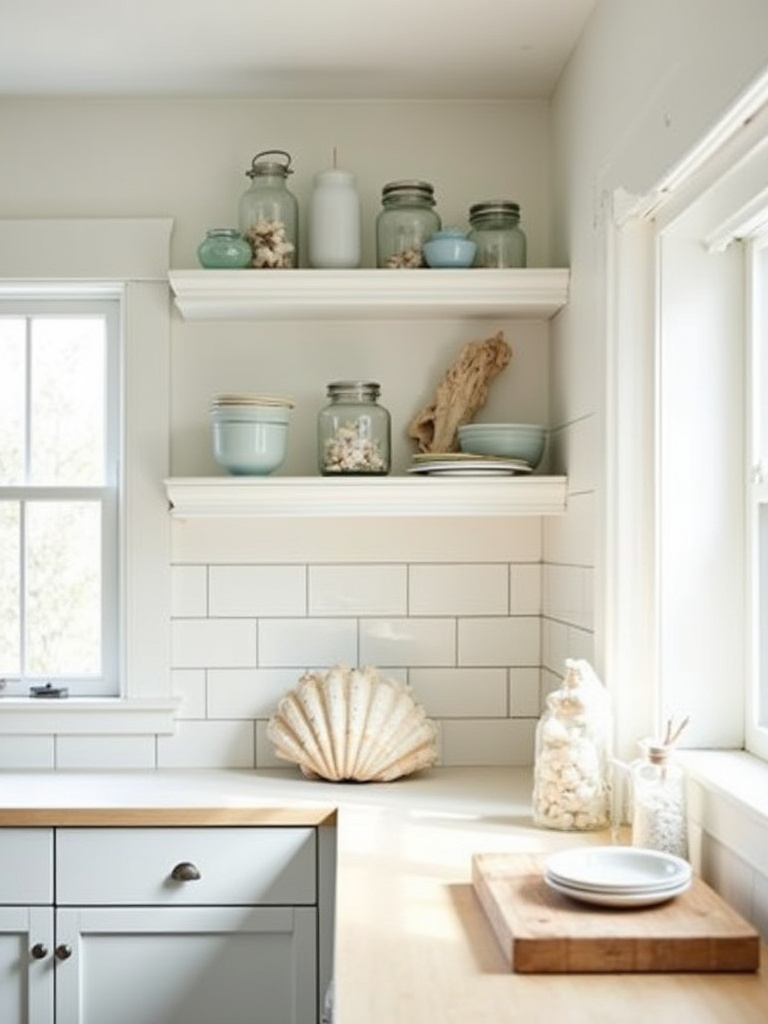
This is where you need to become a ruthless editor. A coastal kitchen is defined as much by what you leave out as what you put in. The goal is not to create a museum of seaside tchotchkes. It’s about a feeling.
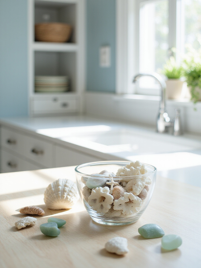
What I tell my readers is to think like a curator. One perfect, large conch shell displayed on an open shelf is a piece of sculpture. A bowl filled with dozens of tiny, broken shells from a gift shop is just clutter. Choose a few objects that have personal meaning or exceptional beauty. A stack of smooth, grey stones from your favorite beach, a collection of sea glass in a simple glass jar catching the light on a windowsill, a framed vintage nautical chart of a meaningful place.
Often, the most powerful details are textural, like the humble material we see everywhere in coastal life.
In the Nordic fishing villages I grew up visiting, rope wasn’t decoration. It was a tool. Essential. Coils of it lay on every dock. Bringing it into a kitchen is a way of honoring that heritage while adding a wonderful, organic texture that contrasts beautifully with the hard surfaces of a kitchen.
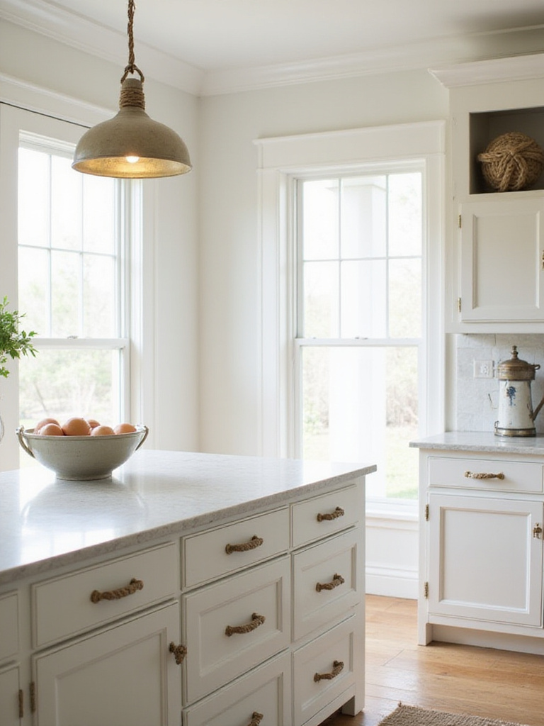
But be selective. In my experience, rope works best when it feels integrated, not just stuck on. Instead of a kitschy rope-trimmed mirror, try wrapping the plain electrical cord of a pendant light with thin jute rope. It’s a brilliant solution that solves a practical problem (hiding an ugly plastic cord) while adding authentic texture. You can also use thicker rope for drawer pulls, but think about where. A rope pull on a less-used pantry door is charming; on the main cutlery drawer that you open twenty times a day, it might get grubby.
This kind of detail works hand-in-hand with the right kind of lighting to set the entire mood.
Lighting fixtures are the focal points of your kitchen. They need to do more than just illuminate the space; they need to reinforce the story. For a coastal kitchen, this means fixtures that feel like they have a purpose, that could withstand the elements. Lantern-style lights and glass pendants are staples for a reason.
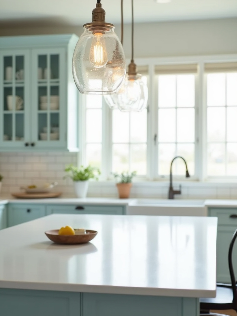
Lanterns, with their simple cages, evoke the lights used on piers and ships. Glass pendants, especially clear or seeded glass, let the light shine freely and feel as transparent as water. But the material is what really counts. I’ve seen a client pick a gorgeous lantern fixture in shiny, polished chrome, and it shattered the entire illusion. It looked brand new. Look for finishes like aged brass, oil-rubbed bronze, or matte black iron. These suggest a life lived and a patina earned through exposure to salt and air.
The ruggedness of these fixtures provides a perfect counterpoint to the casual, soft texture of woven elements.
Wicker and rattan bring an immediate sense of relaxed, indoor-outdoor living. Their woven texture and natural color add warmth and softness, preventing a minimalist kitchen from feeling too stark. Now, this is where it can get tricky. You want to evoke a Nordic summer house, not a tropical resort.
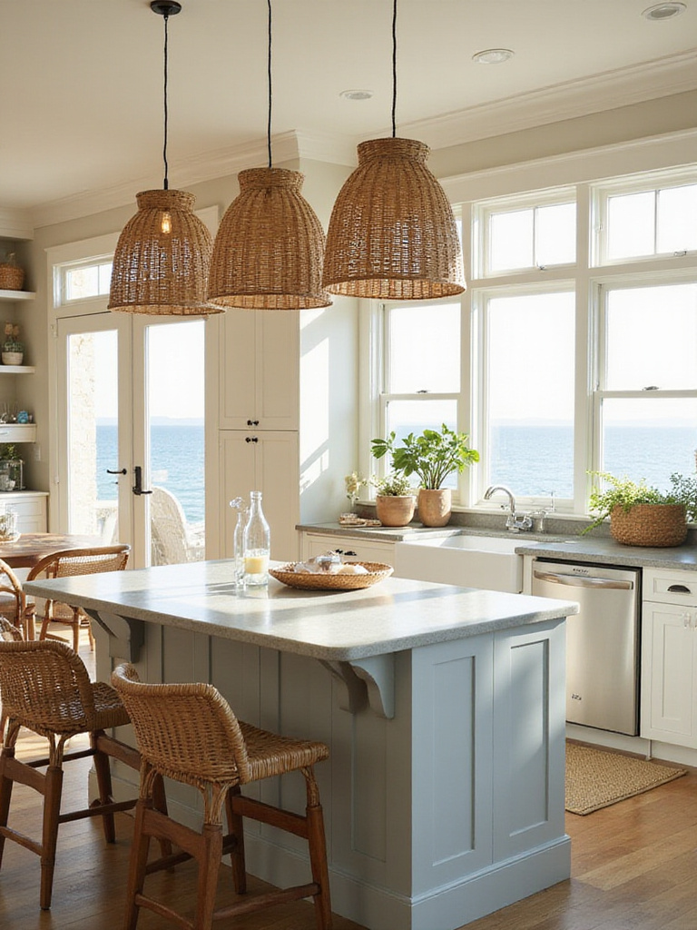
The key is to use these materials as an accent, not a full suite. I’ve seen this work beautifully when a single element introduces the texture. For instance, pair your clean-lined cabinetry and simple wood table with classic Danish-modern counter stools that have woven rattan seats—something from a heritage brand like Sika-Design, perhaps. Or hang a large, single pendant light with a woven wicker shade over your dining table. It becomes a statement piece that adds warmth and diffuses light beautifully.
This natural texture pairs perfectly with a backsplash that has its own subtle character.
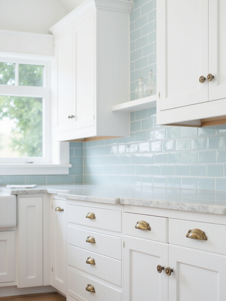
Yes, subway tile is a classic for a reason. It’s simple, clean, and timeless. It provides a quiet backdrop that doesn’t compete for attention. But we can do better than the standard, machine-perfect white tile.
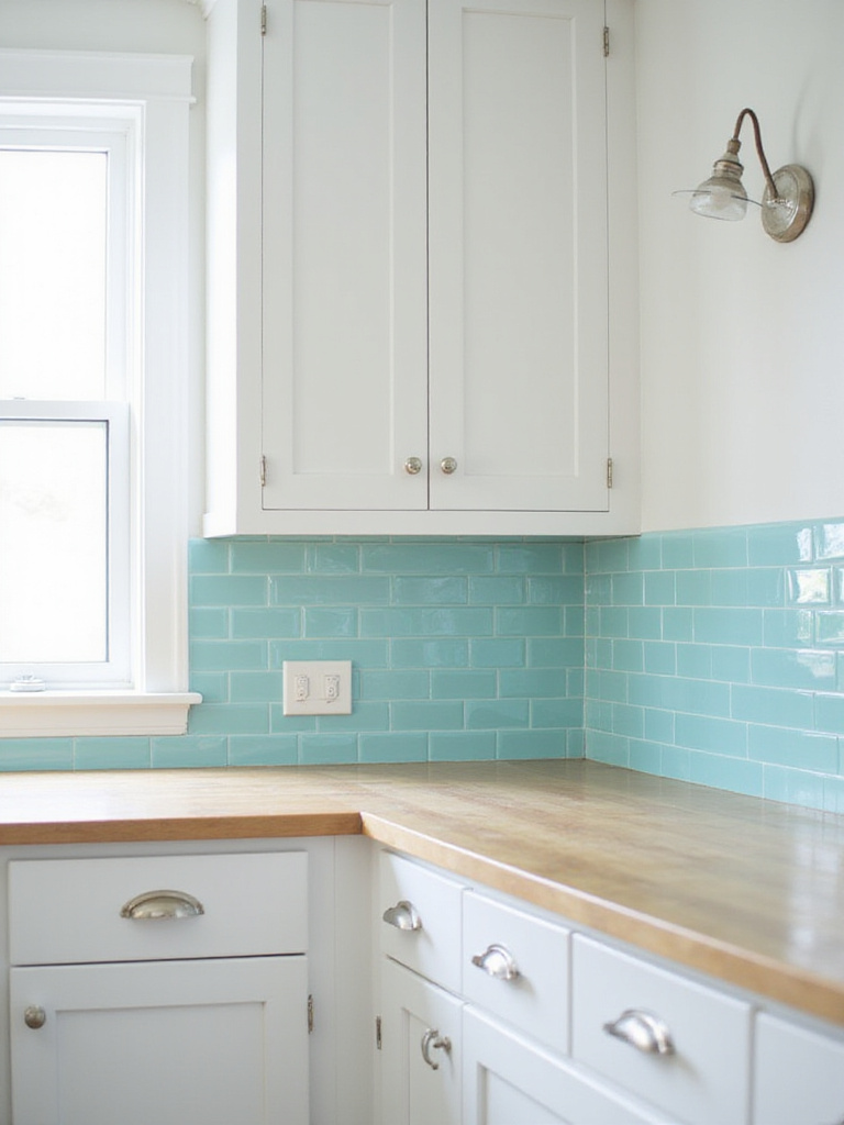
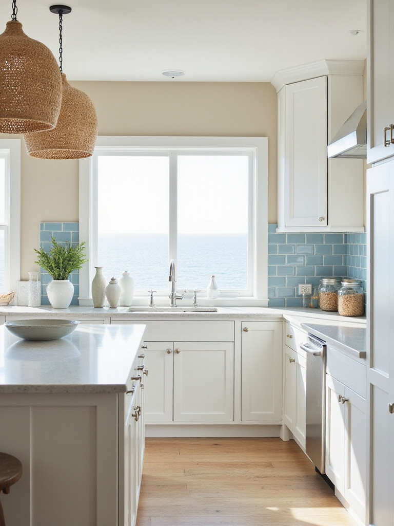
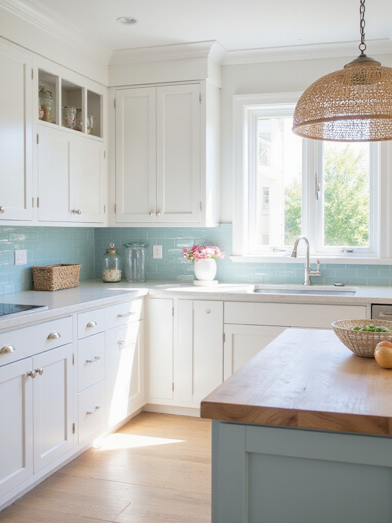
To truly capture the coastal feeling, think about how light reflects off water. It shimmers, it’s dynamic. What I tell my clients is to look for handmade tiles, like Zellige tiles from Morocco, or a domestic equivalent. They have slight irregularities in shape and color, and the glaze is imperfect. When you install them, the surface isn’t perfectly flat. It catches the light in a thousand different ways throughout the day, creating a beautiful, watery effect. Choose them in a range of whites, or soft, sea-glass blues and greens for a look that feels alive.
This textured backdrop needs a calm, simple surface to rest on.
Light countertops are the foundation of a bright, airy kitchen. They function like a sandy beach, reflecting light up into the space and making the entire room feel more expansive. They provide a clean canvas for all the other colors and textures to play on.
While durable quartz in a light, marble-look pattern is a practical choice, don’t dismiss natural materials. In my experience with Nordic design, the focus is often on materials that tell a story through use. A honed marble countertop will etch and stain over time. But to us, that isn’t a flaw. It’s a patina. It’s the beautiful record of family meals and life being lived in the heart of the home. A warm butcher block can also be stunning, though it requires more mindfulness around water.
The Nordic approach to coastal design embraces materials that age gracefully. A countertop that shows its history is a sign of a well-loved kitchen.
That countertop provides the perfect stage for one of the most practical and beautiful elements of a coastal kitchen.
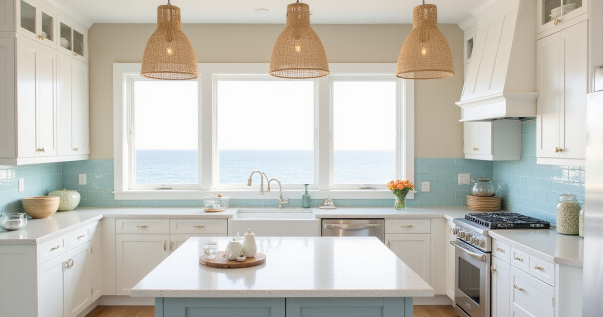
There is something inherently comforting and right about a big, deep farmhouse sink. Its design is rooted in pure function—a basin deep enough to wash large pots or even a small child after a day at the beach. That connection to hardworking, practical history is what makes it feel so at home in a relaxed, coastal design.
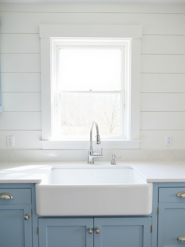
I’ve seen clients hesitate, thinking a farmhouse sink is too rustic or “country.” But it’s all in the pairing. When you set a classic white fireclay sink into a light quartz countertop and pair it with a sleek, modern gooseneck faucet in matte black or brushed brass, the result is pure Scandinavian elegance. It becomes a functional sculpture that grounds the entire sink wall.
The solid, simple form of the sink is a great counterpoint to the graphic energy of a classic pattern.
Stripes and the sea go hand-in-hand. Think of sailor’s shirts, classic beach umbrellas, old lighthouse paintings. A classic navy and white stripe is maritime shorthand for “coastal.” It brings a clean, graphic punch that feels both traditional and fresh.
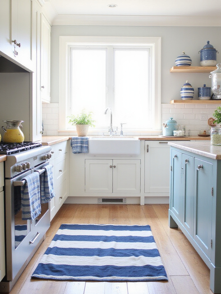
But here’s my advice: use stripes like a potent spice. A little goes a long way. What I tell my design students is to avoid putting stripes on any permanent surface like a backsplash. Instead, bring them in through textiles. A durable indoor/outdoor runner with bold, wide stripes under the kitchen table, a stack of linen dish towels with narrow stripes, or cushions for your bar stools. This way, you get the charming, nautical feel without committing to a pattern that you might tire of.
Those striped accents will look best against the clean, calm backdrop of the right cabinets.
If the countertops are the sand, the cabinets are the sky. White and light-colored cabinets are the backbone of coastal kitchen design because they do the essential work of making the room feel bright, open, and clean. They create a blank canvas that allows your other choices—the backsplash, the hardware, the textures—to truly sing.
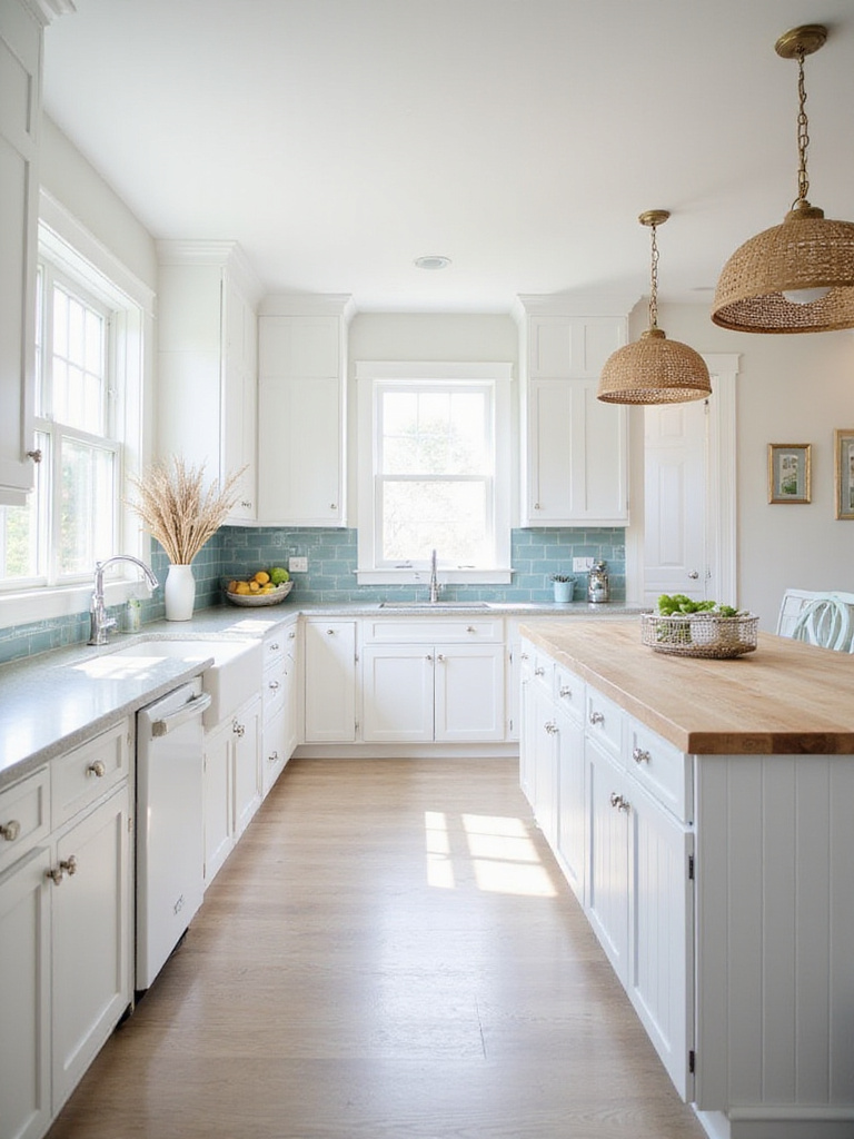
From my years of experience, I can tell you the biggest mistake people make is choosing a sterile, cold, default white. There are hundreds of whites. In a room that doesn’t get a lot of direct sun, a stark white can feel depressing. Look for a white with a subtle touch of warmth, a hint of cream or grey. My go-to is often Benjamin Moore’s “Simply White” or Farrow & Ball’s “Wimborne White.” For the cabinet style itself, you can’t go wrong with the timeless simplicity of a Shaker door. It’s honest, functional, and beautiful.
With this clean foundation set, you can now add the final layers of softness.
A minimalist space without texture can feel cold and clinical. Natural fabrics like linen and cotton are what bring the human touch, the hygge, to a coastal kitchen. They are breathable, casual, and get softer and more beautiful with use. A slightly rumpled linen tea towel or a soft cotton seat cushion invites you in. It says this is a space for living, not just for looking.
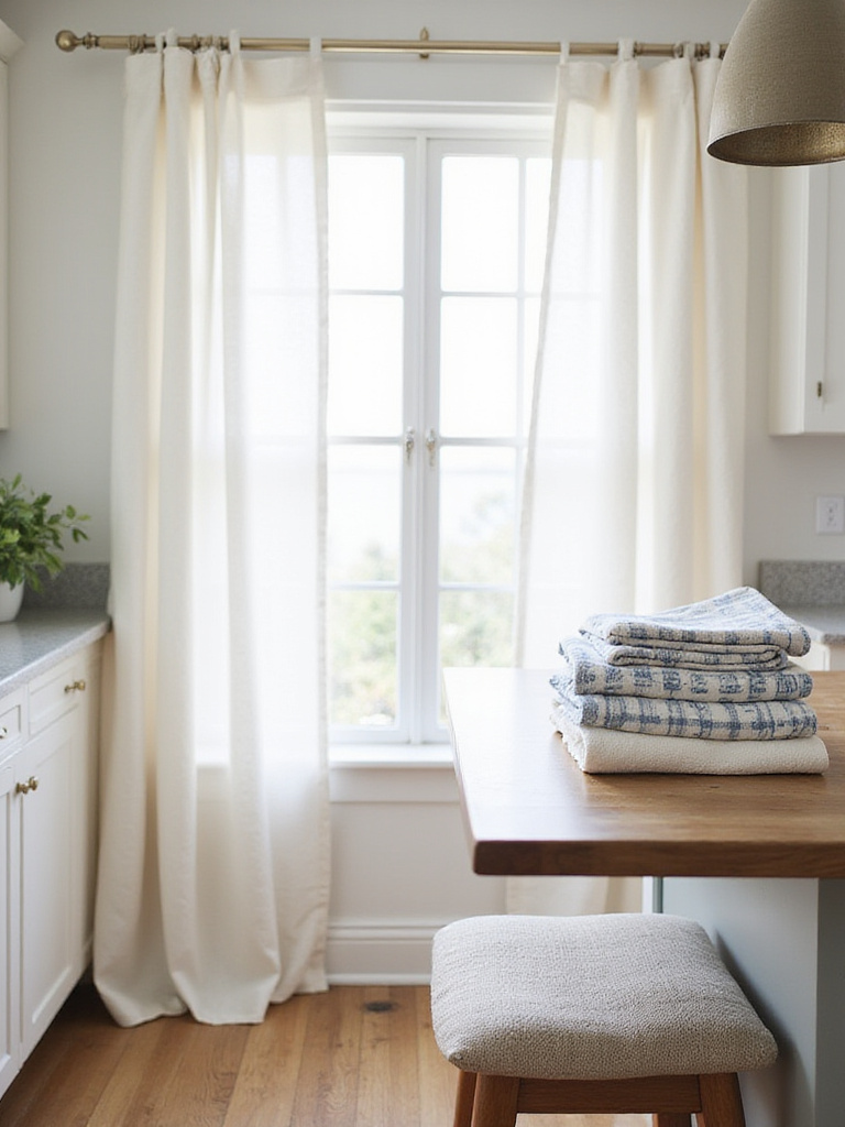
I’ve learned that texture is what keeps minimalism from feeling empty. A simple kitchen with white cabinets, light wood floors, and a stone countertop comes completely alive with just a few thoughtful textile choices. Hang simple, unlined linen cafe curtains that filter the light without blocking it. Choose high-quality cotton dish towels in your coastal palette and hang them from a hook, ready to be used. It’s these small moments of softness that make a kitchen truly inviting.
This tactile softness creates the perfect setting for the final, most personal layer.
Art makes a house a home. In the kitchen, it should be personal. Please, step away from the generic canvas print of a wave from a big box store. The art in your coastal kitchen should mean something to you.
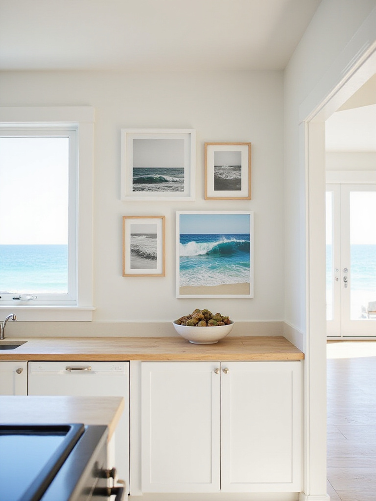
Think about pieces that tell your own coastal story. A black and white photograph of your kids on a beach. A vintage nautical chart of a bay where you vacationed. An abstract painting by a local artist whose colors remind you of the sea. I always tell my clients, buy art that gives you a little jolt of joy or nostalgia when you see it, not just something that “matches” the decor. Just be sure to frame it properly behind glass to protect it from the kitchen environment.
Your art can also be a source of color inspiration for one of our last, most subtle touches.
There’s something magical about seaglass. It’s man-made trash that has been transformed by the sea into a gem. Its colors—those soft, frosted, muted blues and greens—are the perfect accent colors for a coastal kitchen. They feel organic and serene, never loud.
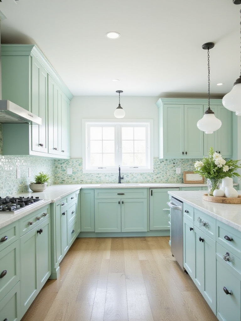
You can bring these colors in subtly. I’ve seen this play out beautifully where a client used a backsplash of recycled glass tile in a perfect, subtle seaglass green. The way the under-cabinet lighting hit it in the evening was enchanting—it had a gentle, otherworldly glow. You can also use these colors in your accessories: a collection of glass bottles on a windowsill, ceramic canisters, or the glaze on your everyday bowls.
These soft colors are the perfect complement to strong, authentic hardware details.
We’ve touched on this, but it’s worth revisiting because when done right, it’s so effective. Using functional maritime hardware like boat cleats for drawer pulls is a powerful statement. It’s an unapologetic nod to the working coast. It adds history and a rugged, tactile quality.
The key, once again, is restraint. These are accent pieces. I’ve seen a single, oversized bronze boat cleat installed vertically next to a sink to serve as a hand-towel hook. It was perfect. It was beautiful, unexpected, and it had a job to do. That’s the essence of good Scandinavian design. The same goes for rope pulls—use them on a special pantry door or a set of utility drawers, not everywhere.
This idea of adding functional, structural detail leads us to our final point.
A kitchen island can sometimes feel like a big, featureless box dropped in the middle of a room. Cladding the front and sides with beadboard is a simple way to give it instant architectural character and a sense of permanence. The subtle vertical lines add texture and visual interest, breaking up the large, flat surface.
What I tell people is that the shadows created by the beadboard grooves add depth and a connection to traditional craftsmanship. It makes the island feel more like a piece of custom furniture. Paint it the same crisp white as your cabinets for a cohesive look, or choose a contrasting color from your palette—a soft grey or a muted blue—to make it a gentle focal point of your kitchen.
It’s this attention to quiet, structural details that truly elevates a design.
In the end, creating a coastal kitchen has little to do with following a list of rules. It’s about cultivating a feeling. It’s about editing your space down to what is both useful and beautiful, and then layering in the light, textures, and colors that reconnect you to the profound calm of the natural world.
The most successful coastal kitchens I have designed are the ones that evolve over time, collecting stories along with stones from the beach. Let your kitchen become a personal sanctuary, a place where the rhythm of your daily life can flow as effortlessly as the tides.