Physical Address
304 North Cardinal St.
Dorchester Center, MA 02124
Physical Address
304 North Cardinal St.
Dorchester Center, MA 02124
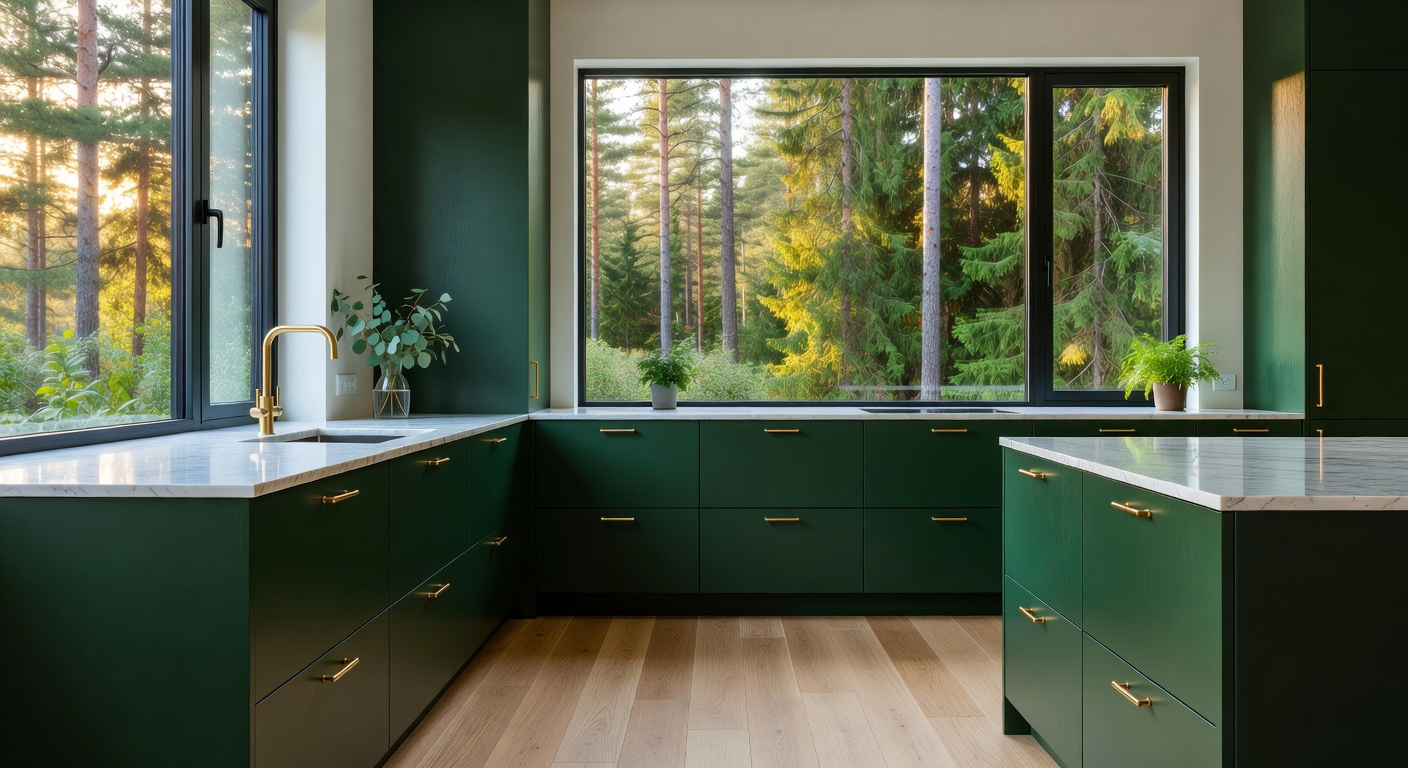
Discover the timeless elegance of green kitchen cabinets. From sage to deep forest, learn how to transform your kitchen into a biophilic luxury sanctuary.
For decades, the Nordic design ethos relied on stark whites and cool greys. We used these clinical tones to maximize scarce northern light. However, a profound philosophical shift has occurred recently. Designers are moving away from “clinical minimalism” toward “emotional minimalism.” Today, the rise of green kitchen cabinets marks a transition toward a grounded, luxury aesthetic. Indeed, the era of the sterile, white kitchen is ending.
In its place, green has emerged as the definitive “New Nordic Neutral.” If you are looking for 24 Ways to Embrace Green Kitchen Design, the philosophy starts with *Friluftsliv*, or open-air living. By incorporating organic greens, the kitchen becomes an extension of the forest floor. Evolutionary psychology suggests the human eye finds these shades inherently restful. Therefore, colors like Sage and Eucalyptus do not demand focus. Instead, they recede into the background, functioning exactly like a traditional grey. This adaptability allows the space to “breathe” rather than merely reflect light.
This guide explores the evolution from clinical whites to organic, breathing greens. We examine how “living stains” preserve the natural texture of wood grain. Additionally, we reveal why these forest hues function as practical neutrals in high-traffic spaces. Next, we analyze how green bridges the gap between warm metals and cool stone. Finally, we discuss how this palette grounds the home in a deep connection to nature.
While many consider *Friluftsliv* a modern trend, its roots are deeply philosophical. Originally coined by playwright Henrik Ibsen, the term describes the spiritual liberation found in the wilderness. Applying this concept to kitchen design requires a mindset shift. Specifically, we aim to mentally dissolve the walls between the hearth and the forest. Therefore, choosing green cabinetry becomes a deliberate act of biophilic mimicry and timeless elegance.
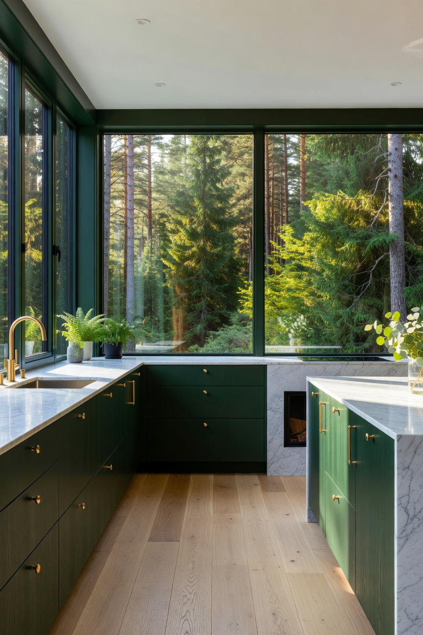
However, true Scandinavian design rejects artificial, candy-colored hues. Instead, we prioritize desaturated earth tones like sage, lichen, and darkened pine. These specific shades offer a unique sensory depth. In fact, deep green cabinets absorb the low-angle winter sun, effectively softening harsh glares. Thus, the kitchen becomes a sanctuary that feels both safely contained and naturally expansive.
Furthermore, material integrity remains non-negotiable. You simply cannot achieve an authentic “open-air” life with high-gloss, synthetic finishes. Ideally, cabinets should feature matte or milk-paint finishes that reveal the wood’s natural grain. This texture mimics the weathering of trees. It embraces the “patina of life” rather than sterile perfection.
Finally, technical precision ensures the color feels grounded. We recommend “umbra-based” greens, which contain hints of earthy brown. By pairing these rooted tones with living finishes like unlacquered brass, the space evolves organically. Ultimately, this approach transforms the kitchen into a calming, evergreen landscape. It lowers stress and connects you to nature.
White kitchens provide brightness, but they often generate high-contrast glare. This strains the eyes. In contrast, sage green offers a scientifically grounded path to visual ease. Specifically, this hue sits at 555 nanometers, the exact center of the visible spectrum. Therefore, the human eye processes it with minimal physiological effort. Viewing these soft tones can trigger the parasympathetic nervous system. Thus, sage cabinetry acts as a biological stabilizer. It effectively dampens the stress of a busy home.
Sage serves as a versatile chameleon. Exploring 19 Kitchen Cabinet Colors to Transform Your Cooking Space reveals why green remains the most soothing choice for a discerning home.
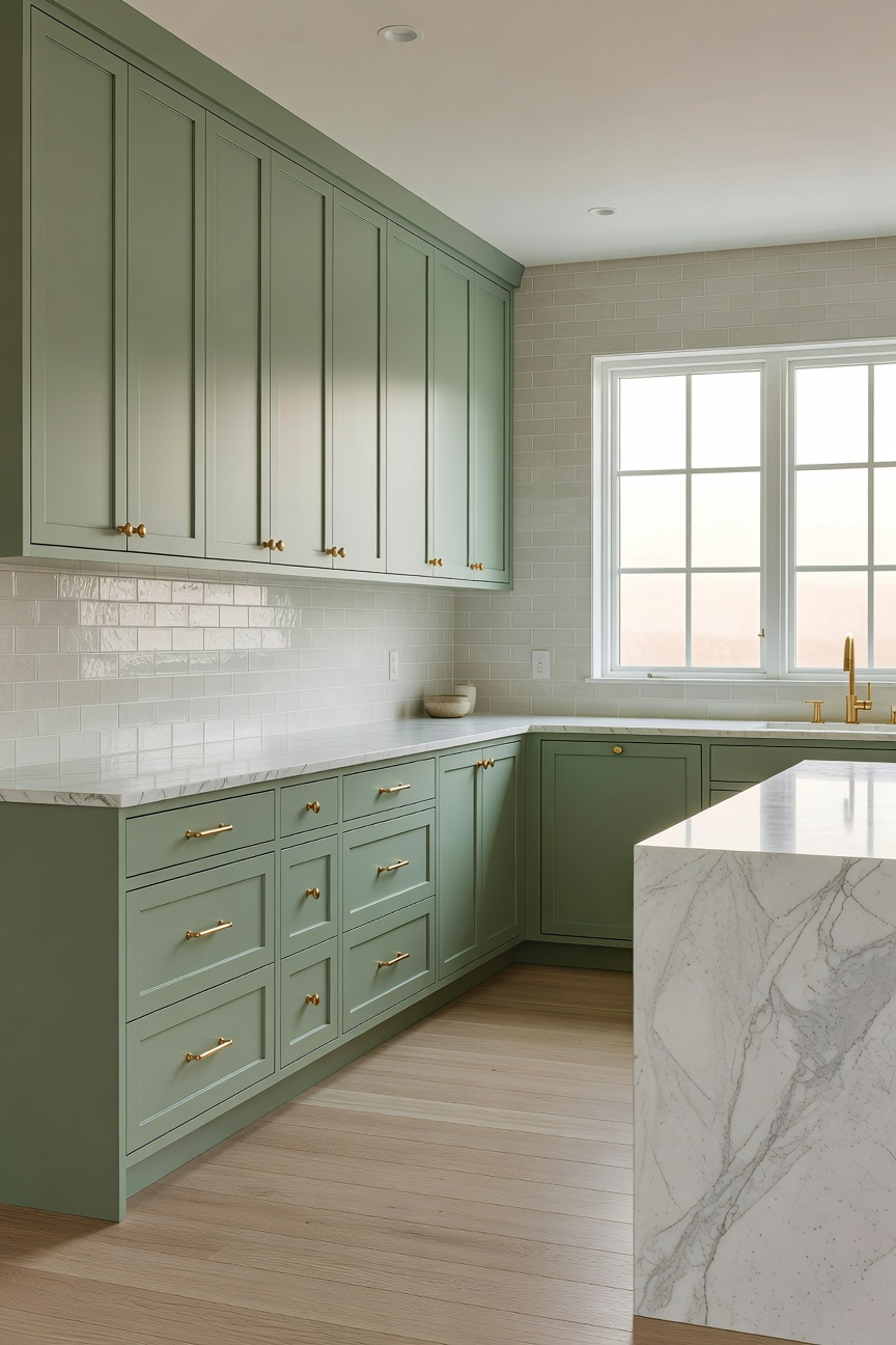
Beyond physiology, sage serves as a versatile “chameleon neutral.” Unlike static white, it possesses complex DNA composed of silver and gray undertones. Consequently, it interacts dynamically with natural light. For instance, in cool northern light, sage recedes into a sophisticated silvery-gray. But under warm evening lamps, it transforms into an intimate, velvety olive. This shift allows the room to feel airy by day and cozy by night.
Furthermore, this color choice supports a modern “wellness” aesthetic rooted in biophilic design. Today, matte sage finishes replace the glossy, dated looks of the 1990s. In fact, this texture invites touch and significantly reduces “cleaning anxiety.” Specifically, the color conceals micro-shadows like fingerprints that white surfaces amplify. Plus, sage naturally enhances organic textures. Because green complements red, it pulls out the warmth in oak or cherry floors. Ultimately, sage green creates a space that is both optically calming and practically resilient.
In minimalist design, expansive white spaces often risk feeling weightless. Or worse, sterile. Consequently, deep forest tones serve as a critical architectural tool. Unlike standard neutrals, these shades possess exceptionally low Light Reflectance Values (LRV). For instance, deep hues like Benjamin Moore’s “Salamander” act as a visual gravity point. While white walls push outward, dark cabinetry pulls inward. Thus, this “visual weight” grounds the room physically. It defines boundaries without requiring walls. By applying heritage colors to modern kitchen cabinets, you create a sense of permanence that anchors the home.
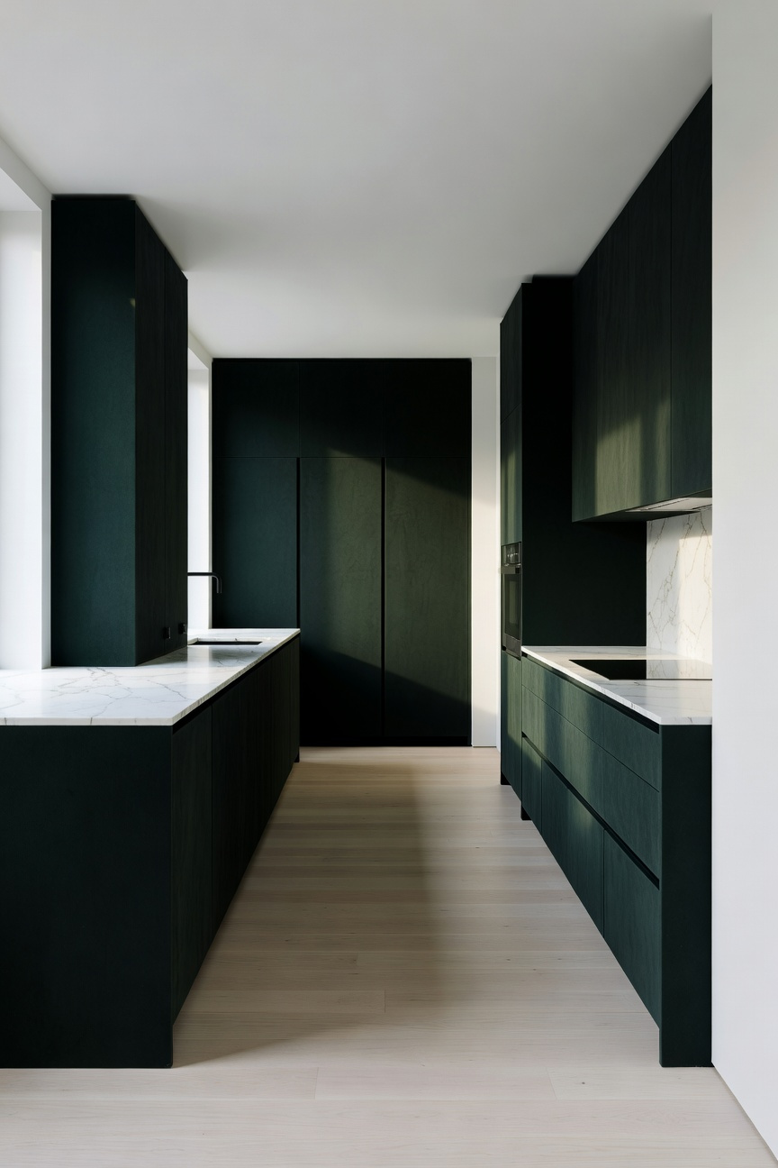
Beyond simple contrast, forest green offers biophilic complexity. Specifically, it behaves like a “mood ring” throughout the day. In low light, the cabinets may appear as soft, velvet black. However, morning sun reveals rich emerald or mossy undertones. This shifting quality prevents the kitchen from feeling static or industrial. Indeed, these tones carry deep historical resonance.
To maximize this effect, material selection is essential. Therefore, experts favor ultra-matte finishes over glossy surfaces. A matte finish absorbs light. This emphasizes the cabinet’s form as a solid, stone-like monolith. Additionally, pairing these greens with unlacquered brass adds a necessary flicker of warmth. Ultimately, this combination fosters psychological “cocooning.” It reduces cognitive load, transforming a high-utility zone into a restful sanctuary.
Muted olive functions less like a trendy accent and more like a sophisticated “heritage neutral.” Historically, this shade revives the “authentic drabs” favored by Victorian designers for library paneling. Yet, it also satisfies a modern craving for organic, biophilic minimalism. Unlike the high-contrast avocado greens of the 1970s, today’s iteration relies on a “muddied” palette. Specifically, manufacturers add significant gray or raw umber to the base. This lowers its intensity and ensures bespoke cabinetry feels truly unique.
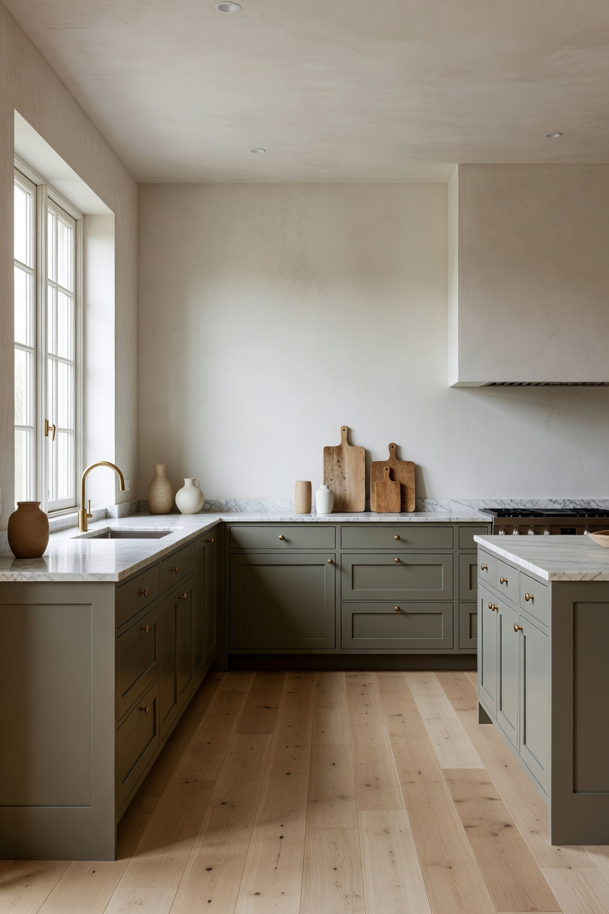
Therefore, the color behaves like a visual chameleon. Ideally, designers seek a Light Reflectance Value (LRV) between 10 and 25. Under natural morning light, yellow undertones emerge to provide modern warmth. Conversely, artificial evening light highlights the gray undertones. This creates historic coziness. Thus, the color anchors the room without feeling heavy or dark.
Furthermore, this shade serves as a bridge between different material textures. For a traditional aesthetic, pair these cabinets with unlacquered brass or soapstone. In contrast, combining olive with white oak or matte black hardware shifts the warmth toward the contemporary. Ultimately, muted olive offers personality without commitment issues. It mimics the timeless hues of moss and forest floors. Consequently, it creates a nurturing, stable environment that feels distinct from the sterile “all-white” kitchen.
At a technical level, high-gloss finishes fundamentally disrupt a room’s sense of calm. Specifically, smooth surfaces create “specular reflection.” This bounces light back in harsh, concentrated beams. Consequently, these hot spots of glare act as visual alarms. They interrupt the eye’s movement. In contrast, matte finishes possess a microscopic texture. This scatters light gently in multiple directions. Therefore, the result is a “visual sedative” that allows the gaze to glide effortlessly across the cabinetry.
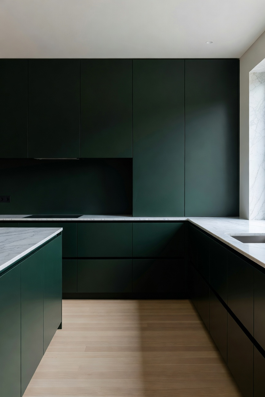
This choice aligns closely with the textures found in nature. For instance, leaves, deep moss, and weathered stone are rarely high-gloss; they are organically matte. Conversely, shiny green cabinets often appear plastic or industrial. They feel like an intrusion rather than an extension of nature. By utilizing a low-sheen finish, the pigment and material truly become one. As a result, complex undertones of sage or olive express themselves with greater depth and authenticity.
Finally, true serenity creates a space for decompression, not constant maintenance. Unfortunately, glossy surfaces highlight every fingerprint or smudge. This signals a constant need for cleaning. However, matte finishes are forgiving. They effectively hide the minor “visual noise” of daily life. Ultimately, this approach supports “nervous system minimalism,” ensuring your kitchen remains a sanctuary rather than a showroom.
Fundamentally, pairing green cabinetry with pale Nordic woods establishes a sophisticated, organic balance. This design strategy mimics the “Canopy Effect” found in nature. Here, foliage meets filtered sunlight. Unlike darker hardwoods, Ash and Birch possess high natural luminosity. Consequently, they act as light reflectors. This prevents moody green hues from making a kitchen feel enclosed or heavy.
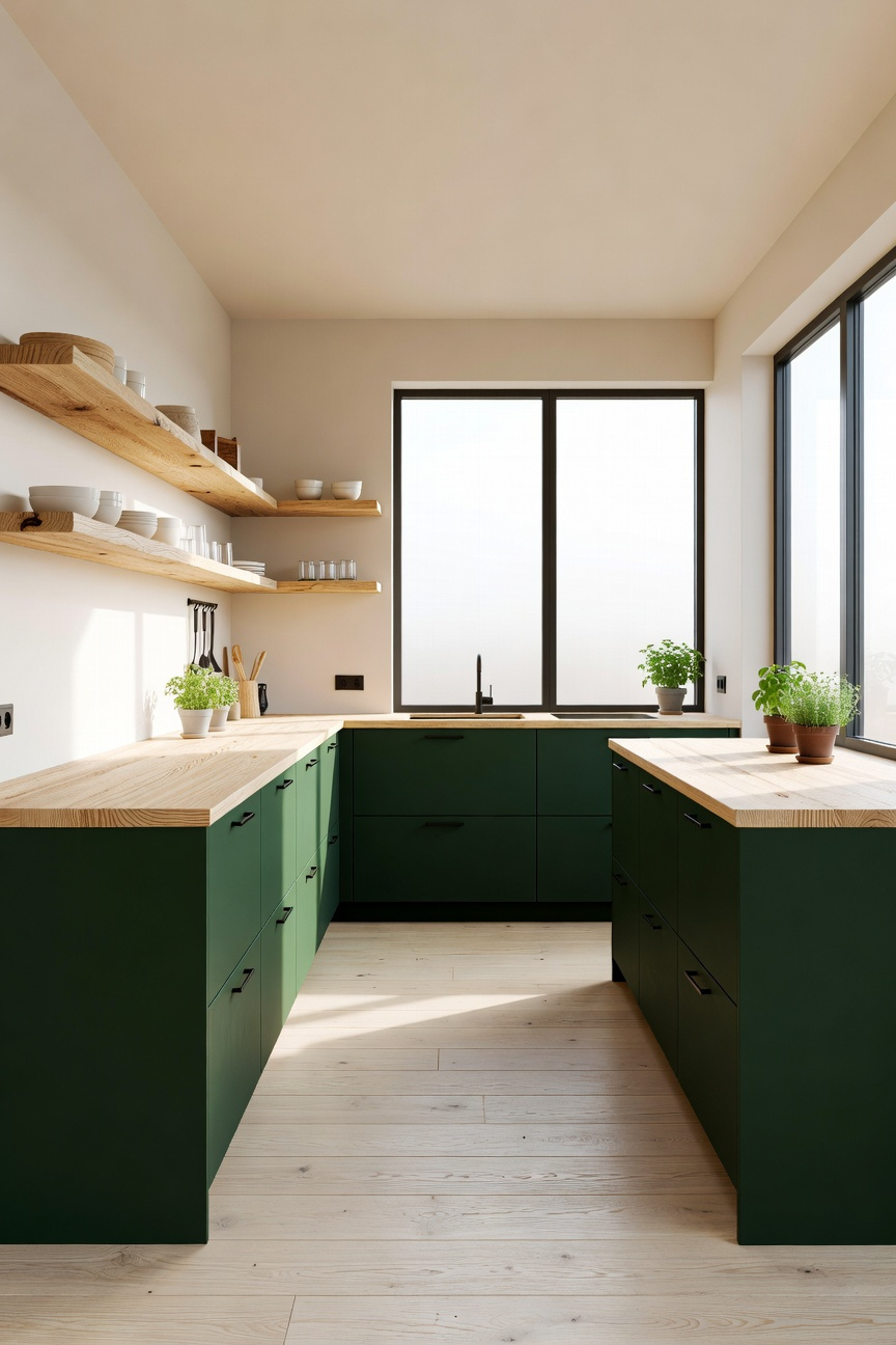
Specifically, the choice between these two timbers influences the final color harmony. Since Ash retains a distinctively cool, pale profile, it pairs flawlessly with desaturated sage or eucalyptus. The wood’s open-pore grain offers a rhythmic texture against smooth, matte paint. Conversely, Birch tends to warm over time. It eventually develops a golden amber hue. Therefore, it harmonizes beautifully with deep olive tones, enhancing the yellow undertones within the paint.
Furthermore, this material selection signals a shift toward “Soft Minimalism.” By moving away from sterile white-and-wood combinations, this aesthetic feels more evolved. In fact, utilizing fast-growing native woods like Ash and Birch supports a narrative of regenerative luxury. Ultimately, the interplay of “living” green and raw timber creates a space that feels visually breathable and deeply calming.
This aesthetic moves away from high-end kitchen styles that feel mass-produced. Instead, it moves toward a style defined by visual weight and material integrity. Specifically, the success of pairing deep green with walnut lies in “undertone anchoring.” Because red and orange sit opposite green on the color wheel, walnut’s complex violet and chocolate undertones prevent the paint from looking flat. Consequently, the wood acts as a warm visual anchor. Additionally, deep greens absorb light to create depth, while oiled walnut reflects a soft, inner glow.
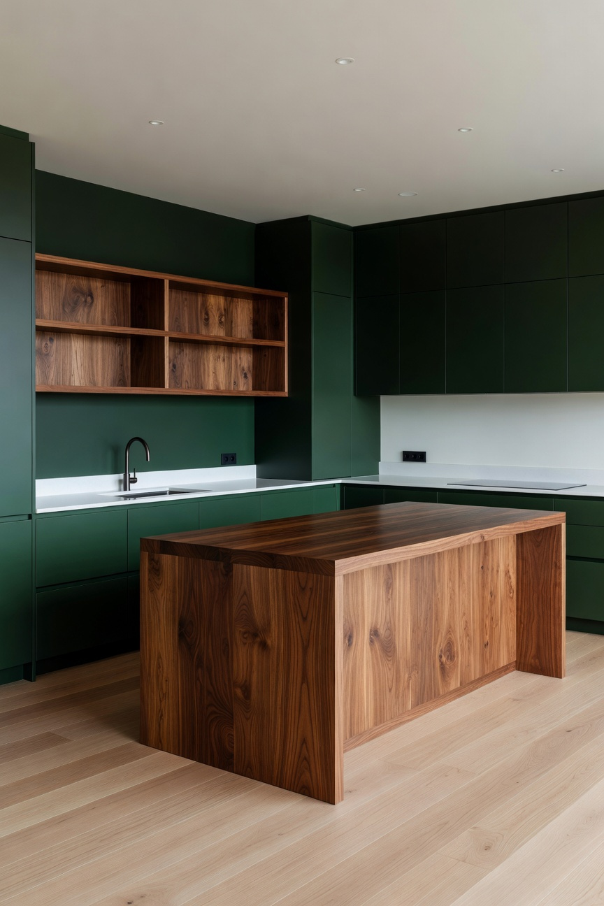
Furthermore, this combination taps directly into biophilic psychology. Designers often refer to this as the “Forest Floor” palette. The green represents dense moss, while the walnut signifies sturdy timber. Thus, the kitchen creates a “cocooning” effect that can actually lower cortisol levels. Unlike clinical white kitchens, this space signals refuge.
Moreover, this pairing serves as a sophisticated historical bridge. It effectively blends Victorian moodiness with Mid-Century Modern materiality. Therefore, the room feels curated over decades rather than purchased in a single day. To maximize this effect, use walnut in high-touch areas like internal drawer boxes. This reveals a “secret” luxury when opening a heavy green door. However, these dense materials require a visual release valve. Ideally, introduce unlacquered brass hardware or light marble countertops. Ultimately, these high-contrast elements prevent the space from feeling too heavy.
To truly ground green cabinetry, one must consider how surfaces interact with light. Polished stone often creates harsh, distracting glares. Consequently, these “hot spots” can make organic green tones appear surprisingly plastic. Therefore, designers frequently recommend honed finishes to diffuse light softly. This matte effect creates an atmospheric depth that is essential for a cozy, minimalist space.
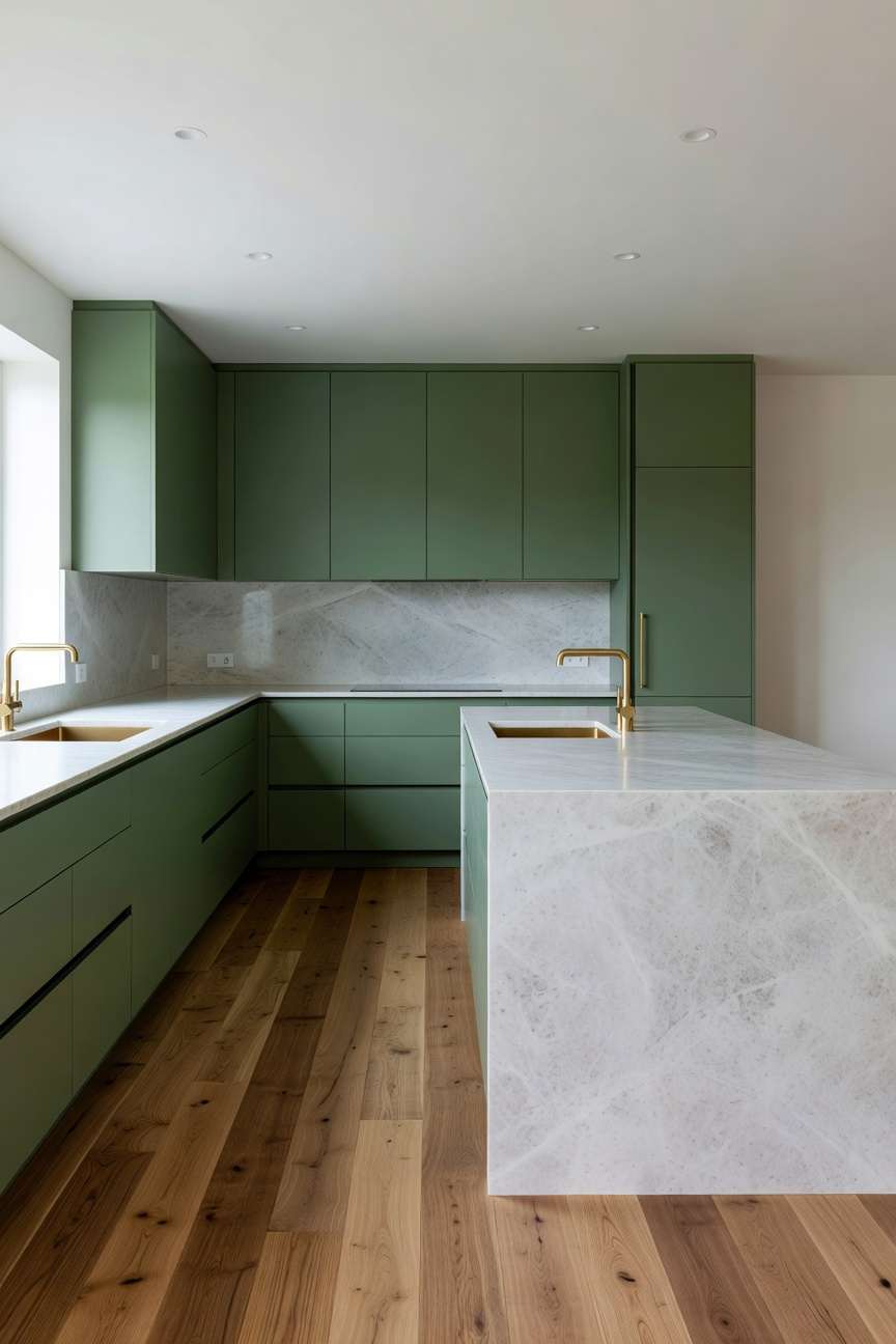
Specifically, honed marble offers a satin texture that feels warm to the touch. Because the sanding process stops early, the surface retains microscopic peaks. Thus, it lacks the cold, clinical feel of standard granite. Similarly, soapstone contains talc, providing a unique, leathery softness known as a “soapy” feel.
Furthermore, these materials embrace the “living surface” philosophy. Green is inherently a color of growth; naturally, your countertops should evolve too. For instance, soapstone deepens into a rich charcoal hue through oxidation. Even marble’s inevitable etching blends into a lived-in patina on a honed finish. Historically, this pairing mirrors 18th-century utility, where stone was chosen for function rather than showroom perfection. Ultimately, whether pairing deep olive with oxidized soapstone or sage with misty Danby marble, the result is timeless.
Green cabinetry uniquely sits between cool and warm on the color spectrum. Consequently, it often requires a “thermal stabilizer” to avoid feeling sterile. Specifically, a butcher block surface pulls hidden warmth from the blue undertones found in sage or forest pigments. Furthermore, this contrast is a study in light absorption versus refraction. While matte paint absorbs light, the wood’s natural shimmer reflects it. Therefore, the kitchen avoids looking flat or one-dimensional.
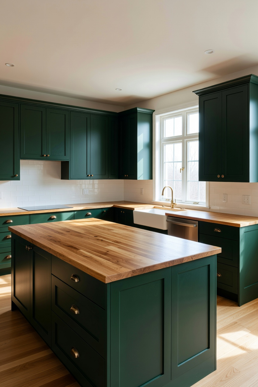
Historically, this pairing signals a “working kitchen” pedigree. In fact, it moves the design away from the “show kitchen” era. Instead, it evokes the “unfitted” heritage of a Victorian scullery. Thus, the space feels like curated, permanent furniture rather than modular cabinetry.
Moreover, the benefit is highly tactile. Unlike cold stone, wood acts as a natural insulator with physical “give.” Additionally, it absorbs sound, effectively dampening the noise of daily prep work. Ultimately, allowing the block to develop a patina creates a “living finish.” This deepens the organic connection between the home and its inhabitants.
Unlacquered brass offers more than a simple stylistic preference for green cabinetry. Specifically, it possesses a “living finish” devoid of any protective lacquer. Consequently, the metal reacts chemically with its environment to create a unique character. Over time, oxygen and moisture allow a deepening patina to develop naturally.
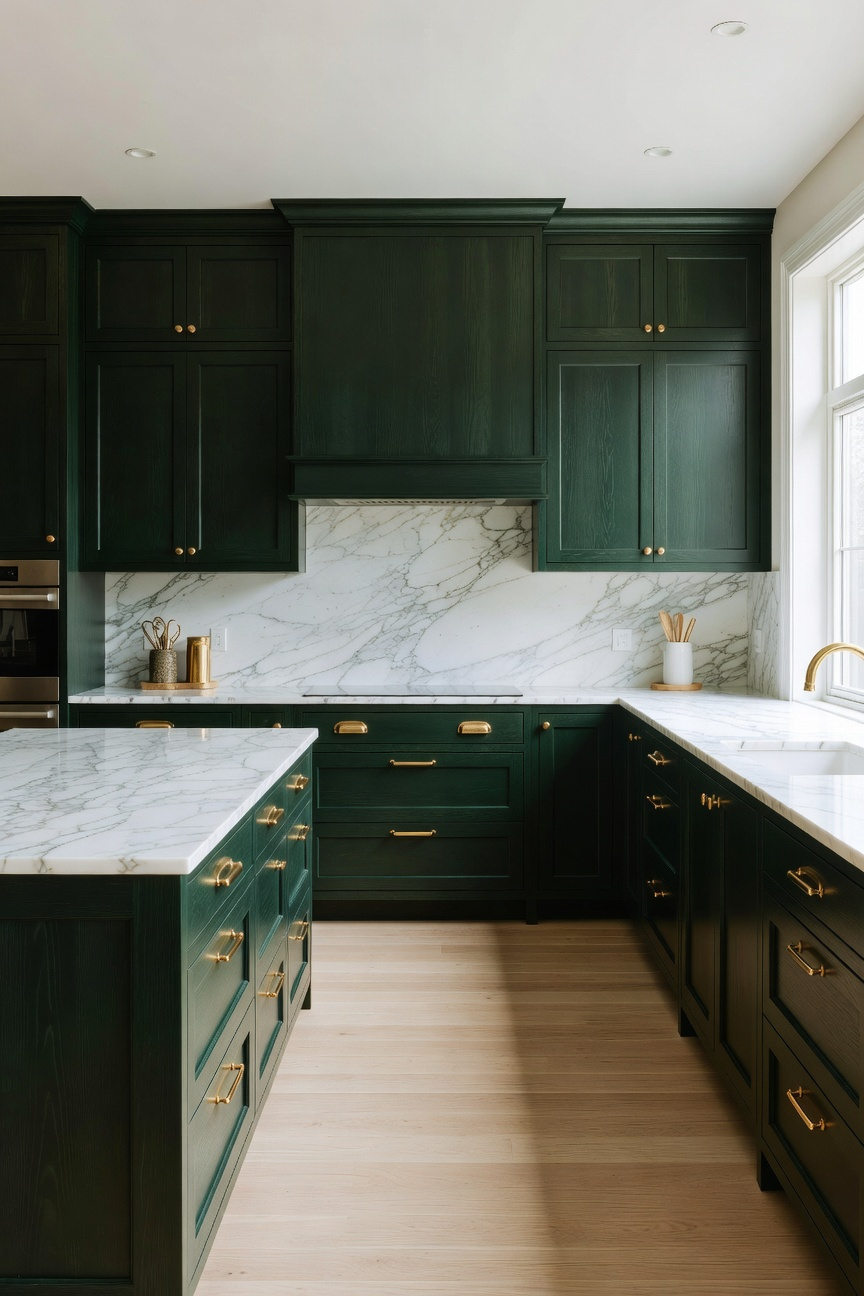
Furthermore, this material holds a distinct physical warmth. Scientifically, brass has significantly higher thermal conductivity than stainless steel or chrome. Therefore, it absorbs and redistributes body heat efficiently upon contact. Touching a solid-forged brass handle feels surprisingly human rather than cold. This tactile quality turns a simple action into a comforting ritual.
Visually, this hardware acts as the kitchen’s fine jewelry. Green cabinetry naturally brings cool, calming nature tones into the space. In contrast, brass provides a necessary sun-like warmth. This chromatic balance prevents deep forest or olive greens from feeling too moody.
Eventually, the finish maps the family’s daily rituals. Frequently touched spots remain bright. Meanwhile, untouched edges darken into rich amber. Thus, the hardware evolves alongside the home, recording its history. This “perfectly imperfect” aesthetic grounds modern designs in timeless heritage.
Hardware often serves as visual jewelry, yet leather pulls transition this element into a profound tactile experience. Specifically, integrating leather creates a “sensory bridge” against the cool surfaces of painted green cabinetry. Consequently, this pairing mimics the natural aesthetic of bark and leaf. It effectively grounds the room. While metal feels static, leather brings a low-frequency warmth. This counters the rigidity of stone countertops.
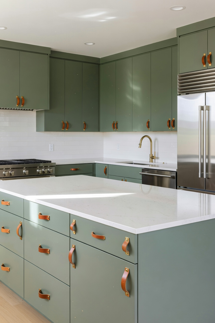
Moreover, this material introduces a necessary “tactile break” for the user. When reaching for a handle, the hand encounters softness rather than cold metal. This signals comfort and security. Therefore, the kitchen feels less like a workspace and more like a living area. Unlike chrome, vegetable-tanned leather is a “living” material that develops a unique patina. As oils from the cook’s hands interact with the hide, tan pulls slowly migrate toward deep mahogany.
However, durability remains a key consideration in culinary environments. Ideally, designers should prioritize vegetable-tanned options. These utilize tree tannins for superior stiffness and resilience. Furthermore, treating these pulls as fine tools requires occasional conditioning. Ultimately, this ritual reinforces a philosophy of slow living. It turns hardware into a cherished narrative of the home.
Many homeowners instinctively assume that dark, windowless kitchens require stark white paint. However, human biology actually suggests a different approach. Specifically, a phenomenon called the Purkinje Effect shifts our optical sensitivity toward cool wavelengths as ambient light fades. Therefore, while warm cabinets lose vitality in dim settings, blue-based greens retain their visual presence. Consequently, these hues prevent low-light rooms from feeling flat or lifeless.
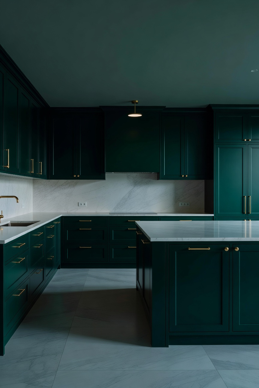
Next, you must consider the physics of depth perception. Surprisingly, light sage tones often appear muddy or grey in shadowed, north-facing rooms. Instead, deep forest greens function effectively as receding colors. In fact, darker hues visually push walls backward. This makes small, dark footprints feel significantly larger. Furthermore, you can borrow a tactical solution from Victorian design. Historically, sculleries utilized glossy finishes to harvest scant light. Thus, applying a satin or semi-gloss sheen turns your cabinetry into a series of micro-mirrors.
Finally, maximize luminosity through your choice of adjacent materials. For instance, unlacquered brass hardware provides a warm, high-intensity reflection against the light-absorbing green base. Simultaneously, pairing green joinery with a white marble backsplash creates a natural reflector dish. Ultimately, these elements work together to wash the green surface in captured daylight. This reveals complex undertones that would otherwise remain hidden.
Selecting the right lighting for green cabinetry is a surprisingly high-stakes decision. Specifically, green paint acts as a sensitive chameleon. It shifts dramatically based on the light source’s temperature. Consequently, the choice between 2700K and 3000K is not just about brightness. It is about preserving the color’s integrity.
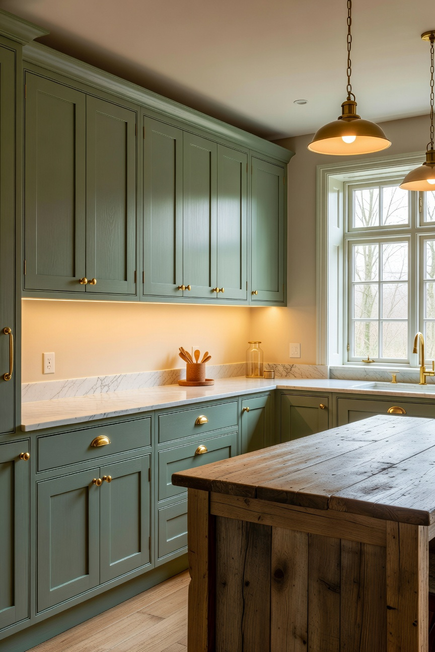
First, consider the atmospheric difference. 2700K mimics traditional incandescent bulbs, casting a heavy, amber glow. For a rustic, “English Country” aesthetic, this warmth creates a cozy, intimate feeling. However, this yellow filter poses a risk. Technically, 2700K is rich in red and yellow wavelengths. When this warm light hits cool greens like sage or mint, it effectively cancels out their blue undertones. As a result, fresh botanical colors can turn muddy or grayish-brown once the sun goes down.
Therefore, many professionals identify 3000K as the safer, modern preference. This “soft white” temperature lacks the heavy amber tint, mimicking the crispness of halogen gallery lighting. It allows the green pigment to remain “true” and airy rather than aged. Specifically, 3000K keeps sage looking silvery and forest green looking jewel-toned.
Ultimately, you must balance the bulb with the paint’s base. For warm, mossy greens, 2700K can enhance organic earthiness without clashing. Conversely, for cleaner, modern greens, 3000K prevents the kitchen from looking “jaundiced.” Furthermore, regardless of temperature, always prioritize a high Color Rendering Index (CRI) of 90 or higher. This ensures that while your cabinets look crisp, the wood floors and food still appear natural.
Rich green hues inherently carry significant visual weight. Consequently, covering an entire wall with upper cabinets can make a kitchen feel like a fortress. To combat this “monolithic” effect, designers use open shelving to act as the room’s lungs. This negative space allows both the color and the inhabitants to breathe. Therefore, maintaining a 70/30 split between closed storage and open space is critical for visual balance.
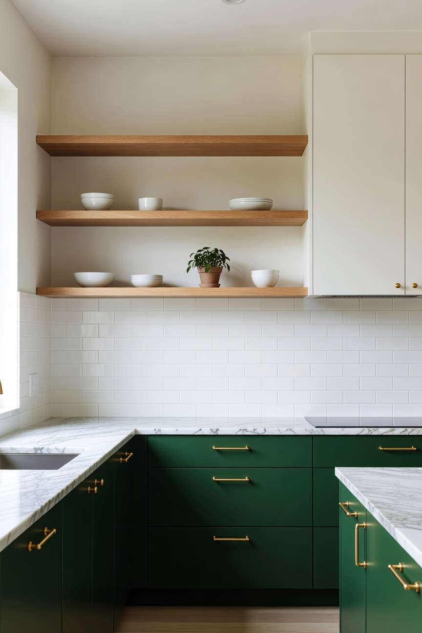
Specifically, the choice of material establishes the room’s temperature. For instance, pair muted Sage or Eucalyptus with White Oak. The wood’s linear grain maintains a clean, Scandinavian aesthetic. Conversely, moody Hunter Green requires the deep richness of Walnut. This contrast prevents dark paint from feeling cold or institutional. Furthermore, consider the “tactile balance” of your display items. Rather than cluttering shelves, create curated vignettes to maintain airiness.
Naturally, biophilic elements are essential here to soften the architecture. Incorporate trailing plants like Pothos to break up rigid horizontal lines. Additionally, introduce terracotta accents. The raw orange tones offer a sun-baked warmth that complements green perfectly. Finally, lighting transforms these shelves from storage into art. Hidden LED strips, ideally in warm 3000K, should graze the wall behind the shelves. Ultimately, this turns the open space into a glowing light box.
In a kitchen featuring green cabinetry, the flooring acts as the foundation. Specifically, the choice between wide-plank oak and slate tile dictates the room’s atmosphere. Wide-plank oak, typically five to twelve inches wide, offers an uninterrupted visual flow. Consequently, this seamlessness creates a sense of expansion. It prevents dark forest greens from feeling enclosing. Furthermore, cuts like live-sawn oak reveal “cathedral grain,” emphasizing a historical, forest-to-furniture narrative. However, wide boards “breathe” and react significantly to humidity. Therefore, experts recommend engineered white oak to prevent cupping.
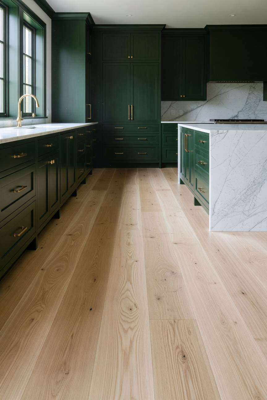
Conversely, slate tile introduces a rhythmic, geological weight to the space. Large-format tiles anchor lighter sage cabinets, providing a deliberate, structural contrast. Notably, varieties like Vermont Unfading Green create a sophisticated, monochrome-natural aesthetic alongside green joinery. Regarding tactility, the “natural cleft” finish offers superior slip resistance for busy cooks. Yet, this 400-million-year-old stone is brittle and requires a perfectly rigid substrate. Additionally, without radiant floor heating, slate feels significantly colder than timber. Oak, by contrast, acts as a natural insulator. Ultimately, the decision balances organic warmth against geological permanence.
Green kitchen cabinets do more than simply look beautiful. Actually, they function as a “natural analogue” for the outdoors. Consequently, shades like “Fir Green” trigger the parasympathetic nervous system. In fact, this connection to color can reduce cortisol levels significantly. Therefore, the cabinetry acts as a visual extension of the living plants within the room.
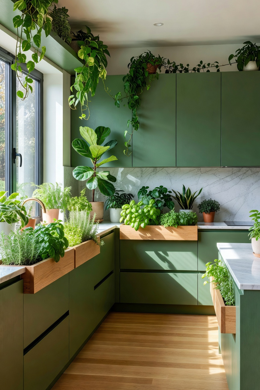
Furthermore, modern design moves gardening from the windowsill to the cabinet carcass. Specifically, “living appliances” like the Miele Plantcube now fit standard dishwasher footprints. Thus, they can be paneled to match green joinery seamlessly. This creates a cohesive “24-inch ecosystem” directly inside your culinary workspace.
Moreover, this integration engages senses beyond just sight. Placing herb gardens near the stove naturally diffuses essential oils. As a result, the cooking heat creates an “aromatic landscape” of rosemary and thyme. Additionally, soil and foliage act as biological baffles against noise. Living elements absorb high-frequency clatter, softening the room’s acoustics effectively.
Green cabinetry grounds a kitchen effectively. However, extensive painted surfaces often feel static or stark. Consequently, high-end designers integrate natural linen to soften these hard edges. Specifically, linen acts as an optical “palate cleanser.” Green paint interacts uniquely with light, sometimes appearing flat. Therefore, placing a matte, slubby linen against the cabinetry breaks this surface tension. The fabric’s microscopic ridges create shadows. These tiny shadows mimic nature’s organic imperfections. Thus, the green feels less industrial and more organic.
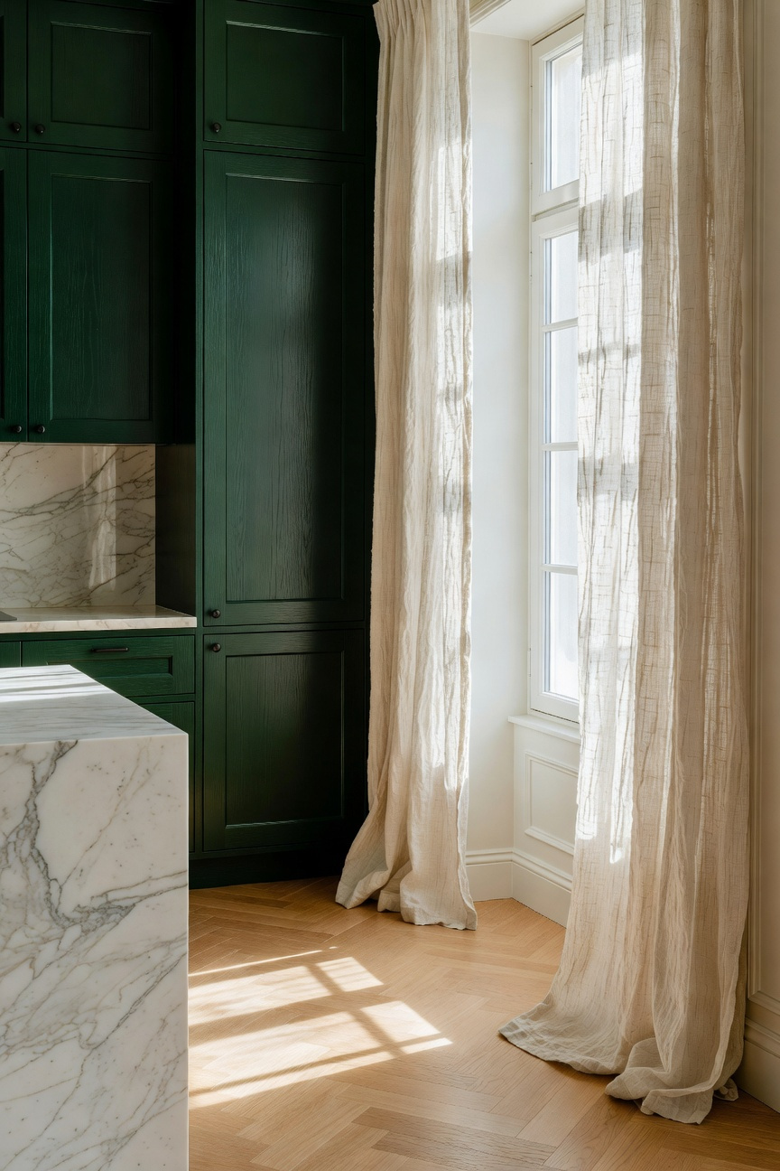
Beyond curtains, consider the sophisticated “linen sandwich” technique. Solid doors feel heavy, yet glass displays clutter. Alternatively, designers trap linen between glass sheets. This creates a “ghostly” transparency. As a result, you gain a soft, hazy view that masks mismatched dishes. In deep green kitchens, oatmeal linen inserts provide a necessary breath of air. This transforms cabinetry from storage into furniture.
Furthermore, functionality extends to acoustics. Kitchens are notoriously loud environments filled with reflective stone and metal. Green cabinetry increases this surface area. Luckily, wool acts as an “acoustic sponge.” Unlike airy linen, wool has a dense, crimped structure. Therefore, using wool-upholstered stools or runners dampens high-frequency clatter. This alignment brings auditory peace to the room. Ultimately, these materials honor the English Country House aesthetic. You are not just decorating. Instead, you are creating a “slow home” rooted in resilience and comfort.
Yes, green is considered a “heritage neutral” in luxury design. Because it is rooted in nature, shades like sage, olive, and forest green transcend fleeting trends. They offer a sense of permanence and biophilic connection that white or grey kitchens often lack.
Honed white marble, light quartz, and soapstone are ideal pairings. For a warmer, more rustic aesthetic, butcher block wood also complements green pigments beautifully. It effectively balances cool undertones with natural timber warmth.
Absolutely. Sage green, especially in a matte finish, has a receding quality. This can make a small footprint feel more expansive. When paired with high-quality lighting and light-toned flooring, it creates an airy, breathable atmosphere.
Ultimately, the shift to green kitchen cabinets represents much more than a fleeting aesthetic trend. It signifies a profound return to nature within our most functional spaces. Instead of maintaining the sterile laboratories of the past, we now cultivate restorative, living sanctuaries. Consequently, these earthy tones neutralize daily stress. They act much like the artist’s *verdaccio* technique. Therefore, the kitchen transforms into a space for mindful rituals rather than frantic chores.
Looking ahead, your home should evolve gracefully alongside your family. In fact, matte green finishes invite this journey, embracing the honest beauty of imperfection over time. Furthermore, pairing these hues with unlacquered wood creates a sustainable, timeless narrative. To begin, simply observe how natural light enters your current kitchen space throughout the day. Finally, select a shade that anchors your home in the calm of the forest floor.