Physical Address
304 North Cardinal St.
Dorchester Center, MA 02124
Physical Address
304 North Cardinal St.
Dorchester Center, MA 02124

Discover 16 cozy bedroom aesthetic ideas — warm neutrals, linen bedding, 2700K lighting, and natural materials — that create a genuinely restful Nordic-inspired retreat.
There’s a moment when you walk into the right bedroom — not a staged showroom, but someone’s actual bedroom — and your shoulders drop before you’ve even sat down. The room is doing something deliberate. Not dramatic or expensive. Just warm, considered, and genuinely restful. That quality is what the cozy bedroom aesthetic is really about, and it’s something Scandinavian designers have understood for a long time.
What they understand is that a cozy bedroom aesthetic isn’t a collection of soft things. It’s a room where every element — light, colour, material, scale — has been chosen to reduce stimulation rather than add to it. The Nordic concept of hygge, which loosely translates to a quality of cosiness and comfortable conviviality, is the design philosophy behind the most restful bedrooms in the world. And the ideas that create it are more practical than they look.
Here are 16 specific ways to build a bedroom that genuinely feels like a retreat — from the lightbulbs you choose to the way you dress the dresser.
The most common mistake in bedroom decorating is choosing bright white walls because they feel ‘safe’ and ‘clean’. In practice, bright white — especially the blue-toned whites that read well in kitchens — makes bedrooms feel clinical rather than restful. The warm quality of a cozy bedroom aesthetic starts with paint that has yellow or red undertones, and it makes more difference than people expect.

In Scandinavian design, the palette works in the territory between white and grey — greige, oat, warm white, natural taupe — with wood tones treated as a colour rather than an afterthought. Benjamin Moore’s hygge palette includes Balboa Mist OC-27, Fog Mist OC-31, and White Sand OC-10. Farrow & Ball equivalents — Elephant’s Breath, Pavilion Gray, Clunch — are all warm-toned despite reading as near-neutral from across the room. Any of these will feel fundamentally different from a bright white under candlelight.
The practical step is testing larger paint patches than usual. A 12×12-inch swatch on multiple walls, viewed at multiple times of day and under your bedroom’s bulbs in the evening — that’s the minimum before committing. A colour that reads warm at noon can look distinctly dingy under overhead lighting, so the nighttime test matters as much as the daytime one. Also test against your existing textiles: the surrounding fabrics shift how a wall colour reads by as much as three tones.
For 2026 Nordic accent colours, muted sage or dusty blue work against these warm neutrals — as a feature wall, a curtain, or a throw. They’re nature-adjacent colours that stay quiet enough to support sleep rather than stimulate it.
Always check swatches at night under your existing bulbs before you buy a full litre. North-facing bedrooms especially need warmer tones; without them, even a ‘warm neutral’ can shift grey in low light.
Matched bedding sets — where the duvet cover, pillowcases, and shams are the same fabric and colour — are the most reliable way to make a bedroom look like a hotel rather than a home. The layered look that defines the cozy bedroom aesthetic comes from mixing materials within a consistent palette, not from matching everything.

The European approach starts with a stonewashed linen duvet cover. Stone-washing pre-softens the fibres and imparts a subtly faded quality that makes new bedding look collected rather than purchased. European Flax linen — certified by the CELC and sourced from Belgium, France, and the Netherlands — is the standard in Scandinavian homes. It thermoregulates through the year, gets softer with every wash, and never needs ironing.
Underneath: a smooth percale cotton fitted sheet. The contrast between the textured linen on top and the smooth cotton underneath adds a tactile complexity that a matched set entirely lacks. Thread counts above 400 in percale cotton create a denser, less breathable weave — the sweet spot is 200-300 for a combination of softness and airflow.
Then fold a merino or lambswool throw at the foot. This is the third material, and it’s what completes the look. A wool throw laid in thirds across the foot of a made bed takes thirty seconds and creates visual depth that no amount of decorative pillows can replicate.
The mistake to avoid: buying ‘bedding sets’ where every element is the same fabric and colour. This removes the layered, lived-in quality that makes a cozy bedroom feel genuinely warm rather than assembled from a catalogue.
Platform beds in the Scandinavian tradition sit 12-14 inches off the floor — well below the 18-25 inches of a typical box-spring setup. This isn’t arbitrary minimalism. A lower visual centre of gravity in a bedroom reduces the sense of the bed dominating the room, making the floor feel more expansive and the space more restful.

The Nordic design logic behind low furniture traces back to the philosophy that visible floor space signals freedom. In a bedroom, that feeling directly supports rest. The room isn’t furniture-heavy; it’s furniture-light, with most of its visual volume below rather than at eye level.
White oak is the dominant wood choice in contemporary Scandinavian furniture — its fine grain, pale colour, and natural hardness mean it ages well without heavy finishing. Walnut runs warmer and darker, suitable when the room’s palette leans towards earth tones. Pine is the accessible option: softer and more prone to dents, but its knot patterns read as authentically Nordic when finished with a clear oil rather than a lacquer.
Pair any platform bed with floating nightstands at 24-28 inches wall height. Wall-mounted shelves at seated eye level extend the horizontal, low-set visual language and keep the floor entirely clear of furniture legs — a core principle of Nordic minimalist design. If you’re working with a small room and want to maximise the effect of low-profile furniture, the same floor-clearance thinking behind apartment bedroom decor ideas applies directly here.
A throw collection is not about quantity. Two throws on a bed is comfort; four throws is clutter. The hygge principle of ‘enough but not too much’ applies directly to textiles, and nowhere is it easier to violate than with blankets.
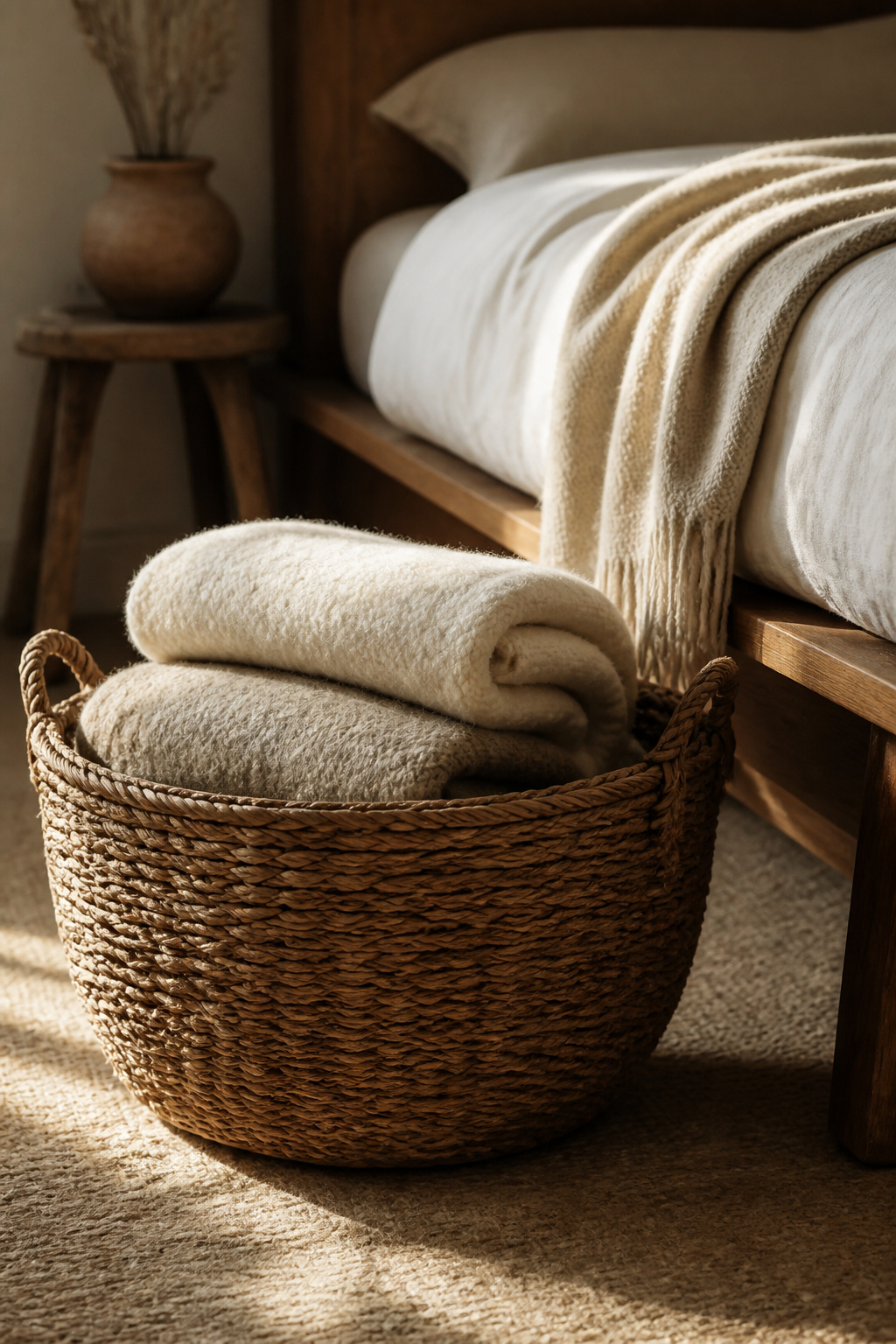
The approach that works: limit the collection to materials that share a visual weight. Linen, cotton, and lightweight wool sit in the same tier. Chunky knit and bouclé are heavier statement pieces that work alone rather than layered. Within your chosen tier, colour discipline matters more than material variety — two different textures in the same neutral tone look cohesive; two textures in two different colours look accidental.
For display, there are two options: a large woven seagrass or rattan basket at the bedside holding 2-3 folded throws, or a single throw draped at the foot of the bed in thirds. The basket reads as purposeful design; the drape reads as relaxed and lived-in. For a low-profile platform bed, the basket often works better given the reduced footboard height.
For quality, the difference between a throw that looks good for a year and one that looks good for a decade comes down to fibre. Klippan (Sweden) and Røros Tweed (Norway) produce natural-fibre throws that age better than anything synthetic. Natural wool throws should be hand-washed in cold water or dry-cleaned — the fibres bind irreversibly when agitated in hot water in a machine.
Changing your bedroom lightbulbs to 2700K is the highest-leverage improvement on this list. Harvard research showed people exposed to warm light in the evening fell asleep 19 minutes faster than those under cool white light. No furniture change, no textile upgrade, no colour shift produces a comparable measurable outcome in a cozy bedroom aesthetic.
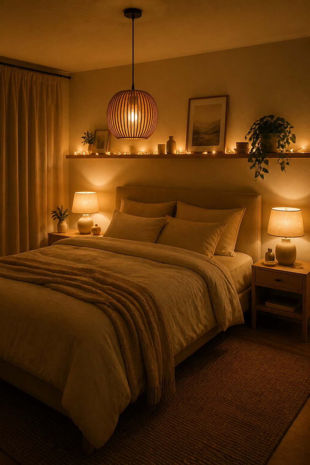
Here’s the mechanism: 2700K produces significantly less blue light than 3000K, the other common ‘warm’ option. Blue light suppresses melatonin production, so the difference between these two temperatures shows up in actual sleep quality, not just visual preference. At 2700K, the light closely mimics firelight and late-afternoon sun — both signals the human brain reads as ‘wind down’.
The full approach layers three sources. Overhead: a pendant or ceiling fixture on a dimmer — not recessed downlights positioned directly above the bed, which project harsh light downward into lying eyes. Bedside: one lamp per person at seated eye height (24-26 inches from tabletop to bulb base), providing reading light when needed. Ambient: string lights, a low table lamp across the room, or an LED candle provide a third layer for evenings when even the bedside lamp feels too bright.
Dimmer switches make the 2700K choice exponentially more effective. A 2700K bulb at 30% brightness creates genuinely candlelight-adjacent warmth. Smart bulbs from Philips Hue or LIFX can be programmed to shift towards 2200K after 9pm and dim automatically over 30-60 minutes. If smart bulbs aren’t an option, dimmer plugs on table lamps achieve the same result at a fraction of the cost.
There’s a quality in reclaimed wood that new furniture can’t replicate: the marks of time. Knots, grain patterns, slight colour variations, the occasional tool mark — these are what make a piece feel like it belongs to a cozy bedroom rather than arriving in it.
Live-edge furniture — where one or both sides of a slab retain the natural outer edge of the tree — is the most direct expression of this quality. A live-edge floating shelf above the bed at 36-42 inches above the mattress avoids the head-height hazard of a traditional headboard and looks both sculptural and intentional. A raw wood nightstand, either a section of trunk or a slab on hairpin legs, adds warmth without competing with the bed frame.
For finishing, Danish oil or tung oil is the right choice for furniture that doesn’t take heavy wear. These penetrate the wood and dry hard without any surface build-up or sheen — they deepen the natural grain rather than obscuring it. Allow reclaimed wood to dry indoors first, until its moisture content reaches 7-9%, before applying any finish.
When mixing wood tones — pale oak bed, darker walnut shelf, natural pine floor — the rule is to work within two stops on the tone scale. Pale oak with medium walnut works. Pale pine with near-black ebonised oak creates too much contrast in a bedroom and makes the room feel unresolved.
The reading nook was the biggest bedroom trend entering 2026, and the reason is practical: most bedrooms have at least one underused corner, and a reading nook turns it into the most used part of the room. The requirements are modest — a chair, a good lamp, a small book surface.
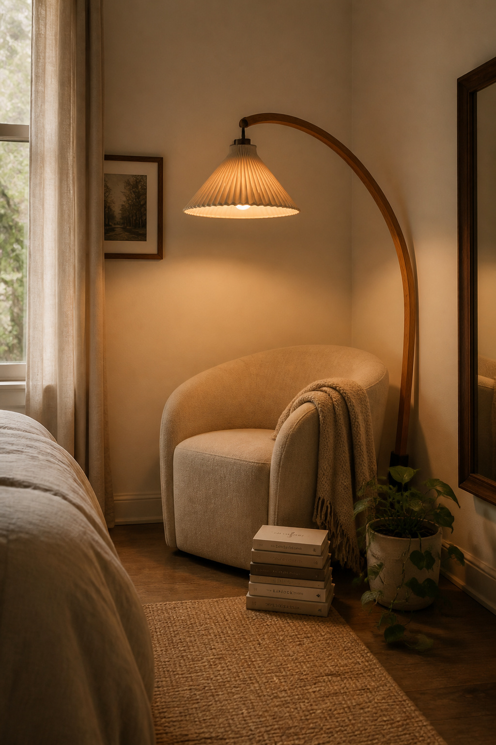
Chair selection depends on available space. A curved linen armchair in cream or natural is the most versatile choice for a standard bedroom — it sits lower than a traditional armchair, suits bedroom scale, and its texture fits the soft, natural palette. Rattan egg chairs (floor-standing for standard ceiling heights) add a sculptural quality that linen chairs don’t. A chaise in the corner is the most functional option but needs at least 60 inches of wall length.
The arc floor lamp is the key to making this corner work. Position the bulb directly above the reading surface at around 50-60 inches of arm extension, angled slightly forward over the reader’s shoulder. Height-adjustable necks are genuinely worth the premium — a fixed-height lamp limits your arrangement options significantly. Keep the bulb at 2700K to match the rest of the room’s light temperature, and the reading corner will feel like a distinct, quieter zone within the bedroom.
The book stack beside the chair: 5-7 books, one plant, one small object. Not a full library — a small, in-use collection that says ‘I’m reading these’ rather than ‘I have accumulated many books’. The difference between a reading corner and a reading nook is that the nook feels inhabited, not decorated.
Rug sizing is where most bedroom rug decisions fail. A rug that only covers the area directly under the bed frame — with 6-8 inches visible on each side — looks like a furniture pad rather than a room element. The sizing rule for a cozy bedroom aesthetic is non-negotiable: the rug should extend 18-24 inches beyond the bed frame on each side and 18-24 inches beyond the footboard.
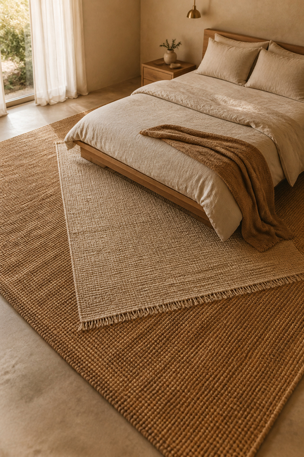
For bedrooms specifically, jute is the best natural fibre choice — it’s significantly softer than sisal underfoot, making it suited to the bare-foot contact of a bedroom setting. Sisal is more durable but harder underfoot; better suited as a base layer in a high-traffic layered rug setup than as a standalone bedroom rug. Both natural fibres have acoustic benefits that synthetic rugs don’t replicate at the same weight: the irregular weave absorbs sound and reduces the echo that bare floors create, which has a real effect on how restful a room feels.
For a queen bed (60 inches wide), a 9×12 rug is standard. For a king (76 inches), a 10×14. These are the minimums for achieving that 18-24 inch extension on each side.
For a more layered cozy bedroom decor effect, place a jute or sisal base rug under a smaller wool or woven rug on top, offset to one side. The top rug should be 1-2 sizes smaller than the base: a 6×9 or 5×8 on top of a 9×12. The key is a flat-weave base — piling a thick rug on top of another pile rug creates an unstable, chaotic surface rather than an intentional layered one.
Earth tones — terracotta, sage, dusty clay, oat — are the most versatile colour accents for a cozy bedroom aesthetic, and there’s a specific reason they work so reliably: they all exist in nature, often within the same landscape, so they’re inherently harmonious. They connect to the outdoor world without trying to bring it literally inside.

For pillow arrangement, the Nordic-minimal approach is simpler than the standard design formula: two sleeping pillows in natural linen cases at the back, two accent pillows in an earth tone in front. Four pillows total, two of which are functional. The contrast between velvet and linen in the same colour family creates visual richness without colour complexity — a terracotta velvet accent pillow against a terracotta linen pillow looks intentional; identical pillows in the same material look like a set.
Waffle weave adds a third texture without a pattern — it reads as dimensional and natural, suited to cozy aesthetics without the formality of embroidered or jacquard fabrics. The rule: vary at least two of three variables (material, texture, size) across accent pillows while keeping colour consistent within one earth tone family.
The seasonal swap extends the investment. In autumn and winter, deeper terracotta and burnt orange. In spring and summer, sage green and pale clay. Store off-season covers in breathable cotton bags — vacuum-pack storage compresses fill permanently.
A single plant in the right pot in the right spot does more for a bedroom’s atmosphere than most people expect. A bedroom with one well-placed plant reads as inhabited and cared for rather than designed and staged. The reason isn’t primarily visual — a living thing changes how a room feels to occupy.
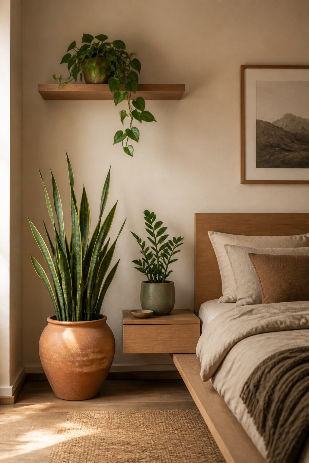
For bedrooms, the plant needs to tolerate low light and irregular watering. Three species are genuinely reliable: ZZ plants (Zamioculcas zamiifolia), which store water in rhizomes and survive weeks of neglect in dim conditions; snake plants, which actually release oxygen at night and need water only every 1-3 weeks; and pothos, which trails attractively from a shelf or hanging planter and tolerates almost any indoor light level.
Pot selection matters more than most plant guides acknowledge. Terracotta is the most versatile choice for a natural bedroom — its warm orange-brown bridges wood tones and earth textiles, and its porosity benefits plant health. Matte ceramic pots in off-white, sage, or dusty blue add a sculptural quality that glazed pots don’t. Woven seagrass basket planters work best for larger floor plants, adding another organic material to the room.
For placement: large floor plants anchor corners at the same visual weight as furniture pieces. Shelf plants should be small enough not to obscure books or objects. When grouping, the rule of three still applies: one tall, one medium, one trailing or low.
How a bedroom handles morning light is one of the defining qualities of its atmosphere. For a cozy bedroom aesthetic, the soft diffused glow that comes through light-filtering linen in the morning is a feature — it creates the warm, gradual awakening quality that certain hotel bedrooms charge a premium to provide.
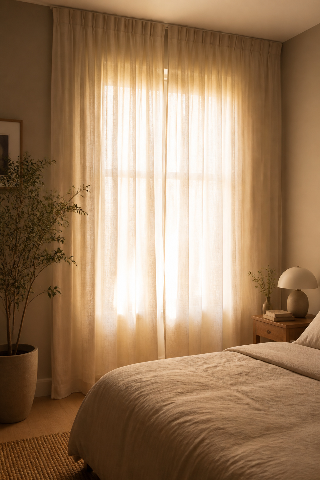
Medium-weight linen at 120-160 gsm is the right specification: heavy enough to diffuse light and provide daytime privacy, lightweight enough to move with air and catch morning light. For those who need full darkness, a separate blackout lining behind linen curtains preserves the visual quality while adding light control — a better solution than replacing the linen entirely.
Hanging height determines how good curtains look more than the fabric does. The rod should be positioned 4-8 inches above the window frame at minimum. In fact, going higher — up to the ceiling or crown moulding — makes windows appear taller and rooms feel larger; Scandinavian design typically favours ceiling-height hanging for floor-to-ceiling visual continuity. Extend the rod 8-12 inches beyond the window on each side so curtains stack fully clear of the glass when open.
For colour: off-white linen against warm white and greige walls. Natural (undyed) linen against deeper warm neutrals. Greige linen — a warm grey-beige — when the room has mixed tones and needs the curtains to sit between wall and bedding rather than compete with either.
The two-thirds rule for bedroom wall art is straightforward: a piece or grouping above the bed should span approximately two-thirds of the bed’s width. For a queen (60 inches), that means 40-48 inches of art. For a king (76 inches), 50-60 inches. Within that target, a single print almost always outperforms a gallery wall.
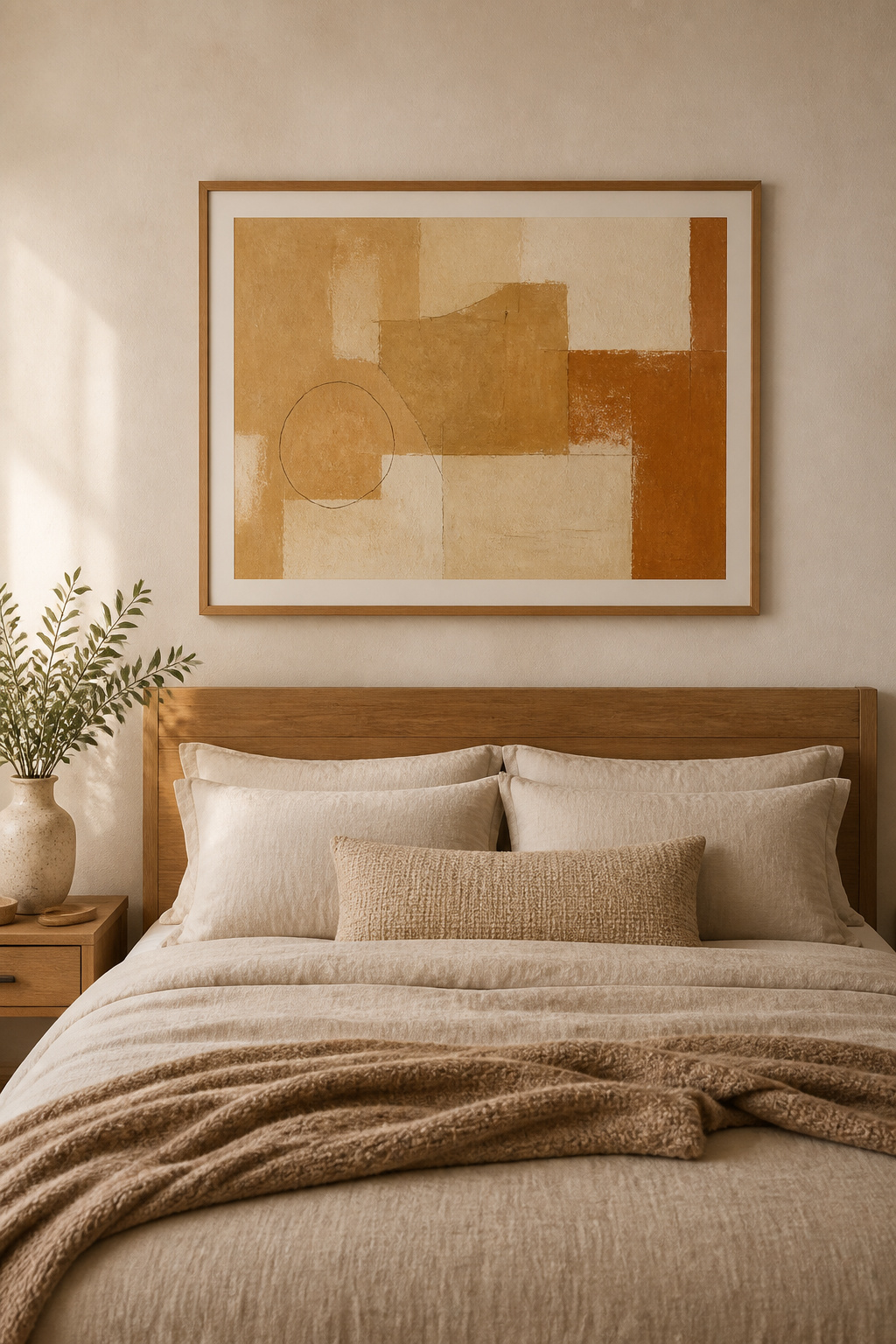
In a bedroom, a single well-chosen piece at the right scale is nearly impossible to get wrong. A gallery wall has dozens of micro-decisions — frame style, mount colour, spacing, visual balance — any one of which can undermine the whole arrangement. More importantly, a gallery wall requires visual processing that works against rest. The bedroom is the one room where visual restraint pays the most immediate dividends.
For content, abstract prints in ochre, terracotta, and cream are the most versatile choice — they age well, suit multiple design directions, and work across seasonal lighting changes. Loose botanical prints in watercolour or pen-and-ink connect to nature in a manner consistent with Nordic values. These same principles around anchoring walls without visual overwhelm apply equally to sophisticated living room decor ideas — scale and restraint solve most wall art problems in any room.
For sources, Society6 and Minted are the most curated affordable print options. Etsy’s digital download section offers high-resolution files for $5-15, printable at a local shop on archival paper. IKEA’s Bild series is an underappreciated source for the 40-60 inch formats the two-thirds rule typically requires above beds.
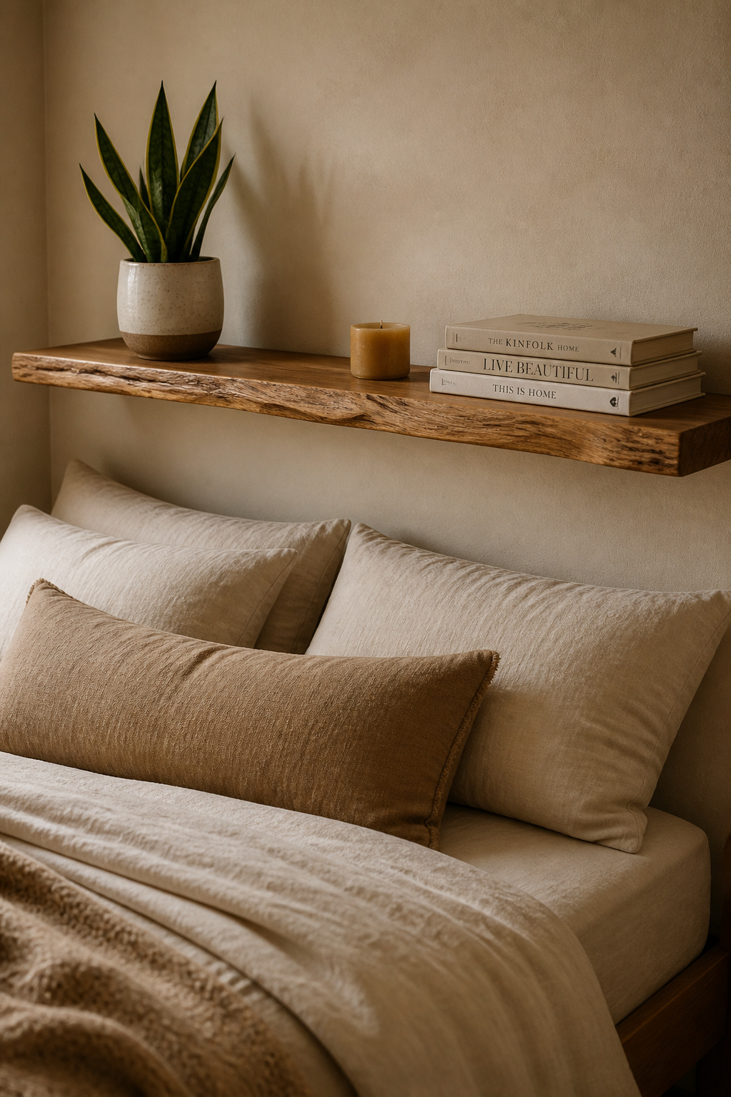
A nightstand is a small surface with a disproportionate impact on how a bedroom feels. It’s the first thing seen when waking and the last when sleeping. And it’s also the surface most likely to become overflow storage — the landing pad for whatever doesn’t have a permanent home somewhere else.
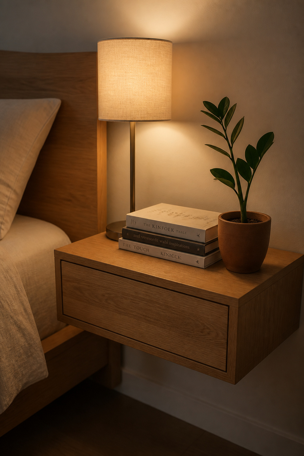
The proven formula: lamp, small book stack, one personal object. These three elements serve different functions — task light, passive interest, personal warmth — while keeping the surface clear. The lamp is the tallest element, positioned at the back corner. The book stack sits in the middle at 4-8 inches. The personal object is flat or barely raised.
Height variation matters more here than most people realise. A nightstand where everything is roughly the same level reads as flat and unresolved. When the lamp is at 22 inches, the books at 6 inches, and the small object sits near surface level, the eye moves naturally from tallest to lowest — a visual journey that makes the arrangement feel curated without being fussy.
The seasonal refresh keeps this cozy bedroom aesthetic element from going stale without any spending. Swap the candle scent — heavy cedar in winter to lighter lavender or eucalyptus in spring. Replace the book stack with what you’re currently reading. Add one seasonal stem: dried eucalyptus in winter, a fresh flower in summer. The nightstand should look in use, not photographically styled.
Scent is the most overlooked element in a cozy bedroom aesthetic. You can get the lighting right, the bedding right, and the palette right — and a room that smells of synthetic air freshener will still undermine the effect. Conversely, a room that smells of cedar, lavender, and a trace of natural wax will feel restful before you’ve assessed anything else.

The science is straightforward. Lavender reduces heart rate and anxiety in multiple clinical studies. Cedarwood and sandalwood have natural calming compounds. German chamomile works similarly. Light an aromatherapy candle about an hour before bedtime — enough time to fill the room, short enough to extinguish before sleep. Never leave a candle burning unattended, and never overnight.
Candle quality matters in a bedroom specifically. Essential oil candles in soy or beeswax bases are significantly preferable to paraffin-based fragrance oil candles. Paraffin releases benzene and toluene when burned — genuine indoor air pollutants. The gap between a $12 paraffin candle and a $25 soy essential oil candle is not aesthetic preference; it’s about what you breathe while trying to sleep.
For consistent, lower-maintenance scent, a reed diffuser is more practical than candles for daily use. Reed diffusers require no flame and deliver consistent scent without supervision. Ultrasonic diffusers can be set on a 30-minute evening timer — they saturate a standard bedroom at 6-10 drops per 100 square feet. For bedrooms specifically, avoid plug-in wax melts near the bed — the synthetic fragrance in most commercial wax melts is not meaningfully different from paraffin candles in terms of indoor air quality.
There’s a useful distinction between supporting textiles (bedding, curtains, rugs) and statement textiles. Chunky knit blankets and bouclé upholstery are the latter — they communicate warmth visually before any physical contact. This is a different quality from a flat throw, and it’s why they function as focal pieces rather than background texture in a cozy bedroom aesthetic.
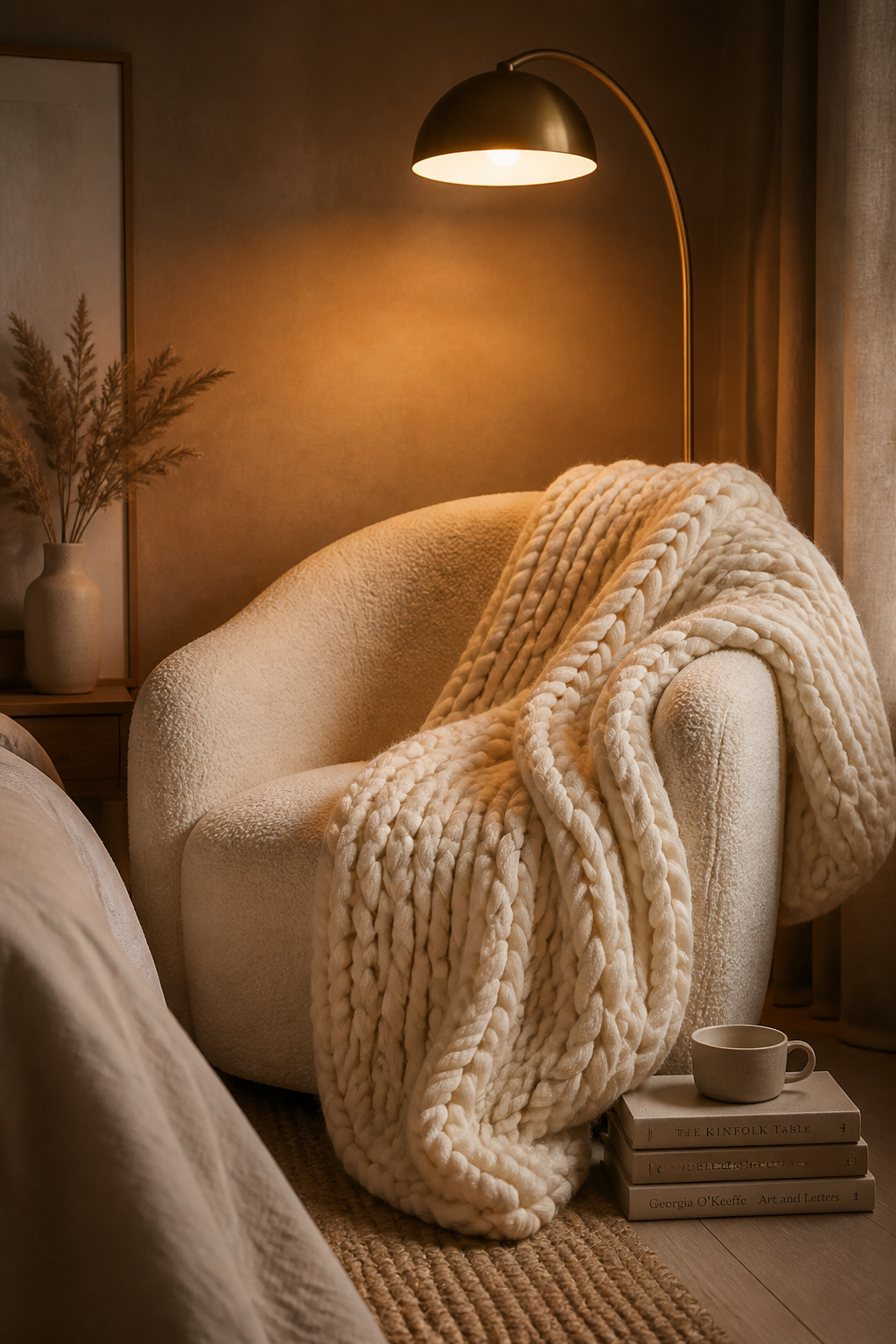
The psychology behind chunky knit is specific: oversized loops and cables are associated with handcraft and time. They read as ‘someone made this carefully,’ which activates a warmth response entirely separate from the tactile experience. 100% merino wool is the benchmark — warm without bulk, naturally anti-microbial, softer than standard wool. Hygge Life’s Broadwick merino blanket is a recognised product in this category. Acrylic versions are more washable and significantly cheaper, but they don’t replicate the natural fibre quality.
Bouclé — a looped yarn with a nubby, cloud-like surface — works best as furniture upholstery in a bedroom. A single bouclé armchair in the reading corner serves double duty: functional seating and a textural focal point. Cream and off-white are the most versatile colours; darker bouclé picks up dust and lint visibly on its nubby surface.
Care matters: merino should be hand-washed in cold water with wool-specific detergent and laid flat to dry. Store chunky knit loosely in a breathable cotton bag with cedar blocks — never vacuum-pack, which permanently compresses the loops. The loft is the entire point of a chunky knit.
The dresser surface is the final element in a bedroom’s visual picture, and it’s the one most reliably cluttered. Perfume bottles, things without other homes, seasonal objects that were never moved — most dressers function as overflow storage rather than designed surfaces. The fix is easier than it sounds.
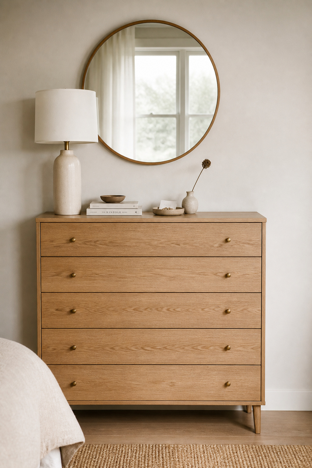
The five-element approach: one tall item (a lamp or large vase), one medium item (a small stack or jewellery tray), one low item (a candle or small dish), one plant or stem, and deliberate blank space. That fifth element — what you choose not to put there — is what makes the surface read as designed rather than accumulated. Corralling scattered items onto a single decorative tray counts as one element, not five.
Mirror placement follows a specific rule: no more than three-quarters the height and two-thirds the width of the dresser. Position the dresser so the mirror catches natural light from a window without direct glare — this reflects daylight into the room without adding fixtures. A round mirror above a rectangular dresser introduces a curve that breaks angular furniture lines — a standard Scandinavian technique for softening a room’s geometry. The same approach to editing and restraint that works on a dresser applies in other rooms too; living room decor ideas that use restraint and purposeful object selection share the same underlying principle.
A quarterly edit of the dresser surface takes ten minutes and maintains the restful visual quality of the room. Remove everything. Consider what genuinely belongs. Return only what does.
Not every room needs all sixteen of these ideas, and trying to implement them all at once is a reliable way to end up with an expensive, unfinished room that feels neither cozy nor cohesive. The hygge approach to change is gradual and intentional — each addition should feel settled before the next one arrives.
Start with lighting. Changing bedroom bulbs to 2700K and adding a single dimmer costs under $50 and immediately transforms the room’s evening atmosphere more than any furniture purchase. This is where the cozy bedroom aesthetic actually lives — not in the objects, but in how they’re illuminated.
Second priority is bedding. Switching to stonewashed linen in a warm neutral has both visual and tactile impact; it’s also the surface used every night, which means it amortises its cost quickly. Quality linen bedding is one of the better daily comfort investments.
From there, one natural material anchors the room’s character. A jute rug, a reclaimed wood shelf, a wool throw — the choice depends on what the room needs most. But some natural material is what gives the cozy bedroom aesthetic its texture and authenticity. Rooms decorated entirely in synthetic materials can look convincingly cozy in photographs and feel cold in practice. The natural fibre does something specific that synthetic can’t replicate.
Beyond those three, the remaining ideas in this list are refinements. The reading nook is a significant upgrade to how a bedroom gets used day-to-day. The plant adds life. The right wall art above the bed at the right scale makes the room feel finished. Each element adds something real — but the lighting, bedding, and one natural material are the foundation. They’re where most rooms see the greatest return, and they’re a reasonable starting point for anyone building their cozy bedroom aesthetic from scratch.