Physical Address
304 North Cardinal St.
Dorchester Center, MA 02124
Physical Address
304 North Cardinal St.
Dorchester Center, MA 02124
Discover 18 modern living room decor ideas, from low-profile sofas to layered lighting, that create a calm, considered space without a full renovation.
There’s a particular kind of quiet you notice in a well-designed room. It’s not silence, exactly, but the absence of visual noise. That’s the feeling I chase in every space I touch. It’s the heart of modern living room decor: rooms that look effortless because every choice was actually considered. I grew up around Scandinavian design philosophy, where a chair isn’t just a chair. It’s a decision about how a family gathers. A wall stays bare not because someone forgot to decorate it, but because the bareness is doing something. That background shapes how I look at a living room now, whether it’s in Oslo or Ohio. Over the next eighteen ideas, I’ll walk you through the furniture proportions, materials, and lighting layers that make a space feel calm rather than empty. Think sofas that open up sightlines, palettes that age well instead of dating in a year, storage that disappears instead of cluttering. None of this requires a renovation budget. It requires understanding why certain choices work, then making them on purpose.
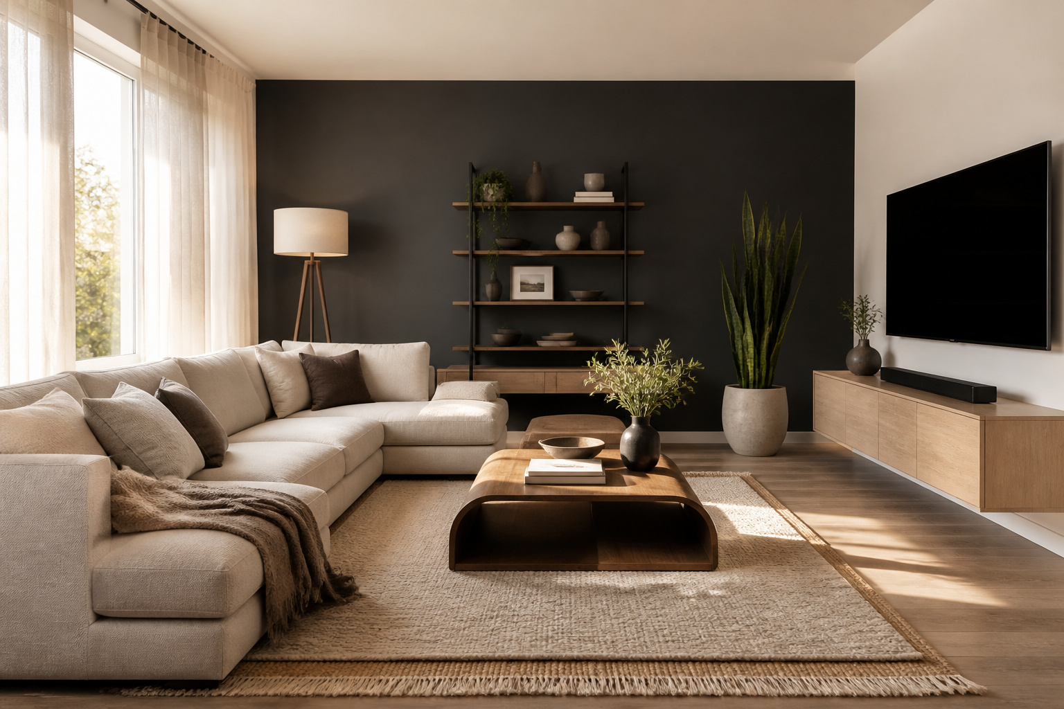
Walk into a room with a low sofa and your eye doesn’t stop at the furniture. It keeps traveling, up the wall, across the ceiling line. The whole room suddenly reads taller than it is. That’s the quiet trick of low-profile seating. It’s why Scandinavian interiors have leaned on it for decades. We don’t build walls of upholstery. A home should breathe, not box you in.
A genuinely low-profile sofa sits around 30 inches or less from the floor to the top of the back cushion. Compare that with the 32 to 36 inches you’ll find on a standard piece. That difference sounds small until you’re standing in the doorway. The whole room opens up in front of you. This matters especially in open-plan layouts, where the sofa is the first thing breaking up the sightline. Keep the classic two-thirds rule in mind too: your sofa should occupy roughly two-thirds of the wall it sits against. Look for something in the 78 to 90-inch width range with a seat depth around 21 to 22 inches. Go 23 to 25 inches if you want proper lounging room. Seat height on these pieces typically runs 15 to 18 inches. You’ll want your coffee or accent table within an inch or two of that to keep the eye level consistent. Leave 30 to 36 inches of walkway clearance around the piece. Leave about 18 inches between the sofa and the coffee table. This kind of modern living room decor thinking rewards patience: measure twice before you buy.
Here’s a tip worth remembering: pair a low sofa with a taller, slimmer side table (arm height plus 2 to 4 inches) in solid oak or ash. It restores the vertical contrast the room needs, so the seating area doesn’t look flattened. Don’t make the mistake of choosing a low-profile sofa that’s too shallow in depth. A too-thin seat next to all that openness just looks stranded rather than spacious.
Restraint is what makes boldness mean anything. A single confident wall against an otherwise quiet palette reads as intention. The same color smeared across every surface just reads as noise. This is the principle behind nearly every Scandinavian interior I’ve worked on. Color isn’t banned. It’s rationed, so it actually lands.
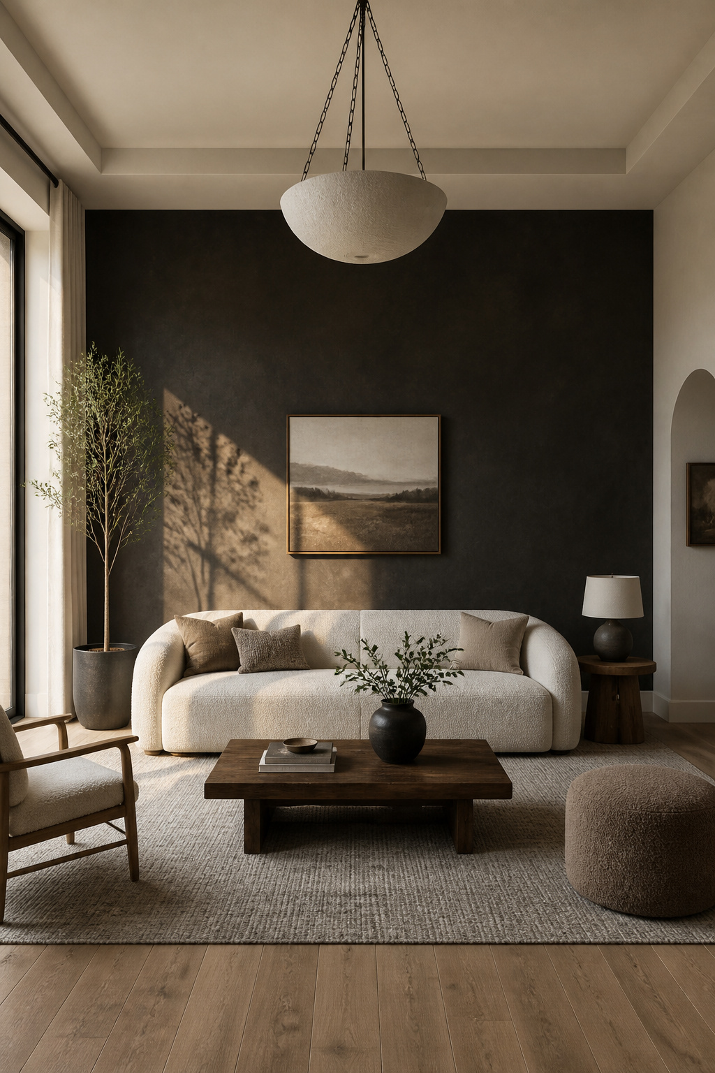
For 2026, the color story has shifted away from saturated trend shades. It’s moving toward tones that feel pulled from nature rather than a paint chip. Benjamin Moore’s 2026 Color of the Year, Silhouette, is an espresso-charcoal that reads sophisticated rather than dark. It pairs beautifully with soft whites, muted greens, and warm terra cottas. If you want a color that won’t look dated in three years, look to the blue-leaning greens and dusty blue-grays emerging as the new “safe” family. Or consider a deep warm brown like Benjamin Moore Willow as a neutral-adjacent accent instead of a true neutral. The trick is keeping everything else in the room tight: white, soft greige, or natural wood. That way the one wall has room to do its work. Contrast comes from value and material, not clutter. If you want something with more texture, hand-applied mineral plaster or limewash is emerging as the natural successor to shiplap. It shifts subtly with the daylight and reads handmade rather than DIY. It does call for a skilled tradesperson and a bigger budget, though. Reeded oak or walnut paneling gets you a similar quiet-luxury texture without the same cost or skill requirement. For more on choosing a paint color that won’t date, it helps to think in terms of undertone family rather than single shades. That’s part of getting modern living room decor choices to age well. Avoid the common mistake of choosing a saturated trend color instead of a nature-referenced muted tone. It’s the fastest way to date a room within a couple of years.
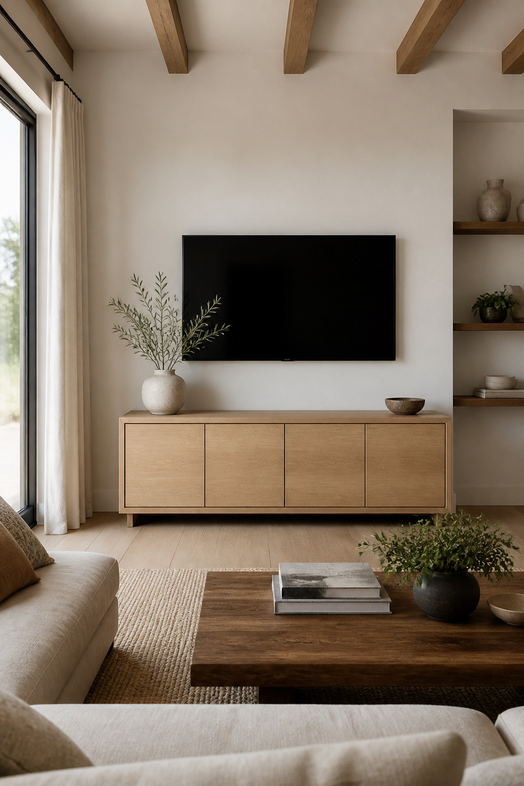
A console that doesn’t touch the floor changes how the entire wall reads. There’s no visual weight pooling at the baseboard. No shadow gap collecting dust bunnies either. Just a clean horizontal line that makes the whole room feel lighter, even though the television is still very much there.
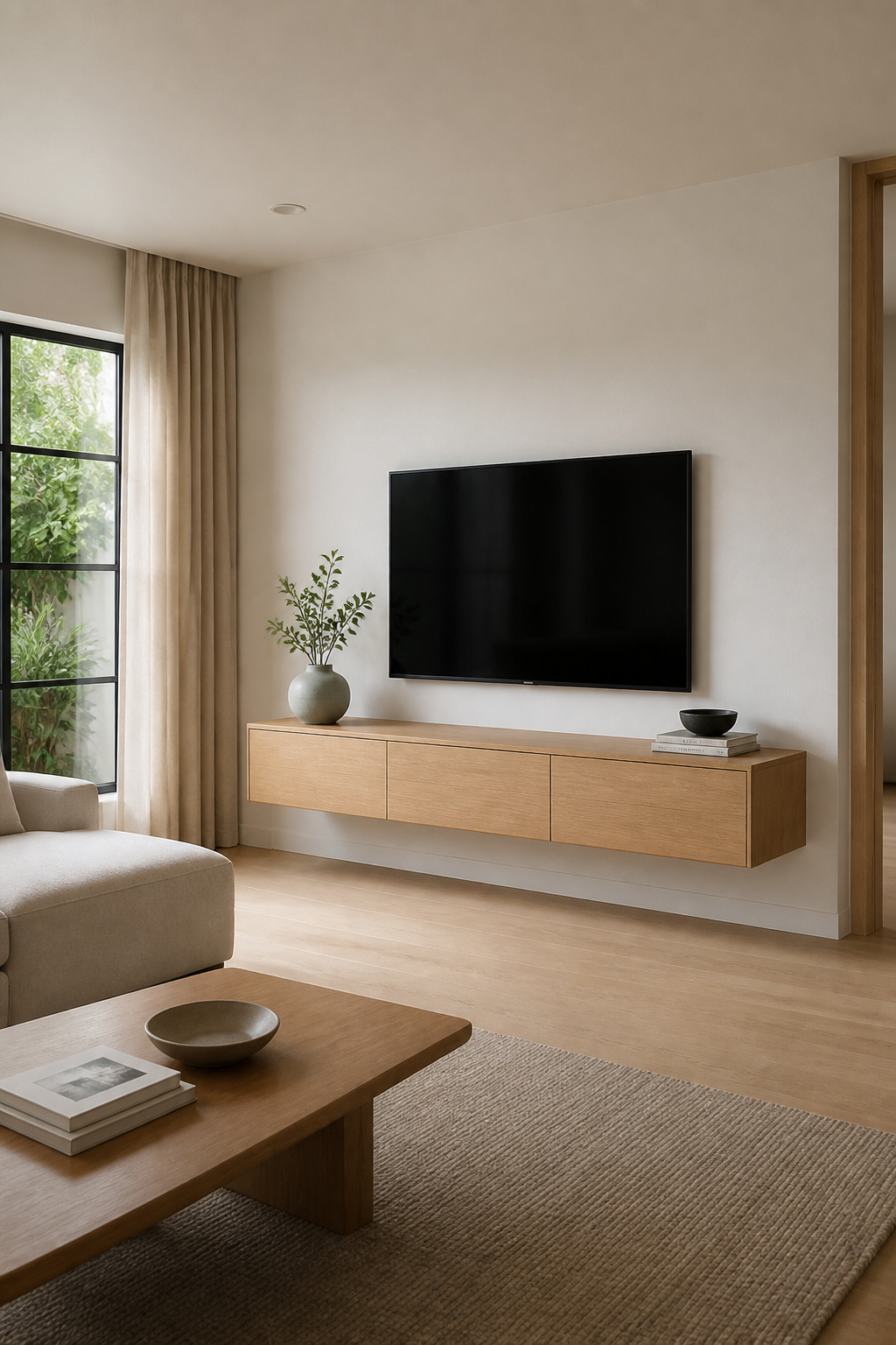
Wall-mounted consoles typically run 60 to 71 inches wide with a shallow depth of just 11 to 12 inches. Compare that with the 18 to 20 inches you’d get on a traditional floor cabinet. That shallower profile is part of what gives the room its airiness. Weight capacity varies a fair amount: lighter units handle around 75 pounds, while heavy-duty versions support 120 to 135 pounds. Build in a 20 to 30 percent safety margin above your total equipment weight before you commit to a model. The non-negotiable part is the mounting. These consoles need to anchor into at least two wall studs with properly rated brackets. Drywall alone will not hold this kind of load safely, no matter how the listing photos make it look.
For a genuinely seamless finish, an in-wall cable kit like the SANUS Ultimate In-Wall Cable Management Kit or the Mount-It! In-Wall TV Cable Concealer routes everything inside the wall cavity instead of along a surface raceway. The Mount-It! kit includes a recessed triple-outlet power box and a 9-foot pre-wired cord. Most people can install it in under thirty minutes. Just make sure you’re using in-wall-rated cable for code compliance. As far as modern living room decor goes, this is one detail worth getting right the first time. The mistake I see most often is someone mounting straight into drywall without locating studs or using rated anchors. It might hold for a while. But combined with a TV’s weight, it’s a matter of when, not if, it pulls loose.
One bright bulb in the ceiling, doing every job in the room at once (reading, conversation, movie night), is a very un-Scandinavian way to light a space. We think of light in layers, the way you’d layer clothing for the cold. Ambient covers the general mood, task handles the specific job, and accent highlights the moments you want to feature.
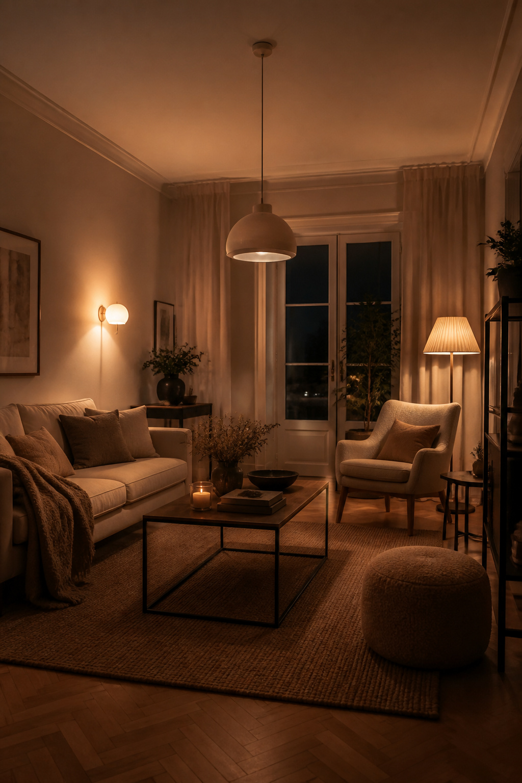
A living room generally needs somewhere between 1,500 and 3,000 total lumens to feel properly lit without going flat or clinical. Task lighting near a reading chair or work surface needs its own dedicated 350 to 500 lumens. The detail people miss is color temperature. Keep every layer in the warm range, 2700K to 3000K, rather than mixing warm bulbs in one lamp with cool white in another. Mismatched temperatures are what make a room feel subtly wrong even when you can’t say why. A smart dimmer like the Lutron Caseta handles up to 150 watts of dimmable LED, or 600 watts of incandescent or halogen. It installs with nothing more than a screwdriver. No neutral wire is required, which matters in older homes. An all-inclusive starter kit with the dimmer, smart hub, Pico remote, and wallplate runs around $169 installed. It integrates with Alexa, Apple Home, Google Assistant, or Sonos, so you can build genuine scenes, not just on-and-off settings.
This is where hygge gets practical rather than aesthetic. Set an evening scene at 20 percent brightness, and the whole room shifts into a different mood with one tap. If your modern living room decor leans toward a calmer evening atmosphere, this single fixture swap does more than most furniture purchases. The common mistake is relying on a single overhead fixture at one brightness setting for every activity in the room. It flattens everything. It’s also the single easiest lighting habit to fix.
Matte black has a way of disappearing that polished metal never manages. It recedes into the background and lets the wood do the talking, which is exactly the point. The grain, the warmth, the material itself should be what you notice, not the hardware holding it together.
This pairing works with nearly any wood species. It’s especially striking against white oak and walnut, where the black creates just enough contrast to define the lines without competing with the grain. If you’re mixing multiple wood tones in the room, follow what I call the Rule of Threes: match undertones (warm, cool, or neutral) across pieces, and cap your palette at three tones total. Start by letting the largest piece in the room, usually the floor or a major furniture item, establish the dominant tone. Then build outward from there. If you want something softer than black’s sharp edge, brushed or unlacquered brass is the warmer alternative. It pairs beautifully with oak, walnut, marble, linen, and wool. An antique brass finish suits richer wood stains and earthier palettes particularly well. This is a small decision, but it’s one of the modern living room decor choices that quietly determines whether a room feels coordinated.
The single most common cause of an accidentally clashing room isn’t a bad color choice. It’s mismatched wood undertones, like a cool gray-stained floor sitting next to warm orange-toned oak furniture. Your eye registers that something’s off long before your brain identifies what it is. Before you buy a single piece of furniture, hold a sample against your existing floor in daylight. Ask whether the undertones genuinely agree.
A coffee table doesn’t have to be a rectangle. Once you let go of that assumption, a whole category of furniture opens up: curved forms, plinth bases, tables that look like they were carved by water rather than built by a joiner.
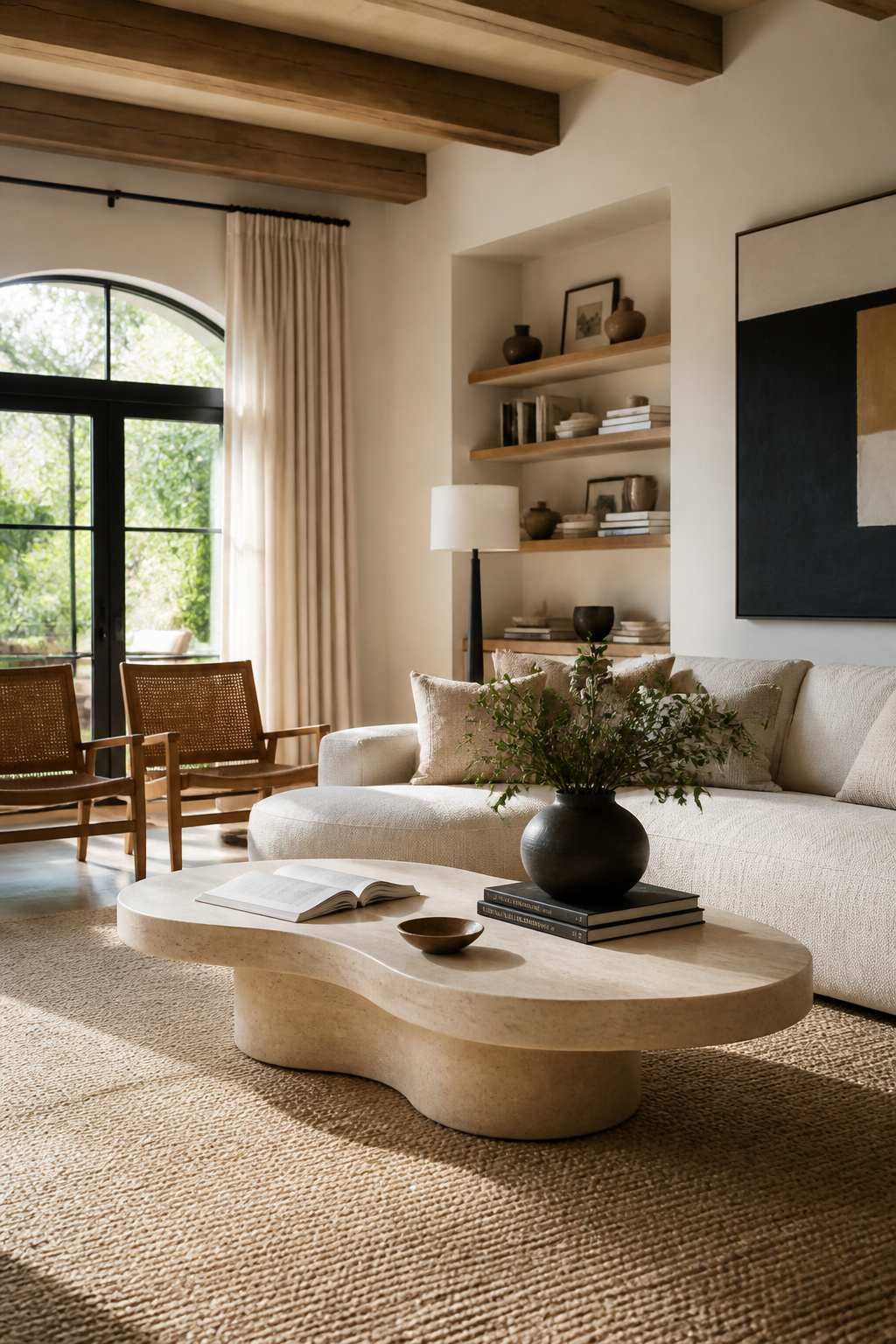
Scandinavian brands like Fredericia, Ferm Living, and 101 Copenhagen have built entire collections around this organic-modern language. Their wave-like silhouettes suit Japandi, Wabi-Sabi, and Scandi-minimalist rooms far better than a hard-edged rectangle would. It’s one of those modern living room ideas that looks effortless but takes real restraint to pull off. Scale still matters here, and the same two-thirds rule from the sofa applies. Your table length should run roughly two-thirds the length of your sofa, so a 72-inch sofa pairs naturally with something around 48 inches. Height should sit 1 to 2 inches below your seat-cushion height, typically landing around 16 to 18 inches tall. Leave 12 to 18 inches of clearance between the table and the sofa.
For material, look at honed travertine or marble for that organic stone quality. Or try curved solid FSC-certified wood like oak or beech if you want warmth instead of coolness underfoot. Some of the better wave-carved or plinth-base designs actually integrate storage pockets right into the sculptural silhouette. That’s a nice way to get function without breaking the quiet, singular form. This is one of the more overlooked modern living room decor moves, precisely because a sculptural table rarely gets credited for doing as much work as it does. The mistake to avoid is choosing a sculptural table that’s too large or too tall relative to your sofa. Instead of acting as a calm centerpiece, it ends up overwhelming the whole seating arrangement. That defeats the purpose of choosing something sculptural in the first place.
A rug does something architecture can’t always do in an open-plan home: it draws a boundary without a single wall. Step onto it and you know, instinctively, that you’ve entered the living area rather than the dining zone or the hallway.
There are two ways to size a rug for this job. The most important rule is to pick one and apply it consistently across every piece of furniture in the group. The all-legs-on-rug method extends the rug 6 to 8 inches beyond the furniture on every side. That usually means a 9-by-12 or 10-by-14 rug for a standard seating arrangement. The front-legs-only method is more budget-friendly: an 8-by-10 rug extending about 18 inches in front of the sofa, with just the front legs of each piece resting on it. Either way, you’re aiming to define a 30 to 36-inch walkway buffer around the whole zone. If you want a full guide to sizing and choosing a living room rug, it’s worth measuring your full furniture footprint before you shop. Don’t just guess at the size in a showroom.
A layering technique worth trying: a large neutral jute or sisal rug as a budget-friendly base for a big room, with a smaller patterned or solid wool rug layered on top for color and softness underfoot. One of the more overlooked modern living room decor moves is layering rugs this way, instead of relying on a single piece to do everything. The common mistake is buying a rug too small for the seating group. The furniture legs end up floating inconsistently off different edges. It reads as under-furnished no matter how nice the rug itself is.
The gap between frames matters as much as the frames themselves. Too tight, and a gallery wall reads as clutter. Too loose, and it falls apart into disconnected pieces. The professional standard is 2 inches of consistent negative space between medium and large frames. Narrow that to 1.5 inches for small or delicate ones, or open it up to 4 to 6 inches if you want a more minimalist, airy feel. What matters more than the exact number is consistency: pick a gap and hold it across the whole arrangement.
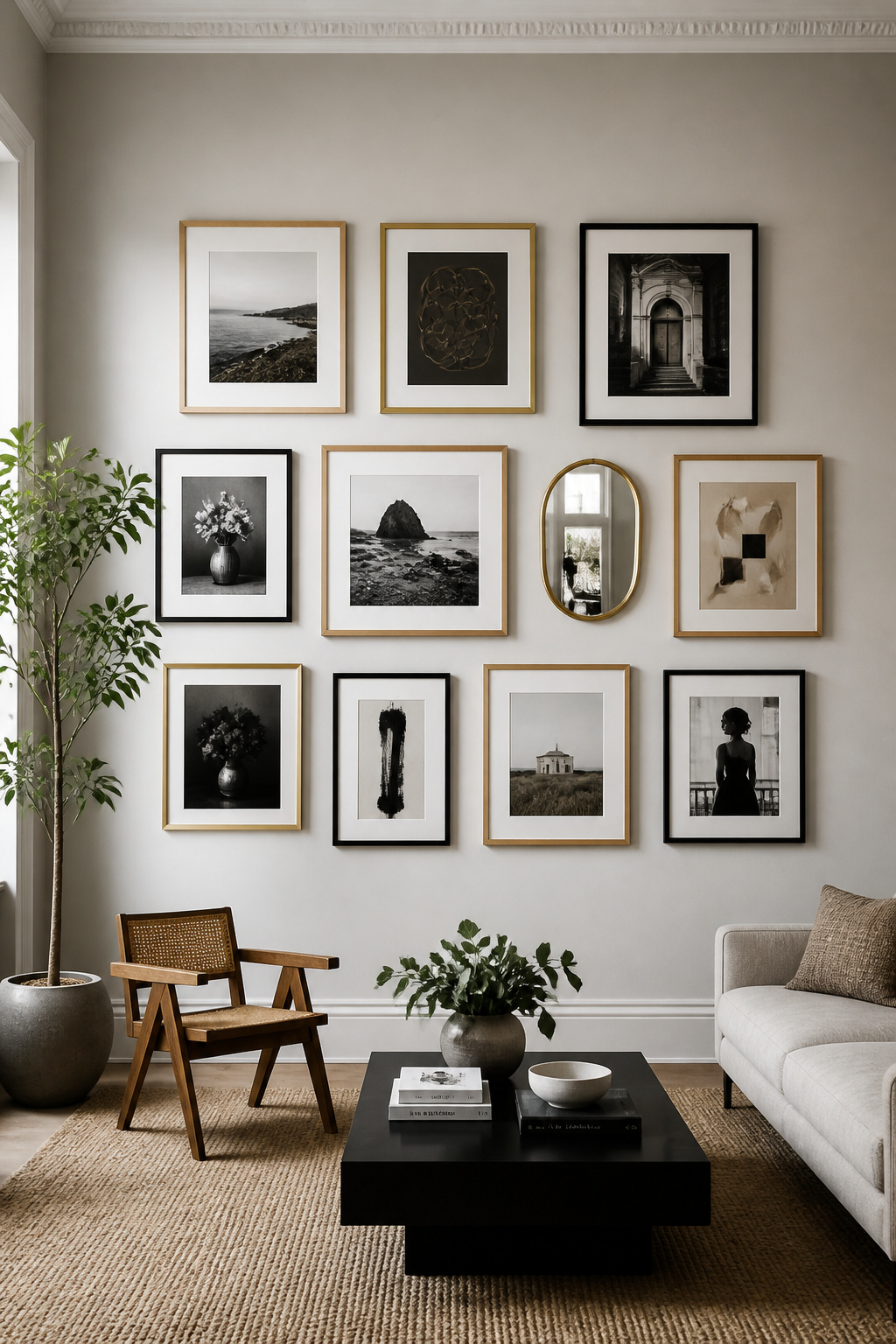
Before you put a single nail in the wall, trace your frames onto craft paper and tape the templates up. Live with the layout for a few days and adjust before committing to anything permanent. Limit your frame finishes to a repeating trio (natural wood, one metal tone, and plain white or black, say). That way even wildly different art styles read as one cohesive collection rather than a yard sale. Start with an anchor piece, usually your largest or most meaningful one. Give it a bit of extra surrounding space so the eye knows where to land first.
One detail elevates a gallery wall from “pictures on a wall” to genuinely curated: work in one sculptural object. A small mirror, a piece of textile, a ceramic form, kept visually lighter than the frames around it, adds dimension without breaking the grid’s rhythm. This kind of modern living room decor detail is easy to skip and easy to add once you know to look for it. The mistake almost everyone makes is mixing too many frame finishes or mat colors at once. It feels generous in the moment, buying whatever frame looks nice for whatever piece. But the cumulative effect reads as cluttered rather than curated. Discipline here is what makes the wall feel intentional.
Color gets all the attention, but texture is quietly doing more of the emotional work in a room. In 2026, it’s taking over as the primary tool for warmth and depth. This makes sense to anyone who’s spent a winter in a Nordic country. When the light is low for months at a time, you stop relying on color to feel cozy. You start relying on what you can touch.
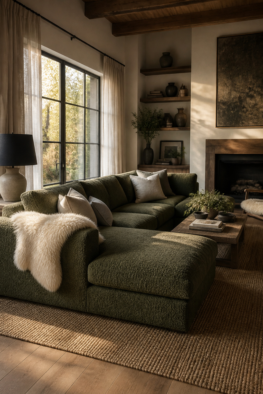
Bouclé itself has evolved, moving toward sleeker, more refined loops rather than the chunkier texture popular a few years back. Some versions are even blended with a thread of metallic for a subtle shimmer. The designer move is pairing large-scale textures like heavy bouclé or velvet against finer weaves like linen or twill. This builds depth through contrast of scale rather than contrast of color. A large bouclé sectional in a dark, earthy tone (olive, terracotta, deep espresso) paired with lighter linen cushions in a neutral tone is a combination that photographs beautifully. It feels even better in person.
For the classic hygge touch, genuine sheepskin from cold-climate breeds like Norwegian or Icelandic sheep brings a dense 5 to 6-inch natural wool pile. It does more than look good. Wool naturally regulates temperature, which is a functional reason, not just an aesthetic one, that Nordic interiors have always leaned on it. Draping one over the back of a chair or across the floor near a low sofa is about as classic a styling move as exists in this tradition. If your modern living room decor already leans neutral, this is the easiest texture layer to add without rethinking anything else. The mistake is using only one texture scale throughout a room, all bouclé, or all linen. This flattens the layering effect instead of building the contrast that makes a room feel touchable from across the room.
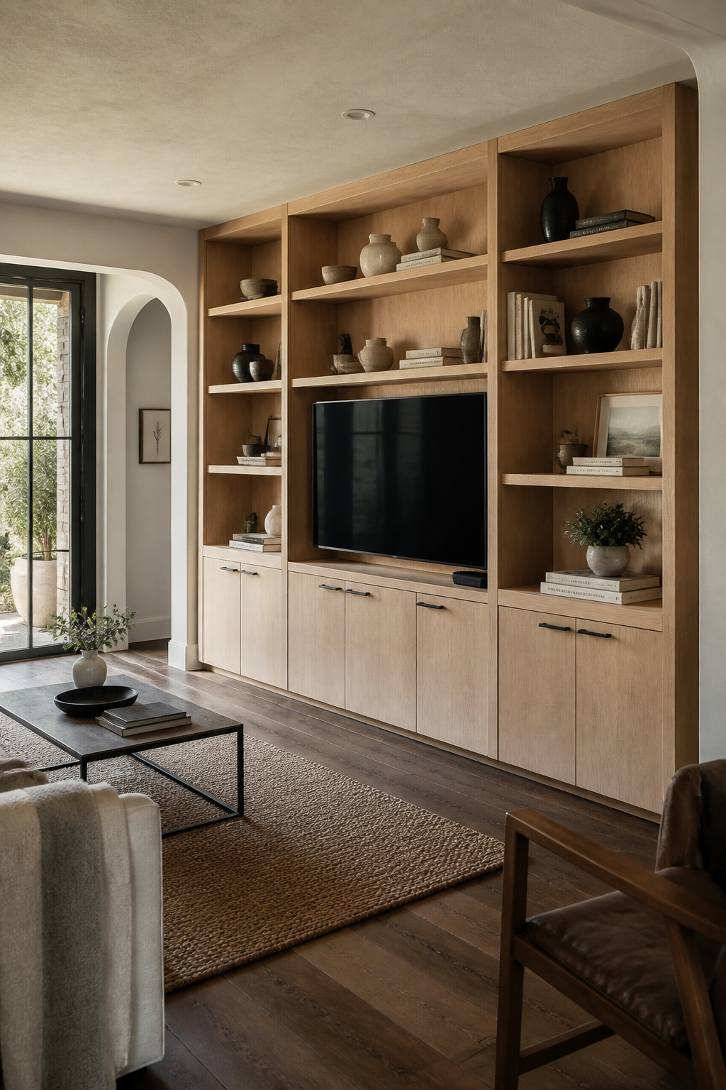
There’s a permanence to built-in shelving that a freestanding bookcase will never have. It integrates with the wall and ceiling plane until it reads as architecture rather than furniture. Appraisers have noted that well-executed built-ins can add 15 to 20 percent more value to a home than stock shelving units would.
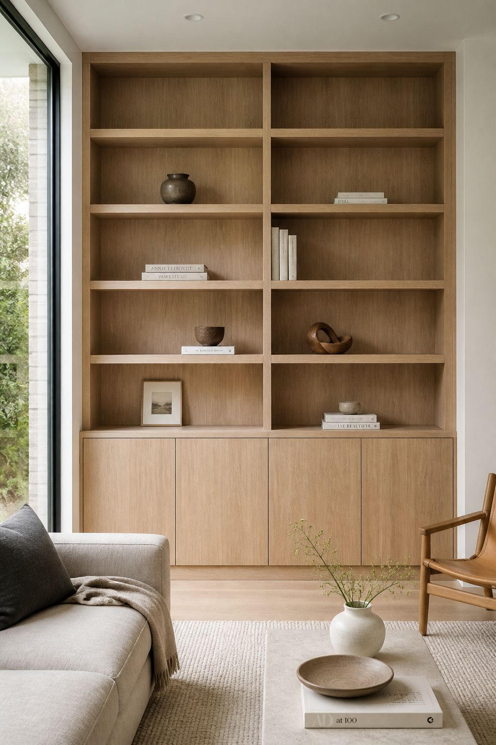
Rift-sawn or flat-cut white oak veneer is the material of choice here. It’s prized for its straight, uniform grain that reinforces the vertical lines running floor to ceiling. The professional split most designers use is roughly 60 to 70 percent closed cabinetry (for media equipment, cables, off-season storage) against 30 to 40 percent open shelving for display. Closed lower cabinets paired with open upper shelving is the most common configuration. If you’re after ideas for built-in and open shelving storage, pay attention to how much you leave empty, not just what you put on display.
That last point deserves emphasis: leave at least 20 to 30 percent of every shelf as genuine negative space. Concentrate it toward the outer third rather than spreading it evenly. A styling formula that works reliably is books arranged both vertically and in horizontal stacks, plus one or two decorative objects, plus a small plant. Vary the gaps from shelf to shelf so the whole wall doesn’t feel formulaic. This is modern living room decor at its most disciplined: knowing what to leave out matters as much as what you choose to display. The mistake almost everyone makes the first time around is filling every shelf completely, edge to edge. It erases the very negative space that makes built-ins look intentional rather than crammed. That’s the difference between a wall that feels curated and one that feels like overflow storage.
Brass has made its return as the warm alternative to chrome. The versions worth choosing are unlacquered or brushed rather than mirror-polished. A satin finish develops a living patina over time, softening and darkening slightly at the touch points like door pulls and lamp switches, rather than staying showroom-perfect forever. That slow change is part of the appeal, not a flaw to avoid.
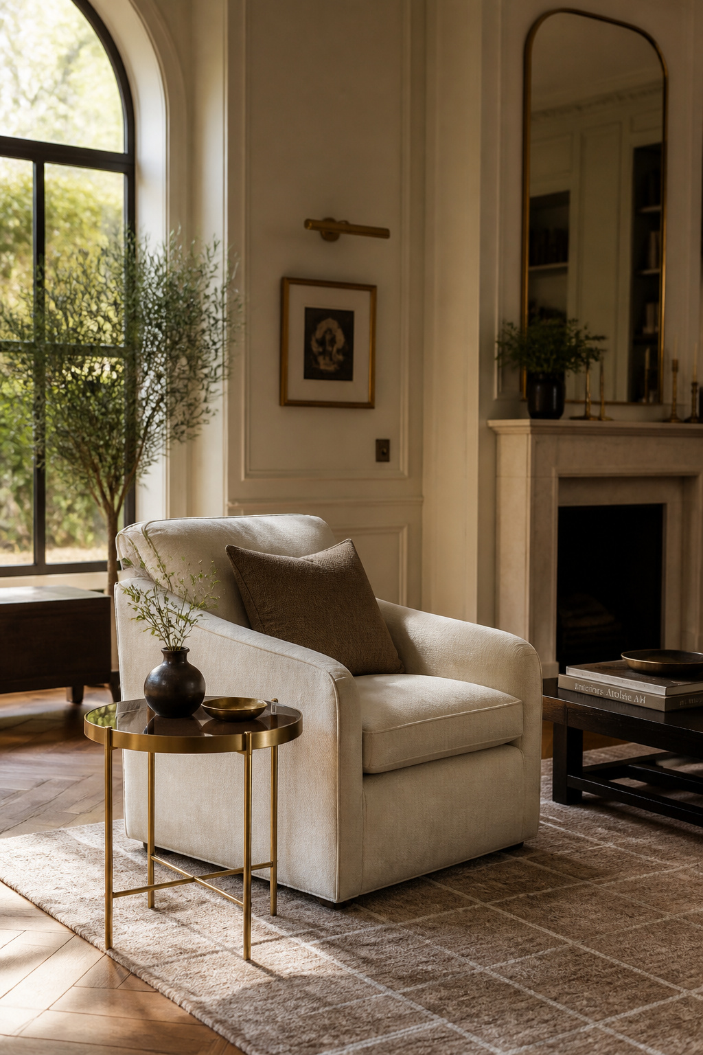
The 80/20 rule keeps this from going wrong: pick one dominant metal, brass in this case, for your highest-value fixtures (lighting, hardware, frames). Treat any second metal as no more than a 20 percent accent. Concentrate the brass in two or three touchpoints per room (a floor lamp base, a side-table tray, a set of cabinet pulls), rather than scattering small brass objects across every surface, which just looks indecisive. If you want a moodier alternative to clear glass for your coffee or side tables, smoked glass, tinted brown, amber, or black, paired with a warm wood or brass base feels far less clinical than clear glass. It also hides smudges and fingerprints considerably better, which matters more than you’d think in a household with kids or pets.
The mistake to watch for is mixing three or more competing bright metal finishes within one sightline: chrome lamp, nickel hardware, and brass picture frames all visible from the same spot on the sofa. Commit to one dominant warm metal at roughly 80 percent presence. The room reads as considered rather than accidental.
A single well-chosen plant can do more for a room than a dozen small ones scattered across surfaces. The 2026 trend toward fewer, larger specimens with strong architectural form treats houseplants as living sculpture rather than greenery filler. Once you start looking at plants this way, it’s hard to go back.
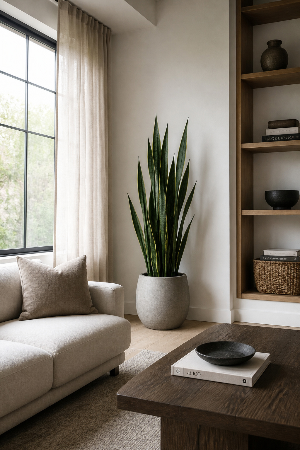
A sansevieria, or snake plant, is essentially living sculpture: vertical, architectural, and it doesn’t visually clutter a room the way a bushy plant might. It suits mid-century and Scandi-modern interiors with clean lines particularly well, and it tolerates low light, though it prefers medium-bright indirect conditions. A ZZ plant is similarly forgiving. It does best with 6 to 8 hours of bright indirect light near a north or east-facing window. It only needs watering once the soil has fully dried, which makes it close to foolproof. A fiddle leaf fig brings a different quality entirely: broad, glossy, veined leaves on a slender trunk that reads almost like a tropical sculpture in the corner of a room. Treating houseplants this way is one of the simplest modern living room design upgrades there is.
Committing one large specimen to an empty corner makes the biggest visual difference here. Pick a fiddle leaf fig, a bird of paradise, or a floor-height snake plant. The height and drama it brings simply can’t be replicated by a cluster of small tabletop plants, no matter how many you group together. The common mistake is scattering several small, same-size plants around a room instead of committing to one large architectural piece. It reads as clutter dressed up as greenery, rather than the design statement a single specimen can make.
A piece of furniture that does three jobs at once is a genuinely Nordic instinct. When your square footage is limited, as it often is in Scandinavian apartments, every object earns its place by doing more than one thing. A storage ottoman combines seating, a coffee-table surface, and concealed storage in a single footprint. That makes it one of the most efficient pieces you can put in a small room.
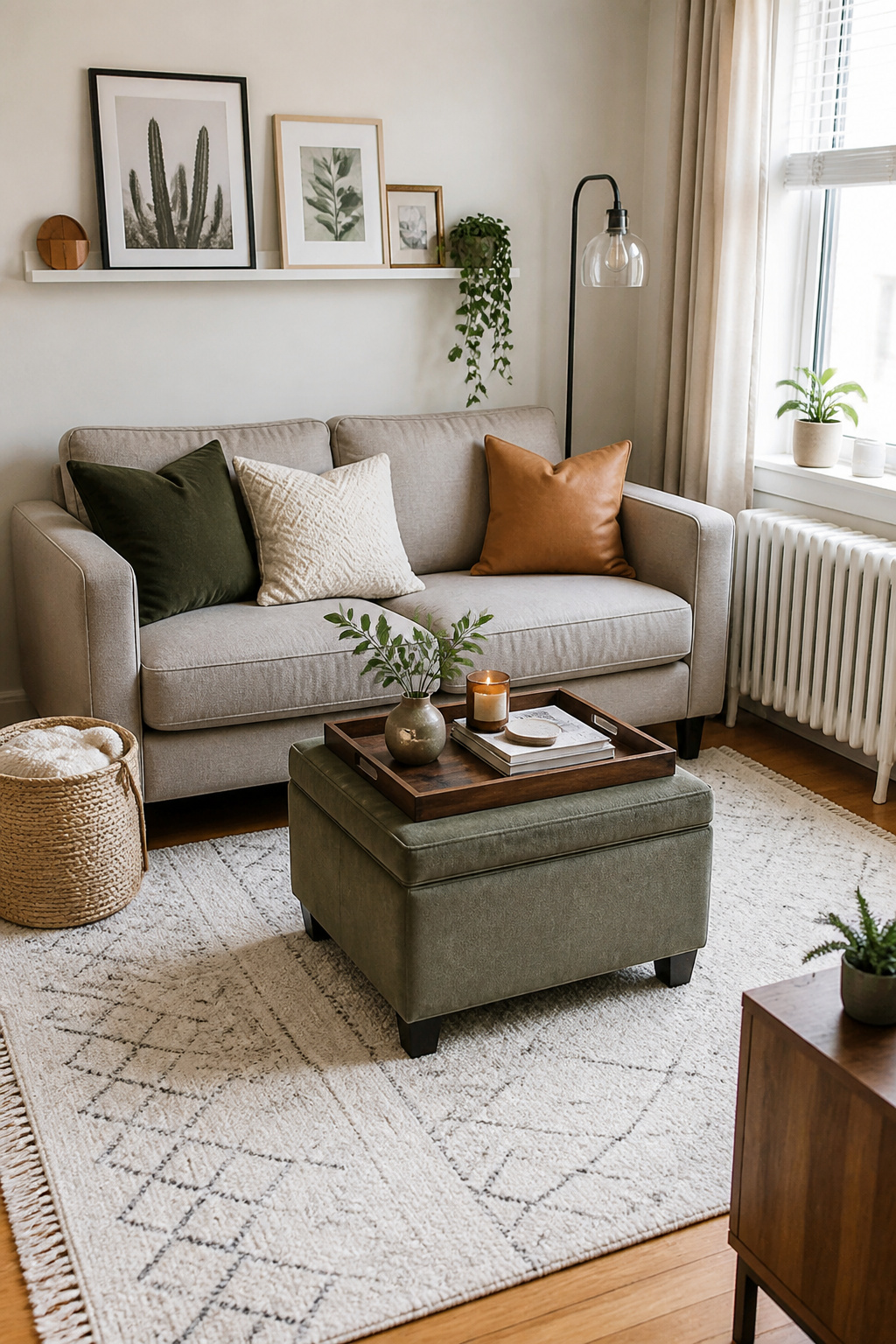
The Simpli Home Rockwood cube ottoman measures 16.9 inches wide, deep, and tall, with a 13.8 by 13.8 by 12.4-inch interior storage compartment tucked inside that footprint. The Owen Tray Top Storage Ottoman runs larger, at 25.2 inches deep and 33.9 inches wide, with dual flip-over tray tops that convert the piece from cushioned seating into a sturdy serving surface in seconds. Look for reversible lid construction (a cushioned upholstered side paired with a flat wood or tray side). Match the interior storage depth to how you’ll actually use it. Deeper compartments around 12 to 13 inches suit folded throws and pillows, while shallower ones work better for remotes and coasters. For more small-space furniture ideas, the same logic of multi-tasking furniture applies to nearly everything in a compact room. It’s one of the more practical modern living room decor strategies for renters especially.
Make sure whatever you choose has a real frame rated to support a person’s weight, not a purely decorative pouf that looks the part but can’t actually hold up under use. The mistake people make most often is choosing purely on upholstery color or shape and overlooking storage depth and tray weight rating entirely. They then discover the piece can’t double as a stable serving surface the first time they need it to.
Undersized art is one of the most common styling mistakes I encounter. It’s also one of the easiest to fix, because the fix is simply sizing up. A piece of art that’s too small relative to the wall or the furniture beneath it looks like an afterthought, even when the artwork itself is genuinely beautiful.
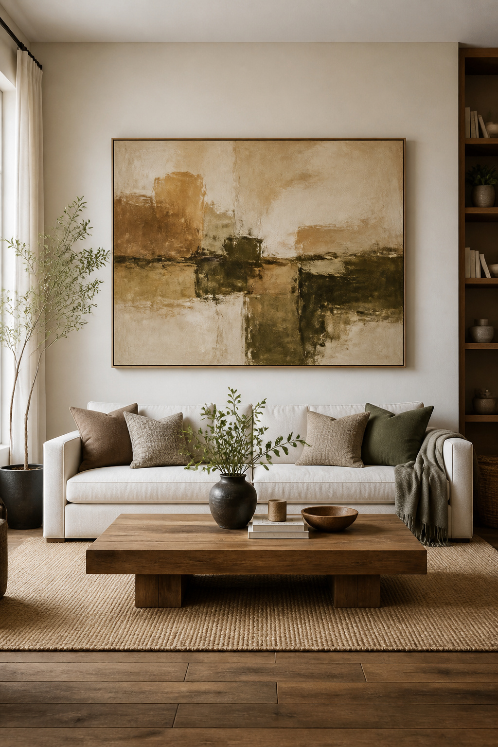
The rule that solves this: your artwork should span roughly 60 to 75 percent of the width of the furniture below it. An 84-inch sofa, for instance, pairs well with art somewhere in the 50 to 63-inch width range. Hang it so the bottom edge sits about 6 to 10 inches above the top of the sofa back. When you’re standing in a showroom unsure whether to size up or down, size up. It’s almost never the wrong call.
Choose a piece that echoes one of the room’s existing anchor tones (a rug color, a wood stain, a textile accent), so the art ties into the palette rather than competing against it for attention. It’s worth checking the art’s undertone, warm or cool, against the undertones already established by your wood and metal finishes before you commit to buying it. The same Rule of Threes logic from the wood-tone discussion applies here too. It’s a useful test for any modern living room decor purchase you’re on the fence about. A single well-scaled piece, chosen this way, does more for a room than an entire wall of smaller frames ever could. It also asks far less of you in terms of arrangement and upkeep.
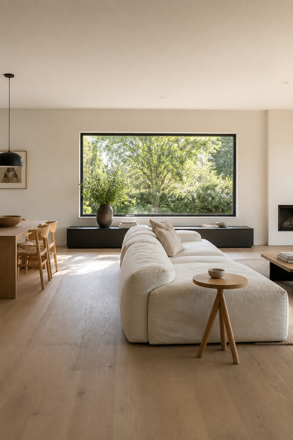
The best window treatment is sometimes the one you don’t notice at all. A ceiling-mounted, recessed curtain track sits flush with the ceiling, built into a channel with wood blocking installed before the drywall goes up. The effect is close to invisible: the curtains seem to simply emerge from the ceiling plane itself.
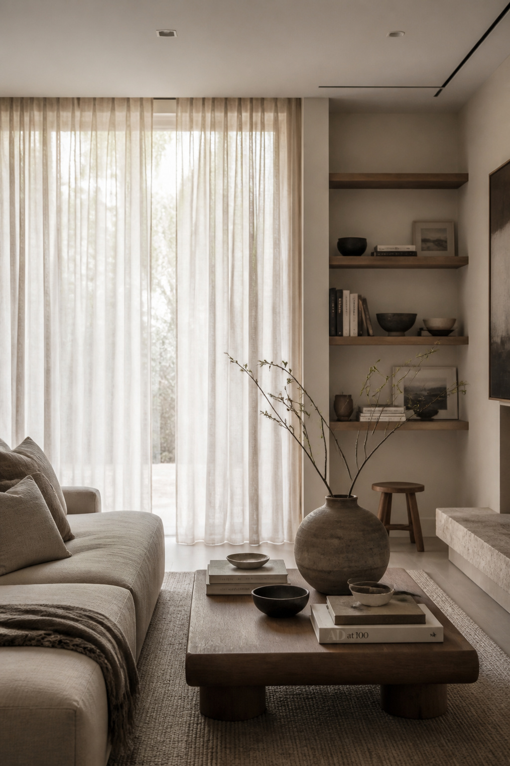
This is typically a new-construction or major-renovation feature, since it requires planning before the walls are finished. It also carries a higher install cost than a surface-mounted rod. The tracks themselves can curve or angle to follow a bay window or wrap a corner wall, which gives you flexibility a straight rod never could. Painting the track and the surrounding channel the same tone as the wall and ceiling reinforces the disappearing effect. There’s no visual interruption where the hardware meets the architecture.
If a full recessed track isn’t in the budget or the renovation timeline, linen semi-sheer panels are the more accessible alternative. They filter roughly 40 to 50 percent of incoming light, which sits comfortably between a sheer voile at 20 to 30 percent and a true blackout fabric at 60 to 80 percent. They soften glare while keeping the room genuinely bright. Linen develops a soft patina and texture over the years that synthetic fabrics never quite manage, all while staying naturally breathable. This is the kind of modern living room decor detail that costs little but changes how the whole window reads. The mistake that undercuts this whole approach is installing a surface-mounted rod with visible brackets in a color that doesn’t match the wall. It draws the eye exactly where you don’t want it, defeating the purpose before the curtains even matter.
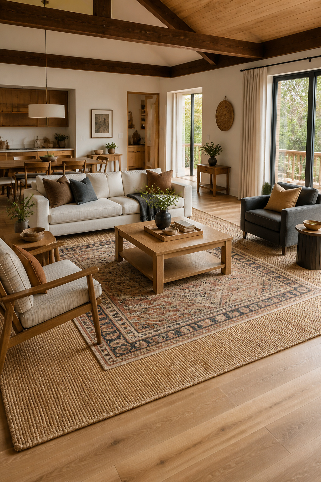
Furniture that can change shape as your life changes is a deeply practical idea. I think it gets undersold as a design choice rather than just a convenience. A modular sectional can reconfigure into an L-shape for everyday lounging and television viewing, which works in both small and large spaces. Or it can become a U-shape that surrounds guests on three sides for serious entertaining. It can even float in the center of an open-plan room, away from the walls entirely, acting as a visual divider between the living area and an adjacent dining or kitchen zone.
Whatever configuration you land on, keep at least 30 inches of clear walking space around it. Avoid letting a chaise module or an armrest jut into a primary walkway. This happens more often than you’d expect once a sectional gets reassembled a few times. For more on planning a flexible living room layout, think of the modular pieces as independent units you’re allowed to rearrange seasonally, not just once at delivery.
That seasonal reconfiguration is actually the whole point of choosing modular in the first place. Split the sectional into two smaller, cozier clusters for winter conversation, pulled in tighter near a fireplace. Then reassemble into one expansive U-shape for summer entertaining, opened up toward a patio door. The traffic pattern through the room shifts along with it, which is a small thing but a meaningful one. This kind of modern living room decor flexibility only pays off if you actually use it. The mistake I see constantly is someone buying a modular sectional, locking it into one permanent U-shape against the walls, and never touching it again. At that point you’ve paid a premium for flexibility you’re not using. A fixed sofa would have done the same job for less.
Visible clutter from electronics is what breaks an otherwise streamlined room faster than almost anything else. That’s why I recommend console cabinets with closed doors over open shelving for stereos, board games, and the tangle of cords that comes with them. Open shelving is wonderful for books and ceramics. It’s far less forgiving for a router and a stack of remote controls.
A TV stand or console with sliding tambour doors reveals its compartments only when you need them. It’s often paired with side cubbies for quick-access devices and built-in cable-management cutouts in the back panel, so cords route invisibly. End tables with hollow bodies are a quieter version of the same idea, holding chargers, magazines, or blankets without changing the table’s footprint at all.
The single most practical hidden-storage upgrade I’d point anyone toward is a console with small interior cubbies sized specifically for remotes and chargers, paired with one back-panel cord cutout. It keeps devices plugged in and charging the whole time, but fully hidden behind closed doors. Remotes and chargers are the items most likely to sit visibly on an open surface otherwise. Solving for them solves most of the room’s clutter problem in one move. This is a modern living room decor priority that’s easy to underrate until you’ve lived with the alternative. The mistake is relying only on open shelving for everyday electronics and remotes. It keeps small clutter constantly visible no matter how nicely everything else in the room is styled, undermining the calm the rest of your choices are working to build.
Chrome and stainless steel can feel almost clinical in a residential living room, showroom-cold in a way that works against the warmth most people are actually after at home. Brass gives that same reflective quality a softer, golden warmth instead. It works equally well in a strict modern-minimalist room or a more layered, vintage-leaning one. The 2026 lighting trend names aged brass, champagne bronze, and subtle gold specifically as the finishes that don’t scream for attention but still bring real warmth into a space.
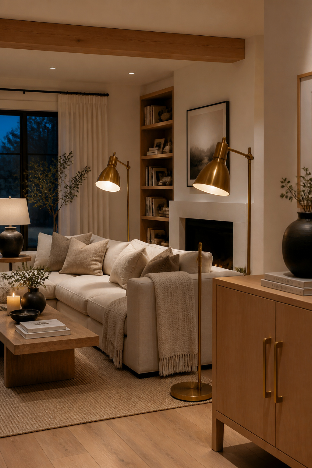
Apply the same 80/20 rule discussed earlier with glass and brass accents: brass dominant on your highest-value fixtures, lighting and hardware especially, with no more than 20 to 30 percent given over to a second metal. It pairs particularly well with white oak cabinetry, earth-tone paint, and textured natural fabrics, tying together several of the ideas already covered into one cohesive scheme. Unlacquered or aged brass develops its living-finish patina fastest at high-contact points like handles and pulls, and no two pieces age quite identically. It ages faster in a humid bathroom-adjacent space, slower elsewhere. This creates a kind of lived-in luxury that’s a nice counterpoint to a minimalist scheme’s otherwise crisp lines.
For more on warm lighting fixtures for a living room, the metal finish you choose matters just as much as the bulb temperature in determining whether a room feels warm or merely bright. This is the last of the modern living room decor details on this list, and arguably one of the easiest to retrofit into a room you’ve already finished. The mistake to avoid is pairing warm brass accents with predominantly cool-toned grays and chrome elsewhere in the room. The two fight each other, undoing the warming effect brass is supposed to deliver, rather than reinforcing it.
Not every idea here suits every room, and that’s by design rather than a shortcoming. The direction your living room faces actually changes which choices make sense. North-facing rooms get the least and most consistently diffused light, so warmer tones with pink, gold, or yellow undertones help compensate. South-facing rooms get strong light all day and can carry cooler or bolder tones without ever feeling flat. East-facing rooms get a softer morning light, and west-facing rooms get that warm golden glow in the afternoon. This is worth keeping in mind when you’re deciding where to place reflective brass accents or sheer linen panels for the best effect. If your room is on the darker or smaller side, lean on sheers rather than opaque treatments. Hang a mirror opposite the window, and choose lighter wall tones that bounce what natural light you do have.
My honest advice on sequencing: make one or two changes at a time and live with them before moving to the next. A full overhaul, attempted all at once, tends to fail precisely because the planning gets skipped. Paint, curtains, and art all get purchased simultaneously without a unifying thread between them. Often the biggest visual improvement available to you doesn’t involve buying anything at all. Editing what you already own, clearing surface clutter, rearranging furniture, restyling a shelf, will outperform a new purchase more often than you’d expect. Start with whichever modern living room decor idea solves your most immediate frustration. Give it time to settle, and let the next choice follow naturally from there. Whether you call it modern or contemporary living room decor, the underlying logic stays the same: choose less, choose well. A considered room built slowly will always feel more like home than one assembled in a single weekend.