Physical Address
304 North Cardinal St.
Dorchester Center, MA 02124
Physical Address
304 North Cardinal St.
Dorchester Center, MA 02124
Turn any bathroom into a personal retreat with these 16 bathroom art decor ideas — botanical prints, gallery walls, original paintings, and sustainable art.
There’s a moment — usually in January, when mornings are dark and the rush feels relentless — when you notice the walls of your bathroom for the first time in months. Four walls. Blank, slightly damp, holding the same quiet nothing they held when you moved in. For a room you enter twice a day, every single day, the bathroom is remarkably underinvested. It’s a threshold space — where we move between sleep and wakefulness, between the weight of the day’s work and the release of rest. Every teacher I’ve learned from has something to say about transition spaces, and how the quality of a threshold shapes what comes after it.
That’s where bathroom art decor earns its place. Not as decoration for decoration’s sake, but as intention made visible. After eight years of designing spaces that support wellbeing and daily ritual, I’ve found that even a single carefully chosen piece of wall art shifts a bathroom from functional to genuinely restorative. The effect is subtle and cumulative — the difference between going through a routine and actually inhabiting a ritual.
Here are sixteen approaches — from botanical prints and vintage illustrations to gallery walls, ceramic plates, and original paintings — that will help you build a bathroom that genuinely feels like a personal retreat.
Walk into almost any spa or wellness studio and you’ll notice the same quiet pattern: leaves, stems, fronds, petals. Botanical imagery is everywhere in deliberate wellness environments, and there’s a reason for it. Biophilic design research consistently shows that nature imagery in interior spaces can reduce stress by 20 to 30 percent. In a bathroom — where water already anchors the room in the natural world — botanical wall art deepens that effect and creates a coherent visual narrative throughout the space.
The most important practical consideration is humidity resistance. Sealed glass frames and acrylic-faced prints are the safest material choices. Unprotected paper prints can warp or develop surface mould within weeks in a steamy bathroom. Metal prints (dye-sublimated onto aluminium) are fully waterproof and work particularly well positioned above a bathtub or near a shower wall. Place art on surfaces that rarely receive direct water spray: the wall behind the toilet, above a towel bar, or on the wall opposite the vanity mirror. UV-protective glass preserves ink quality in sun-facing bathrooms; non-reflective glass is the better choice in smaller rooms where glare becomes an issue.
For small bathrooms, a matched set of three botanical prints — same artistic style, varied plant species — creates cohesion without monotony. For larger rooms, a single large-scale leaf print (A2 or 16×20) often reads more powerfully than several smaller pieces fighting for attention. If you prefer an eclectic mix, a consistent frame finish — all black, all natural oak, all antique white — creates the unifying thread that makes the collection feel deliberate rather than accumulated.
Designers consistently reach for monochrome photography in bathrooms because it solves one problem immediately: it pairs with everything. White tiles, warm stone, coloured grout, dark cabinetry — B&W photography sits beside all of them without tension. That visual neutrality isn’t blandness; it’s flexibility. A strong black and white print brings drama to a white-tiled room precisely because high-contrast imagery creates visual interest where the surfaces around it are uniform.
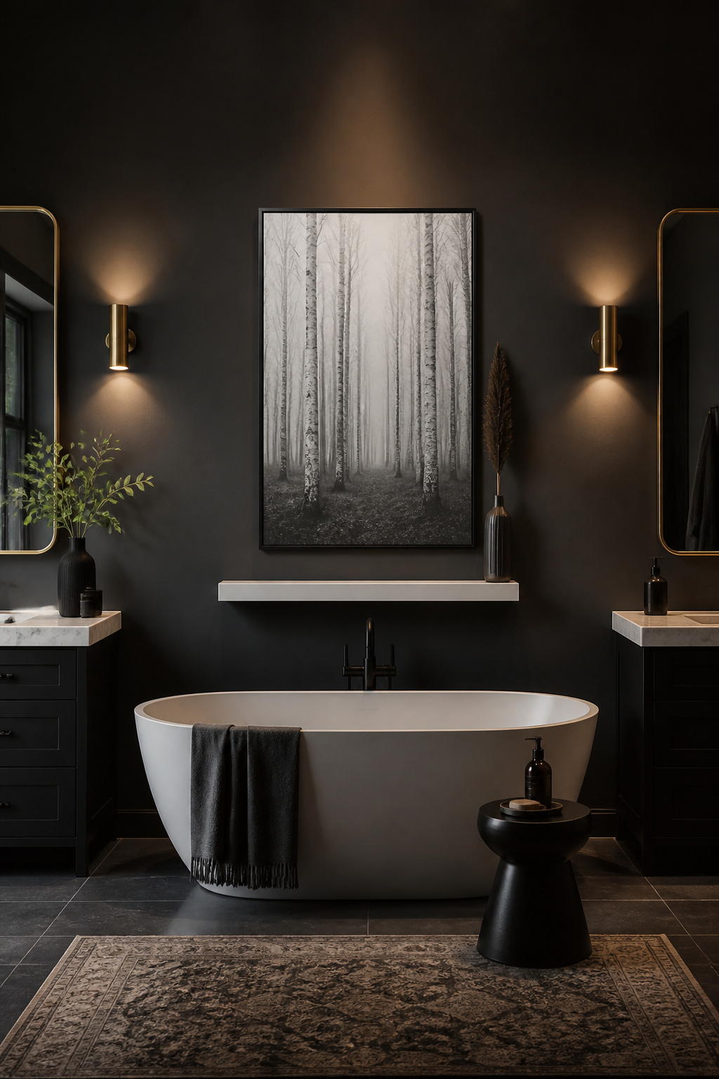
Subject matter matters more in monochrome than in colour, because the image carries its weight without a palette to lean on. Nature subjects translate especially well. The tonal range from vein shadows to petal highlights in a close-up botanical is naturally dramatic in greyscale. So is the contrast between dark tree trunks and pale sky in a woodland photograph. Architectural photography — spiral staircases, arched doorways, tiled floors seen from above — adds geometric structure. Abstract ink-wash forms create moody atmosphere without any literal subject to tire of.
For framing, sleek matte-black metal frames in a 1-2cm profile keep the focus on the image rather than the surround. Thin brushed gold works if your bathroom leans warm. One critical note: avoid glossy glass in a brightly lit bathroom. Reflections from overhead lighting will wash out the image entirely. Non-reflective museum glass is the smarter investment for any bathroom wall art of this kind.
Here’s what a flat print on a wall can’t do: cast a shadow. Decorative ceramic plates create a subtle, shifting three-dimensionality that changes as light moves through the day — morning light from a north-facing window reads differently from the warm glow of an evening lamp. In a room dominated by flat, reflective surfaces, this dimensional quality is genuinely arresting. As bathroom wall art goes, ceramic plates occupy a different category from prints entirely.
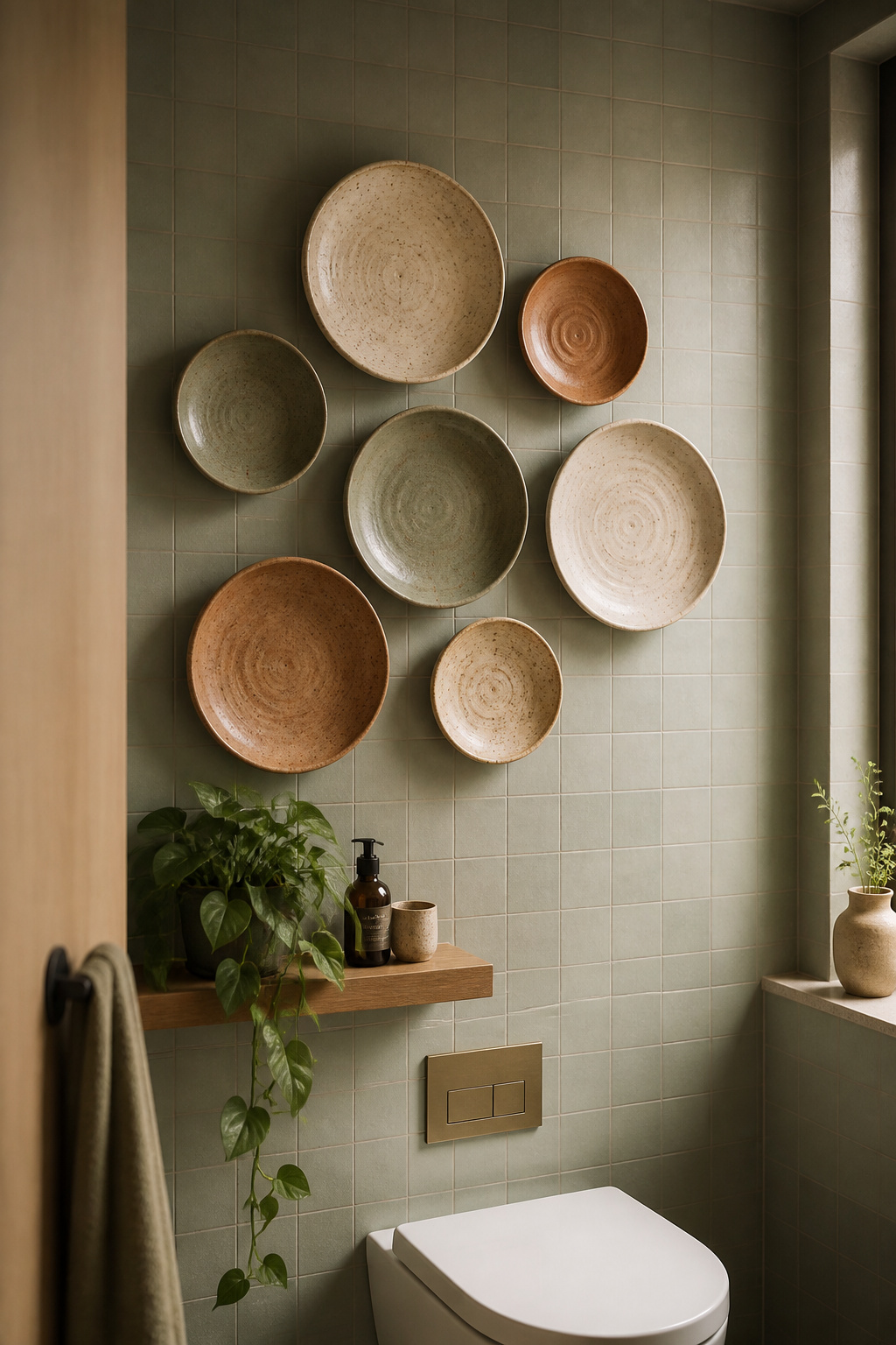
Glazed ceramics are naturally moisture-resistant, making them one of the most practical materials for any bathroom wall. Etsy is the best starting place for handmade pieces — search for “wall plate” or “wall disc” alongside your preferred aesthetic (wabi-sabi, boho, minimal). Plate hangers — spring-loaded wire clips that fit behind the plate rim — are the standard mounting solution; they’re invisible from the front and hold up to 2kg per plate. For heavier hand-thrown pieces, self-adhesive plate hangers rated to 3× the plate weight are more reliable. In tiled bathrooms, adhesive strips rated for ceramic surfaces avoid the need to drill through grout.
Arrangement is where ceramic plates become genuinely beautiful. Groups of three, five, or seven always read more naturally than even numbers. Use a range of diameters — anchor the cluster with one 25-30cm piece and surround it with 15-20cm plates. Before marking a single wall, lay the whole arrangement on the floor to test the composition, then transfer it. Above a toilet tank is a classic placement that uses otherwise wasted vertical space; a loose horizontal line of three above a towel rail works just as well.
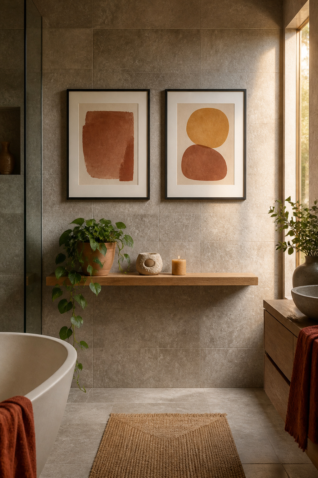
Watercolor art does something that almost no other printed medium achieves in a bathroom: it creates softness. The transparent, organic edges of a watercolor wash are the visual opposite of grout lines and tile grids — that contrast is exactly why the combination works so well. Where the room is rigid and geometric, the art is fluid and unpredictable. The tension between the two creates a more interesting space than either alone.
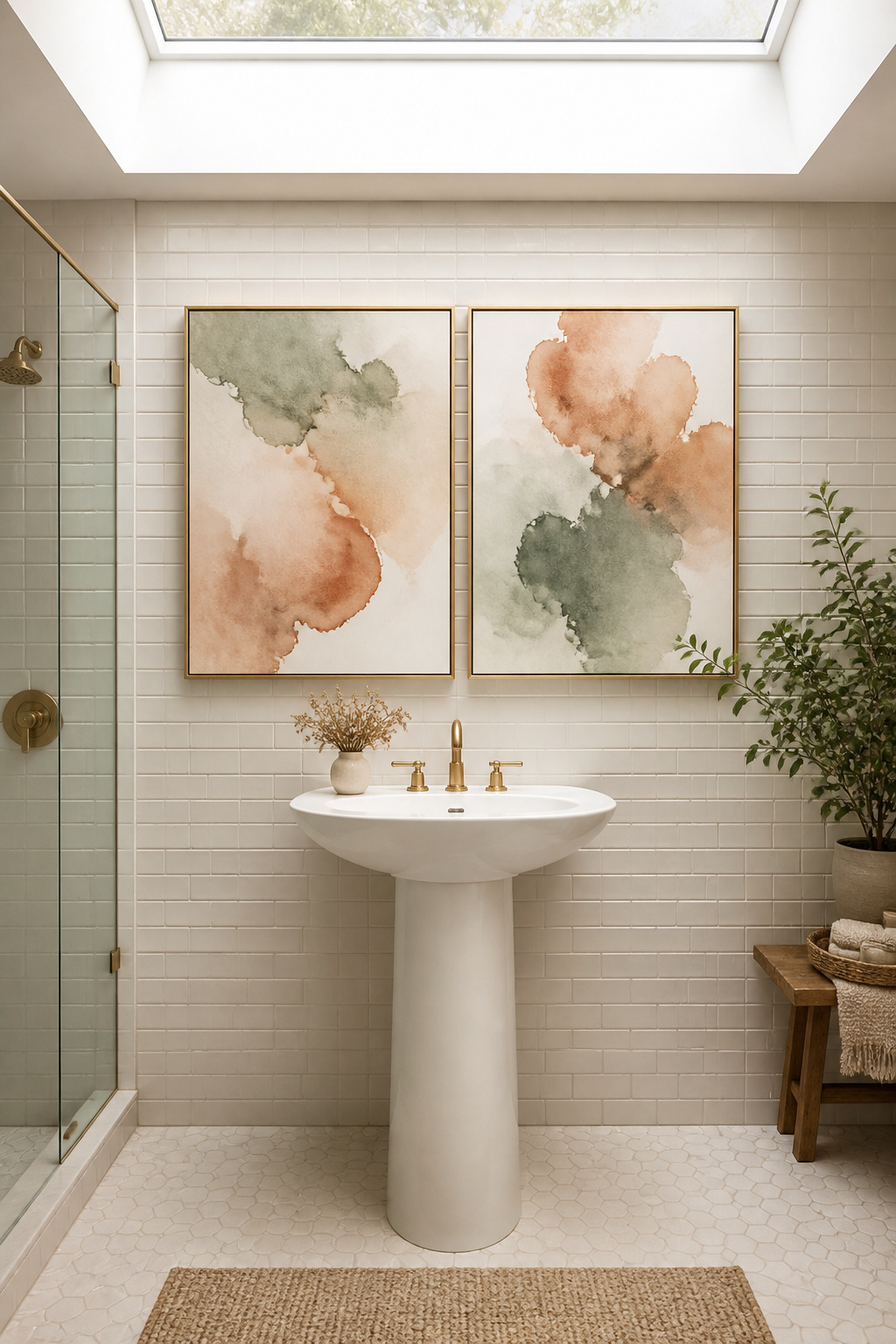
In 2026, bathroom design is moving toward richer saturated palettes — deep sage greens, garnets, warm ochre, dusty terracotta — and watercolor prints in these tones pair naturally with the shift away from stark white. Cool blues and greens work especially well in bathrooms that lean marine or spa-adjacent. Terracotta and ochre prints warm up rooms with grey or white fixtures. Sage green is the most universally versatile option: it complements grey tile, natural stone, and white subway tile in equal measure.
For scale, a series of three small prints (20×25cm) is ideal in a narrow powder room or above a toilet. One larger piece (40×50cm) makes a cleaner statement in a master bathroom with wall space to fill. Print paper quality significantly affects how watercolor reads: fine art giclée on textured cotton rag renders pigment with real depth and warmth. Non-reflective museum glass lets the subtle texture of the paper surface come through without interference from overhead bathroom lighting.
Bathrooms are unusually hard places, material-wise. Tile, glass, porcelain, chrome — the entire sensory register of a typical bathroom is cool, flat, and reflective. A woven wall hanging is often the only soft element in the room. That single tactile contrast changes the space’s feel more than almost anything else you could add. There’s also an acoustic dimension: natural fiber weavings absorb some of the echo that tiled surfaces generate, making the room subtly quieter as well as warmer.
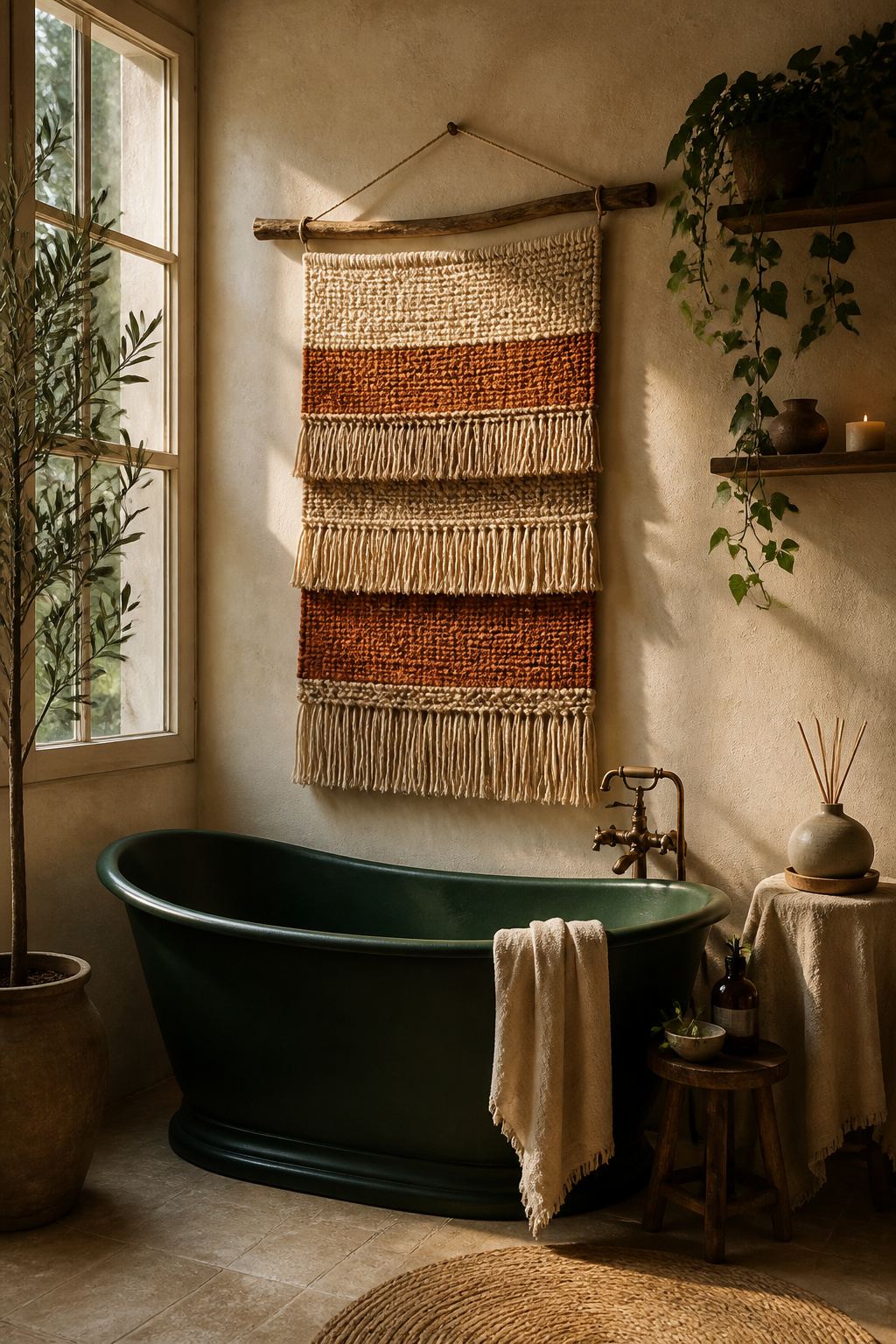
The practical question for bathroom textiles is fiber choice. Cotton is the most common material in hand-knotted wall art, but it absorbs moisture and can develop a musty smell in rooms without good ventilation. Jute has natural antimicrobial properties that give it inherent mould resistance — better than cotton for humid environments, though it still benefits from positioning away from direct steam. For bathrooms with high humidity or poor airflow, nylon and polyester blended hangings are the honest choice: waterproof, mould-resistant, and colourfast. Wools are surprisingly good too — the lanolin content of natural wool makes it hydrophobic and quick-drying.
Position any natural fiber piece at least 1.5 metres from shower heads or steam vents. The wall directly above a freestanding bathtub is an ideal placement — it creates a visual centrepiece for the space while staying well clear of water sources. Narrower, longer pieces (20-30cm wide, 60-80cm long) work beautifully in the gap between a door frame and a vanity mirror. If the bohemian aesthetic carries through to your other rooms, you’ll find plenty of boho living room ideas that pair naturally with the textured, layered approach.
Single-line drawing — contour art made in one unbroken stroke — has roots in Zen artistic practice. There, a single brushstroke represents both the action of making and the completeness of the moment. That philosophical weight doesn’t disappear when the finished piece is printed and hung on a wall. For a wellness-oriented bathroom, there’s genuine meaning in surrounding yourself with art that was made with intention — a single continuous line that required presence and decision in its creation.
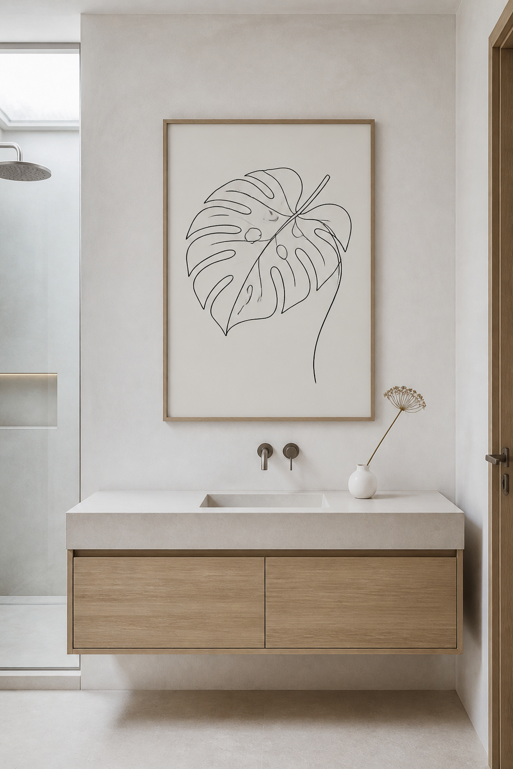
The most effective subjects for bathroom line art are botanical outlines, yoga or meditation poses, and abstract flowing forms. A single-line fern or eucalyptus branch at 40×50cm above a toilet has exactly the calm authority the space needs — visual enough to register, simple enough not to demand attention during a rushed morning. Single-line human figures in meditation positions are a particularly resonant choice: the form communicates practice without being literal or declaratory. Abstract contour compositions — where the line creates organic looping shapes — add visual interest with no representational subject to tire of over time.
For frames, thin brushed-gold or matte-black metal in a 1-2cm profile is ideal. It provides enough definition to anchor the piece without competing with the delicacy of the line. Raw or lightly oiled oak adds warmth to black line art without making the composition feel heavy. One sizing note that matters: a 15×20cm line art print will disappear on a bathroom wall. As bathroom art ideas go, this one rewards going larger — at least 30×40cm — for the piece to hold its presence in a hard-surfaced room.
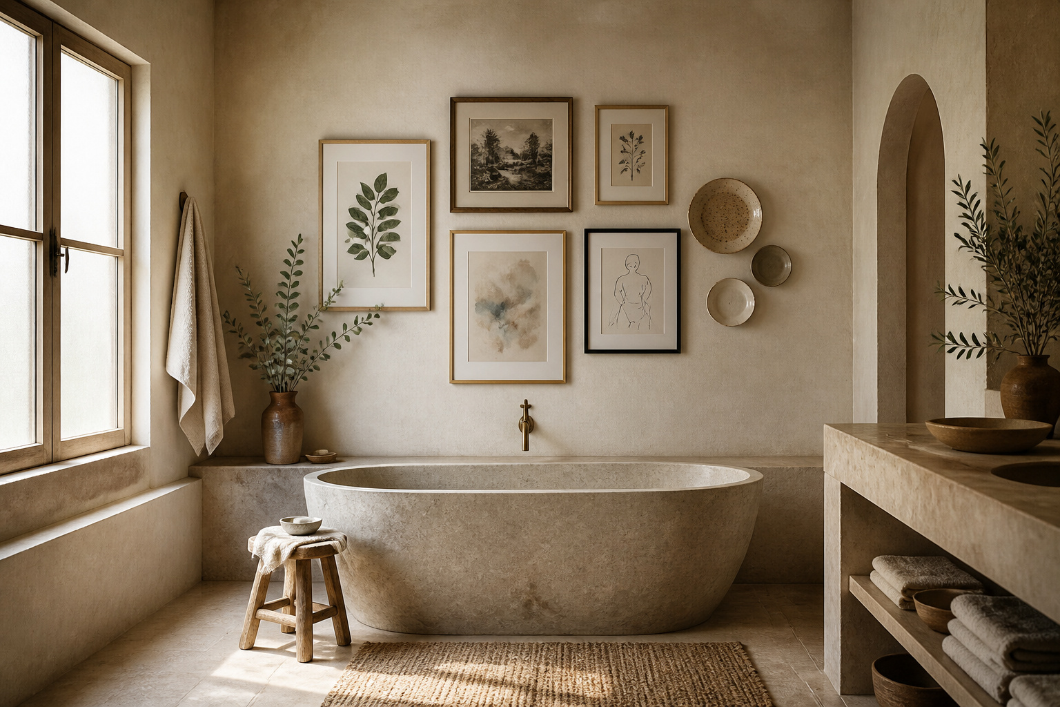
A gallery wall is the most personal thing you can do to a bathroom wall. Done well, it reads as a collection built over time — not a set purchased on a single Saturday afternoon. Done carelessly, it looks like a mess of differently sized frames with no logic connecting them. The difference is almost entirely in the planning, which takes twenty minutes with craft paper and tape and saves hours of replastering.
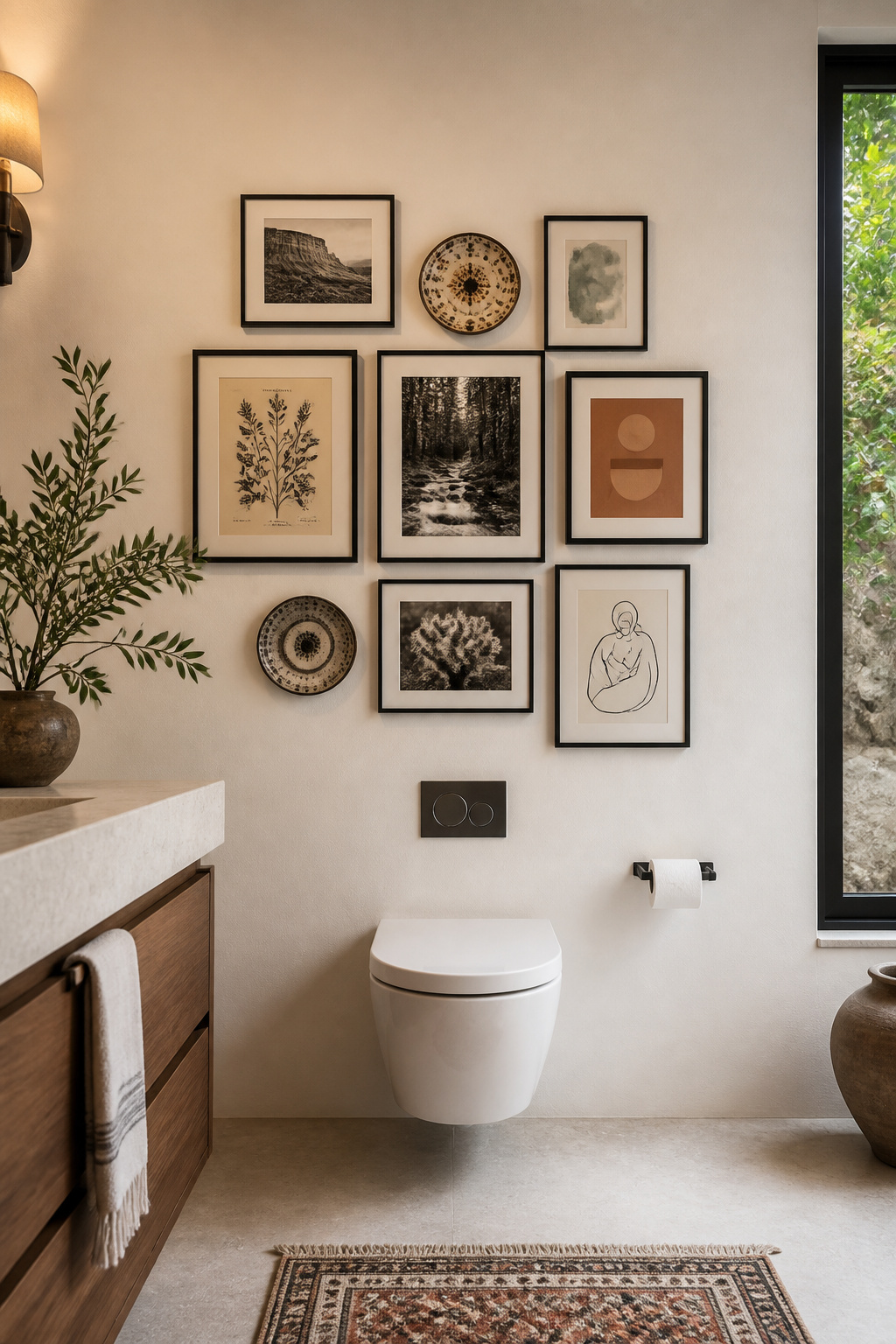
The paper template method is the foundation of a successful bathroom gallery wall. Trace each piece on kraft paper, cut out the templates, and tape them to the wall before committing a single nail. This lets you test the arrangement — shifting pieces, swapping positions, adjusting spacing — until the layout feels right. Then transfer the template positions directly. Leave at least six to eight inches of clear wall space around the perimeter of the entire arrangement so it reads as a deliberate composition rather than creeping wallpaper. Centre the arrangement at 57 to 60 inches from the floor — the standard eye level for a standing adult. Anchor the group with one larger piece (16×20 or 18×24) and fill around it with medium and small works. If you’re working with limited wall space, the small bathroom design ideas that work for fixtures and layout apply equally to art — smaller, more deliberate arrangements often read stronger than ambitious ones squeezed into an inadequate space.
Spacing between frames creates the overall feel: two to three inches reads tight and editorial, four to six reads relaxed and airy. Mixing frame sizes works well only when the sizes are clearly distinct — an 8×10 next to a 16×20 creates intentional contrast; an 8×10 next to a 9×12 just looks like a mistake. A consistent frame finish across varied sizes and print styles is the single most reliable way to make a diverse collection look curated.
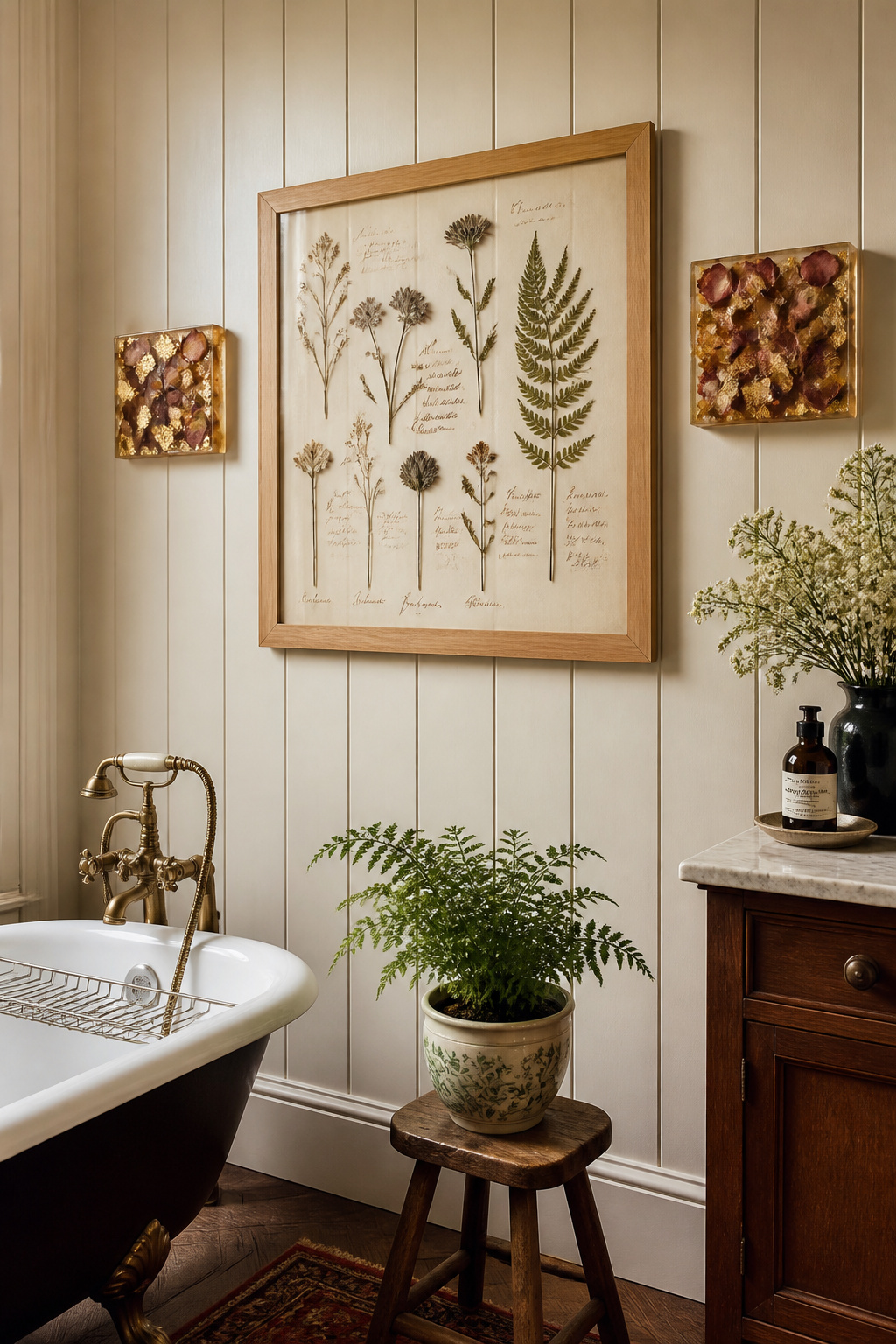
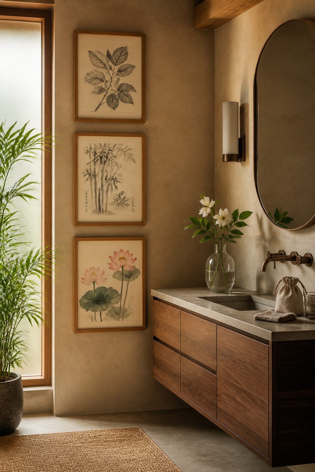
There’s a particular kind of quiet authority that comes with an 18th-century botanical engraving. These weren’t decorative illustrations — they were scientific records, made by artists of extraordinary technical skill to document species with precision before photography existed. Artists like Georg Dionysius Ehret and Pierre-Joseph Redouté worked in royal collections and natural history institutions. They produced images that combined scientific rigour with extraordinary beauty. In a bathroom designed around rest and attention to the natural world, that heritage gives botanical prints a weight that contemporary art can’t replicate.
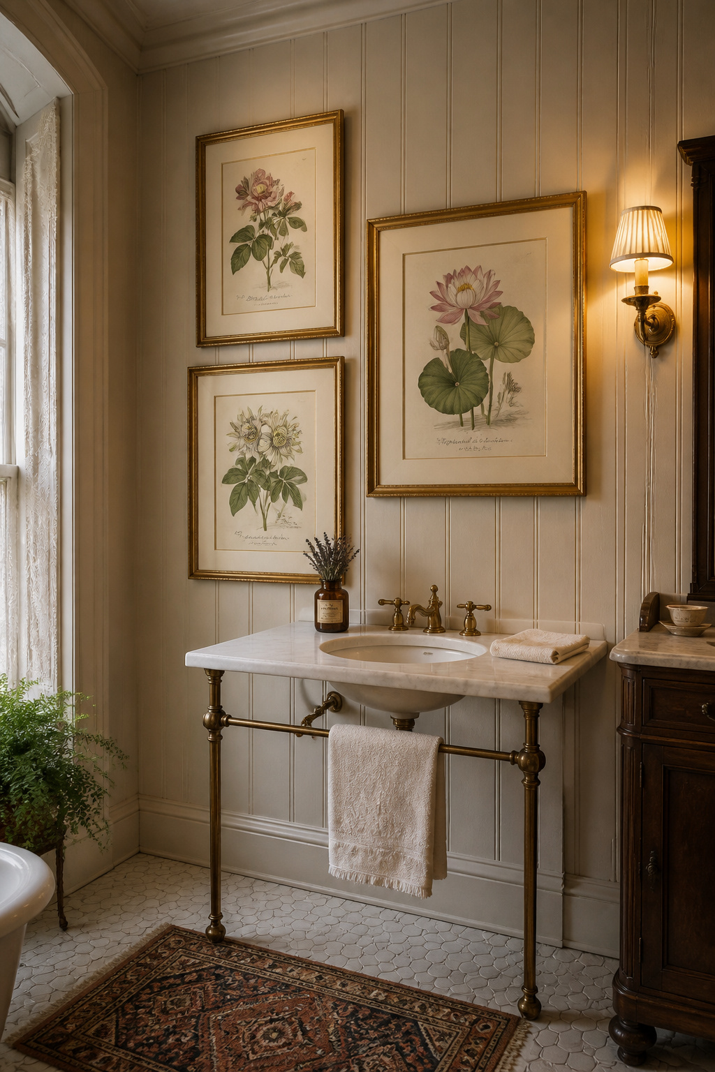
Many of these illustrations are now in the public domain and freely available in high resolution. The Biodiversity Heritage Library (biodiversitylibrary.org) holds over 150,000 botanical illustrations from historical publications, all available to download. The Graphics Fairy curates more than 350 vintage botanicals that print cleanly at A2 size. Rawpixel’s public domain collection features curated Smithsonian Institution pieces under CC0 licence. When downloading from any source, always check that the resolution is sufficient before printing large — a 72 DPI image printed at A2 will show pixelation clearly; aim for a minimum of 300 DPI at your target print size. Etsy shops specialising in vintage reproduction prints are a reliable alternative if you’d rather not manage your own printing, and local antique shops often yield original Victorian-era prints on paper for far less than you’d expect.
Framing for period botanical illustration rewards a bit of thought. Antique gilt or gold-leaf frames are historically appropriate for 18th-century engravings and reference the original display contexts of European natural history collections. Dark mahogany or ebonised frames suit Victorian-era illustrations, particularly those with dark ink on cream or buff paper. For a more contemporary treatment, a wide antique-white matte (4-5cm) with a simple thin frame gives the illustration breathing room while sitting cleanly in a modern bathroom. If the rustic and antique-influenced aesthetic feels right for your space, farmhouse bathroom decor ideas offer a complementary visual language that pairs naturally with vintage botanical illustration.
Bathroom lighting is well-suited to dimensional art in a way that living room lighting often isn’t. Most bathrooms have both overhead recessed lighting and side-lit vanity mirror strips — two directional sources that create exactly the raking light that makes relief sculpture interesting. A plaster or carved wood panel that looks flat under even overhead light comes alive under angled illumination, with shadows shifting through the day as the light’s angle changes. The effect is quietly dramatic. For bathroom art decor that genuinely does something a print cannot, three-dimensional relief is worth serious consideration.
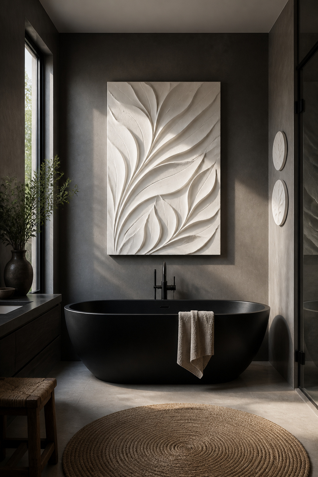
The most architectural option is a plaster relief panel — these can be painted in any finish (raw white, tinted, metallic) and read as part of the wall architecture rather than an object placed on it. For more complex forms that would be fragile in plaster, resin castings work well up to about 30cm in diameter. Papier-mâché wall art from independent makers (search Etsy for organic forms — clouds, waves, coral shapes) is lightweight, surprisingly durable when sealed, and often the most distinctive option. Carved wood panels in teak or oak are beautiful in bathrooms with natural material palettes — seal them with clear marine varnish to protect against steam damage. A 2026 design trend worth noting: three-dimensional wall art panels are increasingly being used where feature tiles once lived, creating sculptural surfaces that respond to light rather than merely reflect it.
For placement, a single large panel (50×70cm or larger) positioned behind a freestanding tub creates the highest architectural impact. Three smaller relief discs (20-25cm each) arranged in an overlapping cluster above a toilet handle the same space with a lighter touch. Whatever material you choose, seal it thoroughly before hanging anywhere near a shower — unpainted plaster erodes rapidly with repeated water exposure.
Environmental psychology has documented clearly what most of us already know intuitively: looking at water and natural landscapes lowers blood pressure, reduces anxiety, and activates the parasympathetic nervous system. This research is one of the stronger scientific arguments for putting deliberately chosen bathroom art decor on your walls rather than leaving them bare. The effect of a large landscape photograph is different in a small enclosed room than it is in a hallway — in a confined space, a horizon line creates the perceptual illusion of an opening in the wall. The eye is drawn outward. The room feels less small.
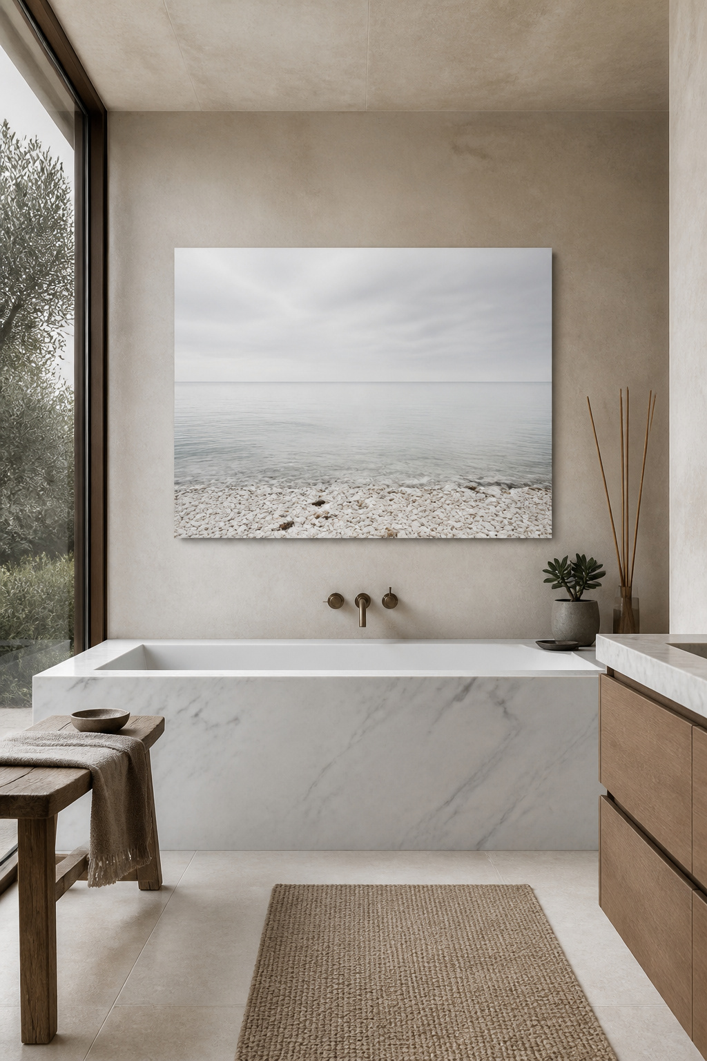
Print size should match your bathroom’s footprint. Powder rooms and small en-suites under 50 square feet are best served by a 20×30cm print or a grouped arrangement of three 15×20cm images — going larger can feel overwhelming in a tight space. Standard bathrooms in the 50-100 square foot range suit 30×45cm to 40×60cm prints as a focal piece. Master and spa bathrooms above 100 square feet can support 50×70cm and above; above the freestanding tub is the classic placement. If the coastal and oceanic palette speaks to you, coastal bathroom decor ideas extend the visual language from art into the full room.
For material finish, metal prints (dye-sublimated onto aluminium) are the unambiguous best choice for bathroom photography: fully waterproof, no warping risk, and vivid colour. Matte paper prints behind sealed glass with non-reflective glazing are a strong second option. Glossy paper prints without frame protection will cockle — the surface ripples as moisture causes the paper to expand unevenly — within a season. Canvas with a UV-protective coating occupies a middle ground: better than unprotected paper, acceptable in well-ventilated bathrooms away from steam sources.
What separates a meaningful piece of typography wall art from a clichéd one is function. A quote that serves the specific ritual of the space — morning intention-setting before you face the day, an evening phrase to let the day go — has a different purpose from motivational text purchased because the font was pretty. In a bathroom, which is a genuinely transitional space, the right typography has the quality of a practice aid rather than a decoration.
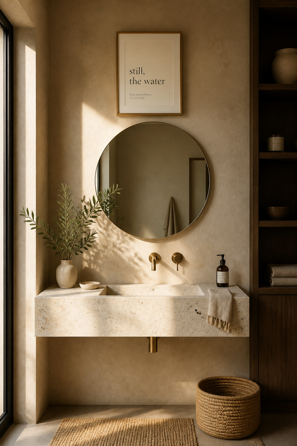
Short phrases under eight words are almost always more effective than longer ones in a bathroom, where reading time is 15-30 seconds at most. “Still, the water” or “begin as you mean to go on” are in the right register. Lines from Rumi, Mary Oliver, or a Zen koan are more likely to sustain meaning over years of daily viewing than anything from the category of corporate productivity inspiration. For typography style, serif fonts (Garamond, Bodoni, Caslon) convey historical weight and suit literary or philosophical phrases. Sans-serif — particularly the geometric clarity of Futura or the warmth of Gill Sans — reads as modern and calm in a contemporary bathroom. Script is warm and personal but needs to be legible at bathroom viewing distances; avoid anything so decorative that it requires effort to read.
The inspirational-quote category has been exhausted. “Live Laugh Love,” “Good Vibes Only” — these were mass-produced at a scale that has drained every molecule of meaning from them. Independent hand-lettering artists on Etsy produce genuinely distinctive typography art that you’re unlikely to see replicated in anyone else’s bathroom. A framed line from your own journal — something you wrote that crystallised something true — is the most personal typography art imaginable, and it costs almost nothing.
There is a perceptible difference between a room with a print on the wall and a room with an original work on the wall. The original carries what Walter Benjamin called the work’s “aura” — the trace of its making, the specific moment of a human hand and a unique decision. In a bathroom, where we’re often in our most unguarded state, that presence matters more than in a room we perform in. You don’t need to spend gallery prices to feel it.
A small oil sketch (15×20cm), a quick watercolour study of a shell, a plein air impression of a garden wall — these are the studio works that artists make during exploratory phases. They’re often the most alive and immediate pieces in an artist’s body of work, and they’re frequently the most affordable too. Saatchi Art is the most straightforward starting point: filter by size (under 12 inches) and budget, and the range is genuinely broad, with free shipping and a 14-day satisfaction guarantee. Etsy’s strength is in emerging watercolour and illustration artists — search “original watercolour small” or “original oil 6×6” for work at the right scale. Instagram has become the primary gallery for many independent artists; DMing someone whose work you’ve been following about available small pieces is often how the best bathroom-scale originals are found. For subject matter, botanical studies, still lifes with water themes (shells, pebbles, sea glass), and small abstract landscapes all translate beautifully to bathroom proportions. If extending a consistent art sensibility across multiple rooms appeals to you, bedroom wall art decoration ideas show how the same approach translates to a very different space.
One placement caveat worth flagging: avoid portraits with direct eye contact in a bathroom. In a room where we’re often undressed and vulnerable, a painted figure looking straight at the viewer creates discomfort that’s hard to articulate but consistently felt. Botanical still lifes, abstracts, and landscape-adjacent subjects are universally at home.
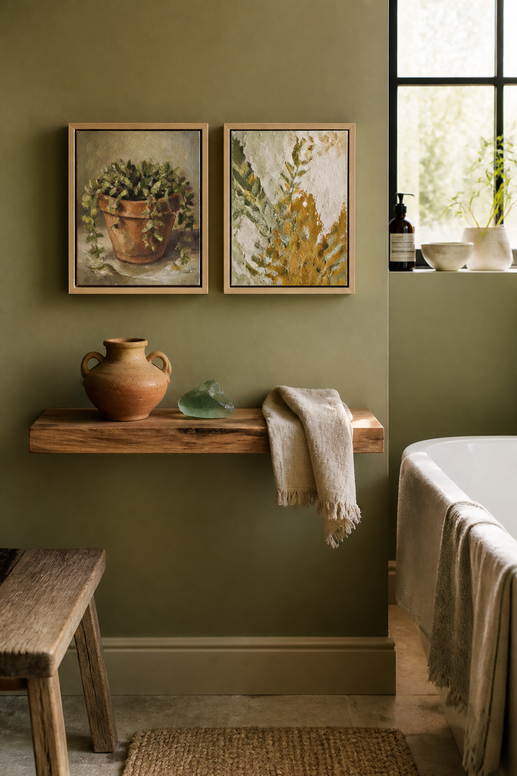
Terracotta’s moment in interior design has extended well past trend. The colour — that particular warmth of fired clay, of sun-dried earth, of Roman amphora walls — speaks to something older than design cycles. In colour psychology, earth tones are consistently associated with stability, groundedness, and calm. Sand, clay, and warm beige palettes create a spa-like comfort that is deeply stable across different lighting conditions and seasons, which is part of why terracotta-toned art has held its position through multiple trend rotations without looking dated.
The design logic for terracotta bathroom art is particularly strong where the fixtures skew cool. Rooms with grey or blue-grey tile, chrome fixtures, and white porcelain can feel clinical without a warm counterpoint. Terracotta or ochre wall art introduces exactly the colour temperature tension that prevents a cool bathroom from reading cold. The pairing works because ochre and blue are near-complementary on the colour wheel — the contrast is colour-theory correct, which is why it reads as visually interesting rather than jarring. Brass and unlacquered gold fixtures amplify the earth-tone palette naturally; chrome fixtures are substantially warmed by terracotta and ochre nearby.
The botanical terracotta combination — prints featuring green foliage motifs against terracotta grounds — is one of the most versatile bathroom art ideas available. It connects the warmth of earth tones with the biophilic quality of nature imagery, and it complements almost any neutral tile palette. One combination to avoid: terracotta art against pink-toned tile. Both read warm-red, and the result is visually muddy rather than dynamic; earth tones work best alongside cool or neutral surfaces.
A collage piece tells a story that a single-medium print never can. It references the found, the reclaimed, and the brought-together — materials sourced from different times and places, assembled in a specific moment. For a bathroom that should feel personal and lived-in rather than professionally styled, this is exactly the quality you want from the art on its walls. Pressed botanical collages — dried flowers, leaves, and seed heads mounted behind UV glass — are among the most beautiful and humidity-appropriate mixed media formats available. The glass completely seals the organic material from moisture while making it fully visible; you get both the warmth of something handmade and the practicality of glass-protected art.
Beyond pressed botanicals, several mixed media formats work well in bathroom conditions. Paper collages (torn tissue, vintage magazine pages, washi tape elements) are fine behind sealed glass. Resin art — natural elements suspended in clear resin, including dried petals, shells, and pigment — is both mixed media and fully waterproof, making it one of the smartest bathroom art ideas in this category. Embroidery and needlepoint wall pieces are gaining ground in bathrooms; seal them in humidity-resistant frames and keep them clear of direct steam. The one mixed media format to handle with care is any collage assembled with water-soluble adhesive — steam will soften it over time, and components will begin to lift from the backing. Archival PVA or conservation-grade adhesive is the correct material for anything intended to stay on a bathroom wall for more than a season.
Maintaining visual cohesion in an eclectic mixed media collection is straightforward if you follow one rule: choose three to four colours and make sure every piece shares at least one. A consistent frame finish is the secondary unifier. Four very different artworks in identical black frames read as a deliberate collection — not a random accumulation.
Macramé is one of those crafts that keeps reappearing in interior design because its fundamental quality — knotted natural cord with organic texture and physical weight — fills a sensory need that nothing else quite matches. Its origins are older than its 1970s reputation: Arabic weavers refined the practice in the 13th century, it spread through European craft traditions, and its current revival is more refined than the last. Contemporary macramé is made with finer cord, cleaner geometric knot patterns, and a restraint in colour that makes it feel at home in genuinely contemporary spaces as well as bohemian ones.
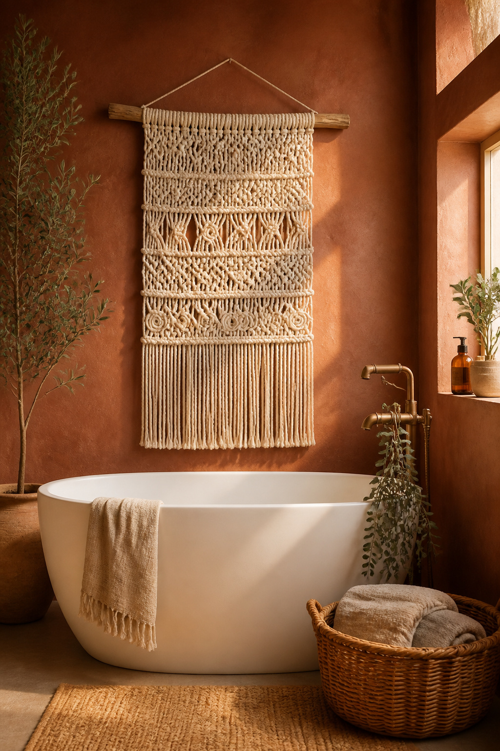
The humidity question is where bathroom macramé requires honest decision-making. Cotton is the most aesthetically preferred natural fiber, but it absorbs moisture and will develop mildew in a bathroom with poor ventilation — particularly in small, high-use spaces. Nylon cord is fully waterproof and mould-resistant: the practical choice for any bathroom where humidity is a concern. Polyester is a strong second option for the same reasons. Jute has natural antimicrobial properties and resists mould better than cotton, though still not as effectively as synthetics. Whatever fiber you choose, keep the piece at least 1.5 metres from shower heads, bath taps, and any steam source.
For scale, match the knot complexity and width to the bathroom’s overall aesthetic. Minimalist bathrooms — clean lines, sparse surfaces — call for narrow, geometrically simple pieces (30-40cm wide) rather than large, busy compositions. Bohemian spaces can accommodate wider, more complex hangings (50-80cm) with layered knot patterns, long fringe, and added elements like wooden beads or dried botanicals. Small bathrooms benefit from vertical, narrow pieces that draw the eye upward without consuming horizontal wall space. Hang with a wooden dowel or driftwood rod — these are integral to most handmade macramé and look deliberately chosen rather than improvised.
The choice of what frames our art is a design decision that often gets made unconsciously. Walking past a wall of generic black frames in a home goods store and picking whichever fits — that’s a missed opportunity. For a bathroom designed around intention and wellbeing, sustainable framing materials extend the philosophy of the space into its details. Bamboo grows several feet per day in some species and can be harvested in three to five years, compared with decades for hardwoods. It’s strong, lightweight, and has a natural warm-toned grain that photographs beautifully in any room. Bamboo frames sealed or lacquered for moisture resistance are the most practical choice for bathroom use; unlacquered bamboo can swell and crack in sustained high humidity, so check the product description before purchasing.
Reclaimed wood frames have something bamboo can’t offer: uniqueness. Each frame sourced from salvaged timber — old floorboards, wine barrel staves, retired furniture — carries grain patterns, character marks, and colour variations that no two frames share. Recycled aluminium frames are fully waterproof, made from post-consumer content, and require 95% less energy to produce than primary aluminium — an excellent environmental choice for any bathroom print. Cork is an emerging framing material: naturally antimicrobial, moisture-resistant, and harvested without killing the tree every nine to twelve years. For prints themselves, Minted offers carbon-neutral printing on recycled paper in recyclable packaging — one of the more complete sustainable choices for a quality art print. Also, many independent Etsy print shops now print on demand (eliminating inventory waste) and offer recycled paper options; look for “sustainable printing” or “eco-friendly paper” in their shop descriptions. Choosing art from local independent artists involves no shipping emissions and directly supports a maker — the most circular option of all.
Before any art purchase, three questions are worth sitting with. The first is scale: measure the wall space and aim for the print or hanging to occupy sixty to seventy-five percent of the width of the surface it’s going on. Art that’s too small reads as an afterthought. The second is humidity tolerance: metal, ceramic, acrylic, and sealed glass belong anywhere in a bathroom; unprotected paper and untreated natural fiber need to stay clear of direct steam. The third is the most important: what emotional tone do you want this space to hold?
Starting with one strong, carefully chosen piece is almost always better than attempting a complete gallery wall in one session. Let it become part of how you begin and end each day, then add to it gradually. The most interesting bathrooms look like they were built over time — not decorated in an afternoon. If budget is a real constraint, a bathroom makeover on a budget approach — one quality piece chosen with intention rather than several affordable ones filling space — creates a more considered result than its price tag suggests.
The bathroom will ask the most of any art you put in it: humidity, temperature fluctuation, daily scrutiny. But it offers something no other room does — a guaranteed daily audience, alone, usually unhurried. The right bathroom art decor doesn’t fill a wall; it becomes part of how you meet yourself every morning.